2001: A Space Odyssey – Stanley Kubrick’s 1968 sci-fi masterpiece – seems an appropriate place to start a blog about typography in sci-fi. Amongst other delights, it offers a zero-gravity toilet, emergency resuscitations, exploding bolts, and product placement aplenty. It’s also the Ur Example of Eurostile Bold Extended’s regular appearance in spacecraft user interfaces.
Right from the opening scene, we’re treated to Kubrick’s love of bold, clean, sans-serif typography:

This title card is set in Gill Sans, one of the all-time classic sans-serif fonts. Perhaps surprisingly, the zeroes in ‘2001’ appear to be set with the Gill Sans capital letter O (shown below on the left), rather than its zero character (shown on the right):

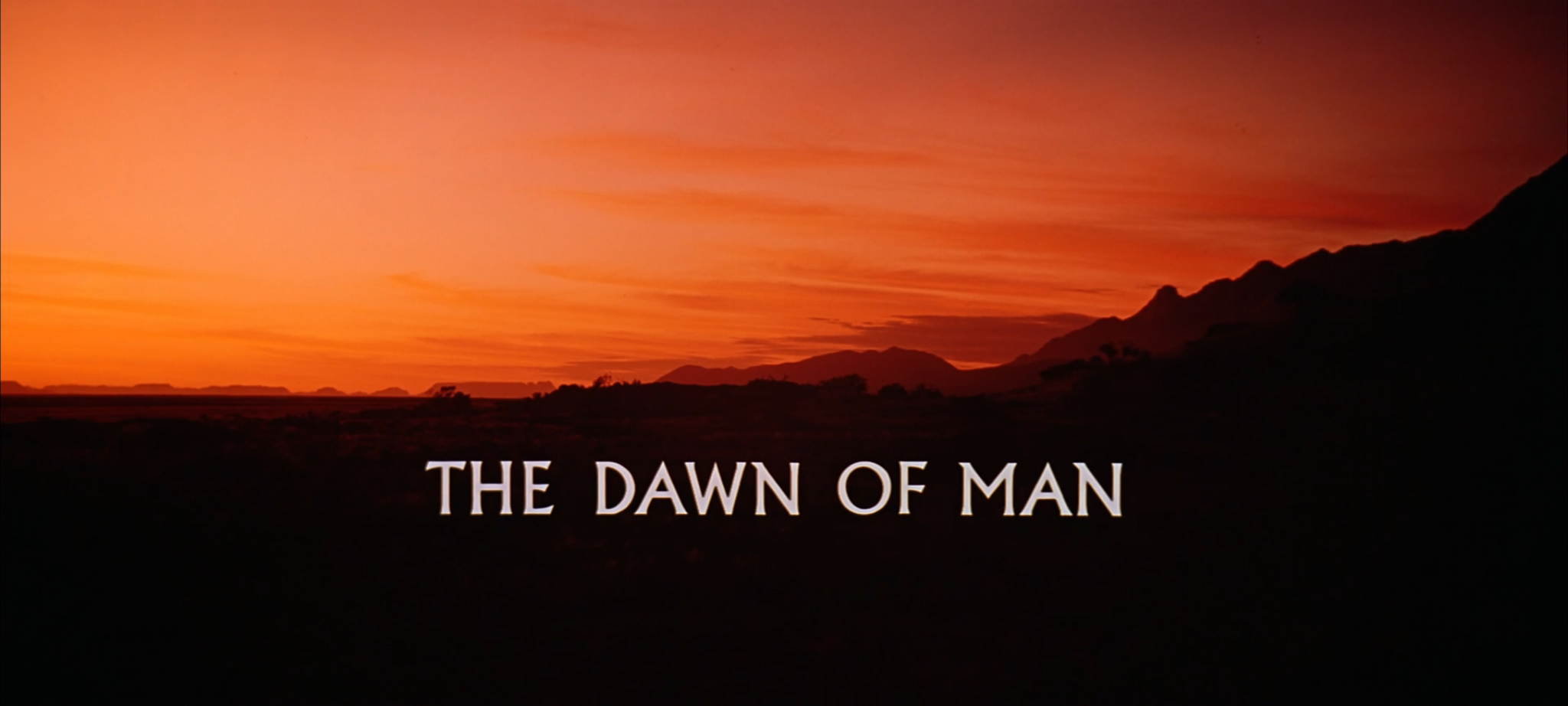
The film’s opening act is set during The Dawn Of Man. The dawn of man is definitely not set in the future, as indicated by its use of Albertus for the act’s title card:
After introducing us to Albertus, the Dawn Of Man turns out to be typographically unremarkable. So, let’s skip forward a little, and join Dr. Heywood R. Floyd on his Pan Am flight to Space Station 5.
In the first of several subtle inclusions of real-world American companies, we discover that the Pan Am logo hasn’t changed much between 1968 and 2001. (We’ll gloss over the fact that Pan Am went bust in 1991.) The cabin crew have, however, adopted Velcro Grip Shoes to counter the weightlessness of space:

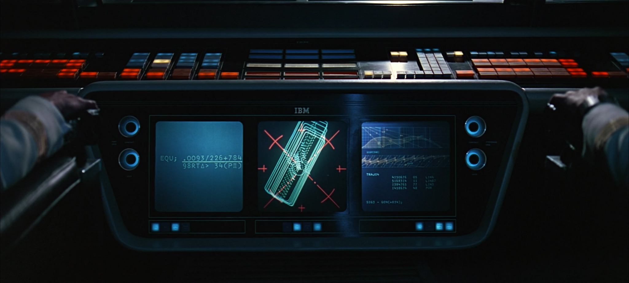
The Pan Am spacecraft’s flight deck gives us our first sighting of Eurostile Bold Extended, in an ominous foreshadowing of the HAL 9000 interface screens we’ll see later on. Presumably the Pan Am craft are also controlled by HAL-series computers. And why not? After all, the 9000 series has a perfect operational record.

In a subsequent close-up, we see that the craft also features the IBM logo in its pre-1972 version, set in City Medium, as designed by Paul Rand:
There’s no mistaking Eurostile Bold Extended on the receptionist’s language buttons when the Doctor arrives on the space station. Actually, there might be some mistaking it, because it could just as easily be Eurostile’s precursor, Microgramma. It’s nigh-impossible to tell them apart. Who knows, it could be Microgramma throughout the entire film. Let’s just call it Eurostile and get on with things.
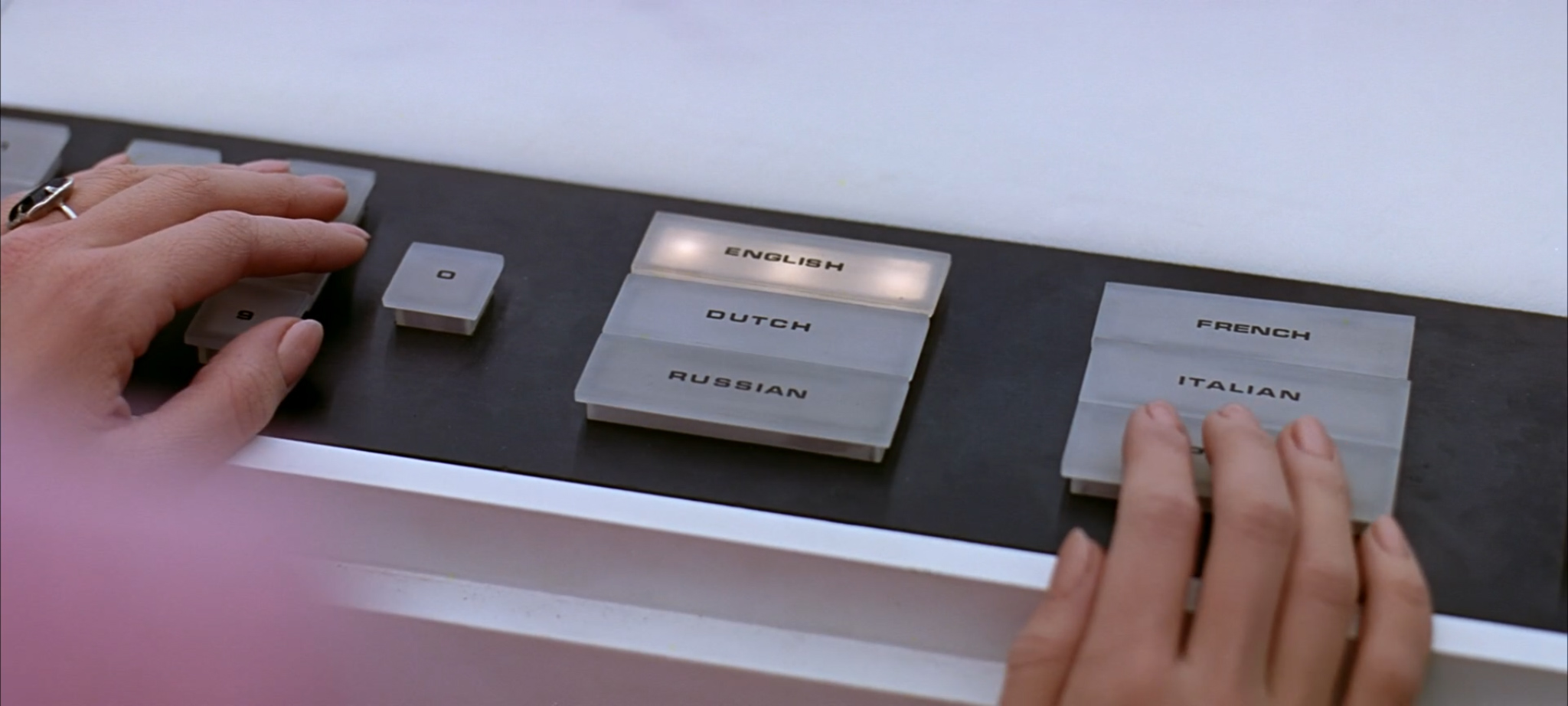
UPDATE: In response to this article, Erik van Blokland has posted a comprehensive side-by-side comparison of Eurostile, Microgramma, and HAL interface artwork from the traveling Kubrick exhibition. His conclusion: inconclusive.
The Hilton chain of hotels has opened an outpost on Space Station 5. This logo doesn’t match any I can find from their history, but it is very reminiscent of the iconic signage for the Beverly Hilton in Los Angeles:

Just like Pan Am, the Howard Johnson’s chain of restaurants doesn’t seem to have changed its logo since the sixties. This is ironic, given that it updated its classic logo in 1998, a year or so before this scene takes place:
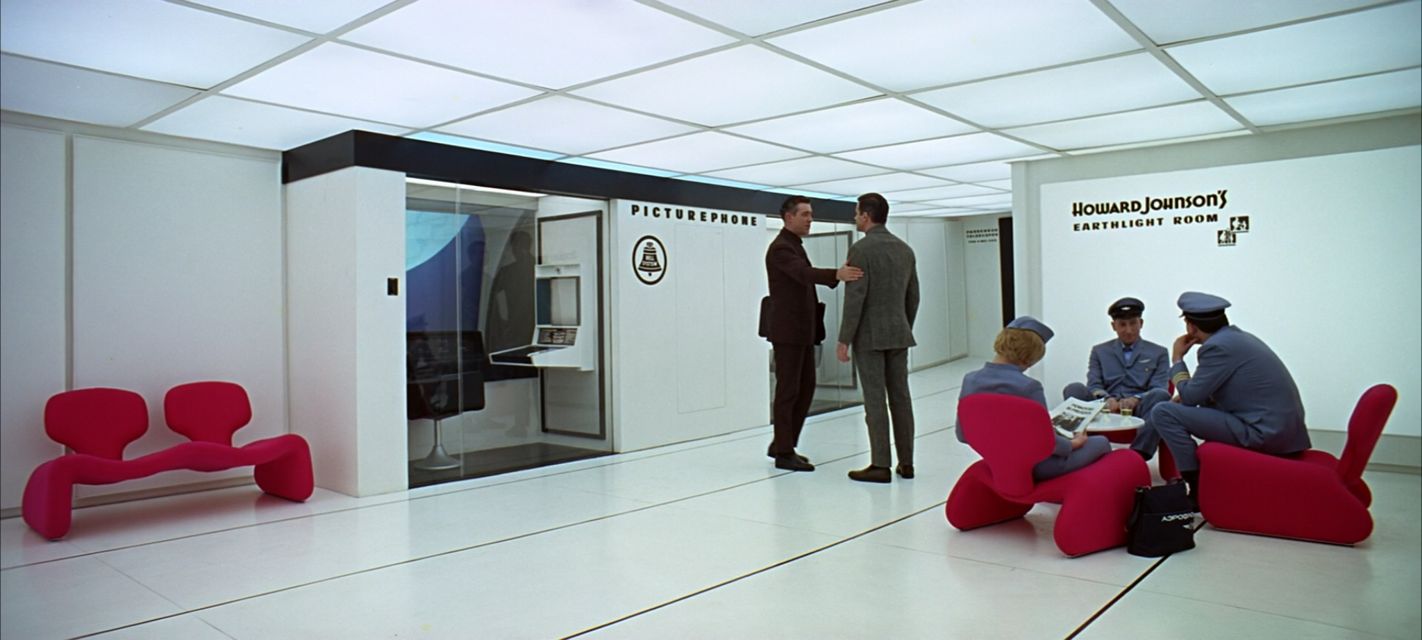
Dr. Floyd’s video call to his daughter sees another use of Eurostile Bold Extended. There’s also another real-world company logo, this time for the American Bell Telephone Company. (Their logo was redesigned by Saul Bass the year after 2001 was released.)
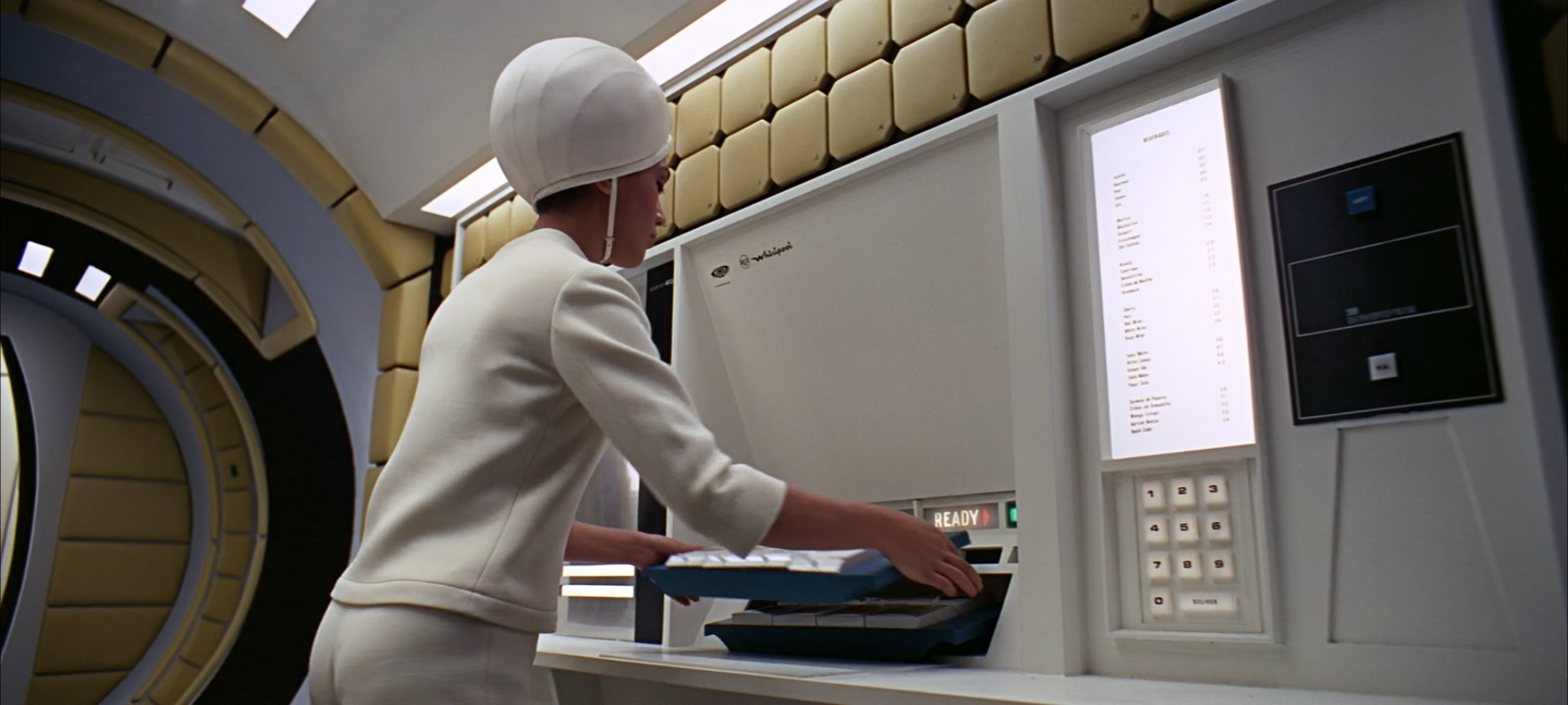
Eagle-eyed viewers may spot a logo for RCA Whirlpool (now the Whirlpool Corporation) during Dr. Floyd’s subsequent flight to the Clavius moon base. This logo (and the name RCA Whirlpool) was dropped in 1966, suggesting that this scene may have been filmed earlier in the movie’s production:
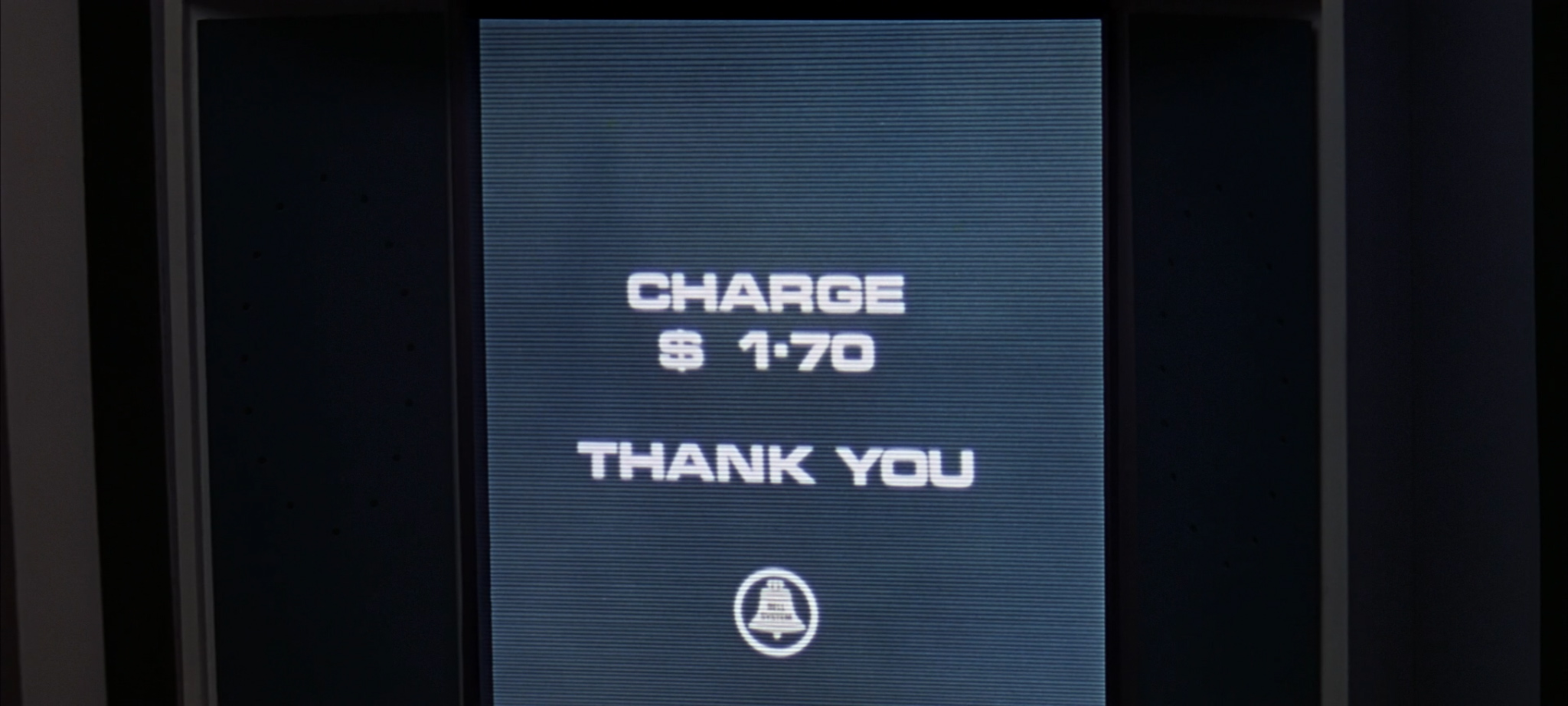
The Clavius flight also features Eurostile Bold (not Extended) in the instructions for the ship’s comedy Zero Gravity Toilet. It’s probably very sensible that Passengers Are Advised To Read Instructions Before Use.

Let’s take a brief aside to find out how a Zero Gravity Toilet works. These instructions have been transcribed as best as possible from a HD source.
1. This toilet is of the standard zero-gravity type. Depending on requirements, system A and/or system B can be used, details of which are clearly marked in the toilet compartment. When operating system A, depress lever and a plastic dalkron eliminator will be dispensed through the slot immediately underneath. When you have fastened the adhesive lip, attach connection marked by the large “X” outlet hose. Twist the silver coloured ring one inch below the connection point until you feel it lock.
2. The toilet is now ready for use. The Sonovac cleanser is activated by the small switch on the lip. When securing, twist the ring back to its initial-condition, so that the two orange lines meet. Disconnect. Place the dalkron eliminator in the vacuum receptacle to the rear. Activate by pressing the blue button.
3. The controls for system B are located on the opposite wall. The red release switch places the uroliminator into position; it can be adjusted manually up or down by pressing the blue manual release button. The opening is self-adjusting. To secure after use, press the green button which simultaneously activates the evaporator and returns the uroliminator to its storage position.
4. You may leave the lavatory if the green exit light is on over the door. If the red light is illuminated, one of the lavatory facilities is not properly secured. Press the “Stewardess” call button to the right of the door. She will secure all facilities from her control panel outside. When green exit light goes on you may open the door and leave. Please close door behind you.
I don’t know why Pan Am’s toilet instructions spell ‘coloured’ with a u – or, indeed, why they call it a ‘toilet’, rather than the more typical American name of ‘bathroom’. I also dread to think what a plastic dalkron is, and I’m still not entirely clear when one might prefer systems A or B. But that’s probably for the best.
Let’s move on. Following a brief speech in a moon base, three American chaps take a spacecraft to visit a suspicious-looking monolith. What could possibly go wrong? Either way, their map makes good use of a mix of Eurostile Bold Extended, Futura Medium and something that looks like it’s probably a condensed form of Univers:

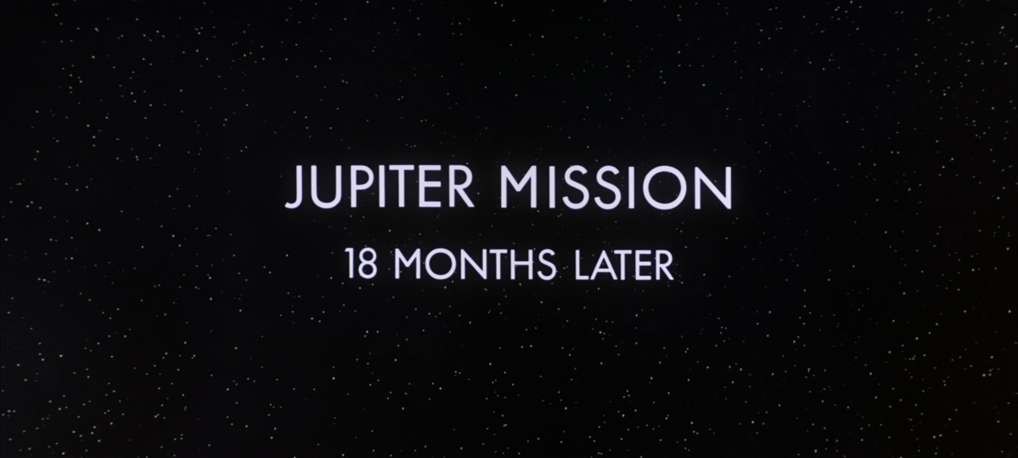
Things do, in fact, go wrong. General badness happens. Next thing we know, we’re looking at a title card for Part 3: Jupiter Mission. This title card is set in the other classic sans-serif font – Futura – but with a few idiosyncrasies. The points of the capital N characters have been softened, and the capital M appears to be borrowed from Gill Sans:
Only two of the Jupiter Mission crew of USS Discovery are awake, with the rest still in hibernation. The two crew members spend some time watching a BBC TV show on their eerily-prescient tablet devices. The channel is BBC 12, which is eight TV channels higher than the present-day BBC transmits. The corporate logo correctly uses its 1960s form of Univers in italicized outline boxes. (It was changed in 1997 to use its modern-day Gill Sans layout.)

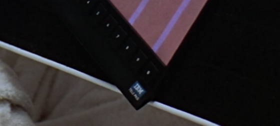
The tablet is made by IBM, like much of the spacecraft’s hardware. It’s hard to be sure, but I think the tablet is called an IBM Tele Pro (although it could be Tele Pad, but I think that’s modern-day device naming trends influencing my eyesight):
Either way, BBC TV is clearly portrait-only in the future. (The device’s numeric buttons along the bottom portrait edge don’t make it look like it’s meant to be used in both orientations.)
The mission’s hibernation devices use Futura for their numeric and medical buttons, and Univers for their Emergency Revival Procedures:

There’s an unfortunate typo on the very first button, which refers to hypothalamus stimulation as ‘hyperthalamus stimulation’. (The spelling of this word changes throughout the instructions below.)
If you need to revive someone in an emergency, you’ll want to make sure you have several hours available. Again, my best attempt at a transcription from HD source:
1. Set level button for hyperthalamus activation in accordance with subject’s AQX chart.
2. Activate electric stimulation of the hypothalamus for 12 minutes.
3. Set blood sugar enrichment level in accordance with subject’s AQX chart (if secondary level indicated, activate primary level (step 4 below) and hold for 75 minutes, then change to secondary level for 40 minutes).
4. Activate blood sugar enrichment for 110 minutes.
[…]spiratory levels in accordance […]
7. Activate temperature B button to increase respiratory rate.
8. Activate thyroxin control at level 4 for 30 seconds, at level 6 for 30 seconds, and at level 9 for 10 seconds to reestablish normal endocrine activity.
9. When subject shivers vigorously awakening is about to take place. Disengage brain monitor, suppressant connector and [thermolator band?].
10. Immediately upon awakening activate vibrator for 2 minutes.
11. Subject may now arise and undergo normal post-hibernation rousing.
By my reckoning, that’s a minimum of four hours and ten seconds to revive someone in an emergency. Let’s hope nothing goes wrong for the crew members who are still in the hibernation pods, eh? (I do like 2001‘s use of in-craft typography to foreshadow events later in the film.)
On that theme: I’m not sure about the typeface used for the hibernating crew members’ vital statistics, although it feels like it may be a slightly extended variant of Univers:

However, I do know that this section of the movie contains some absolutely Eurostile-tastic HAL 9000 screens:

We also get a glimpse of HAL 9000’s own logotype, which could be a manually compressed and outlined variant of Univers, but honestly, it’s hard to tell:
![]()
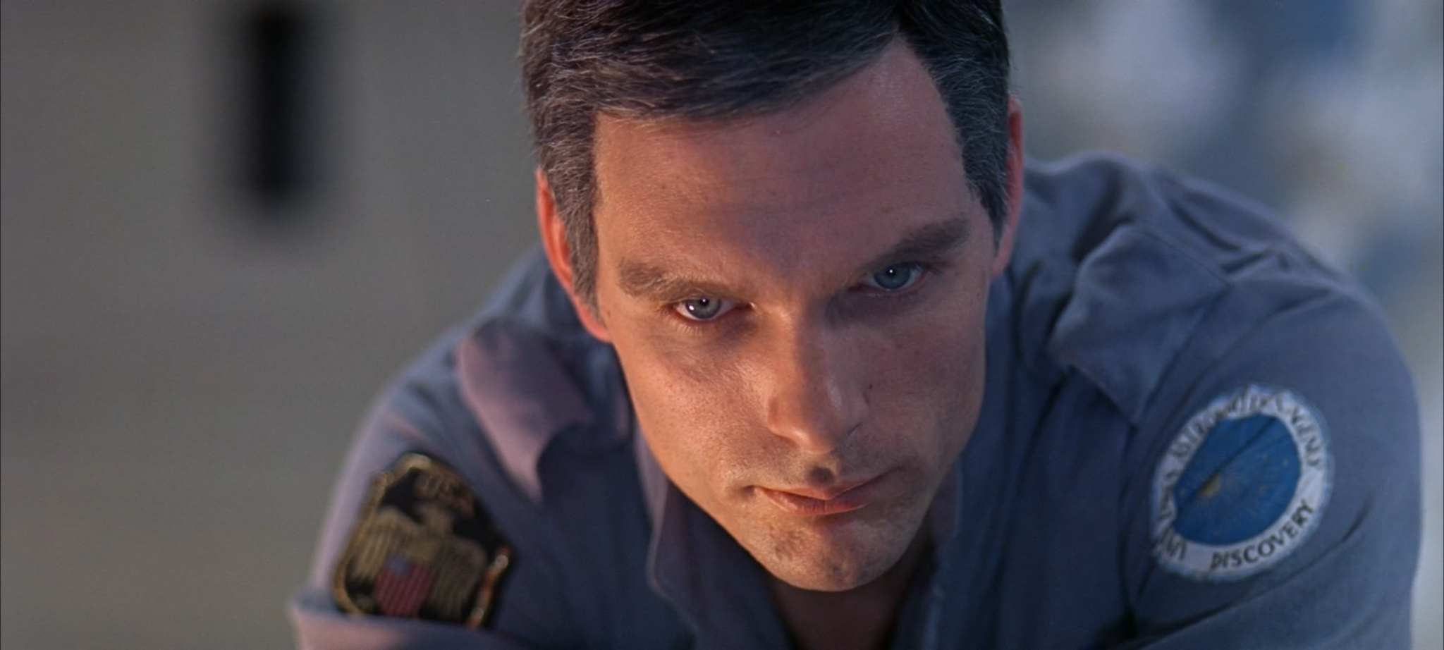
During the first EVA, we see that Dr. Bowman’s space suit features yet more IBM equipment:

We also get a close-up of HAL’s telemetric displays, in a beautiful data font that appears in many of HAL’s interface displays (and which I’ve sadly not been able to identify):

You can see this telemetry in action on your own computer in the beautifully-crafted HAL 9000 interface screensaver, which is available from the HAL Project web site.
UPDATE: Heather, in the comments to this post, has correctly identified this font as Manifold from the DSG IBM Selectric Type Element Catalog. Thank you Heather – a fantastic spot!
After Dave returns from his EVA, we get a brief and blurry glimpse of the USS Discovery mission patch on his shoulder:
This warrants a brief mention of the timing of 2001‘s release. It’s easy to forget that 2001 actually hit cinemas in 1968, the year before Apollo 11 first put a man on the moon. The movie’s use of spacesuit and spacecraft typography is particularly interesting in light of the mission patches of the Apollo missions building up to Apollo 11’s historic landing. Here are the patches for Apollo 7, Apollo 9 and Apollo 10:

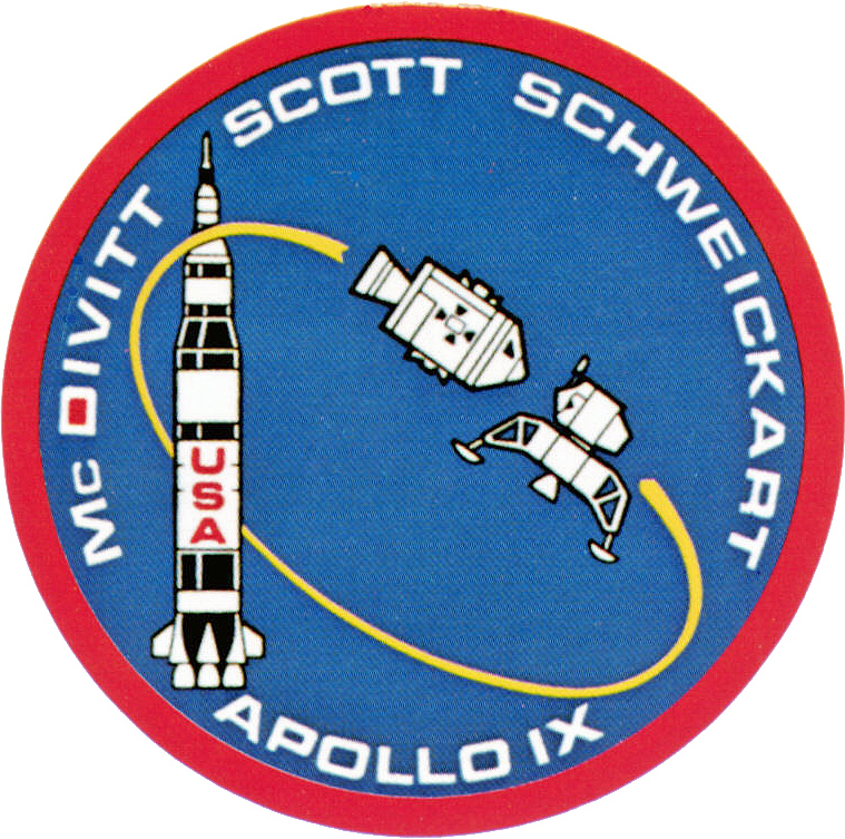

Does the typography remind you of anything?
Apollo 11 took a slightly different typographic tack, opting for Futura instead of Eurostile, but I don’t think Kubrick would have complained:

Much of the Apollo mission documentation and material also makes extensive use of Futura. The USS Discovery is certainly in good company.
UPDATE: Stephen Coles from Fonts In Use notes that the Apollo 11 mission patch is actually set in Spartan, an American knock-off of Futura. You can tell the difference from the flat (rather than angled) terminal on the 1.
Futura is also used to good effect to warn the Discovery crew about the pod’s Explosive Bolts:
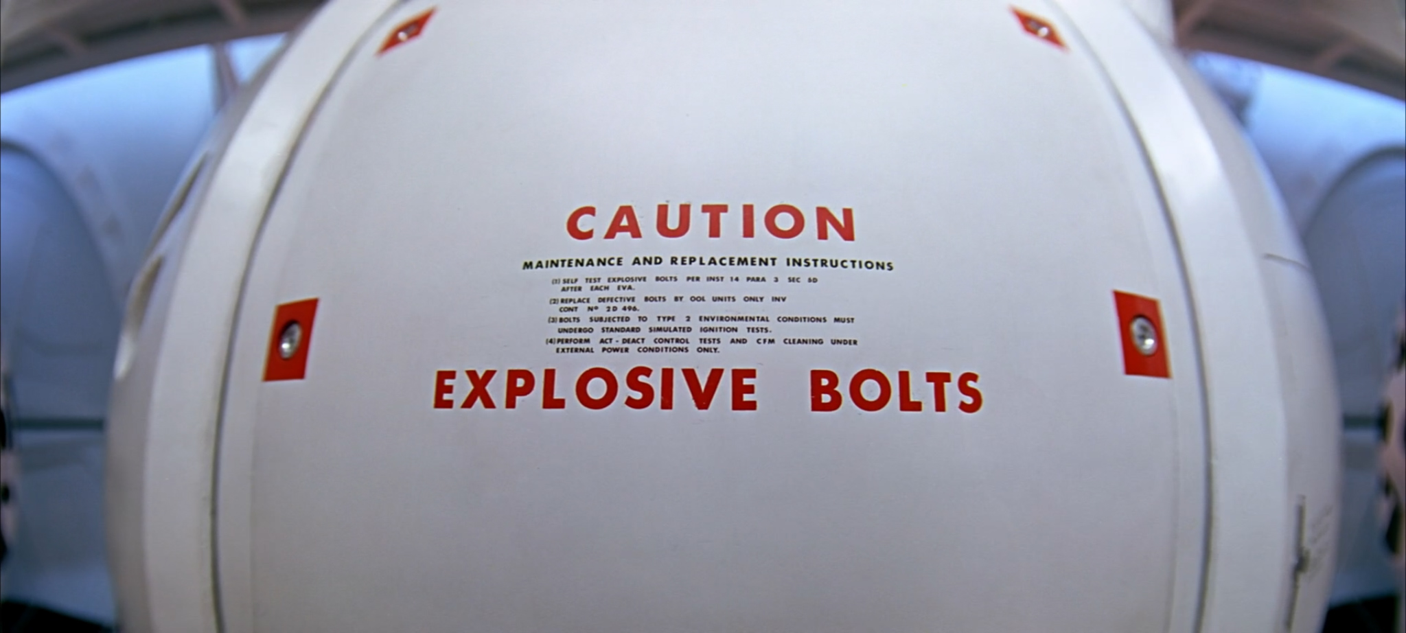
Again, a lovely bit of foreshadowing that still ties in neatly with the overall aesthetic of the craft. (Chekhov’s Typography, if you will.)
Futura also features on the pod communications switches used to cut HAL off from the worried crew’s conversation:

Good lord, is that the time? We should have an intermission!

This time, the title card is Gill Sans all the way. Go and make yourself a cup of tea while the scary music plays.
And we’re back. Frank heads out on another EVA to pop the comms dish gadget back in the comms dish gadget slot. Unfortunately, his pod turns evil and cuts his air supply. Frank spirals away into space. Dave follows him in a pod, attempting in vain to retrieve his body before it’s too late. While he’s doing so, there’s a dramatic…

…in the hibernation pods, which causes the life support machines of the hibernating science crew to start reporting…
…and end up with their…

…which isn’t what they wanted AT ALL.
Still: if it is going to happen, it may as well happen in what is probably Univers 67 Bold Condensed.
Now: if Dave wasn’t out in the pod trying to catch Frank, he’d’ve been able to instigate the four hours and ten seconds of Emergency Revival Procedures. Remember those? Ah well, never mind.
Worse is yet to come. Dave is locked out of the Discovery by HAL. There’s only one thing for it: open the emergency air lock, and fire the Explosive Bolts. Remember those?

Having just about made it back in, Dave triggers the Emergency Hatch Close (which is just next to the Emergency Umbilical Connect):
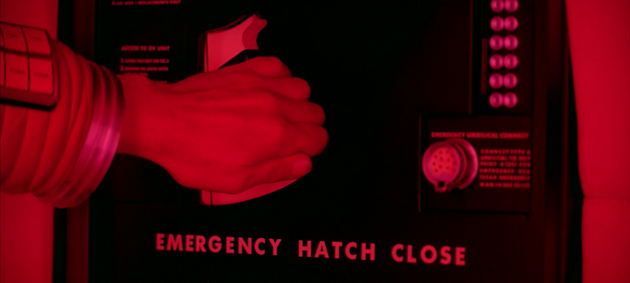
There sure are a lot of things labeled ‘EMERGENCY’ in Futura on this spacecraft. Perhaps the most notable example of all is the HAL 9000 Logic Memory Center:

Dave removes HAL 9000’s memory. HAL sings a song. The typography might be Univers 67 Bold Condensed again, but I’m not convinced by those numbers:

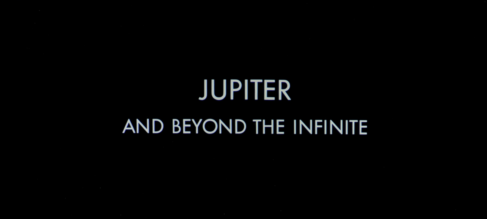
And, as soon as you can say ‘National Council of Astronautics’, we’re in to Part 4: Jupiter And Beyond The Infinite.
Less-pointy Ns notwithstanding, this title card is Futura all the way:
This final part of the film is visually eclectic, aurally stunning and philosophically challenging. Many thousands of words have been penned over the decades to try and fathom the meaning of the monolith, and the genesis and future of the space-baby. However, none of this act contains typography, and it is therefore of no concern to us. Let’s skip to the end credits.

It’s Futura again, with an M borrowed from Gill Sans, and a W that I don’t recognize from anywhere.
Goodnight!
FUN FACT: An expanded version of this article appears in the Typeset in the Future book, available on December 11 2018. You can pre-order it now on Amazon.

Fantastic article — thank you! 2001 is a very dear film to me, and your insights were lovely to read. Good luck with the rest of your entries, I’m looking forward to them.
LikeLike
In the last picture, I think the W is just an inverted M from Futura.
Not sure why someone would do that, but it sure looks that way.
LikeLike
What? Hate to break it to you, but the M and W look nothing alike. Think you better put those glasses on Mr. Magoo, and have another look.
LikeLike
Not a chance. Look at the M just to the left of the W (in the word FILM). The edges are perfectly vertical not angled out like they are in the W.
LikeLike
The “M” in FILM isn’t from Futura (as noted in the article, which I recommend reading before commenting). Futura’s “W” is indeed angled out.
LikeLike
Already noted is that the M in FILM is borrowed from Gil Sans, it is NOT the M from Futura. That said, the W in WAS is not an inverted Futura M anyway. It actually just looks like a regular Futura W to me.
LikeLike
Totally awesome article.
Please keep delighting us, the typoaddicted.
LikeLike
Awesome article! Thanks so much for doing all this work, it was an absolute pleasure to read. Love all the attention to detail and screenshots.
In case anyone hasn’t seen this, there is an awesome flash video that explains all kinds of other neat details about the movie:
http://www.kubrick2001.com/
LikeLike
Gets a lot wrong, though. The first monolith is definitely a teaching machine. When it buries itself on the moon, it acts as an alarm clock – the ETs know that any civilization that can reach the moon can also destroy itself. The story is actually pretty straightforward, but Kubrick deliberately left out important details – perhaps to make it obscure?
LikeLike
I think Kubrick deliberately buried information in the visuals, he didn’t spell it all out for the audience. For example, the scenes in prehistoric times and the scenes in the beginning space age tell different stories, but the subtext seems to be the same, the scenes in prehistoric times add to the story in the future. When Floyd talks about the potential for cultural shock and social disorientation, I’m reminded of the man-apes going insane when they encounter the monolith without any prior preparation. Both ages are linked together by that match cut, and since the next title card announces the Jupiter mission, it means the dawn of man is not a singular moment in the past, but a process which began in the past and – from the perspective of the aliens – ends when humanity sets out to conquer the final frontier.
LikeLike
That definitely takes me back, Eric. I used that on a book report for “2001” that I did in high school back in 2002 or so (I was off by one year…oh well.)
LikeLike
The choice of languages compares poorly with the buttons in the movie, which accord Dutch its rightful place as one of the three most important languages, along with Russian and English.
LikeLike
You should talk to Joe Kosinski about his fonts in Tron and Oblivion. Joe is a font geek and put a lot of effort and attention into that area of the creative.
LikeLike
great idea–i would LOVE that!
LikeLike
please include TRON ANIMATED as well.
beautiful graphics in all tron incarnations!
LikeLiked by 1 person
Easily one of the most enjoyable reads on design and typography I’ve ever encountered, and one of the best articles (and concise!) on 2001. Thanks for this.
LikeLike
This is an amazing amount of work that you made so entertaining to read. Thank you so much, it is very interesting and makes me want to watch 2001 again with a different point of view.
LikeLike
Many compliments for the excellent article, it’s something I’d love to have written for my own site! I can confirm that the Newspad, as it was called in early production documents, is actually a ‘IBM Telepad’ – I noticed it clearly in the 70mm. showing of the movie I saw back in 2001 when it was re-released.
I’m placing this blog in my newsfeed right away. Regards, Simone
LikeLike
Hi Simone,
Thanks for the extra info about the Tele Pad. I’ll update the post accordingly. Much appreciated!
LikeLike
Re: the spelling of “colourful”, it’s the British spelling. 2001 was a British-based production (mostly at Shepperton Studios) and obviously Arthur C. Clarke was British, which is also probably why they use the term ‘toilet’ instead of the American preference for ‘bathroom’.
LikeLike
Yet later we see ‘Logic Memory Center’ not ‘centre’
LikeLike
Well HAL was produced by IBM, which is an American company, so it makes sense they’d use the US spelling …
LikeLike
It’s made very clear in the scene where Bowman disengages HAL’s higher-level logic modules that — according to HAL himself — he was assembled “at the H-A-L plant in Urbana, Illinois.” No doubt a future corporate projection of the University of Illinois’ well-known computer science lab, which in the late ’60s was doing cutting-edge work with parallel-processing, etc. (The main campus of U. of I. is located in the twin cities of Champaign-Urbana.) Thus HAL 9000 was definitely not made by IBM, for all that many of his (or its) peripherals were. You’re welcome.
LikeLike
2001 was ‘mostly ‘ made at MGM British Studio’s, Borehamwood Herts. They needed to use Shepperton Studios for the large H stage where the live action part of the pit shot was filmed (where the momolith was first discovered)
LikeLike
Ehh… I was too quick to comment. I see your point is not why it’s spelt that way, but why it would be spelt the British way on a vehicle belonging to an American company…
LikeLike
Perhaps the company that built and installed the Zero Gravity Toilet was a British firm?
Or perhaps the visionary Clarke and Kubrick secretly foresaw the coming bankruptcy of Pan Am in 1991, and this was Clarke’s subtle way of hinting that an aerospace firm in the nation of his birth should take over the name for their commercial spaceflight operations?
(Either explanation would be easier to accept than the inescapable fact that Clavius Base and the Moon Bus to TMA-1 both have Star Trek-style artificial gravity rather than centrifugal gravity — the most glaring scientific error that no one ever mentions in the film. Having swallowed that, we can live with a British Pan Am or British space toilets…)
LikeLike
But the moon has its own gravity.
LikeLike
The Moon’s gravity is only 1/6 Earth gravity & this would show up in all physical movement. Remember the Apollo footage?
LikeLike
Maybe, once on the Moon, everyone in the film would wear weighted shoes to be able to walk somewhat more naturally and “Earth-like”.
Also the film was made *before* NASA even landed on the Moon, so no one had seen people actually hopping around on the Moon yet. However, that hopping on the Moon by NASA astronauts was partially due to have suits on that were somehow difficult to bend at the knees. So the tougher-to-bend suits combined with the low gravity, it was easier for them to hop around. (Without such suits, hopping maybe would not be necessary and the film is possibly not as inaccurate as first assumed.)
LikeLike
Pan Am doesn’t have artificial gravity in either of the space craft. The shuttle to the space station is shown to be gravity-less in the floating pen scene, and Floyd’s floating tray during the journey to Clavius indicates that no gravity applies there, either. The way they all stay upright is supposedly explained by velcro shoes.
LikeLike
One technical flaw that apparently no one ever mentions is that the actress playing the stewardess on the Pan Am shuttle loses her balance slightly when walking down the aisle “heel-to-toe”, and has to take a couple of quick “bunny steps” to balance herself. That, of course, would never occur in zero-G, where loss of adhesion would instead cause her leg to drift up, forcing her to plant it down slowly but firmly (extending rather than crouching). It was, of course, an instinctive reaction rather than the action of a zero-G-trained flight attendant, which leaves me puzzled as to why Kubrick (a stickler for detail) left the take as is…
LikeLike
Maybe they were at risk of running behind schedule or something, and the producer/s insisted? Or maybe they’d done that take so often that even Kubrick (as obsessively perfectionistic/controlling as he was) was tired and wanted to move on? (Just my wild guesses.)
LikeLike
Well spotted sir, about the artificial gravity, which is of course, impossible. In the Moon based scenes, people would have been ‘bunny-hopping’ along corridors & outside on the Moon’s surface, as the Apollo astronauts soon discovered this was much easier than walking. A fact I shall be using in my new TV series LIGHT YEARS.
LikeLike
No need for artificial gravity on the moon, of course (I see David Mann has pointed it out, already).
2001 is perfect.
LikeLike
It’s a *toilet joke* after all, so it must be British. The Yanks just didn’t do toilet humour at this period, and the Brits did little else. I rest my case.
LikeLike
Perhaps they thought that by 2001 the British spelling would be universal?
LikeLike
Er…the British spelling is universal…it’s the American spelling that’s not…
LikeLiked by 1 person
Please keep this going, fascinating.
LikeLike
Very nice work! That’s some exhaustive research into my favorite film of all time.
Just as a matter of helping out with this noble project: I’m nearly positive the text that rings the Discovery 1 mission patch is Optima Regular. That struck me as odd b/c you don’t see that font anywhere else in the film. The Wikipedia link to “Mission Patches” was also useful in that it explained why the patches were silkscreened rather than embroidered.
LikeLike
Regarding the zero gravity toilet: I should think system A/B is in reference to whether you need to go #1 or #2, or perhaps male/female operators.
LikeLike
Yes, I was going to comment the same: A & B would be male or female applications.
LikeLike
Can’t be male/female; the instructions imply that an individual may want to use system A AND/OR system B. I doubt that hermaphroditism is meant to be widespread by then; certainly it doesn’t seem so – and these very instructions refer to the ‘stewardess’, too.
Given that system B has a ‘uroliminator’ and an ‘evaporator’, it seems clear to me that system B is for #1s 🙂
Just in case you wanted to know after all.
LikeLike
I agree that B is for number 1s. Moreover, A seems to involve a large hose with an adhesive lip. I for one would appreciate these features doing a 2 in zero-G.
LikeLike
THIS IS WHAT I UNDERSTAND FOR A BLOG!
great!
LikeLike
The telemetry typeface appears to be inspired by nixie tube numerals. Might be wrong on that though.
LikeLike
Agree. Nixie tube-like.
ed
LikeLike
Fantastic first entry, so glad you’re doing this. Watched the making of Alien last night and there were some shots of Ron Cobb’s icon graphics for the Nostromo, some funny touches.
LikeLike
This was great absolutely loved it THANK YOU….
LikeLike
HALs internal font (as you call it) looks like an old typewriter. I didn’t know that there exists a digital version or what name the font is though. Fascinating research. Thank you 🙂
LikeLike
Pretty sure Trumbull created the HAL internal font using an IBM Selectric.
LikeLike
Great post! Just a bit of clarification: although IBM’s own history page says that the logo is the City typeface, it’s actually only (perhaps) based on City. Rand’s design is actually quite different than the letters in the typeface. The ‘I’ is wider, the contour of the ‘B’ bowls are round and its counters are squares, and the ‘M’ vertex reaches the baseline.
LikeLike
The Apollo 11 patch is most likely in Spartan, a knockoff of Futura commonly used in the States. One of the few ways Spartan noticeably differs from Futura is the ‘1’ with a flat, rectangular stroke rather than diagonal.
BTW, you have a misbehaving apostrophe right here in “2001‘s”.
LikeLike
Oh, good spot on the Spartan! Yes, you’re right – the flat 1 does give it away. I’ll add that to my list of things to watch out for.
The misbehaving apostrophe is a blogging software glitch, I think, caused by the emphasis on 2001. I’ll see if I can fix it.
LikeLike
Nice writeup!
I don’t know the source of the monospaced technical text, either, but it looks an awful lot like the typefaces used by various impact printers/typewriters/calculators of the day. I found a lot of very similar-looking specimens (IBM’s Selectric had a few), but no exact match.
As for the IBM “Tele Pad”, the same device is referred to in the book as a “Newspad”, so that seems like a very plausible interpretation.
LikeLike
I always meant to write about the type in 2001 on my site (I am the author of Typecasting: The Use (and Misuse) of Period Typography in Movies, but never got around to it. Very nicely done.
Incidentally, the complete ten-step instructions for the zero gravity toilet were reproduced in the 1970 book The Making of Kubrick’s 2001 by Jerome Agel. (Let me know if you’d like a scan of it.) In the book it notes that Clarke said that Floyd’s reading of the zero gravity toilet instructions was the only intentional joke in the movie.
LikeLike
I’m not sure how, but I’d not come across Typecasting before. I will be reading it this weekend. Good work!
I have a copy of the Jerome Agel book on order from Amazon, so I look forward to seeing the rest of the toilet instructions therein. According to an ex-NASA colleague at work, they are actually pretty accurate 🙂
LikeLike
The data font looks to me like a variation on the old IBM Selectric fonts:
http://munk.org/typecast/2011/04/25/1964-nomda-blue-book-ibm-font-styles/
Or less likely one of the IBM line printer fonts.
http://slantedhall.com/fonts/1403
In the book the equivalent device to the Tele-pad was called a Newspad so at least to me it doesn’t seem unlikely that TelePad was it’s name.
LikeLike
Wonderful, informative article. Thank you.
LikeLike
The data font looks like a variant of Orator, especially if you compare 3, 4, and 5.
LikeLike
Oh, good spot! The numerals are almost but not quite Orator – the tail of the 9 is slightly wrong, for example – and the uppercase letters definitely aren’t right. But I’d say you’re on the right lines. Orator was created in 1962 for use in IBM typewriters, and the font in the film looks like it may be from a 60s typewriter too.
LikeLike
I had been curious about those end credits for a while. Did some poking around on the Typophile forums and someone eventually contacted me with a recreation from screen grabs I pulled from a Bluray.
For those interested it can be found here:
LikeLike
Great page! Very useful for my current t project. I think the font used for Hal’s I interface (the one you weren’t sure about is Andale Mono
Cheers,
Rich
LikeLike
Fascinating stuff: I shall look forward to future posts!
I was just thinking about the way all these props and title cards would have been produced in the days before DTP. I can imagine that many of them may have started out as Letraset or similar, where it’s very easy to mix and match different typefaces as the fancy takes you. Maybe some of them are Letraset’s own designs so not now identifiable.
LikeLike
Indeed, the Eurostile throughout was almost certainly Letraset. The Univers body text (TMA-1 screen) looks to me like it was Selectric. The lightboxes would have been simple to create with a process camera of the period shooting a black on white paste-up layout, and backed with a gel insert (not that I am any expert in film props).
LikeLike
The danish headphone manufacture AIAIAI has released a high end DJ headphone set w/ phone integration called the TMA-1 … I own a pair and they are as awesome designed as 2001…
http://www.aiaiai.dk/store/headphones/tma-1
LikeLike
Hola Dave,
espero no resulte muy difícil traducir mi comentario.
Me disponía a invitarte a leer al maestro Mark Simonson, cuando descubrí que él mismo se ha hecho visible en los comentarios previos. Lleva más de 10 años, entre otras cosas, identificando “incoherencias” tipográficas en el cine y la televisión. Su trabajo es admirable y recomendable: http://www.marksimonson.com/notebook/view/typecasting
Con otro enfoque, yo también estudio la tipografía en el cine, concretamente en los títulos de crédito, aunque no sólo en la ciencia ficción. Supongo que tendrás preparados otros posts pero, te invito a disfrutar del trabajo de los hermanos Greenberg para el inicio de Alien, brillante viaje del signo primitivo a la letra del futuro, o en los títulos de Altered States compuestos en AvantGarde. Por no hablar de Barbarella, y más, y más y más,…
Me alegra que estos temas interesen a la gente.
Mucha suerte y hasta la próxima.
Saludos.
Julio
LikeLike
Hi Dave,
I was about to invite you to read the teacher Mark Simonson, when I discovered that he has been visible in previous comments. It takes more than 10 years, among other things, identifying typographic “inconsistencies” in film and television. Their work is admirable and commendable: http://www.marksimonson.com/notebook/view/typecasting
In another approach, I also studied typography in cinema, specifically in the credits, but not only in science fiction. I suppose you have prepared other posts but I invite you to enjoy the work of Greenberg brothers for the start of Alien, brilliant trip primitive sign the letter of the future, or in the titles of Altered States AvantGarde compounds. Not to mention Barbarella, and more and more and more …
I’m glad that these issues of interest to people.
Good luck and see you soon.
LikeLike
Hola Julio, este artículo también me interesó por su relación con el artículo de Typecasting que me interesa mucho para mi tesis y al ver que mencionaste que estudiabas las tipografías en el cine me interesaría saber más acerca de tus investigaciones, si es que existe algún artículo escrito. Y se paso si tendrías algún otro material relacionado con el mismo tema.
LikeLike
Great post! I’ve tried for a while to come up with the Ur Example of Eurostyle bold extended in sci-fi – here’s the earliest I’ve spotted, broadcast in October 1966: http://youtu.be/jS-KCjzd5SE
LikeLike
Oh, that is a great spot. Very nice! I’m filing that one away for future reference. (And possibly as prior art for when I finally get round to writing about Avatar.)
LikeLike
Those of you interested in space and type will be glad to know about a book I packaged and produced for The MIT Press, to be released in a couple of weeks. It’s called:
Marketing the Moon: The Selling of the Apollo Lunar Program
by David Meerman Scott and Richard Jurek
http://mitpress.mit.edu/books/marketing-moon
http://www.amazon.com/Marketing-Moon-Selling-Apollo-Program/dp/0262026961
http://www.marketingthemoon.com
It contains some three hundred period images, including all kinds of advertising and PR material, as well as some key documents that have never been seen before. One item of direct relevance to this thread is a handwritten note showing the relationship of Kubrick and Clarke and Julian Scheer, the head of the NASA Public Affairs Office at the time 2001 was in the works, as well as the relationship of some others involved with both NASA operations and the film.
For those of you who are interested in period typographic analysis, it’s a gold mine of graphics related to the space program, all very well reproduced (if I say so, myself). I consciously avoided using space-program era types in the design of the book, which I thought would be gilding the lily, considering the illustrations.
You won’t be disappointed!
LikeLike
That looks fantastic. I’ve just pre-ordered a copy, and can’t wait to read about the Kubrick / Clarke relationship. I guess 2001 was a pretty good PR opportunity for NASA, especially given the timing. Thanks for letting me know, and best of luck with the book!
LikeLike
Great-looking book! I just ordered a copy via Amazon…
LikeLike
+1 on awesome
LikeLike
This is brilliant! Sci-fi and typography, it doesn’t get much better than that.
LikeLike
I hope you get around to ITV’s The Prisoner before too long.
LikeLike
I always thought the font on the biomedical readouts was similar to something that used to be called Modula from Chartpak.
Although the big system names on the computer screens in Discovery were in Eurostile, a variety of different fonts were used for the smaller text and statistics. I always suspected that an ordinary typewriter was used to create some of this. When I first saw the film, I had seen real computers, but their output was done mostly with printers. Video displays were relatively rare. At least, I don’t remember having seen them on any school field trips. I remember thinking that video displays were a great idea, but I didn’t believe that anyone would ever waste the computer and electronic hardware resources to create a video display with changeable typefaces and changeable type sizes!
LikeLike
Loved it!
Great work
LikeLike
Great article about a truly great film experience. The clever use & design of the fonts created a plausible look & feel of a fantastic future that, as a child at the time, I thought was just around the corner. I’m still waiting for it.
Your deconstruction of the detail & decision making that went into just the choice of fonts used in the movie is a perfect example of the level of detail that both Kubrick & Clarke (& the production designers) were famous or even infamous for. Kubrick was a micro-managing perfectionist. Today he would be labelled as OCD. He had seen the future clearly in his mind & knew exactl how it should look. This is also reflected somewhat in his next venture (I think) A Clockwork Orange.
I will be using an unashamedly similar look in my forthcoming TV series LIGHT YEARS which pays homage to ‘2OO1’ & in a way, picks up where it left off…
LikeLike
What a winderful read! I am looking forward to the next. And such great comments too! BRAVO
LikeLike
Great website! I’m really looking forward to your future articles. Kubrick, fonts, film, design, space..what more!?
LikeLike
The interface typeface looks close to Manifold from this type specimen catalog. http://munk.org/typecast/2013/11/03/dsg-ibm-selectric-type-element-catalog-type-styles/
They definitely swapped the 1’s for I’s though.
LikeLike
Heather: I do believe you have solved the mystery of the teletype font. It’s definitely Manifold. Excellent work – thank you!
LikeLike
Great post.
Regarding the title card, not only does the “2001” feature the Gill Sans “O” instead of the zero, it may also feature the lowercase “L” instead of the one. Or would all the kerning have been done by hand anyway, back in 1968?
Also curious about the colon. The current Gill Sans colon appears to be two round dots, not the rectangles we see on the title card.
LikeLike
As far as I know, Gill Sans has no square punctuation, so the round colon is the one in the font.
LikeLike
Fantastic article! Thank you so much!
I can confirm what a previous poster said about the flat-panel portable screen device used in the movie: it’s definitely “Tele Pad.” I have two sources for this.
First, I was lucky enough three years ago to see 2001 in 70 mm at the Toronto International Film Festival’s Bell Lightbox Theatre, and the text was legible then.
And, second, the term “pad” (actually, “newspad”) is used in the 1968 novel 2001: A SPACE ODYSSEY, in which Arthur C. Clarke writes:
“When he tired of official reports and memoranda and minutes, he would plug in his foolscap-size newspad into the ship’s information circuit and scan the latest reports from Earth. ”
All best wishes — and thanks again!
LikeLike
Nicely done! I’ve shared it with art director colleagues at Tor Books.
I look forward to more.
LikeLike
i don’t think it’s “IBM Tele Pro”, to me it looks more like “IBM Think Pad” and the funny thing is that IBM did use to make Think Pad’s years later!
LikeLike
A bit of trivia on the Apollo 9 mission patch: the center of the ‘D’ in ‘McDivitt’ is red, highlighting the mission type being flown: ‘D’. During the early days of the Apollo program, mission types were named alphabetically:
A and B – unmanned flight tests
C – Earth orbital test of the command and service module (CSM) (Apollo 7)
C’ (C-Prime) – Lunar orbital flight (Apollo 8)
D – Earth orbital test of the CSM and Lunar Module (LM) (Apollo 9)
E – High earth orbital test of the CSM/LM (never flown, though elements of the E mission were incorporated in Apollo 8 without the LM)
F – Lunar orbital test of the CSM/LM (Apollo 10)
G – First lunar landing (Apollo 11)
H – Lunar missions (Apollo 12-14)
J – Long duration lunar missions (Apollo 15-17)
LikeLike
Kubrick was a known fan of san serif fonts, used in titles and materials; Futura, Gil Sans, Universe, etc. … well, not to overstate it but he had his hands in all aspects of his film and typography was yet another of his layered obsessions. You know when he used a particular typeface it had meaning as much as any edit or shot.
I really like how you’ve pulled the typography out of the film to highlight it’s not so minor role. Labels and logos everywhere, writ large; they stand between the people and the tools/technology they’re interacting with, subtle intertitles that not only help propel 2001’s storyline, but underscore it.
LikeLike
By coincidence, I saw this just last week at the local art-house.
I also thought for a long time that the type family for the closing credits was Futura, given the number of places where Futura appears in the film. But now I wonder if it’s really Nobel. The lower case “j” when crediting von Karajan for conducting “The Blue Danube” is hooked, and the crossbar on the upper-case G seems much too low for Futura.
On the other hand, the digital cuts of Nobel I’ve seen have a more sensible W. That might have been an alteration from the original design (a had a pretty odd looking W). Someone with access to good pre-digital specimen books could see whether the phototypesetting cuts of Nobel that Kubrick had access to had the strangely deflated W, and if so we’ve got a definitive answer.
It’s also worth pointing out that much of “2001” was shot at the same time, and in the same studio, as Patrick McGoohan’s brilliant ITV series “The Prisoner,” in which all the signage (as series identity in general) is in a modified form of Albertus. So Kubrick may have picked up his inspiration from there.
LikeLike
Excellent piece of trivia, that brings my fave film and fave tv show together! This also explains why they use toilet and colored 🙂 And quite possibly why the importance of typography exists in both works, it being quintessential to both.
LikeLike
In an obscure book I no longer have about THE PRISONER by the guy who wrote the outline for their western episode, it is mentioned that the starfield seen in the untelevised version of CHIMES OF BIG BEN was actually purloined from 2001.
LikeLike
Excellent blog and meticulously thought out!
LikeLike
From everything I’ve ever read, seen, or heard about Stanley Kubrick, I think it’s fairly safe to assume he art directed every font choice, right down to inverted Ms and Os replacing 0s.
LikeLike
could it be a lower case w from avant garde book?
LikeLike
Avant Garde wasn’t released commercially until 1970.
LikeLike
Smashing article! Most enjoyable.
LikeLike
Wonderful article! Thanks so much.
Having written and directed two documentaries (and counting) on the making of this landmark film, I think I can help out with one of your speculations: The Whirlpool logo is present because the ‘kitchen of the future’ module seen in Orion was actually built by Whirlpool in 1960, under contract to the U.S.A.F. It toured the country for some time before being inserted as is into Fred Ordway’s set design. (The full story can be found in the book “2001: The Lost Science” (available through Apogee Press) and our documentary “2001: The Science of Futures Past”) Thanks again for this terrific article!
LikeLike
Great concept for a blog, I shall be following intently.
I love the detail that is often overlooked in movies – and Kubrick was the ideal starting place to explore the use of fonts and labelling. For a notorious attention to detail perfectionist it’s also interesting to see when even Kubrick cannot future-proof his movies – logo changes, defunct companies and outdated technology (the micro cassette in A Clockwork Orange feels so old yet the incredibly and expensively engineered record turntable doesn’t – go figure!).
Enjoyable work, keep it up!
LikeLike
What I love is the Retina displays everywhere, with crystal clear fonts and no visible pixilation, unlike those seen on later Sci-fi films.
LikeLike
All the displays in the movie were NOT computer screens. They are all rear projected movie film. Even the ‘tablets’ used inside the Discovery were rear projected movie film. They won’t pixelate as there are no square pixels! Real large scale computer displays won’t be around until decades after the film was made.
LikeLike
Excellent. Really enjoyed this.
LikeLike
Presumably, the “system A” and “system B” on the zero-g toilet refers to the disposal of – ummm – “liquids” and “solids”.
LikeLike
The IBM Tele-Pad always blows me away. It’s such a far out prediction for a film in the 60’s. I just noticed I typed, far out, lol. How ironic, but anyway, predicting the tablet back then is nothing short of astonishing. When you consider it skips right over desktops and laptops and goes straight to predicting tablets. It’s really remarkable that in that time someone could see that far into the future.
LikeLike
It may be of interest to note that Univers 57 and Univers 67 Bold Condensed are the official fonts to be used on US Geological Survey publication figures and chapter headings. I doubt this was the case in the 60s.
LikeLike
Revising and extending my remarks, as they say in the halls of Congress.
Here is a fairly recent cut of Nobel:
http://www.myfonts.com/fonts/fontbureau/fb-nobel/nobel-book/glyphs.html
Solves the “M” problem, the squared colon in the main title, comparatively narrow “T”, the hooked “j”, the pointy bits of “N”, low-barred “G”, pretty much everything except the strangely dynamic “W” – which may have been updated by Tobias Frere-Jones when he made this digital cut. I still don’t think anyone knows where Kubrick’s W comes from (“Its origin and purpose are still a total mystery”).
Having said that, “Intermission” is Gill Sans (from the R) not Nobel. Also, replacing the 0s with Os in the title card makes a great deal of sense in a visual composition consisting mostly of circles.
LikeLike
It’s a good suggestion, but I’m not sure it’s Nobel. If I compare the modern version on MyFonts with the JUPITER MISSION screenshot, the curve of the S is too vertically symmetrical in Nobel, and the angle of the N is different. Also, I think the M is too wide. Thank you anyway!
LikeLike
There is actually a much simpler and elegant solution to the mysterious M. It’s not borrowed from Gill, it’s a Futura N split along the vertical axis and then the right side inverted.
As for the W, I reckon it’s built up – this time from 2 intersected Futura V’s. If you check the credit for William Sylvester, the point in the W occurs in line with the underside of the top bar of the E and the R.
A lot of faffing around but not unusual when it was all being done on markup boards with scalpel, blue pencil and Letraset!
And an excellent overview of the film – gave me an excuse to haul out the dvd.
(Letraset – that’s the rub-down stuff, kiddies…)
LikeLike
OutShtanding article very well put together ..
LikeLike
Very interesting read! I might link to this in a future blog post!
LikeLike
Using the words “coloured” and “toilet” is likely because the film was mostly shot in the England using UK prop and set designers. Either that or Kubrick predicted American spellings in the future would be dropped and revert to the original and proper British
spellings. As you’d expect from an enlightened and advance civilisation 😉
LikeLike
What an excellent article. Thank you!
LikeLike
Lovely piece, well-researched, well-written and packed with insight and wit. Speaks right to the heart of any 2001 fan. A real work of love. Thanks a million!
LikeLike
The effects are now a bit dated, but the scene where the twin wheels of the space station sweep by is still one of the most breathtaking ever. To see it for the very first time, not knowing it was coming, was overpowering.
It’s fascinating to see what went right and what didn’t. Neither Pan Am nor the USSR survived to 2001. You’d be just as likely now to see female flight officers and male flight attendants. You don’t need Velcro slippers (Velcro was very new and “in” in 1968) or hair nets. Crew would be trained to move safely and wear short hair. Neither Kubrick nor Arthur C. Clarke suspected we’d have such detailed imagery of Jupiter and Saturn by 2001. But even if we’d pushed on after the Apollo Program, we’d probably not have traveled to other planets by 2001.
This is the film that made Star Wars possible. Never again would we have space ships with diffuse lighting. The Moon is a bit more rugged than in reality, but quite passable.
Solarization was so-o-o cool in 1968, but the trippy sequence is just way too long now.
LikeLike
Great work!
FYI – to see small details in the film with greater clarity, (e.g thinkpad / telepad text etc) Overlay 10 single frames of the footage over each other with 10% opacity (Better yet, use 20 frames with 5% opacity). This will average out the film grain that is different on a frame by frame basis and reveal sometimes amazing detail that previously required a lot of squinting and scrubbing back and forth to see. The framing of the shot has to be static for this to work obviously, but you can also stabilize the footage to achieve good results. Using this technique in the past allowed me to take grainy 16mm footage and produce a stunning virtually grainless print resolution image. Happy to help out if you have any 70mm/BluRay source that’s giving you trouble.
LikeLike
Astronomers call that “stacking”. You can get pretty amazing results with it.
LikeLike
Excellent tip John, I’ll definitely use it for my next 2001 bluray screenshot. Thanks!
LikeLike
Hal doesn’t just sing a song
From Wiki
In 1961 an IBM 704 became the first computer to sing, in a demonstration of Bell Labs’ newly invented speech synthesis – and the song was “Daisy Bell”.[3] Vocals were programmed by John Kelly and Carol Lochbaum and the accompaniment was programmed by Max Mathews. In a famous scene in the 1968 science fiction film 2001: A Space Odyssey, the intelligent HAL 9000 computer during its deactivation loses its mind and degenerates to singing “Daisy Bell”, which was one of the first things HAL learned when it was originally programmed. The author of the story, Arthur C. Clarke, had seen the 1961 demo.[4]
LikeLike
Awesome article, but I can’t believe nobody’s spotted this…
“During Dr. Frank Poole’s first EVA, we see that his space suit features yet more IBM equipment:”
Bowman (with the RED spacesuit) had the first EVA.
LikeLike
Oh, you’re absolutely right. I was so focused on the typography, I wasn’t paying attention to the plot. I’ve fixed the article. Thanks for the correction!
LikeLike
The one day I decide to actually read the news app on my Windows 8 computer and this is what I lucked up on and found!
Yes, excellent work, PLEASE continue!
Fate must have steered me to this site because I have always loved he computer graphics of 2001 ASO so much that I wanted to feature similar screens in the space sim game I’ve been working on as a personal project.
I always loved the (easily readable from very FAR distances?) tiles with 3-letter abbreviations – one of the main features I wanted for my game. I often find it humorous trying to figure out how to abbreviate a lot of the ship control functionality within my game down to 3-letters!
Thanks so much for this breakdown of 2001, I couldn’t have asked more more, and once again, yes please keep this up!
LikeLike
Wonderful piece of internet…
Can I suggest followups? Space: 1999, Alien and ST:TNG
Well done
LikeLike
A review of Space 1999 typography would be great fun to read.
So would Star Trek, though it’d be interesting to learn how the type changed from Enterprise to classic through to Voyager.
LikeLike
Ah, Space: 1999. The numbers were done in Countdown, one of the most hard-to-read typefaces I’ve ever seen, but well, very futuristic-looking. I think they did change that in the second series though…
LikeLike
Your ideas are intriguing to me and I wish to subscribe to subscribe to your newsletter!
Really cool idea for a blog, the marriage of my two loves, typography and science fiction. I can’t wait to see more!
LikeLike
Excellent Blog! Retailer eye! Love that.
LikeLike
this was fantastic–excellent work!
looking forward to many more posts :]
LikeLike
Since I first saw 2001 back in 1968, I’ve always been fascinated by the font used for the title on its LOBBY CARDS. When in 2008 I published my book about the film, in the form of a dictionary arranged by alphabetical entries (there are more than 200 in it), I wanted the title set in the same style. I think it was in Times New Roman without capitals, with the numerals outstanding. Am I correct?
LikeLike
Fantastic article, I’m both a huge 2001 fan and also a type geek.
Putting in another vote for a Prisoner analysis as well – I’d love to hear your thoughts on their use of a modified Albertus. To this day things set in Albertus still make me nervous that a giant weather balloon is going to come get me. 🙂
As for the “W” in the end credits. I have an idea but not an actual name. We run a small antique letterpress, and I have several sizes and weights of a metal tye simply called “Sans Serif” (an example is at http://www.flickr.com/photos/dolcepress/2598909819/). The slanted out “W” looks like it’s from there, though I don’t know how that might translate to Letraset or something that they could have actually used in the titling.
LikeLike
Dave, you turned my weekend into a 2001 research session.
I came across a blog entry about B-17 bombers . The author concludes with a comment on the similarity between the ball turret and the Discovery EVA pods. There’s a link to a page about the Sperry Ball Turret with close-up shots of turret markings and warning labels …mostly stencil, but also a printed decal with heavy Sans. One shot in particular is highly validating. The ball turret and EVA pods are similar, but I’d wager the application of written warnings and instructions borrow from the same military/institutional tradition.
LikeLike
Absolutely great stuff. The theory of fonts is of interest to anyone who is concerned about how their presentation looks and I plan to refer the few readers of my blog on technical presentations over here.
Many times just finding the correct font takes forever and the information you have here is extremely useful for the non-professionals like me.
LikeLike
I am a graphic design / animation student making a retro futurism short film as a thesis project with my colleagues. This is one of the most useful articles I ve found in the web! Keep up the good work!
LikeLike
“I don’t know why Pan Am’s toilet instructions spell ‘coloured’ with a u – or, indeed, why they call it a ‘toilet’, rather than the more typical American name of ‘bathroom’.”
My best guess would be, that the sets were made in the UK, one of the films shooting locations. Where colour would be correct. Most of the commonwealth uses colour as well. Toilet is also the common use in the UK.
LikeLike
A great blog. What an eye for detail! One point worth adding: you say that 2001 was released before Apollo XI landed on the moon. Absolutely right, of course – but it was actually released several months before Apollo VIII orbited the moon.
One other observation: the reference in the toilet instructions to “stewardess” (rather than the modern “flight attendant”) and “she”.
LikeLike
A few points in the article text I would like to address—
The Pan Am spacecraft’s flight deck gives us our first sighting of Eurostile Bold Extended, in an ominous foreshadowing of the HAL 9000 interface screens we’ll see later on. Presumably the Pan Am craft are also controlled by HAL-series computers. And why not?
What is so ominous about the same font, Eurostyle Bold, being used on the Pan Am craft’s flight deck, merely because it is also later used inside the exploratory craft Discovery? Is it really a foreshadowing, or could it simply be an effort by the filmmakers to construct a consistent world?
Why is the notion of a conspiracy necessary? Because we’ve been condition by many Hollywood films and lots of brain-dead illiterate conspiracy nuts on the internet to expect it as normal.
If you’ve read the book, HAL was not evil, he was just paranoid because he knew things about the mission his programmers had foolishly failed to realize could make HAL act as he did in order to protect the mission objective. They forgot to equip him with a moral protocol to preserve the lives of the crew regardless of the situation. HAL’s programmers and handlers were at fault, not HAL.
The assumption of the Pan Am shuttle also being controlled by a HAL 9000 is only the author’s assumption. You asked “why not?” The Orion shuttle is not a large or sufficiently complex spacecraft to require such a sophisticated and advanced computer. It’s an A-to-B near-earth hopper, whereas the Discovery is an interplanetary craft with a long, long distance to travel, and a complex mission including maintenance of life support for the crew members in hypersleep. The Discovery’s mission is complicated by further unknowns, including knowledge unknown to the crew and possessed only by HAL. The Discovery and its mission parameters are nothing like those of the Orion shuttle, and nowhere near as vast or complex.
My take on this aspect of the film is informed by a thoroughgoing education on the topic of manned spaceflight gleaned from NASA’s documentation of the Mercury program and the Apollo program.
Also read the book by Clarke, 2001: A Space Odyssey.
Many thousands of words have been penned over the decades to try and fathom the meaning of the monolith, and the genesis and future of the space-baby.
Thousands of words penned by ignoramuses who either did not read the book, or insist on speculating (to justify their wage-earning jobs) even when the true, original explanation *by the author himself* (Clarke) has been staring them in the face since the film and novel were released. Makes me wonder if any of those monkeys read it.
The meaning and purpose of the monolith, and the meaning of the trippy end sequence, especially the interior scenes of Dave Bowman ageing, and the Star Child (not “space baby”!) are made abundantly clear in Clarke’s novel—
The monolith is a universal machine that functions at the Dawn of Man as a teaching machine that rouses the apes into using tools (remember the bone? Duh.)
The monolith buried on the Earth’s moon is simply a beacon that points to Jupiter. Full stop. End of story. That is how Clarke explains it in the book. Its purpose mystifies the characters in the story, but to the reader Clarke presents no mystery.
The monolith at Jupiter is a gateway device permitting hyperspatial travel. Full stop. No mystery. It’s in the book.
The trippy hyper-colored flying sequence is a colorful depiction of spaceflight in an unfamiliar region of space over an unfamiliar body (planet or similar). Dave Bowman is somewhat off his trolley at this point because of recent (traumatic) events and the unfamiliar mode of travelling, and this is how he sees things—freaky, ‘coz he is freaked-out.
The interior-set scenes of Dave Bowman watching himself dine and age are described in the novel as the efforts of the mega-intelligent extraterrestrials to provide the human with a familiar environment to comfort him at the end of his strange journey, in which he ages rapidly to get on with the plans they have in store for him. The novel suggests he may be ageing at a normal rate, but his perception of time has been altered so he percieves it taking place rapidly. To comfort Bowman they (the aliens) chose classical / neoclassical furniture and decoration, stuff that became bound up in the human genetic memory hundreds of years ago and would be familiar to us. That is how Clarke described it in the novel.
The “star child” (Clarke’s words, in print) at the end is in fact meant to be astronaut Dave Bowman himself reborn in more intelligent, evolved-beyond-human form, and a kind of inheritor of man’s future.
Wikipedia explains everything in much greater detail—
http://en.wikipedia.org/wiki/2001:_A_Space_Odyssey_(film)
As for Kubrik’s relation to clean sans serif fonts: well, ha-ha-ha, that’s a a funny and contentious bone to pick with. It seems to be partially true, but then again partially not true. Perhaps it is best off as a half-truth. I wrote about the subject fully ten years ago in 2004 at Typographica, on a thread in which it was established that Kubrik’s “love of Futura” may be nothing more than a myth invented by Kubrik’s personal assistant, subsequently seized-upon by a clueless journalist, and reinforced by just a handful of type geeks. The Kubrik-Futura myth was subsequently believed as truth by readers who didn’t realize how the internet can make you stupid.
http://typographica.org/on-typography/stanley-kubrick-fan-of-futura/
LikeLike
Great site. Thank you.
Perhaps also of interest, is the “Science Fiction Typography” analysis of American science fiction (mostly in pulps) from 1930 to 1970. Found at:
http://www.typographyserved.com/Gallery/Science-Fiction-Typography/359401
LikeLike
re: The use of the capital letter O rather than zeroes
It seems pretty clear to me that the designer(s) were playing off all the circular forms in the title card — the “O” of the earth and the sun, the “O” in Odyssey. Using the zero character would break the pattern — hence the use of the double “O”
LikeLike
Thanks for this! A brilliant typographic study of the present looking at the past’s interpretation the future.
Please review Outland. A forgettable sci-fi drama with very memorable typography and Sean Connery.
LikeLike
Loved this!
Just one note – the BBC logo. Unlike any BBC logo I’ve ever seen (as an ex-employee) the letters here seem to be reverse italicised, they always slope forward historically.
Also as far as I know, the letters are usually reversed out of a solid colour, rather than with a transparent box around them as shown here (http://www.bbc.co.uk/historyofthebbc/resources/in-depth/bbc_logo.shtml). So I think that this might have been an effort to make it look good on the IBM TelePro interface?
LikeLike
Hmm… The final title card and end credits are not “Futura all the way” with “an M borrowed from Gill Sans” (!) but clearly set in Johnston (the London Underground typeface). Note the B the M and the “unrecognised” W.
LikeLike
Johnston wasn’t commercially avaliable in 1968.
LikeLike
I think it’s pretty obvious given the term “uroliminator” that system B is for men urinating, because men defecating are in the same position as women no matter what they do. 🙂
LikeLike
Thank you so much.
The idea of swapping out individual letters for ones from other typefaces is a revelation. You may have just changed my life.
Looking forward to the next journey to the future.
LikeLike
For one of your future topics, I suggest George Lucas’s THX1138. It makes very deliberate use of some very specific type fonts.
LikeLike
I totally agree! I remember lots of keypads and input devices…
Have to rewatch it soon!
LikeLike
I think the intermission cards may actually be in Gill Sans.In Adrian Frutiger’s book,Adrian Frutiger typefaces-the complete works,on page 335,figure 18,it shows some rare hot metal geometrical alternate figures of gill sans that have not been replicated elsewhere.I suspect that Kubrick may have done it on hot metal.
LikeLike
A few comments:
1) Tablets in zero-G would have difficulty determining when to switch orientation;
2) In 1983 I sourced VTEXT from a British firm and a CDS laser publishing system using an IBM XT from the U.S. to do fully WYSIWYG technical/foreign language typesetting for local universities – well before anything else was WYSIWYG o typeset on Apple or IBM. I had to program my own Cyrillic and Greek fonts in Times Roman and then received a request to design a “dot matrix” font “to simulate! computer printouts”.
LikeLike
with an accelerometer they’d surely have difficulty telling orientation, since they rely on gravity, but wouldn’t a gyroscopic sensor still work? after all, that’s how spacecraft find out their own orientation.
early auto-rotating smartphones would have to be held vertical to switch them, but ones with gyroscopes mostly work even when laying down, or flat on a table. of course that is still under the influence of gravity here on earth, but given the gyroscope is reasonably isolated from its surroundings, i should think the tablet would be able to tell it had been picked up and turned about.
still, having a button to do it manually or lock it would probably be useful. if the system started going wild you wouldn’t want it constantly randomly rotating on you. and nevertheless, the “channel buttons” (i assume that’s what the numbers are for) are clearly vertically oriented. but smartphones of today also clearly have vertical-as-default in the design, while still being capable of horizontal display.
LikeLike
SO MUCH LOVE FOR THIS!
Kubrick was do detailed in everything he did, no surprise that there is legitimate instructional fine print on props, even if it was never intended to be read.
LikeLike
great article on 2001. interested in iur take on Star Trek topography.
LikeLike
Regarding the HAL 9000 logotype. It’s some kind of outline font.
Regardless, it’s a really faithful rendition of the IBM’s nameplate & graphics for products at the time. Logic would say that is there were thoughtful designers at work, that they would have spent some fair attention to the nameplate of a main character.
My father worked for IBM at the time and we had lots of high quality promo materials laying around the house. The HAL logo totally nails the IBM look of the time. In fact, that outline font on the HAL plate is the one that was printed on the spines of the 3-ring binders dad used to bring home from work.
LikeLike
yeah! it reminds me of the ibm/360’s nameplate.
LikeLike
if we talk about sci-fi fonts, i have to bring this up: http://iloveeurostile.com
Enjoy!
LikeLike
The A and B systems on the toilet are obviously for solid and liquid respectively: the B system includes a uroliminator.
LikeLike
Amazing post, and such a great idea for a website! I just love “futuristic” design, architecture and typography.
Hope to see a post about the typography in “Space: 1999” if you ever have the chance.
LikeLike
Really interesting article, thank you. I didn’t realise there was so much thought behind all the fonts used.
LikeLike
A very interesting read, thank you! It has piqued my interest in these kinds of typographies! < Did I say that right?
LikeLike
Great job Dave…
this is a page from Jerome Agels 1970 making of:
LikeLike
Erik and Stephen… now we just need Spiekermann and Siebert to drop by ;))
LikeLike
Absolutely wonderful article! Fantastic attention to details.
LikeLike
(Really enjoying this thread. Thanks!)
A quote from Vincent LoBrutto’s extensive bio, “Stanley Kubrick”:
page 175 describes Saul Bass meeting Kubrick at a [first?] screening of “Paths of Glory.” According to Bass, Kubrick “was excusing the typography he used. ‘I really wanted to use a Bodoni but they didn’t have the right Bodoni…so I want you to understand that it isn’t *exactly* what it should have been.’
[This surely refers to the opening credits?]
LikeLike
Read Leonard Wheat’s online essay,Misconceptions about 2001,if you don’t get his 2000 book,Kubrick’s 2001;A Triple Allegory,showing how all events and characters come from Homer’s Odyssey(HAL=Cyclops,TMA-1=Trojan Horse,etc)and Nietzsche’s Thus Spoke Zarathustra,which also opens at dawn,ending with the hero’s interrupted last supper! here HAL=God,made in man’s image,beyond the infinite=beyond God.To become the child-like Overman,God must ”die”,hotel suite=womb,Dave’s ageing =maturing fetus.A truly fascinating read!
LikeLike
Unbelievable good post … As 2001 movie fan this article brings new insights into a wold already thought I knew … It’s unbelievable that typography relates to so many fields … thank you!
LikeLike
as HAL would say …
“thank you, dave.”
fantastic bit of typographic sleuthing.
you’re a man after my very own heart
~ type and kubrick ~
hoorah!
respectfully,
m.
LikeLike
The Zero Gravity Toilet instructions use a ‘u’ in colour because that’s the way ‘colour’ is spelled in the UK, where the film was made. Also, we call a ‘toilet’ in the UK a…er…toilet. hence the use of ‘toilet’ to describe a…toilet.
You can argue Kubrick screwed up here – it should clearly have been US spellings and terminology used for US company vehicles.
LikeLike
Great piece! Do you have any idea which font is used on the screen in the “ALL THESE WORLDS ARE YOURS EXCEPT EUROPA…” shot?
LikeLike
Great article. I’ve been doing film graphics for the last 18 years and its very flattering that someone takes so much notice and care in their appreciation of the details. Thank you.
LikeLike
Telemetry data definitely looks like a vector display, i.e. a display without pixels, where an electron beam than can be switched on and off follows mathematical curves in order to draw line data of constant width (like an oscilloscope). It’s easily seen where lines end or make an angle: there’s a kind of brighter blue spot that corresponds to places where the beam is switched on/off or where it is switched to the next curve.
While it’s quite easy to draw shapes like circles and lines using this technology, it’s admirable that someone designed such a nice font with varying curvatures, probably hand-coded using portions of lissajous curves and/or paraboloids/hyperboloids.
LikeLike
there is no “plastic dalkron”. dalkron is waste. there is a waste eliminator, and it’s made of plastic.
LikeLike
I learned type from the man who did those titles, Martin Soloman.
LikeLike
Great article! Can’t wait for the Tron article! I didn’t see anyone else mention it so thought I’d point out “HAL” is actually a play on “IBM”, each letter is just one letter “higher.”
LikeLike
Clarke denied that.
LikeLike
Some notes on the less-identified faces:
What you note as being ‘Univers Condensed’ is quite probably Bauer Folio – it’s the smaller font on the map legend, and looks very much like the ‘life signs’ monitor font; the warning signs, and the numbers on the HAL memory cards, look a lot like Folio Condensed. The leg on the R is quite distinctive – it’s like a midway step between Aksidenz Grotesk and Helvetica. http://www.fonts.com/font/linotype/folio/complete-family-pack
The BBC font was the one used in the 50s and 60s – Washington, a metal typeface used extensively for BBC idents and signage, and recently recreated in this project by Hungarian typographer Kecske Bak. http://kecskebak.blogspot.ca/2011/05/washington-post.html
LikeLike
Marvelous posts; pointed here by Daring Fireball.
The entire Zero Gravity Toilet card was reproduced in the book, The Making of Kubrick’s 2001, edited by Jerome Agel. My copy is a 1970 paperback. I would be happy to forward a scan of the book’s page. Someday, I intend to reproduce the card on a backlit lightbox, and put it on my bathroom door.
LikeLike
Mr. Addey, thank you for the information. But I think you missed one: the MGM logo. What font is that text in? More importantly, who designed the lion head above it? I can find no evidence the Usual Suspect (AKA Saul Bass) designed it. If he didn’t, who did? The logo is a modernization of the traditional logo, presumably to take the company into the next century, but It was used in only two other MGM movies, The Subject Was Roses (1968) and Grand Prix (1966). Was the logo designed for only one of these three movies (e.g. the earliest, Grand Prix) and then shared with the other two or was it not designed with any specific movie in mind? Surely you have info on this. (I disagree with most of the discussion of the movie’s plot and meaning but the font info is great.)
LikeLike
dyk? take the next letter in alphabet from the word HAL=IBM.
LikeLike
fantastic work on this and also Alien and Moon… But what’s the fixed pitch font on the left hand screen of the 2001 shuttle control panel? text starts with EQU;
Though a lot of this stuff passed me by even after several viewings I always thought it was odd that the shuttle designers thought showing algebra puzzles to the pilots was the right thing to do – their job looks tricky enough without any extra distractions.
I’d always assumed a lot of the text in 2001 was stock letraset transfers e.g. the black lettering on the pods ‘Explosive bolts’ panel.
If you ever want to do any more analysis I’d like to see you tackle the TV series SPACE:1999 – just an overview, probably not at all practical to do scene by scene.
e.g. http://catacombs.space1999.net/main/epguide/t09fol.html
obviously we better hope that heavy metal door with the enormous warning on the floor in front of it stays closed… but is that some sort of old OCR on the right above the blue fire extinguisher?
LikeLike
I believe “thermolator” from the Emergency Revival Instructions is actually “thermistor“, for what it’s worth; thermistors can be used as electric heating elements, as well as thermometers. “band” might be “load”, in the sense of “<a href="http://en.wikipedia.org/wiki/Electrical_load"electrical load“.
LikeLike
Fascinating stuff. Here’s a link to an astonishing article in the UK Guardian from 2004 about Kubrick, Of particular interest is the note that Tony left out for the postman.
http://www.theguardian.com/film/2004/mar/27/features.weekend
LikeLike
This is about as close to Manifold as I’ve found—and it’s free:
Artisan12
http://www.fontriver.com/font/artisan_12/
LikeLike
Was it Manifold, or was it Astrology Startype (see same page)?
LikeLike
Thanks for your posts. Amazing Blog!
LikeLike
Not sure which fonts designers used in 2010 Space Odyssey – 2 but they did a lousy job with Russian sign – according to them Kosmonaut Alexey Leonov Spaship carries bullets and AK-47!
LikeLike
Can anybody read the button-captions on Paul’s spacesuit arm-controller?

And on the life-support device? Please, help me. THX
LikeLike
My comment disappeared without any trace 😦
LikeLike
I just now have seen my comment is awaiting moderation…
maybe for ever 😦
LikeLike
I haven’t read all comments, so please forgive me if I’m being redundant. The last act “Jupiter and Beyond Infinity” contains typography in the EVA pod, after Dave has landed in the alien zoo. We see the inside of the room from his perspective and two screens say “Non Function” and something else, abbreviations I don’t know.
LikeLike
As a typographer, love this site. Note there is a broken URL: http://https//typesetinthefuture.files.wordpress.com/2016/06/2001_logic_memory_center_full.jpg
LikeLike
Thank you! Fixed.
LikeLike