After studying 2001: A Space Odyssey in intimate detail, Duncan Jones’s Moon was the logical choice for my second foray into sci-fi typography. As its opening shot illustrates, Moon is a bleak, lonely, and above all beautiful love-letter to classic sci-fi typography and design. It’s also one of my favorite sci-fi films of all time.
UPDATE: I forgot to mention it originally, but this article contains some pretty massive spoilers about the plot of Moon. In my defense, you’re here to read about typography, and typography is always essential to the plot. Nonetheless, if you haven’t seen Moon, go and watch it first. The future will still be here when you’re done.

I’ll tell you exactly where we are now. We are in the FUTURE; and we are on the MOON.
The searching question above is the opening shot of an infomercial for Lunar Industries. Their moon-based mining of Helium-3 is providing a plentiful source of energy on Earth. (On the evidence of the advert, they sound like a great company to work for. I’m sure they have strong ethical values.)

Sounds like science fiction, right? I’m afraid that’s where you would be wrong, sir or madam. As of January 2014, NASA is accepting applications from companies who want to mine the moon. This film isn’t science fiction – it’s inevitable science fact.
Fittingly, the infomercial finishes with an animation of the words ‘sun / moon / earth / energy / future’…

…and a transition to the Lunar Industries logo:

As introductions go, it doesn’t get more Eurostile Bold Extended than that.
And that’s where I have bad news, I’m afraid. It’s not Eurostile. It’s not even Eurostile’s daddy, Microgramma. According to conceptual designer Gavin Rothery, it’s actually Microstyle.
You’re probably wondering how to tell the three apart, right? Don’t worry – it’s trivially easy, as the big number two below will illustrate. Eurostile is in blue; Microgramma is in red; Microstyle is in green:

I’m glad we’ve cleared that up. (For ease of blog post cross-referencing, I’m going to put my fingers in my ears and continue to call it Eurostile anyway.)
Of course, sci-fi typography isn’t just about the Eurostile, you know. Eurostile has a long-standing competitor; a rival, if you will. And the yang to Eurostile’s tenuous yin is none other than our rectilinear friend, Bank Gothic. Moon uses both fonts in quick succession for maximum futuristic effect.
A clever 3D layout of Bank Gothic Medium is used for much of the film’s opening credits, superimposed in-and-over each of the positioning scenes:

One of these scenes introduces us to the film’s central character. Look! It’s Sam Bell, running on a treadmill to keep fit during his three-year stay on the moon. But what’s that on his t-shirt?

Haha! It’s a meaningless, throwaway gag about running. Because ‘runners don’t quit’, do they? Unless this comedy 80s typography has a deeper, hidden meaning…
One of my favorite things about Moon is its constant foreshadowing of the movie’s central twist. Wake Me When It’s Quitting Time is a pretty damn blatant forward reference to what happens later in the film. (And I hate to say it, type-fans, but that’s not Helvetica on Sam’s t-shirt. It’s Arial. You can tell from the Q and the G.)
This opening sequence is also the first time we discover that the moon base is called ‘SARANG – 사랑’:

This is essentially a duplication – the word ‘sarang’ is an English rendition of the Korean word ‘사랑’, which means ‘love’ or ‘affection’. (‘Sarang’ is also etymologically and graphically close to ‘saram’ or ‘사람’, which, ironically, can mean either ‘person’ or ‘people’.) In either case, it’s an unfortunate choice of name for Sam’s permanent home on the Moon, many thousands of miles away from his beloved wife and daughter.
Next up is Moon‘s title card, an inverted homage to Apollo 8‘s famous Earthrise photograph:

…albeit with more Bank Gothic than the original:

(The gradient fill effect on the MOON logotype is a popular sci-fi trope for adding drama to typography. We’ll revisit this in future blog posts.)
Moon uses an interesting angular typeface for its location-establishing shot:

This typeface is OCR-A, which was designed in 1968 for use in optical character recognition systems. It’s actually an ISO standard for character recognition. Moreover, it looks like THE FUTURE, and so it makes a perfect choice for on-screen interstitial positioning shots. (Matthew Skala has very kindly made a modern implementation of OCR-A available for free on his web site.)
Back inside the base, Sam notices that one of the four HE3 harvesters has a full load ready for collection. The on-screen display is classic Bold Extended sci-fi, with bonus points for yellow-and-white text and barber’s-pole patterning:

Also notable in this screenshot is a juxtaposition between the precision of the harvester’s on-screen display, and Sam’s hand-written customization of the surrounding fascia. This human customization of a clinical surrounding is something we certainly didn’t see in 2001, but it’s a common theme in Moon. Sam’s boredom keeps finding creative and subversive outlets within the strict design confines of the moon base environment.
Sam’s pressurized suit has three fabric mission patches:

Although Sam’s patches follow the Apollo mission patch trend for Bold Extended typography, they are very different from those of the Apollo era. NASA astronauts always had creative input into the patches for their missions. In his fantastic autobiography Carrying The Fire, Command Module Pilot Michael Collins describes the design process for the Apollo 11 mission patch typography:
I also penciled APOLLO around the top of my circular design and ELEVEN around the bottom. Neil didn’t like the ELEVEN because it wouldn’t be understandable to foreigners, so after trying XI and 11, we settled on the latter and put APOLLO 11 around the top.

Sam’s patches are the exact opposite of those from the Apollo era – rectangular rather than round; corporate and branded rather than personal and decorative.
Sam records a message for Lunar Industries central back on Earth. He’s unable to speak to them live, due to an ongoing problem with the long-range comms:

The on-screen interface is once again all about the Bold Extended. One of the buttons to the right of the screen has an interesting label. I wonder what it does?

Sam isn’t happy about the fact he’s been on the base for nearly three years. “I’m talking to myself on a regular basis”, he says. (Be careful what you wish for, Sam.)
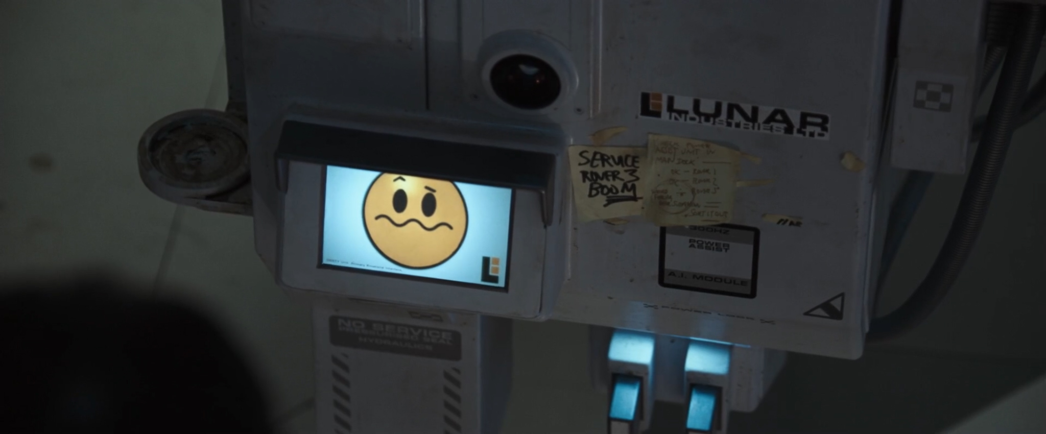
Sam’s attempts to customize and personalize his environment continue in the living quarters. He’s keeping count of his days on the Moon with a dry-wipe marker on the bathroom wall. By my reckoning, this is 146 days and counting – not quite the nearly-three-years mentioned in the plot.
UPDATE: Patrick Devine has commented on Hacker News that there are actually 156 smileys, not 146. Turns out I miscounted. Patrick also notes that three years is exactly 156 weeks. Good spot, sir!

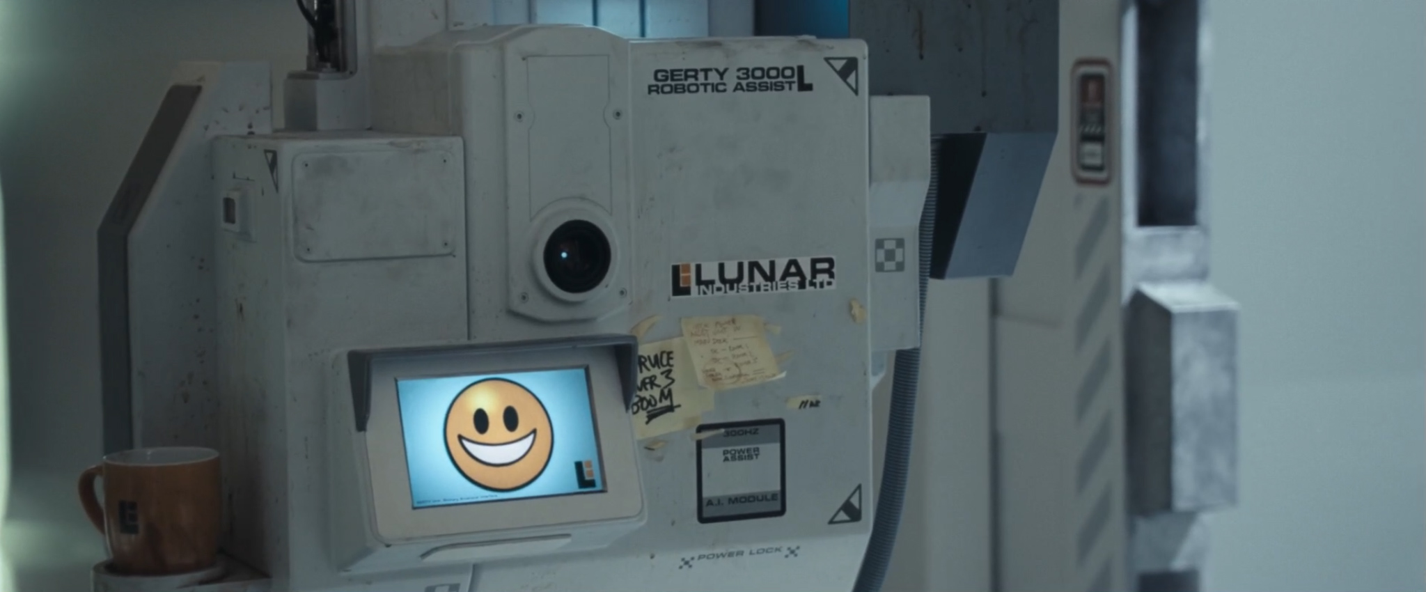
It’s not clear whether the facial emotions represent Sam’s mental state day by day. Nonetheless, they are a neat parallel to the simple expressions seen on the front of GERTY, Sam’s AI companion in the base:

GERTY communicates his emotions to Sam via the GERTY Unit Primary Emotional Interface. He has a stock set of emoji faces to draw on, based very closely on the standard emoticons that any Internet user will be familiar with. I’ll reference a few of them throughout this article, along with their official emoji names.
Sam has drawn a window and pastoral scene on another metal wall, and surrounded it with family photos…

…and the functional Eurostile of a harvester status screen is similarly customized with family photos and postcards:

Just readable amongst the photos is a Post-it note detailing Sam’s cheeky plans for starting the day:
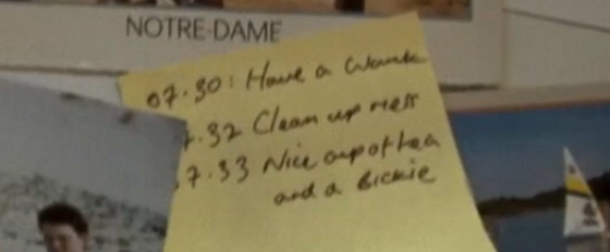
07.30: Have a wank
07.32: Clean up mess
07.33: Nice cup of tea and a bickie
Sam might be American, but the film’s director and designer are definitely British. (To explain for Americans: ‘bickie’ is British slang for ‘biscuit’; ‘biscuit’ is British slang for ‘cookie’; and you can work out ‘wank’ for yourselves.)
This Post-it is particularly ironic in light of the quotation we see as the camera pans down the wall of photos:

I’m delighted to report that the card is set in popular sci-fi font Swiss 911 Compressed.
Next up is a gratuitous shot of Sam having a shower. If this isn’t a ‘backside of the moon’ gag, I’ll be sorely disappointed.

I’ve had a closer look, but I can’t see any typography:

If there’s no typography, then I’m afraid we’re just not interested.
After his shower, Sam gets his hair cut by GERTY:

GERTY is using a futuristic vacuum-based device to suck up Sam’s hair and cut it to the perfect length. You can just make out a Lunar Industries logo on the device’s hi-gloss handle:

Here’s how the device looks in close-up:
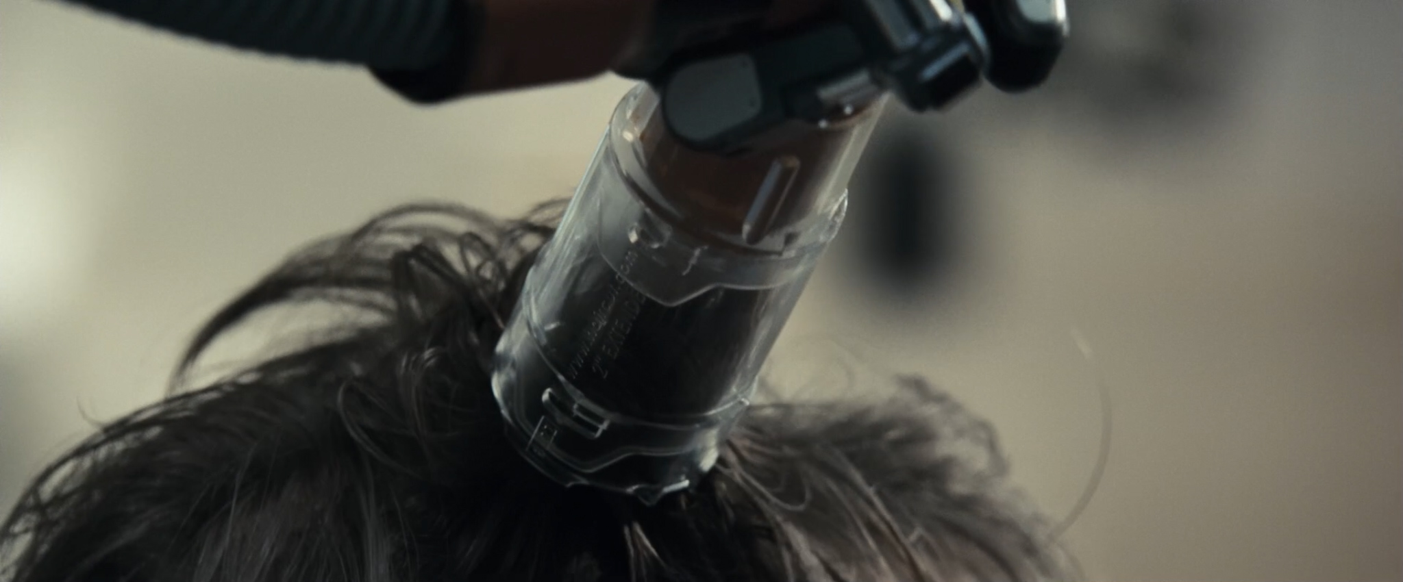
HANG ON A MINUTE. What’s that written on the transparent plastic tube?
Crop. Zoom in. Move left. Zoom in again. Enhance.

That embossed text appears to say:
2″ EXTENDER
Is this the Moon production team saying that at some point in the future, haircut.com will be purchased by a futuristic hair-cutting company who make robotic trimming devices?
No, dear reader, it is not. Because that future is already here. TODAY.
It turns out that haircut.com is the present-day home of RoboCut Inc.:
![]()
…and that RoboCut Inc. are the makers of the RoboCut DIY:

That’s right – the product you see in Moon is a product you can buy yourself today, for only $59.99 (including free shipping).
Want to know how the RoboCut works? Here’s RoboCut founder and inventor, Dr. Alfred Natrasevschi, to explain:
Haircut completed, Sam expresses his annoyance that LunarSat (a.k.a. ‘long range comms’) still hasn’t been fixed. GERTY notes that it’s fairly low on the company’s priority list right now. His passive role in this scene is fascinating. If you watch Moon after 2001, you can’t help but be suspicious of GERTY, in the same way that Ripley can’t help but be suspicious of Bishop in Aliens after her experience with Ash in Alien. GERTY is a calm, relaxing AI voice with a glowing camera lens and corporate logo on the front. Moon certainly isn’t afraid to play on our expectations. After all, what could possibly go wrong?
Sam listens to a message from his wife and daughter. He can’t talk to them live due to the LunarSat mishap, but he’s delighted to see them nonetheless. Just look at the joy on his face:

No. Don’t look at his face; look at his clipboard. That’s where the typographic interestingness is most likely to be found.
Crop. Zoom in. Rotate ninety degrees. Zoom in again. Enhance.

Hold on a minute – it looks like this clipboard was signed on the 16th January 2008. But that’s not THE FUTURE – indeed, it’s not even after Moon was released!
Moreover, who’s the signatory? It looks remarkably like the name of the film’s line producer. (Damn you, high-definition film releases.)
Later on, Sam watches some TV. Specifically, he watches Bewitched – or as it’s also known in the future, ‘SUPERNATURAL COMEDY LADIES’:

As he makes a cup of tea, he spots a strange girl sat in his chair:

While he’s distracted by the plot, let’s take a look at two typographically-interesting posters in the background:
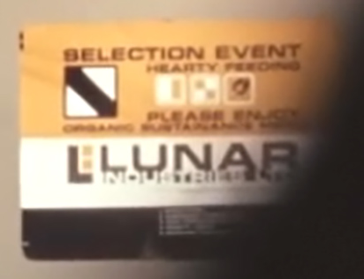
This poster, with its square iconography and cheery SELECTION EVENT – HEARTY FEEDING – PLEASE ENJOY – ORGANIC SUSTAINANCE MENU, makes you wonder if the Lunar Industries catering team learnt their trade at Aperture Science.
Even more interesting is a sign just visible beneath the pre-packed food boxes:
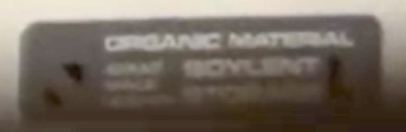
Soylent. That name sounds familiar. Surely this isn’t the same foodstuff made by the Soylent Corporation in 1973’s Soylent Green? Because if it is, that would be remarkably worrying. Soylent Green is People!
At least we can be confident that this Soylent isn’t made from people. After all, where would you get them from? There’s only one person on this moon base, and that’s Sam Bell.
Sam burns his hand in all the kerfuffle. GERTY fixes him up in the infirmary. Just visible behind Sam’s head is a screen with the comforting advice to “TRUST ROBOTIC ASSIST”:

ROBOTIC ASSIST is the official name for GERTY 3000, Sam’s AI companion in the base (voiced by Kevin Spacey doing his best HAL impression). And why not TRUST ROBOTIC ASSIST? I’m sure the 3000 series has a perfect operational record.
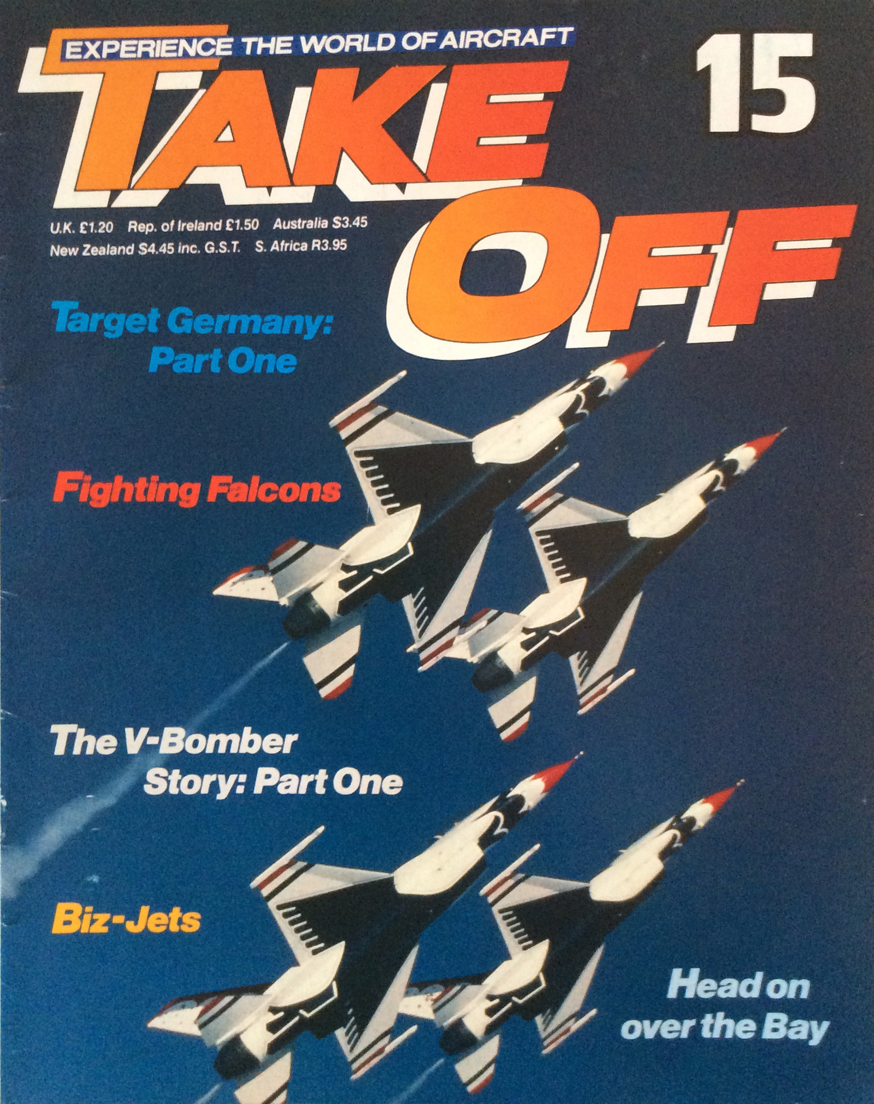
Sam goes to bed. Beside his bunk is issue 15 of Take Off Magazine:
Take Off was a 132-issue aviation partwork published in the 1980s by Eaglemoss. This issue features V-Bombers and Biz-Jets:
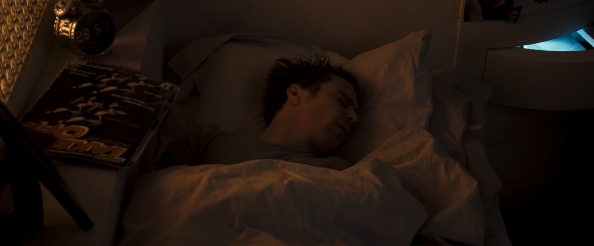
Sam has a sexy dream about his wife. It does not, however, contain any typography.
Sam is rudely awoken by his Karlsson Digibell Alarm Clock, which features a classic LCD font. Sam’s future version of the clock has a bonus feature compared to the one you can buy in shops today. That’s right – Sam’s version plays Chesney Hawkes songs.

Specifically, it wakes him up by playing Chesney’s number one hit The One And Only. “I am, the one and only”, croons Mr. Hawkes.
Yes, you heard me right – the filmmakers are foreshadowing upcoming events via the lyrics of a Chesney Hawkes song.
Over food, we see more of Sam’s Post-it reminders:
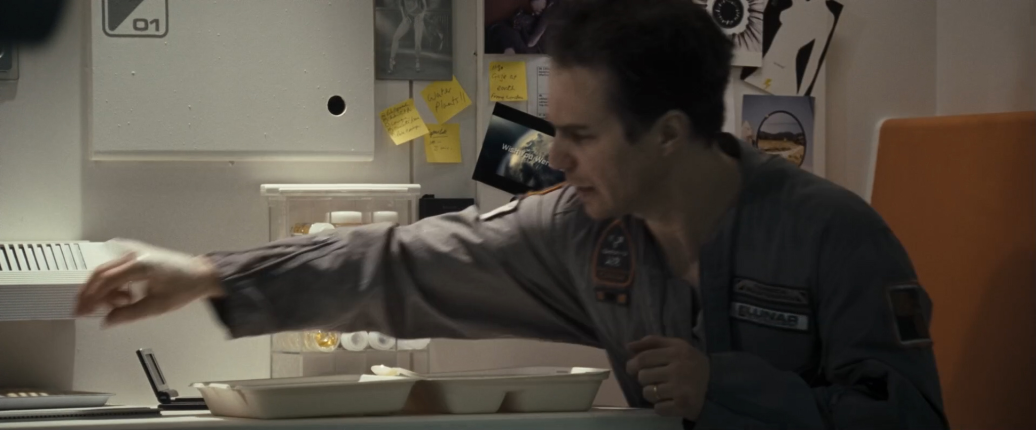
Water plants!!
11:30 Gaze at earth from window
…and a picture of the Earth, with Wish You Were Here on it. He really does want to go home, you know.
Sam also has an IKEA instruction booklet tucked behind his Lunar Industries sheet. The reasons for this are somewhat unclear.
Sam heads out to retrieve some more HE3 from Matthew, one of the harvesters. He sees a second vision of the mysterious girl, and crashes into the side of Matthew, damaging both himself and his rover. The rover’s emergency sign once again asks him to TRUST ROBOTIC ASSIST:

There’s a clear message coming through from these on-screen text displays: if things go wrong, ROBOTIC ASSIST should be TRUSTed to make things right. Let’s fade to black with that sensible advice in mind.
Fade up from black. Why hello, Sam! You’re looking remarkably fresh-faced for someone who’s just nearly killed himself in an accident. How’s the head? Fuzzy? Tell you what, why not let GERTY run some tests to check for brain damage:
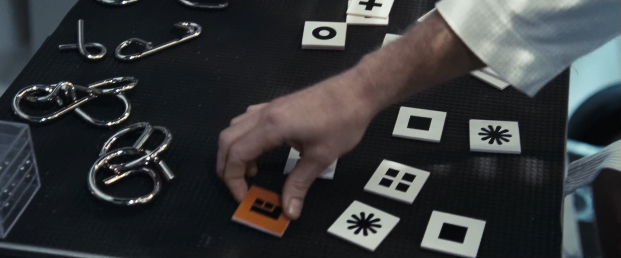
This test is a Concentration-style matching pairs game. (Unlike Concentration, these cards all have Lunar Industries logos on the back.) Some of the card symbols are reminiscent of Zapf Dingbats – such as the HEAVY GREEK CROSS, and a rotated BLACK DIAMOND MINUS WHITE X – but I do wonder if I’m reading too much into things, and the design team haven’t just drawn some pretty symbols in Illustrator. (I had hoped that the asterisk card might be my own personal favorite, the HEAVY EIGHT TEARDROP-SPOKED PROPELLER ASTERISK, but alas it is not to be.)
“Let’s try another test” says GERTY, like some kind of benevolent GLaDOS. The analogy makes me trust him even less.
Shortly thereafter, we overhear GERTY saying something to Lunar Central about “the new Sam”. What’re you going on about, GERTY?
I’ll tell you exactly what he’s going on about. This is a brand new Sam. He’s a clone of the original Sam Bell, and he’s just been woken up by GERTY. This might get confusing rather quickly, so let’s lean on our good friend ‘typographic convention’, and use subscript to refer to him henceforth as Sam2. Trust me, it’ll make life a damn sight easier once you know where we’re going with this.
Sam2 spots that Matthew has stalled. He asks GERTY to unlock the doors so that he can go and fix it. GERTY says “I’ll pass on your message”. (This is Lunar Industries speak for “I’m sorry Sam, I’m afraid I can’t do that”.)
Sam2 has a dream about his wife. This time, it’s not sexy at all – it’s psychologically and typographically disturbing. There’s a scary Sam1 under the bedclothes, and he works for RANUL SEIRTSUDNI, on the 랑사-GNARAS base:

Lunar Central tells Sam2 to stay put. GERTY apologies for being under strict orders not to let him outside. He’s acting like some kind of… benevolent HAL 9000. This analogy actually endears him to me slightly. Sam2 tricks GERTY into letting him go outside anyway. He finds Sam1 in the rover, and brings him back to the base. GERTY tells him that the person he’s found is also Sam Bell.
GERTICON: OHMYCRIKEYFACE
A considerable amount of plot happens. It’s all fascinating, but if I’m honest, it’s rather light on typographic action. I feel I’d be doing us a disservice to document the whole lot, but I will report an important bit of GERTY dialog when he’s explaining events to Sam1:
“I’m here to keep you safe, Sam.”
That sounds a lot like the First Law Of Robotics to me. If GERTY is programmed to follow the Laws, his robot AI is about to have some interesting choices to make.
A message comes through from Central to say that the crew of the Eliza are on their way to ‘rescue’ Sam2:

They look like a friendly bunch, don’t they? The instructions next to their mugshots say:
Lunar Industries rescue crews have your best intentions at heart. Please try not to panic until they arrive. Remain on-station and make sure you obey their instructions no matter how strange they may seem. After all they’re here to help!
What could possibly go wrong with a crew called Rothery, Ward and Shaw?
Sam2 realizes he must have come from somewhere on the base, and starts hunting around. He and Sam1 have a fight. Sam1 looks in a topical multi-mirror. (Don’t worry, that’s definitely Sam1 in both mirrors. After all, it’s not like there are any more Sams around, right?)

GERTY and Sam1 have a Big Chat. When pressed for the truth about his wife, GERTY says “I can only account for what occurs on the base”.
GERTICON: NOTHINGTOSEEHEREFACE

After some cajoling, GERTY finally tells Sam1 the truth. He’s a clone, and his memories of his wife and daughter are memory implants.
GERTICON: SADTRUTHFACE

The Sams find some signal-blocking antennas outside the base. Sam1 goes back to look at his old video logs. GERTY enters a special password on a Windows Keyboard to unlock all of the video diaries:

Eagle-eyed viewers will notice that the password begins with KLGAN. Unfortunately, the security-conscious Duncan Jones cuts away from the keyboard just before we can hack into his email.
Sam1 learns that Lunar Industries seem to view the words ‘termination’ and ‘contract’ in much the same way as the Mafia. Sam2 finds yet more long-range-comms-blocking aerials. He prints out their coordinates on a handy receipt printer:

I very much doubt those are going to become significant later on.
Now: I’m sure you’ve already noticed that these are Selenographic coordinates, as used to refer to locations on the Earth’s Moon. Specifically, the co-ordinates are:
LAT 034°23′01.2″S, LONG 124°56′67.6″E
LAT 121°09′56.2″S, LONG 045°34′56.4″E
We’ll gloss over the fact that one of these numbers has sixty-seven seconds in a minute. However, it’s a little hard to ignore the latitude value of 121°S, given that the maximum value that latitude can take is 90°S at the pole. (Maybe Sam mistyped it due to the stubby fingers you get on space gloves.)
Back at base, the Sams discover a hidden room. Look at that: it’s Sams all the way down!
Trays 0001 through 0006 have already been opened. Sam0005 and Sam0006 (for it is they) decide to open tray 0007:

It’s the small details of this scene that I find most disturbing. Every pre-packed Samn has a pre-packed Wake Me When It’s Quitting Time t-shirt. The person at Lunar Industries responsible for this whole macabre set-up not only had the temerity to subject Sam Bell to his own personal Groundhog Day; they also had the gall to leave cynical in-jokes for every iteration to endure.
Once they’re out of the Tunnel Of Clones, Sam1 asks GERTY why he helped with the password. “Helping you is what I do”, says GERTY.
See, Sam1? I told you you should TRUST ROBOTIC ASSIST – he’s definitely read the Laws. (Although he may have skim-read the bit about not killing people in a space-coffin.)
Sam1 drives the rover a very long way from the base, and re-establishes video contact with Earth. He calls his house. Turns out his wife is dead, but his now-15-year-old daughter has a chat with him anyway. She ends by shouting off-screen to her Dad to say that someone is asking about Mom. We hear the distinct voice of a certain Sam Bell in reply. Sam0 is still alive! (Sam1 closes the video call device quickly, and looks sad and pensive.)

The known-to-be-alive-ness of Sam0 gives an an alternative, cheerier way of looking at the pre-packed t-shirt dilemma for the less depressingly-morbid of you. Presumably Sam0 is complicit in the fact that thousands of Sams are in cold storage on the Moon. If he’s complicit in the scheme, could it be that these small personal details – even that seemingly-sinister t-shirt – have been chosen with Sam0‘s involvement, as homely comforts to soften the terror of Samn‘s reality?
I don’t think that’s the truth of it at all. But if helps you sleep at night, you’re more than welcome to run with it.
We’re back at the base. Sam1 continues to fall apart. Sam2 sees Sam1‘s video call with his daughter, and realizes that he and Sam1 will be killed when the Eliza crew arrive. He convinces GERTY to wake up a new clone. Let’s call him Sam3.
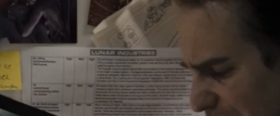
This section of the film gives us a rare close-up of the base’s OPERATIONAL NOTIFICATIONS board:

Amongst other things, we discover that Lunar Industries Ltd. is a Registered Company Of The United Kingdom No. 06346944. Delightfully, this is indeed the case. In addition to the scrolling Eurostile, there’s also a Big Countdown Clock (in a pseudo-LED font), reinforcing the time pressure of Eliza‘s imminent arrival. (It was conveniently fixed at 88:88 before the Eliza plot point came into effect.) Notable on both font displays is an illustrative dot-matrix resolution substantially lower than the actual resolution of the fonts displayed thereon.
Sam1, who is by now in a right state, wakes up to Chesney Hawkes. (See? I told you it was foreshadowing.) He discovers Sam3 in the infirmary.
Talking of foreshadowing: on the movie’s original one-sheet poster, there are three copies of Sam Rockwell’s name, as shadows behind the main one:
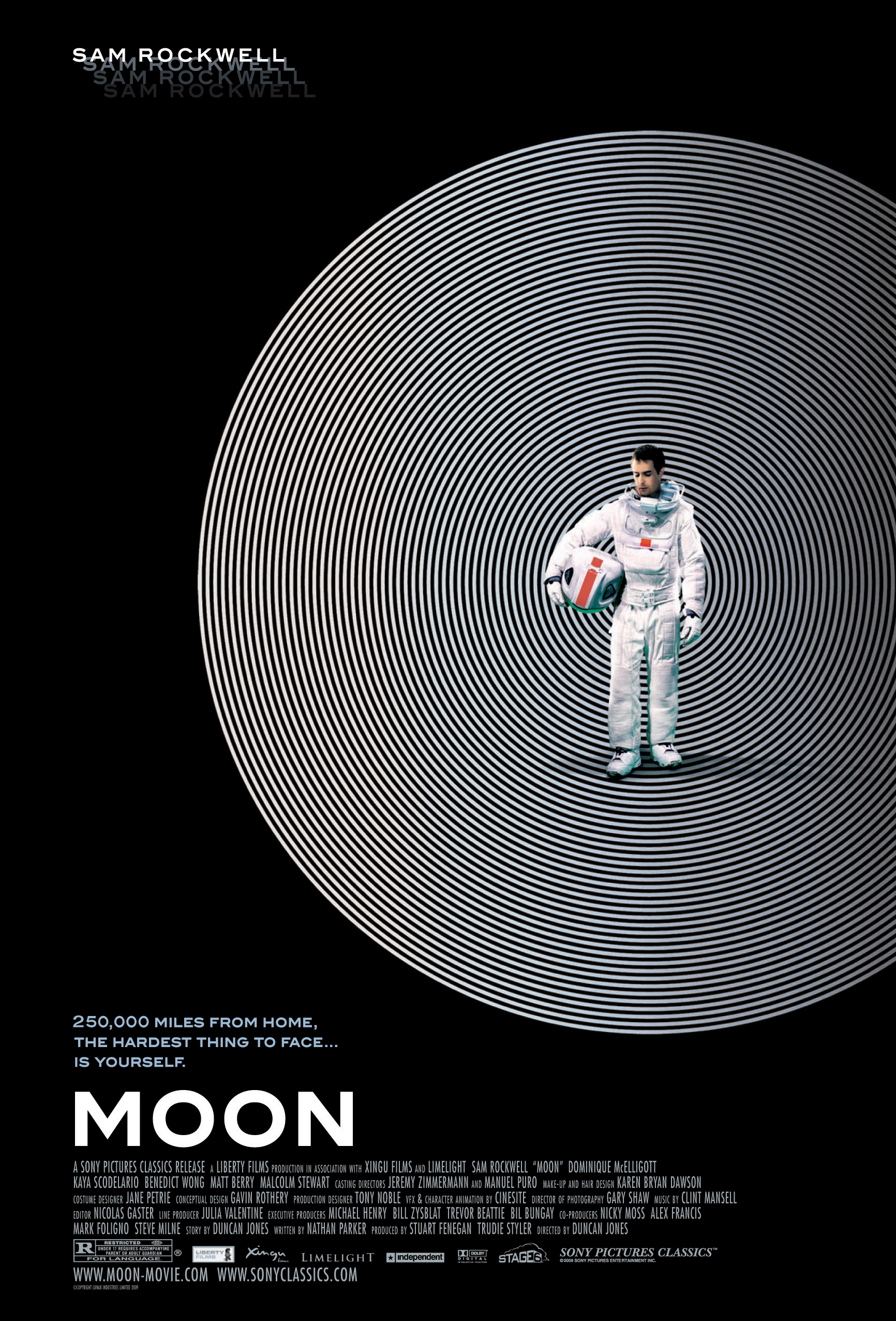
Strictly speaking, this is an accurate cast list. The film now stars Sam Rockwell0, Sam Rockwell1, Sam Rockwell2, and Sam Rockwell3.
To put it another way – the movie’s poster is four-shadowing the foreshadowing.
Maybe I should go and have a lie down for a bit, and come back when the conspiracy theories have subsided. It’s a shame sci-fi films don’t have intermissions these days. Let’s transplant the one from my 2001: A Space Odyssey post, and go and have a cup of tea while the Sams work out what to do next.

And we’re back. After much debate, it is decided that Sam1 will go back into the crashed rover; Sam2 will take the HE3 launcher back to Earth; and Sam3 will stay in the infirmary to be discovered by the crew of Eliza. He’s still unconscious, so he doesn’t know this yet, but it’s a decision made by a quorum of hims, so he can’t really complain.
Once he’s dropped Sam1 off, Sam2 loads up the HE3 launcher. GERTY suggests turning him on and off again so that he can’t provide any incriminating evidence to Eliza. “I’m here to keep you safe, Sam. I want to help you.”
Sam2 asks GERTY if he’ll be okay. “Of course. The new Sam and I will be back to our programming as soon as I’ve finished rebooting.”
GERTICON: YAYPROGRAMMINGFACE
Sam2 replies: “Gerty, we’re not programmed. We’re people, you understand?”
As GERTY turns round, we see that Sam1 has stuck a KICK ME Post-it on GERTY’s back side:

Sam2 turns GERTY off. After a short, poignant pause, he removes the Post-it from his back.
GERTICON: REBOOTINGFACE

Sam2 gets ready to launch back to Earth. At the very last minute, he realizes he can use the harvesters to knacker the signal-blocking aerials, and avoid Sam3 suffering a similar fate to his own. He grabs the piece of paper with Chekhov’s Coordinates on it:

…and types a long series of numbers into a keyboard with great precision despite wearing spacesuit gloves. The harvester coordinates update. Go Sam2!
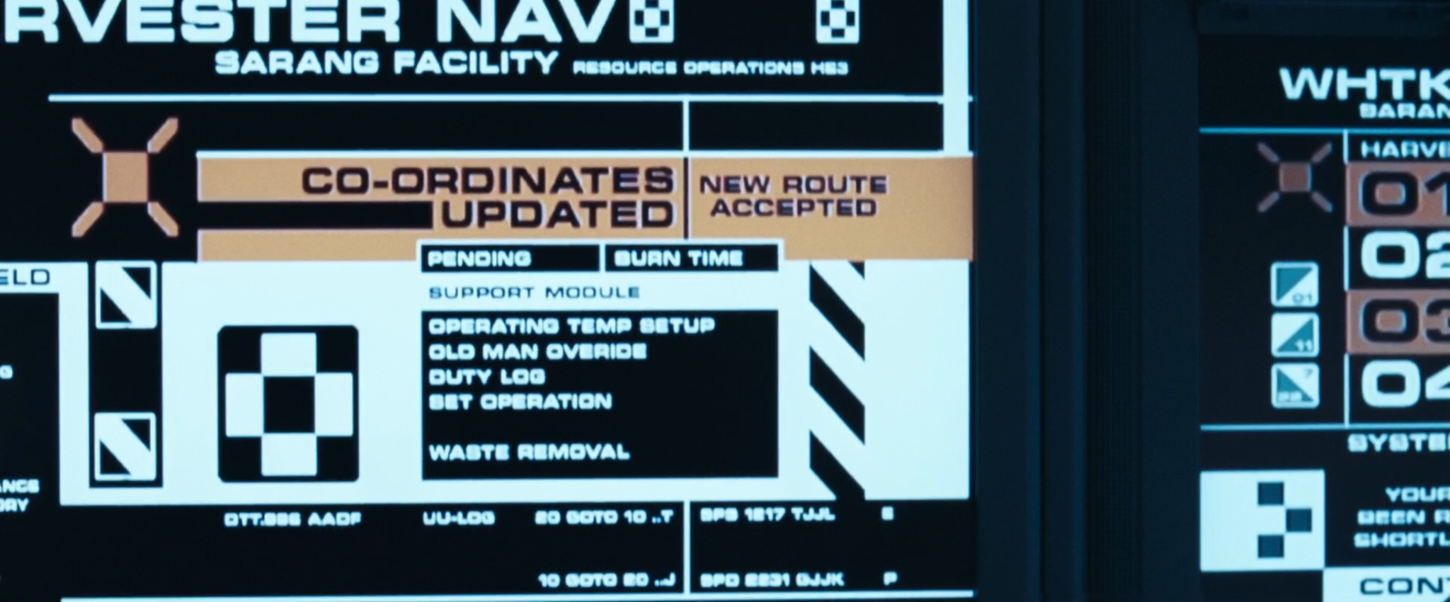
This screen prompts a couple of interesting questions:
1) What’s an ‘OLD MAN OVERIDE’?
2) Is that an infinitely-looping BASIC program?
20 GOTO 10
10 GOTO 20
The Eliza arrives. Sam3 wakes up and asks GERTY what’s going on.
GERTICON: DONTASKMEJUSTREBOOTEDFACE

Eliza crew members find Sam1 in his rover. Sam2 has a psychedelic trip through space. A harvester crashes into an aerial. Long Range Comms finally start working. And if you look closely, you discover that the contents of the portrait-orientation comms monitor is actually being played from a DVD player plugged into a landscape monitor turned 90 degrees clockwise:

All of which is a timely reminder that this frankly awesome sci-fi film was made on a budget the size of a postcard. Which just makes its amazing styling and design all the more impressive. Indeed, Moon is one of my favorite examples of sci-fi storytelling through design – and, to my mind, a worthy successor to Kubrick’s masterpiece.
Postscript: Apart from the note about Microstyle, and a nod to the DVD players, I deliberately wrote this post without referring to Moon Conceptual Designer Gavin Rothery‘s superb ‘They Never Went To The Moon’ blog. I much prefer to write these posts as a response to just what I see on screen – it’s more fun that way. You should totally go and read his blog in its entirety, however, as he explains or expands upon much of what I’ve written above. The blog also includes images of many of the computer screens and stickers from around the base, along with Gavin’s original renders for the base design. Good work, sir!
FUN FACT: An expanded version of this article appears in the Typeset in the Future book, available on December 11 2018. You can pre-order it now on Amazon.

All of a sudden typesetting has become quite interesting…
LikeLiked by 1 person
Perhaps those 146 smiley faces drawn in marker each represent one week, as three years is 156 weeks.
LikeLiked by 2 people
Duncan drew those on the wall – they actually make no sense. The number was just when he got bored – there’s no maths in there that pertains to anything in the story I’m afraid.
LikeLiked by 1 person
Not true! There was one for each week, but I think I lost count, as there should have been 2 less than the full 3 years. Also, each face was meant to represent how the week had gone. Smile/good! Sad face/shit.
LikeLiked by 2 people
Thank you. That was a great read! I’d never heard of this film till now, but will track it down now.
LikeLike
“‘biscuit’ is British slang for ‘cookie’”? Ahem!
LikeLike
Indeed, if I had to quibble, I’d say that American has widened the scope of cookie (which in English is a specific type of biscuit) to become the generic term.
LikeLike
Bickie is slang for a biscuit, biscuit is not slang for anything it’s the name of a a small baked unleavened cake, typically crisp, flat, and sweet. Cookie is slang for a sweet biscuit, me thinks.
LikeLike
Well, this blog is now in my favorites folder titled “Yay! The Future is Awesome!”
If you keep posting, I’ll keep reading. Great work.
LikeLike
Soylent is recently created future food by Rob Rhinehart. http://soylent.me
The future is here.
LikeLike
At the bottom of the Eliza manifest is says “thankyou for helping us to help you” which sounds an awful lot like GLaDOS’s “thank you for helping us help you help us all”.
LikeLike
It is also very reminiscent of one of the various posters shown all over the place in Terry Gilliam’s Brazil, which read “Help the Ministry of Information Help You!”
LikeLike
In Bahasa, “sarang” means nest/lair/den
LikeLike
Peculiar detail, the harvesters are named Matthew, Mark, Luke, and John. That’s quite a heavy biblical reference.
LikeLike
Yes, the harvesters are the only ‘witnesses’ (as the apostles were) left after Sam (the Christ figure) dies and resurrects after three years (three is the magic number). Probably another deliberate inside joke by Lunar Industries.
My feeling on GERTY killing the clones is that it felt it was helping them, because the film alludes that the clones are genetically engineered to die after three years anyway (hence Sam1 having visions, vomiting, etc). So GERTY was easing their suffering with a quick death. And GERTY was factually correct about both Sam and GERTY being programmed, it’s just that the Sams are programmed on a genetic level.
LikeLike
A detail I noticed in the scene where he’s sitting by the harvester monitors:
He’s crossed out the name Luke and written ‘Judas’ beside it, adding an incredibly subtle little narrative.
LikeLike
There was honestly no biblical references ever intended – we just needed a set of four things that belonged together as a set. This was an easy reference that made sense – it’s really nothing more than that.
LikeLike
I would argue that sometimes even the creators aren’t fully aware of all the subtleties they are including and how they will line up in the end. It becomes the audience’s job to cull meaning from those symbols. The art takes on a life of it’s own once it’s out in the world.
LikeLike
An absolutely brilliant typographic review for a brilliant film.
LikeLike
Interestingly, Lunar Industries is listed has having assets of £4242 – a HHGTTG reference?
LikeLike
Well spotted, it is 😉
LikeLike
Lovely. Thank you for this
LikeLike
Excellent write up making one of my favourite films even more interesting to me.
I should also point out that I actually bought the big doors with the Lunar Industries logo on them as well as the photographs from around Sam’s bed (no; I didn’t get his wank post it though), some patches produced for the film and the complete set of blueprints used to design/build the set.
I did want Gerty but couldn’t afford it 😦
And yes; I am serious.
LikeLike
i love that movie.
good job and thank you
LikeLike
Personally, I find the idea of Sam0 being complicit in enslaving his clones more depressingly-morbid, rather than less.
LikeLike
FWIW Dept.
Lunar Industries Ltd. has also created a worm, soon to be a bot. https://isc.sans.edu/forums/diary/Linksys+Worm+TheMoon+Captured/17630
LikeLike
As someone has pointed out biscuit is most definitely not slang for cookie, it’s a fully fledged word in its own right. What is odd to me is the spelling of bickie which I have only ever seen spelt as biccy.
LikeLike
When I was a wee wet naked baby designer, I had an SF Film inspired rather unhealthy crush on Microgramma Extended. The cure involved the pain (aversion therapy) of hundreds of sheets of crappy press type. But by then I could render the &$@#%&$ typeface by gorram HAND.
MOON was frakkin’ beautiful, disturbing and awesome.
LikeLiked by 1 person
Moon was available as a 99c rental on iTunes a while back.
I watched and loved it.
Now, of course, I’ll have to rewatch and pay a little more attention.
(luckily I have since purchased it)
😀
LikeLike
love love LOVE LOVE!
laughed my ass off at the eurotsile/microgramma/microstyle business!
another foreshadowing from the take off mag is that sam will “experience the world of aircraft” very soon.
+ HAPPY VALENTINE’S DAY DAVE!
LikeLike
Eliza is the name of a primitive AI-type computer program (or chatterbot) written in the 60s, designed to mimic human style interaction to typed responses:
http://en.wikipedia.org/wiki/ELIZA
LikeLike
great article! Just wanted to add a nice detail:
– after gerty enters the password, the archive expands from three to 15 years
– so he’s probably in the 5th iteration of his 3-year contract
Also GERTY seems to have originated from QWERTY:
“The spacing around the name in this picture suggests that it originally may be longer, like QWERTY” – oɔɯǝɹ May 4 ’14 at 8:02
http://scifi.stackexchange.com/questions/55311/what-is-the-reason-for-gerty-having-that-name
LikeLike
The “WAKE ME” part of the t-shirt looks like Linotype Kabel Black to me, the Rudolf Koch design; there are others fonts named kabel (shame on their designers).
The t-shirt is available here: http://shirtoid.com/31035/wake-me-when-its-quitting-time/
LikeLike
So glad you posted that. I saw it yesterday and never got around to it. It’s my favorite font on the whole post- and you’re right- shame on the other Kabels!
LikeLike
OLD MAN OVERRIDE is a clear reference to a certain Mr David Jones, Mr Duncan Jones’ father.
David Jones is usually known as David Bowie, and Duncan Jones started life as Zowie Bowie.
Sting told me never to name drop.
LikeLike
Actually that’s not it – the “Old Man” was the name I gave to the station computer just as a little detail – it was actually a nod to “Mother” from “Alien”.
LikeLiked by 2 people
This is literally my favorite ubernerdy blog that I’ve found in a while. Please write more!
LikeLike
Soylent would probably be based on the real-world product of the same name (which is an homage to the Green stuff). It’s supposed to contain all the nutrition you could need, so it makes sense he’d have it!
LikeLike
What comes to my mind when I hear “Old Man” in a sci-fi context is Perry Rhodan, a German sci-fi series published since 1961 and still running. Old Man is a huge spaceship built by the protagonist’s allies in the distant past (time travel is involved) and operated by the minds of scientists that have gone mad by waiting 50,000 years.
But that probably doesn’t have anything to do with Moon.
LikeLike
Besides laughing my head off and just loving the geeky-ness of both posts, this is the first blog in which I read all comments (instead of ignoring them).
Very well done!
Now I finally have to watch moon!!!
LikeLike
Do Bladerunner next! Bladerunner please!!!
PS – Love it. A fantastically obsessive piece of work. Please do keep it up. On Bladerunner next, preferably.
LikeLike
Excellent! A convincing enough study to send me straight to Amazon and order the film. Obviously this will get rather costly unless you just stick to films I already own…
LikeLike
Fantastic article for a truly underrated movie. This blog combines two of my nerdiest passions in an amazing way. Keep it up.
Also, if Gavin Rothery is still perusing these comments: Is there a way to buy a nice big 27″ x 40″ poster of the concentric circles ‘Moon’ Poster?
LikeLike
Well, I got mine, when I worked a the time of the german release in a cinema…
But it looks like you can order one here. 🙂
http://www.tfaw.com/Profile/Profile___417843
LikeLike
I am and there is – they’re up on Amazon here. Happy shopping.
http://www.amazon.com/27×38-Moon-Movie-Poster/dp/B00A6VKBS4
LikeLiked by 1 person
http://www.amazon.com/27×38-Moon-Movie-Poster/dp/B00A6VKBS4
LikeLike
Fantastic stuff. Also lead me to the “Making of” blog Gavin Rothery wrote which is an excellent read too. Have spent the last couple of days reading all the entries on and off and it’s really funny stuff and a superb insight. Loved the film when it came out at the cinema so this was a real delight.
LikeLike
Would be most interested in reading one on Elysium, that’s got some lovely fonts and design
LikeLiked by 1 person
Amazingly detailed website. Thanks!
LikeLike
Yeah, well, thanks for the Soylent Green spoiler… Great blog, looking forward to more of your insight and humour.
LikeLike
Oh come now, SG was released over 40 years ago, the film is a classic and the final reveal quote is a staple of the SF lexicon. Really, it is beyond the spoiler statute of limitations and into the realm of assumed common knowledge.
LikeLike
Best blog ever.
I’m so hanging out for your next installment ❤
LikeLike
I haven’t seen it in quite a while, but ‘Outland’ had some fantastic production design and utilized a lot of Eurostile Extended. Might be worth a look!
LikeLike
Moon was clearly inspired by 2001 on many levels, including typography, but even so, it’s a refreshing movie. Sam Rockwell is also great …
The haircut.com was a nice discovery … You probably watched this movie man many times … and now with these new insights on board it’s time for me to do so myself …
LikeLike
No more posts?
I enjoy tour analyses very much and keep coming for more. I hope all is well and you resume writing those awesome posts.
LikeLike
The octagonal shape of the countdown clock board is a reference to the octagon-based typeface prominent in the 1981 sci-fi western Outland, seen on that film’s own countdown clock board which ticked away the seconds till the arrival of the shuttle carrying the assassins sent to dispatch Sean Connery.
LikeLike
Soylent Green was advertised as being more nutritious and better tasting than Soylent Red and Soylent Yellow. The Soylent Corporation claimed Green was made from High-energy plankton. They lied. Also, in this over-crowded future, Euthanasia centres are quite popular.
LikeLike
Actually, Apollo 8’s “earthrise” photo was rotated from a horizontal aspect. The picture as originally taken was (in the perspective and mind of the photographer) of them “coming around the moon”, and indeed rotationally-wise, assuming that the normal to their rotation is “up”, (the most common assumption in a slingshot action) the Earth was indeed coming from around the moon, rather than rising/lowering from the lunar horizon.
As such, the “earthrise” present in the film would be an inverting of only the most comment presentation of the original “earthrise” photo. The photo as originally conceived was horizontal…
(In fact, talking of an “Earthrise” as I’m sure any good sci-fi fan here already knows, is complete bunk, because the moon is tidally locked to the Earth, and as such, when standing stationary on the moon, the Earth will occupy a constant position in the sky.)
LikeLike
Stylistically, “Moon” also reminds me of “Silent Running,” which makes a lot of sense as it is directed by Douglas Trumball, who supervised a lot of the special effects in 2001. But from a typographical standpoint, I like to think “Silent Running” uses a somewhat softer touch. I would be interested in any thoughts on the way that “Silent Running” seems to merge “futuristic” typefaces with more classic styles. In particular, I have never been able to clearly identify what is used in the opening of that film.
LikeLike
This ranks as one of my favorite click throughs from IO9. Lovely article. I watched the movie a couple of years ago and none of these details soaked into my thick skull.
LikeLike
“Biscuit” is not British slang, it’s the word used in British English for a baked good made without yeast that when fresh is hard and crispy and when stale becomes soft, as opposed to a cake which is soft when fresh and hard when stale. “Bickie” or “biccy” is slang for “biscuit”, a French word for a twice cooked baked good, also described by the Italian word “biscotti”.
Now I’m feeling hungry…
LikeLike
Thanks for another fascinating post. 2001, Moon… good choices. Have you considered a similar analysis of Blade Runner? (My personal favorite science fiction film, and although I’m certainly no expert in typography I gather they used some custom fonts for the production, which might be interesting in a different way than the other two films.)
LikeLike
Wonderful. I know it’s a lot of work but I hope that one day you’ll give Europa Report a shot as well, to complete a trilogy of great hard sci-fi movies.
LikeLike
Maybe reading too much into it, but having just discovered this blog and started my binge with the Alien post, wondering if the 3×3 checkerboard seen in a number of places might be homage to the Semiotic Standard For All Commercial Trans-Stellar Utility Lifter And Heavy Element Transport Spacecraft?
LikeLike
Again, fantastic post!
If you google the address listed on the Lunar Industries company page you linked to (81a Main Road, Hockley, Essex, SS5 4RG), Google Street View shows an odd building with a part date (190_) and the initials SB. Another nod to Mr Bell?
LikeLike
Amazing blog, thanks. When you say Sam(2) says to Gerty : “We’re not programmed, we’re people”. Is that correct? Because in the fantastic Clint Mansell score, track 8 is named “We’re not programS, Gerty, we’re people.” A very minor point in an otherwise brilliant read.
LikeLike
Beware of those Directors of Photography First Class, they are right bastards, as likely to waste you as to look at you. And those RAP14-class VFX Supervisors… well, you better pray you’re already dead when they get their hands on ya.
Thanks! Much of this was simply fun and educational, but the Eliza list was mind-blowing – not to mention the existence of the actual Lunar Industries Inc. And no less than a…
“…certified women-owned small business which specializes in the design and manufacture of high quality complex tooling, fixtures, gages, molds (lay-up and compression for composite materials) and progressive dies.”
LikeLike
I worked on this film and know that GREEN MOUNTAIN 3 was used extensively. Why no mention in the header, or in the blog?
LikeLike
Sure there must be at least one other person who thought of Wayne’s World when it came to GERTY?
Nice article, though. Saw Moon recently, now will have to watch it again.
LikeLike
Excellent, I really love they typeset analysis/viewpoint. I really loved the subtle hints in the movie, like the “safe trip, ” instead of “safe trip, ” in the cremation sequence. Really liked seeing all the visual effects details.
LikeLike
Biscuit isn’t ‘slang’. Americans have dog biscuits; is that slang for dog cookies? If anything cookie is American slang for biscuit.
LikeLike
Oh dear. I am having inappropriate sexual thoughts about a blog post. Oh dear oh dear.
(Others have said profound things, and this is all I have left to offer.)
LikeLike
Oh, oh, OCRA. It works well for simulating tiny screens and I used it all the time when I was doing mockups with a mobile phone engineering firm. The distorted numbers especially conveyed the idea of a hand-held device with not many pixels, which is what we had at the time.
LikeLike
Fantastic eye for detail! I love that Lunar Industries is an actual registered company.
LikeLike
They misspell “satellite” as “sattelite” (see your last picture).
LikeLike
Considering that (according to the LI TV ad) HE3 is harvested from the “far side of the moon” and assuming that the Sarang base is located somewhere nearby, Sam wouldn’t have a view of planet Earth. Correct?
LikeLike
If the food is made of Soylent it may be grown from the cloning bay. So Sam is eating himself.
LikeLike
“The spacing around the name in this picture suggests that it originally may be longer, like QWERTY” – oɔɯǝɹ May 4 ’14 at 8:02
http://scifi.stackexchange.com/questions/55311/what-is-the-reason-for-gerty-having-that-name
Also Sam seems to be on his 5th iteration of his 3-year contract. LUNAR might have one hell of a lawyer team: Sams contract might have included his clones. Each clone (beside their short lifespan) legally has to fullfill a 3-year contract.
LikeLike
Great analysis! Do you intend to type-check GATTACA? SILENT RUNNING?
LikeLike
Forgive me – should Sam0 not be Sam-4? 🙂 (I may have counted wrong..)
I LOVE your blog! It is giving me much joy this evening ❤
LikeLike
I adore the film, just re-watched it, and found this website when I went looking for possible meanings for KLGAN. But I never noticed until now… “SATTELITE”?!!! (sad GERTY face)
LikeLike
The Terminal Man poster uses MICR font. https://en.wikipedia.org/wiki/The_Terminal_Man_(film)
LikeLike
Just watched the film and read this blog. Super! Thanks. Now watching Disney’s Black Hole and cant stop looking for typography stuff!
LikeLike
Wot, no mention of Green Mountain 3 font? I was sent the font file while making Rovers and Harvesters and used them on said hardware.
LikeLike