In addition to the film-specific typographic deconstructions on this site, I’m keeping track of all the times I spot classic sci-fi fonts in movies. What better way to start than with perennial sci-fi favorite, Eurostile?
Eurostile, and in particular its Bold Extended variant, has appeared in countless sci-fi settings over the years. It’s got to the point where the very presence of Eurostile Bold Extended in an opening title card says FUTURE far more effectively than an expensive effects shot:
Indeed, Eurostile is such a quick way to establish a timeframe that whenever I see it in real life – which happens quite a lot in my adopted home of California – I assume I’ve been transported to some futuristic dystopia, where a local care center feels more like a sinister government facility for scientific experimentation:
Eurostile is most commonly seen in its Bold Extended form, but Regular, Bold, and Regular Extended sometimes crop up as well. I’ve captured (and tried to clarify) as many as possible below.
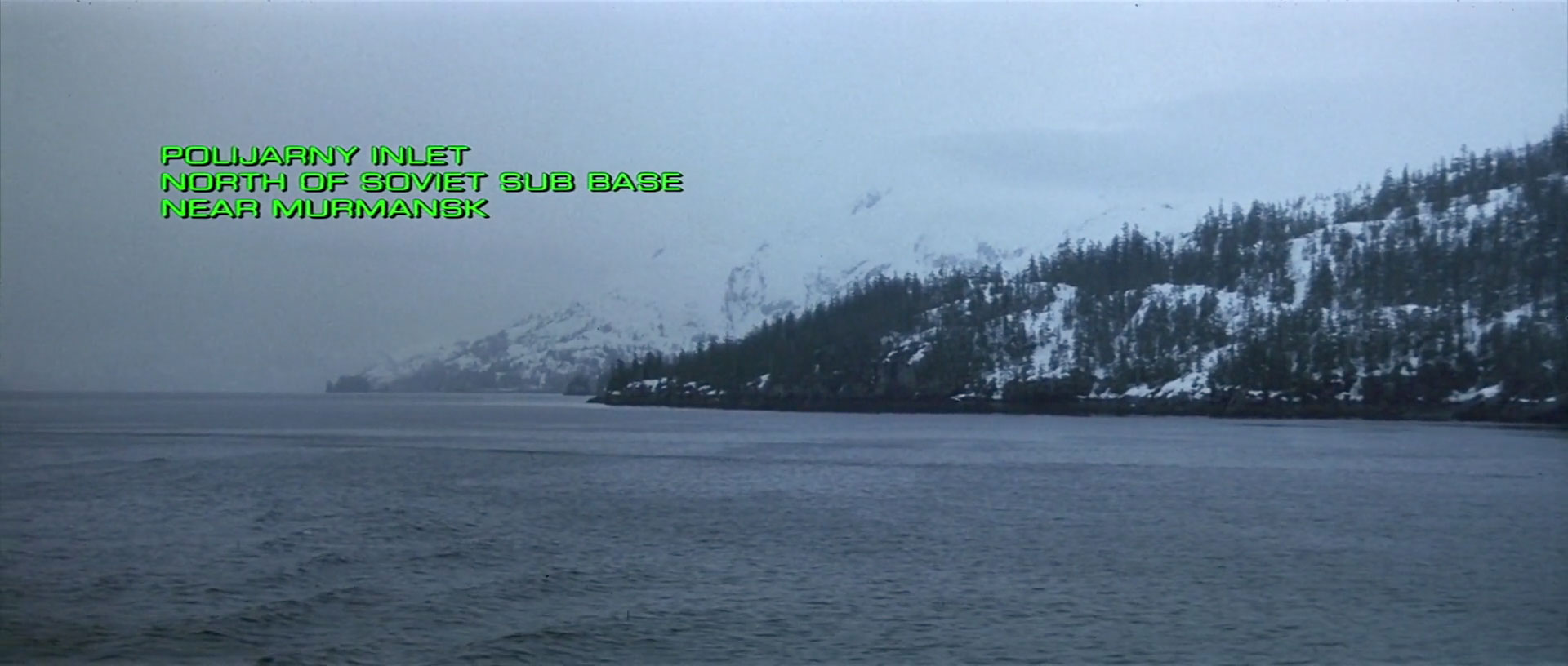
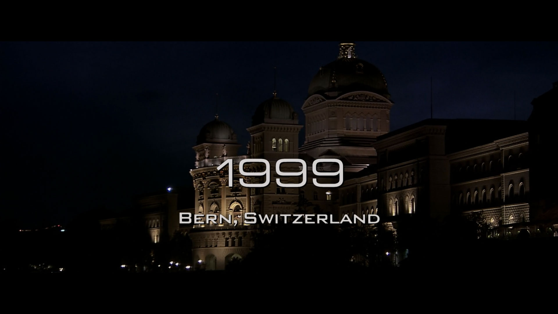
Date / Location Positioning
When and where are we? If it’s set in Eurostile, we are in the FUTURE, and we are in the FUTURE.
Captain America: The Winter Soldier (Eurostile Regular and Eurostile Condensed, although it looks like someone forgot to set the first “3” digit to be Condensed – it’s still Regular, unlike all of the other glyphs on that line.)Elysium (Eurostile Regular Extended)The Hunt For Red October (Eurostile Regular Extended)Iron Man 3 (Eurostile Regular Extended, plus a special guest appearance by Bank Gothic)
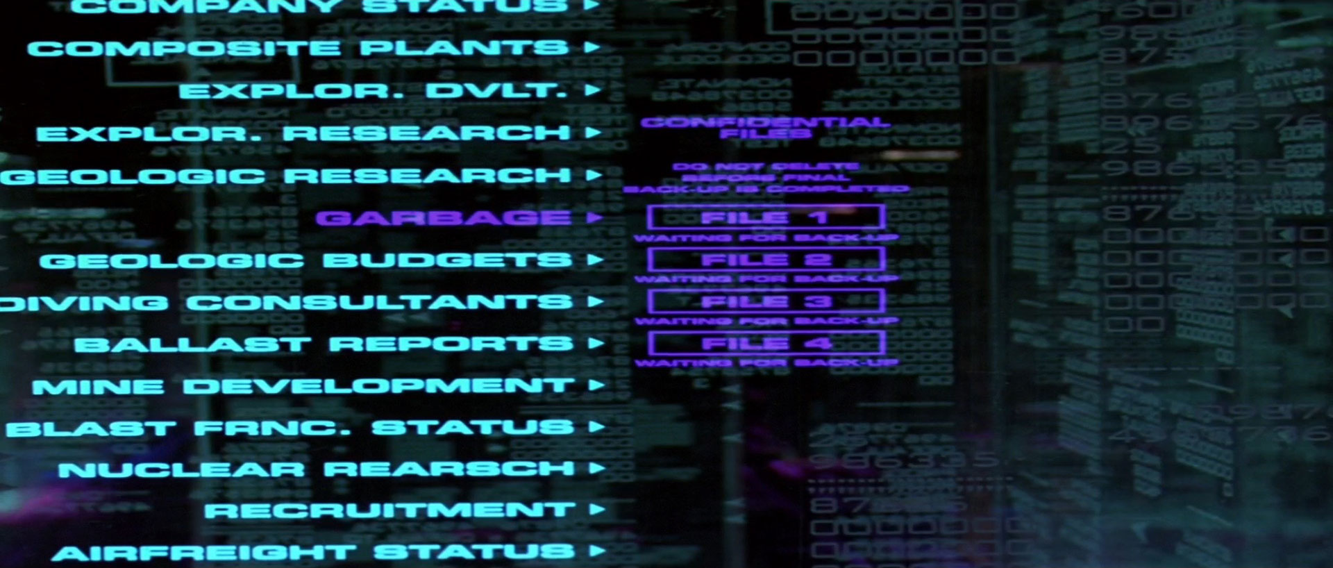
Computers and Screens
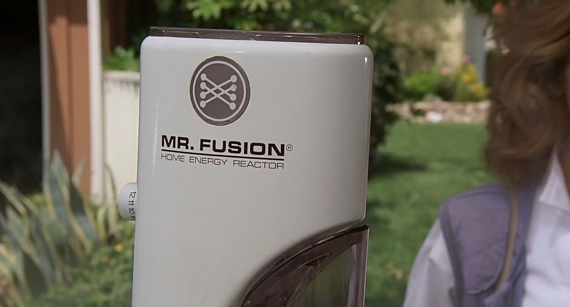
If your computer system or TV show needs some futuristic-looking text that’s easy to read in a long-shot, there’s no better choice than Eurostile Bold Extended.
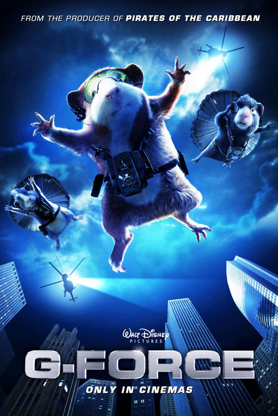
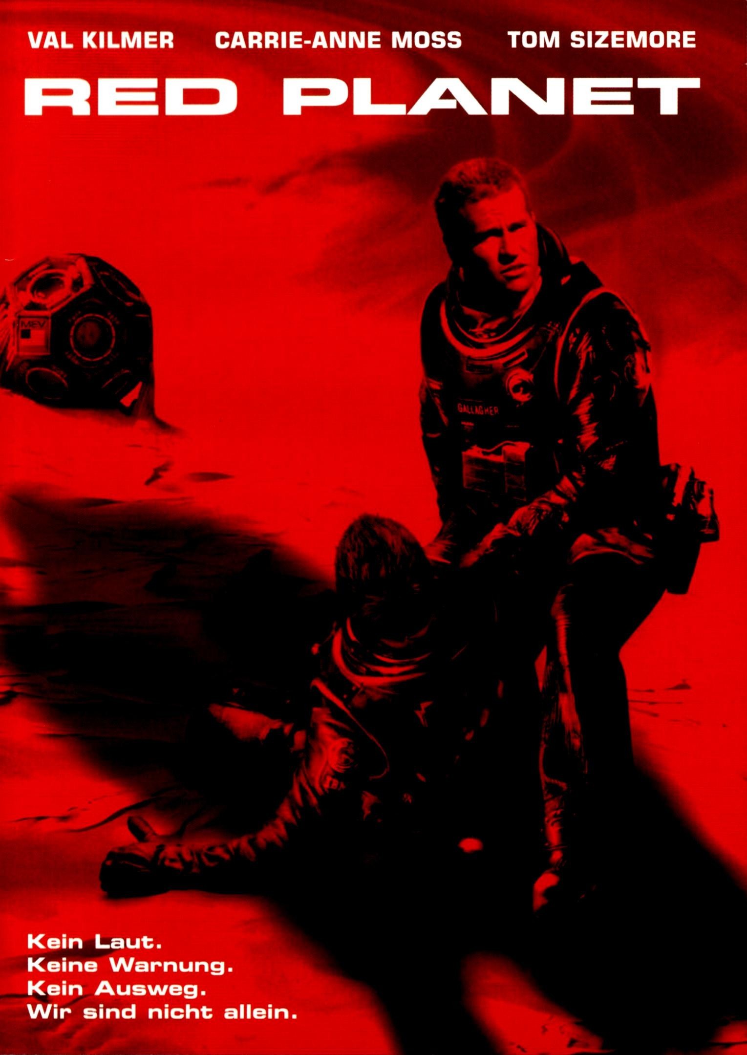
Dark Star (Eurostile Bold Extended, plus a bonus bit of Data 70)G-Force (Eurostile Bold Extended)Red Planet (Eurostile Bold Extended, horizontally stretched, and with a bit snicked out of the “A” for effect)Surrogates (Eurostile Bold Extended, also horizontally stretched, and badly kerned if the G and the A are anything to go by)
Titles and Credit Sequences
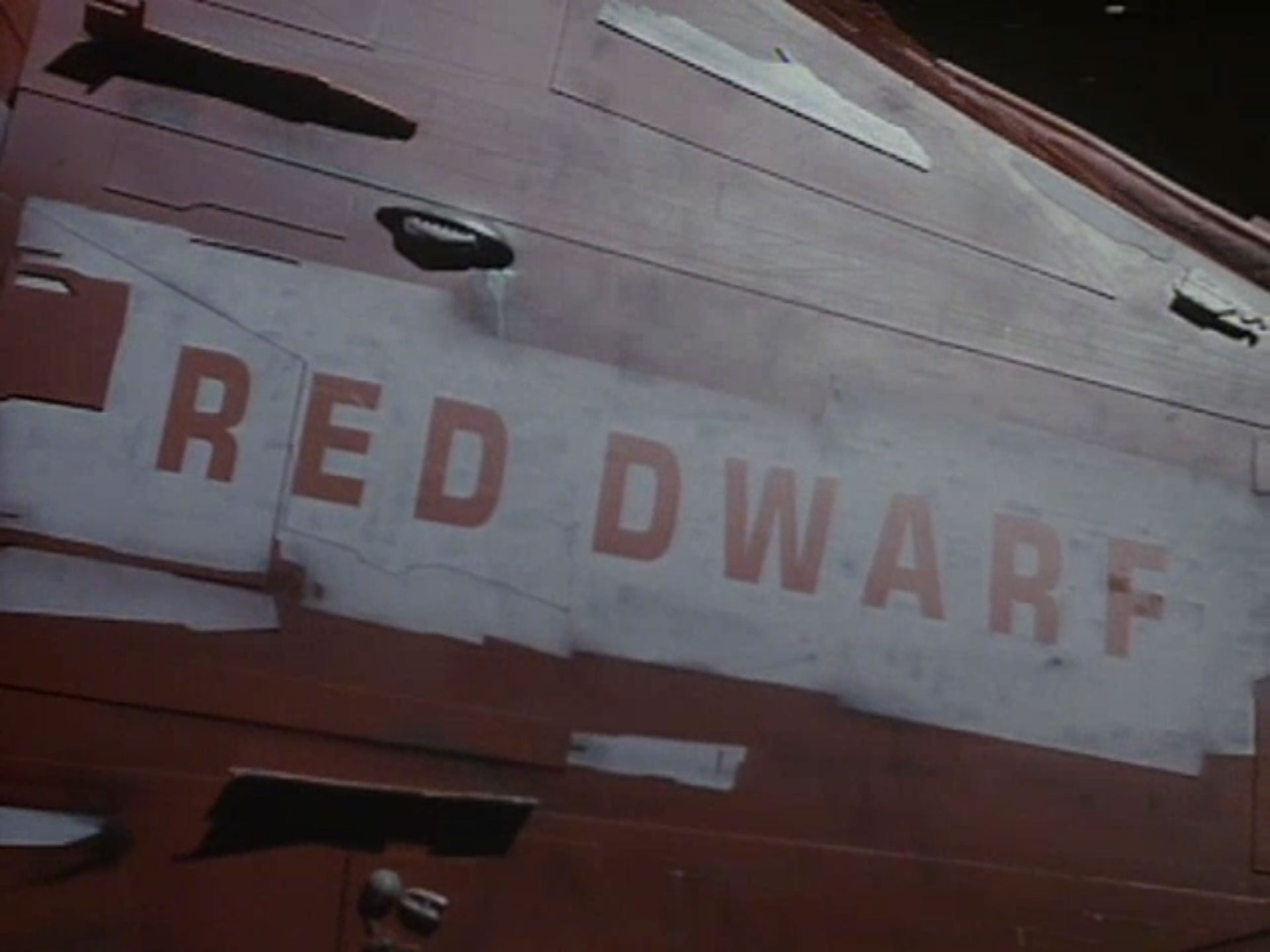
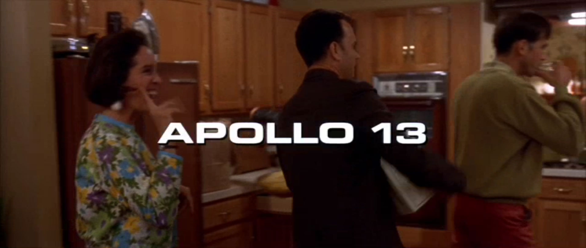
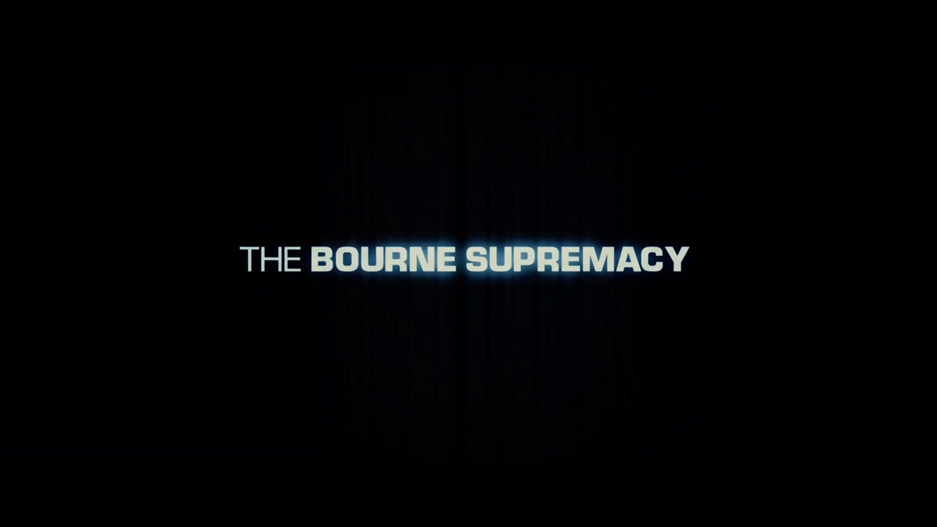
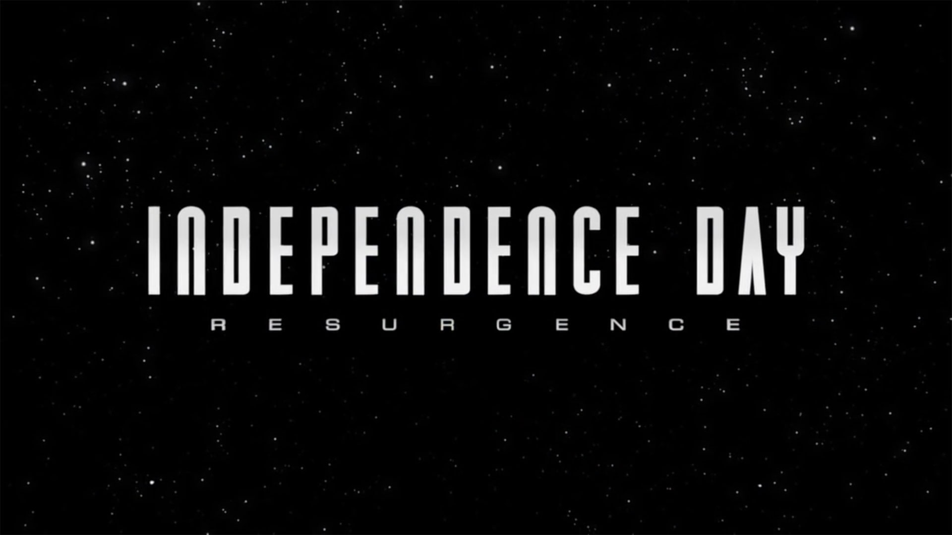
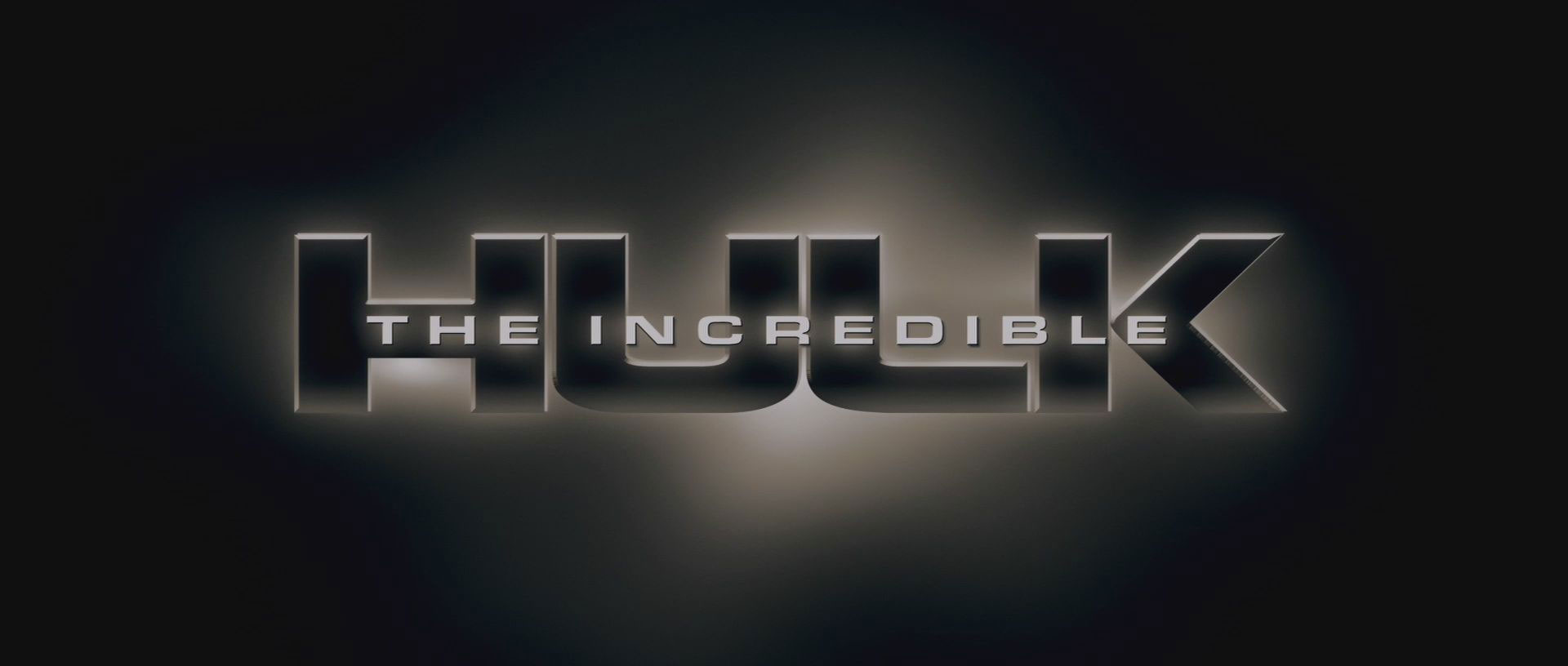
Alan Partridge: Alpha Papa teaser trailer (Eurostile Bold Extended and Regular Extended)Apollo 13 (Eurostile Bold Extended)Battlestar Galactica (Eurostile Bold Extended, and a font I don’t recognize)The Bourne Identity (Not actually Eurostile Bold Extended. I think it’s Eurostile DemiBold, horizontally stretched to about 140%. Why would you do that, when there’s already a perfectly good Eurostile Bold Extended? I despair sometimes.)The Bourne Supremacy (Eurostile Regular and Bold, with sufficiently bad kerning that I read it as “SuperMac-Y”)Captain Scarlet and the Mysterons (Eurostile Regular Extended)District 9 (Eurostile Bold Extended)Pacific Rim (Eurostile Bold Extended)Independence Day: Resurgence (Eurostile Extended, at least for the “RESURGENCE” text)Red Dwarf (Eurostile Bold Extended, disastrously kerned)The Incredible Hulk (Eurostile Bold Extended for “THE INCREDIBLE”, stretched to 125% horizontal width)The trailer for Grimsby (two indeterminate weights of some kind of Eurostile, somewhere between non-extended and extended)Doctor Who: The Tomb of the Cybermen (and other Patrick Troughton-era episodes of Doctor Who, which use Eurostile Condensed in their closing credits, as spotted by Graham Lee)
Wannabes
These are not the Eurostiles you are looking for.
Doctor Who: Into The Dalek (not quite Eurostile Bold Extended, but clearly inspired by it)Star Trek: Enterprise (also not quite Eurostile Bold Extended – the bar in the R is way too high – but very similar in overall style)Terminator Salvation (too curvy to be actual Eurostile Bold Extended, but clearly inspired by it)
Any More?
I’ll keep adding to this page as I spot more examples. If you know of any I’ve missed or got wrong, please do mention them in the comments, together with a link to an image if possible.
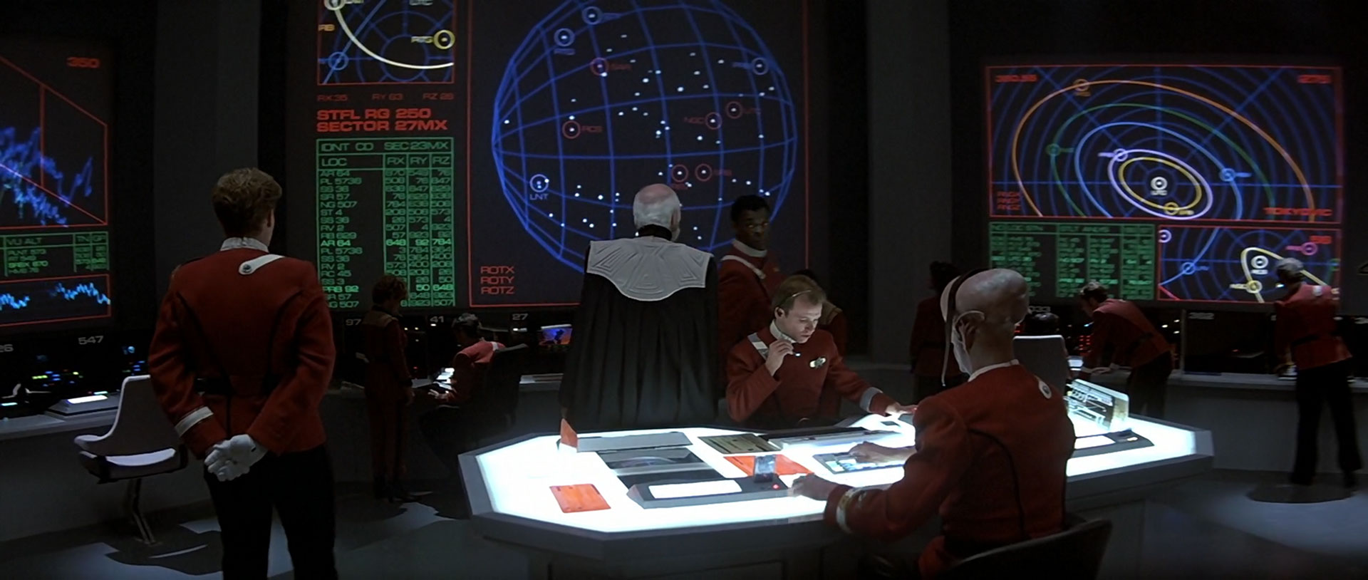
It appears from time to time in signage and computer screens, as well, but ship hulls are where you’re guaranteed to find it in the various movies and spin-off series.
That font is known as Starfleet Bold Extended, and was patented by Paramount Pictures. I used to have an official TrueType copy on my classic Mac. It is also of note that Sr. Novarese’s earlier Microgramma and not Eurostile Bold Extended is considered the root.
But hey, I say we all raise a glass to Aldo Novarese for making both fonts!
“Starfleet Bold Extended” is just Eurostile Bold with a red line around the letterforms. And Eurostile Bold is a classic Swiss typeface invented in the 1950s.
In addition to its use in other Gerry and Sylvia Anderson productions as noted above, Eurostyle is all over their 1970 series UFO. From the series logo, episode credits, the organization insignia, vehicle markings, and pretty much all signage, UFO may have the densest concentration of Eurostyle ever observed on screen. That show was where I learned that by 1980, everything would be written in Eurostyle and all men would wear turtlenecks and Nehru jackets.
Thank you so much for this article.
My Gerry Anderson XCom mod had previously been using Microgramma.
I can’t believe I’d been such a fool.
I have now switched to Eurostile.
Fantastic website and wonderful insights and a great read.
I would be interested in you appraisal of the new Game Elite:Dangerous, as (To my untrained eye) it would appear that David Braben has opted for “Eurostile” for the typeface used in the stations, landing pads and possibly parts of the UI.
Very interesting. I had no idea it was so common in sci-fi films.
It’s also used in the Homeworld video game series, which is how first became aware of the typeset. To this day I still think of it as the “Homeworld font.”
A British science fiction sitcom. An on and off thing since the late 1980ies.
Screenshot is from the opening sequence of episode 1, series 1. Given the “budget” the BBC gave the show and the overall situation during production, my guess is that this was a last minute rush job using LetraSet. Hence the bad kerning.
I created the Terminator Salvation mark, and although the broader aesthetic definitely owes a lot to Eurostile, it was not a direct influence. My starting point was the logo from the original movie, with the goal of modernizing it, particularly the more noodly letters.
Oh, that’s very interesting! I’ll confess I didn’t do a detailed side-by-side comparison for that one, so it’s useful to know its true evolution. Thanks for the info!
I believe it’s used (in various stretched forms) all through the first two series of Red Dwarf, in anything from the title of the episode through to the name painted on the side of the ship and various signage throughout the ship.
I also seem to remember seeing it used for signage in the atmosphere processor (and possibly elsewhere in the colony) in Aliens. The example that springs immediately to find is the “LEVEL 01”, “SUB LEVEL 01” etc. signs when the Marines are working their way through the complex to the trapped colonists.
In 1978–81 my college scifi club showed movies to raise money to buy books, and Bill who made the flyers insisted on Eurostile Bold Extended even for, say, The Magic Christian and The Assassination Bureau.
An excessively nitpickey and pedantic note… but I figure if ever there was (were?) an audience for such trivialities, it’s here. Most style guides (including the MLA) use double-quotation marks to surround television episode titles, as with other “short works”. This helps avoid confusion, since several of the titles mentioned (Star Trek: Enterprise, Alan Partridge: Alpha Papa) already contain colons.
(I mention this because I initially wondered how I’d missed hearing anything about this Firefly: Ariel movie, or a second Firefly movie at all. Then I snapped out of my stupor, thought to follow the link, and realized the frame was actually taken from the Firefly episode “Ariel”. That’s just cruel, is what that is.)
Years ago, at the beginning of my career as an artworker, my boss insisited I used Eurostile for every project. Every project. From then, I’ve garnered a bitter distaste for this font, despite acknowledging how good it looks in the hands of a master.
Mystery Science Theater 3000: The Movie had its title and opening credits all in Eurostyle. It was one of the more subtle jokes in the movie: credits straight out of a “serious” sci-fi movie, plunked into this not-remotely-serious flick.
I work for a company called Parsons, and I’m happy with our logo. Not quite Eurostile Bold Extended – the S has the ends changed. http://www.parsons.com/
I think Eurostile was used on the heads-up display on the otherwise more-or-less contemporary looking car here, which nicely added to the near-future-but-relatable tone of the film
You’re missing a lovely use of Eurostile – the Bold Extended Stencil version – in Cyrillic, for the interior signage of the Russian space craft in the sequel to 2001, “2010: The Year We Make Contact.”
Great blog… we too are fans of Eurostile and have used it in our brand for many years now (www.aspider.com). One drawback seems to be that people like to use the font for emphasis in documents and try tweak the kerning… probably because subconsciously they have seen in in so many movies?
The video game Deus Ex: Human Revolution — set in the year 2027 — uses Eurostile everywhere. It looks great and fits rght in with that game’s wonderful black-and-gold UI.
Something I’ve been wondering about for a long time: Microgramma was designed back in the 1950s, The Chicago Cubs have had something very close to Eurostile Bold for the numerals on their jerseys since the 1930s (the “1” looks very different, but all the other digits are close):
(It’s hard to google for good images; there are so many cheap knockoff jerseys these days, and those are infamous for getting the fonts wrong.)
The “UBS” in the “CUBS” logo also seems to be Eurostile-like. I wonder who designed this font, and what inspired them. It has a great, timeless look, which manages to somehow be futuristic no matter what year it is.
“Logan’s Run” used “Huit Medium” for the computer displays and the typestyle of the Sandmen’s communicators. Huit Medium, however, remained a strictly commercial font as of 2017, and when I checked its price, I got sticker shock–downloading it would have cost FIFTY-FIVE DOLLARS, money I did NOT have to spare.
The article says that seeing Eurostile makes you think you’ve been transported to some futuristic dystopia. Canadian currency uses Eurostile. Conclusion?
As somebody mentioned before, the Alien franchise is one of these:
The ship Sulaco has it printed all over:
“Aliens” also has some Eurostile “cameos” 😛 https://reelclub.files.wordpress.com/2012/04/aliens7.jpg (You can see “RM” in the back).
I remember there is more Eurostile but can’t find a good snapshot. Perhaps watch the movie again and make them myself…
Something tells me that the next fontspot is going to be Bank Gothic, also notoriously used in Science Fiction and Military-Related fiction (as much as OCR-A)
All the letters of the ‘Wipeout’ logo were variants of the Eurostile number 8:
Here's something I've always enjoyed about the original WipEout logo: it's made of the chopped up (and slightly modified) Eurostile letterform for the number 8.
With regard to the main title card for Star Trek: Enterprise, I did not use Eurostile. I used the solid version of Starfleet Bold Extended, which was designed at ASTRA Image Corporation for the first Star Trek movie. Starfleet Bold seems to be based on Eurostile, but has distinctly flatter top, bottom, and side strokes. Most uses of that font in those films use the inline version, with the red outline. I had wanted to design a new font for Enterprise’s titles and credits. Alternatively, I was leaning toward a serif font because this show’s visual style was quite a bit different from previous Treks. However, I noticed that the various promotional materials (including print advertising and billboards) had used Starfleet Bold, and I felt it would be worthwhile to be consistent with the advertising, which had already generated a certain expectation in the audience.


You touch on it a bit with the example from Star Trek Into Darkness, but since 1979’s Star Trek: The Motion Picture, a variant of Microgramma/Eurostile has been the standard for the nameplates of spaceships in that franchise.
It appears from time to time in signage and computer screens, as well, but ship hulls are where you’re guaranteed to find it in the various movies and spin-off series.
LikeLike
That font is known as Starfleet Bold Extended, and was patented by Paramount Pictures. I used to have an official TrueType copy on my classic Mac. It is also of note that Sr. Novarese’s earlier Microgramma and not Eurostile Bold Extended is considered the root.
But hey, I say we all raise a glass to Aldo Novarese for making both fonts!
LikeLike
Bitstream is still selling “Starfleet Bold Extended” as “Millenium”.
LikeLike
“Starfleet Bold Extended” is just Eurostile Bold with a red line around the letterforms. And Eurostile Bold is a classic Swiss typeface invented in the 1950s.
LikeLike
Just so great that TITF is back.
Excellent work! Keep it coming.
LikeLike
In addition to its use in other Gerry and Sylvia Anderson productions as noted above, Eurostyle is all over their 1970 series UFO. From the series logo, episode credits, the organization insignia, vehicle markings, and pretty much all signage, UFO may have the densest concentration of Eurostyle ever observed on screen. That show was where I learned that by 1980, everything would be written in Eurostyle and all men would wear turtlenecks and Nehru jackets.
LikeLike
pls. it’s called eurostile. not eurostyle.
LikeLike
Not a huge fan of the show, but my father is. I’d still *love* to see UFO or Space 1999 get the Typeset in the Future treatment.
LikeLike
Thank you so much for this article.
My Gerry Anderson XCom mod had previously been using Microgramma.
I can’t believe I’d been such a fool.
I have now switched to Eurostile.
LikeLike
Hey,
I designed the screens for the 1998 film ‘Lost in Space’ using…. Eurostile Bold Extended!
LikeLiked by 1 person
Hi Peter! Thanks for the comment – I’ve added Lost in Space to the list.
LikeLike
The Star Fleet Technical Manual (first printed in 1975) clearly indicated that the standard Star Fleet typeface is Microgramma.
LikeLike
Idylwood Care Center, huh? So you’re in the Bay Area? I’ve literally driven past that sign thousands of times!
LikeLike
When you say stretched, maybe you are mistaking Eurostile for the infinitely more classy Microgramma http://en.wikipedia.org/wiki/Microgramma_(typeface)
LikeLike
This is one of probably the best websites I’ve ever visited. Thank you so much, and I hope to see tons more analysis!
LikeLike
Fantastic website and wonderful insights and a great read.
I would be interested in you appraisal of the new Game Elite:Dangerous, as (To my untrained eye) it would appear that David Braben has opted for “Eurostile” for the typeface used in the stations, landing pads and possibly parts of the UI.
LikeLiked by 1 person
Very interesting. I had no idea it was so common in sci-fi films.
It’s also used in the Homeworld video game series, which is how first became aware of the typeset. To this day I still think of it as the “Homeworld font.”
LikeLike
Red Dwarf?
LikeLike
A British science fiction sitcom. An on and off thing since the late 1980ies.
Screenshot is from the opening sequence of episode 1, series 1. Given the “budget” the BBC gave the show and the overall situation during production, my guess is that this was a last minute rush job using LetraSet. Hence the bad kerning.
LikeLike
The FX boys would have been massive fans of Gerry Anderson shows, so defaulted to a font they knew very well from space models of their youth.
LikeLike
Great collection!
I created the Terminator Salvation mark, and although the broader aesthetic definitely owes a lot to Eurostile, it was not a direct influence. My starting point was the logo from the original movie, with the goal of modernizing it, particularly the more noodly letters.
LikeLike
Oh, that’s very interesting! I’ll confess I didn’t do a detailed side-by-side comparison for that one, so it’s useful to know its true evolution. Thanks for the info!
– Dave
LikeLike
It’s all over the first couple of seasons of Red Dwarf, too.
LikeLike
I believe it’s used (in various stretched forms) all through the first two series of Red Dwarf, in anything from the title of the episode through to the name painted on the side of the ship and various signage throughout the ship.
I also seem to remember seeing it used for signage in the atmosphere processor (and possibly elsewhere in the colony) in Aliens. The example that springs immediately to find is the “LEVEL 01”, “SUB LEVEL 01” etc. signs when the Marines are working their way through the complex to the trapped colonists.
LikeLike
Great blog!
Another prolific use of Eurostyle Extended was the 1990s BBC Sci-Fi sitcom .
LikeLike
In 1978–81 my college scifi club showed movies to raise money to buy books, and Bill who made the flyers insisted on Eurostile Bold Extended even for, say, The Magic Christian and The Assassination Bureau.
LikeLike
An excessively nitpickey and pedantic note… but I figure if ever there was (were?) an audience for such trivialities, it’s here. Most style guides (including the MLA) use double-quotation marks to surround television episode titles, as with other “short works”. This helps avoid confusion, since several of the titles mentioned (Star Trek: Enterprise, Alan Partridge: Alpha Papa) already contain colons.
(I mention this because I initially wondered how I’d missed hearing anything about this Firefly: Ariel movie, or a second Firefly movie at all. Then I snapped out of my stupor, thought to follow the link, and realized the frame was actually taken from the Firefly episode “Ariel”. That’s just cruel, is what that is.)
LikeLiked by 2 people
Years ago, at the beginning of my career as an artworker, my boss insisited I used Eurostile for every project. Every project. From then, I’ve garnered a bitter distaste for this font, despite acknowledging how good it looks in the hands of a master.
LikeLike
I used to hate Helvetica until I saw a documentary on it creation and use. Now I’ve done a complete 180 on it and all Swiss typefaces.
LikeLike
Mystery Science Theater 3000: The Movie had its title and opening credits all in Eurostyle. It was one of the more subtle jokes in the movie: credits straight out of a “serious” sci-fi movie, plunked into this not-remotely-serious flick.
LikeLike
You might want to check the screencap archives informally established for Agents of SHIELD. You’ll see plenty of examples of usage of Eurostile by both SHIELD and HYDRA.
In the movies, SHIELD seems to have gone in for Stratum 1 and 2 from Process Type, among several others.
LikeLike
While not precisely sience fiction but science fact, the title cards of ‘Apollo 13’ also are written in Eurostile.
LikeLike
I worked on the GRID series of racing games, and we used some Microgramma throughout all of those. Take a look if you like!
LikeLike
I work for a company called Parsons, and I’m happy with our logo. Not quite Eurostile Bold Extended – the S has the ends changed.
http://www.parsons.com/
LikeLike
What’s this on the poster for the forthcoming supernatural thriller London Fields… http://jimsturgessonline.com/images/albums/userpics/10001/London_Fields_poster_001_small.jpg
LikeLike
I think Eurostile was used on the heads-up display on the otherwise more-or-less contemporary looking car here, which nicely added to the near-future-but-relatable tone of the film
LikeLike
It’s all over Prometheus. Not a very good movie but the font is everywhere in it.
LikeLike
Just noticed this at the weekend:
Stargate Universe
LikeLike
You’re missing a lovely use of Eurostile – the Bold Extended Stencil version – in Cyrillic, for the interior signage of the Russian space craft in the sequel to 2001, “2010: The Year We Make Contact.”
LikeLike
Great blog… we too are fans of Eurostile and have used it in our brand for many years now (www.aspider.com). One drawback seems to be that people like to use the font for emphasis in documents and try tweak the kerning… probably because subconsciously they have seen in in so many movies?
LikeLike
The video game Deus Ex: Human Revolution — set in the year 2027 — uses Eurostile everywhere. It looks great and fits rght in with that game’s wonderful black-and-gold UI.
Something I’ve been wondering about for a long time: Microgramma was designed back in the 1950s, The Chicago Cubs have had something very close to Eurostile Bold for the numerals on their jerseys since the 1930s (the “1” looks very different, but all the other digits are close):
Home jersey for many decades: http://content.sportslogos.net/logos/54/54/full/e3f5jgwdkumdril813xym4t6k.gif
1978-vintage road jersey; https://farm4.staticflickr.com/3842/14749529602_7e03899720_o.jpg
(It’s hard to google for good images; there are so many cheap knockoff jerseys these days, and those are infamous for getting the fonts wrong.)
The “UBS” in the “CUBS” logo also seems to be Eurostile-like. I wonder who designed this font, and what inspired them. It has a great, timeless look, which manages to somehow be futuristic no matter what year it is.
LikeLike
I first noticed Eurostile in 1978 when I first picked up an issue of 2000AD . It’s used for the issue number and date – see here:
I think it may have been Tom Frame (the letterer for Judge Dredd) who designed this
LikeLiked by 1 person
The Telepod computer from The Fly (1986) –Also Eurostile?
Example 1
Example 2
LikeLike
Good spot! I’ve added this to the list above.
LikeLike
Did you do Logan’s Run yet?
LikeLike
“Logan’s Run” used “Huit Medium” for the computer displays and the typestyle of the Sandmen’s communicators. Huit Medium, however, remained a strictly commercial font as of 2017, and when I checked its price, I got sticker shock–downloading it would have cost FIFTY-FIVE DOLLARS, money I did NOT have to spare.
LikeLike
Good, now I know what to use for my TV graphics when futurising. Any tips on best use?
LikeLike
The article says that seeing Eurostile makes you think you’ve been transported to some futuristic dystopia. Canadian currency uses Eurostile. Conclusion?
LikeLike
Poster / Titles for Scifi-Horror MORGAN
http://www.firstshowing.net/2016/watch-teaser-trailer-for-sci-fi-horror-morgan-starring-kate-mara/
LikeLike
Although not sci-fi at all, 80’s cult detective show Remington Steele, starring a pre-Bond Pierce Brosnan used what very much looks like Eurostile both in title credits as well as the actual in-show office glass doors: https://seniorcitylocal.com/wp-content/uploads/2015/11/Remington-Steele.jpg
LikeLiked by 1 person
As somebody mentioned before, the Alien franchise is one of these:

The ship Sulaco has it printed all over:
“Aliens” also has some Eurostile “cameos” 😛
https://reelclub.files.wordpress.com/2012/04/aliens7.jpg (You can see “RM” in the back).
I remember there is more Eurostile but can’t find a good snapshot. Perhaps watch the movie again and make them myself…
LikeLike
That was the standard lettering used by Brazilian TV network Globo, from its founding in 1965 until 1976.
If you don’t believe me, check it out:
LikeLike
Something tells me that the next fontspot is going to be Bank Gothic, also notoriously used in Science Fiction and Military-Related fiction (as much as OCR-A)
LikeLike
Also used lot in the classical Luc Besson’s “Fifth Element” from 1997 (UI, Medal of honour letter, NYC Mail and so on)…
LikeLike
The new Netflix show “Space Force” uses Eurostile for the logo
LikeLike
All the letters of the ‘Wipeout’ logo were variants of the Eurostile number 8:
https://pbs.twimg.com/media/FerdQsMakAQA_6_?format=jpg&name=small
LikeLike
With regard to the main title card for Star Trek: Enterprise, I did not use Eurostile. I used the solid version of Starfleet Bold Extended, which was designed at ASTRA Image Corporation for the first Star Trek movie. Starfleet Bold seems to be based on Eurostile, but has distinctly flatter top, bottom, and side strokes. Most uses of that font in those films use the inline version, with the red outline. I had wanted to design a new font for Enterprise’s titles and credits. Alternatively, I was leaning toward a serif font because this show’s visual style was quite a bit different from previous Treks. However, I noticed that the various promotional materials (including print advertising and billboards) had used Starfleet Bold, and I felt it would be worthwhile to be consistent with the advertising, which had already generated a certain expectation in the audience.
LikeLike
Thank you for the definitive clarification!
LikeLike