We’ve already seen how Eurostile Bold Extended is spectacularly effective at establishing a movie’s timeframe. But if Eurostile isn’t enough, there’s more you can do to clarify your movie’s timeframe. I’d like to introduce you to six easy rules that are pretty much guaranteed to position your text firmly in the FUTURE.
We’ll start with some simple sans-serif text, such as this randomly chosen word in Eurostile Bold. So far, so 2016:
![]()
Rule 1: First, let’s add an italic slant. We want it to look like the text is stretching towards 2020:
![]()
Hmm. It’s still a little boring. Rule 2: What if we make things a bit more curvy in some places, and a bit more angular in others? I hear that’s all the typographic rage in 2035:
![]()
That’s much better! There’s still more we can do, mind. Rule 3: How about adding some consummate Vs to a few of the letters? Yeah! That’d be cool!
Hello, 2050:
![]()
There’s still something missing, however – we’ve forgotten to take into account the devastating Kern Wars of 2067. Rule 4: Let’s combine a few letters into one, to make sure we’re not violating the Kern Tithe:
![]()
Now we’re talking! Let’s end with Rule 5: Remove an entirely pointless and arbitrarily segment of the text. In this case, we’ll remove a horizontal line from the majority of the word:
![]()
WOAH. That looks amazing! Who knew 2092 was so easy to reach?
D’you know what –I think we need a Rule 6 too. Let’s add a noise texture, some shamelessly steel-brushed metal, and a bit of moody blue lighting:
![]()
Finally, let’s emboss it to within an inch of its life:
![]()
…and add a god-damn star field:
![]()
BOOM. Welcome to the FUTURE!
Here’s how it looks if you put the whole thing together:
![]()
Now. Various permutations of these six rules have been applied in many different movies. Perhaps the Ur Example is Ridley Scott’s Blade Runner, which I may have slightly copied in my example above:

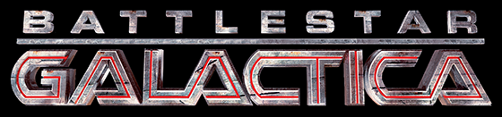
Blade Runner is far from the only example, however. The logotype for 2003’s Battlestar Galactica miniseries follows pretty much every rule to the letter (and adds some extruded Eurostile Bold Extended for good measure):
Transformers is similarly all-encompassing, taking the brushed metal effect to the extreme:
![]()
Guardians of the Galaxy also uses pretty much every trick apart from the italics:

…whereas RoboCop is all about those consummate Vs, plus the world’s most extreme embossment:

Star Wars, of course, takes Rule 4 and runs with it all the way to the bank:

…whereas The Amazing Spider-Man follows nearly all of the rules (and takes Rule 2 to extremes), although it will be receiving a visit from the Tithe Kern Police for Opportunities Missed:

Captain America: The Winter Soldier really likes applying Rules 2 and 3, plus some of the best Rule 6 you’ll ever see:

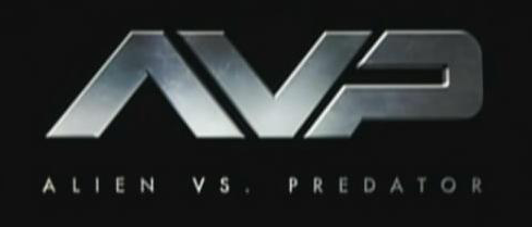
Alien vs. Predator is ridiculously italic and metallic:
G.I. Joe: Retaliation uses every trick apart from the kerning:

And WALL·E is all about Rule 2:

Finally: if you have any lingering doubts that these six rules spell FUTURE, here are Rules 1, 2, and 4 in action for the iconic logotype for none other than Back To The Future itself:

Hello, the FUTURE. It’s good to be back.
UPDATE: Several people have noted that I missed pretty much the textbooking-est textbook example of this trope – namely, Star Trek: The Next Generation:

I mean seriously. It even has a God-Damn Star Field in the background. (I swear I didn’t have this logotype in mind when I wrote the article, but boy, does it prove the point.)
FUN FACT: An expanded version of this article appears in the Typeset in the Future book, available on December 11 2018. You can pre-order it now on Amazon.

I feel like there should be a mention of pretty much every incarnation of Star Trek, except Enterprise (which you already covered in the related Eurostile Bold article, of course). ST:TNG is pretty much the ur-example although pretty much all of the series are guilty to some extent.
LikeLike
I’m surprised you didn’t even include the title that I assumed you were building toward the whole time – Star Trek: The Next Generation!
LikeLike
glad to see you posting again here. watching the blank rss feed for this was very depressing.
LikeLike
Moar posts please! I’m a huge fan of your 2001 article. I’m eagerly awaiting more posts.
LikeLike
+1 ! Very good posts!
LikeLike
Glad to have you back!
LikeLiked by 1 person
Please consider advising us how to achieve that futuristic mood with serifs as well.
LikeLike
This is a wonderful blog. I’ve kept it on my RSS reader for a long time in the hopes another post would come by. This made me very happy.
LikeLike
you forgot metal gear!

LikeLiked by 1 person
Great to see a new post after so long. Please keep it up.
Would love to get your impression of the LCARS computer GUI used in various Star Trek series.
LikeLike
Great work. Glad to have you back.
LikeLike
This is great! Love it. Keep them coming.
If I may, would you think that “tracking” the typeface would be another rule? See W A L L – E , B A T T L E S T A R, R E T A L A T I O N.
LikeLike
What do you think about the fonts in The Expanse, or district 9? I’d love to hear your trademark take on it!
LikeLike
Glad to see you’re back! More of your wonderful posts please!
LikeLike
Impressive articles, I didn’t know that fonts could be that interesting.
Thank you very much for your dedicated work and knowledge.
LikeLike
Sidebar on the Captain America wordmark: I’m not sure the designer back in 1940 ever intended for it to be seen as “futuristic” at all when they came up with the original version of it for that first comic book.
LikeLiked by 1 person
Babylon 5 did #5 and then went all-out on the star field: http://screenrant.com/wp-content/uploads/Babylon-5-Logo.jpg
LikeLike
Star wars is in the past 🙂
LikeLike
Typography and sci-fi? Your chocolate got into my peanut butter!
LikeLike
Very interesting read.
LikeLike
The Orion Pictures logo is a contender.
Thank you for the interesting site.
LikeLike
Just discovered this great website. Man, are you talking to me! Typographer and scifi movie lover for decades, I can’t imagine how I could NOT have found you earlier. Keep up this interesting work!
LikeLike
❤
LikeLike
What if _this_ is not the future, but _my helicopter_ is very futuristic? Do I only need to follow half of the rules?
…yes!
LikeLike
You say on your page for the movie “2001”, “In a subsequent close-up, we see that the craft also features the IBM logo in its pre-1972 version, set in City Medium, as designed by Paul Rand.” Yup, IBM went whole-hog on Rule 5.
LikeLike
I think it’s important to note that Star Wars is not set in the future. As very clearly stated in a disclaimer included at the start every film, it is set a long time ago.
LikeLike