After studying Alien in intimate detail, it’s time to look at the typography and design of Ridley Scott’s other classic sci-fi movie, Blade Runner. Based on Philip K. Dick’s novel Do Androids Dream of Electric Sheep?, Blade Runner cements Scott’s reputation for beautiful, gritty, tech noir science fiction.
(As with my previous articles, I should note that there are spoilers aplenty throughout the next 5,000 words. If you don’t want to know when Blade Runner’s sole appearance of Eurostile Bold Extended occurs, look away now.)
Blade Runner’s opening crawl is distinctly un-futuristic in its choice of font. It uses Goudy Old Style – designed by Frederic W. Goudy in 1915 – as part of a veritable typographic cornucopia:

Within five-and-a-bit paragraphs, we are treated to several inconsistently spaced examples of small caps (all of which make me think of death talking inside my head), and five — count them! — examples of particularly chunky em dashes. (Thankfully, they do not follow the freaky American style of removing—for no reason at all—their surrounding spaces.)
My favorite aspects of this opening crawl, however, are the arbitrary examples of Mid-Sentence Capitalized Words, as popularized by A. A. Milne and P. L. Travers:

With the opening crawl’s typographic anomalies fresh in our minds, it’s time to meet our first suspected replicant. Leon, a potential NEXUS 6, is being tested with a Voight-Kampff machine in the offices of the Tyrell Corporation. We know we’re in the offices of the Tyrell Corporation, because the chairs have TYRELL CORP. stenciled on the back of them, in what might be Akzidenz-Grotesk Extended:


As we discovered in both Alien and Moon, omnipresent corporate branding is the single most important sign of a successful international conglomerate.
The Voight-Kampff machine measures contractions of the iris muscle to gauge the subject’s empathetic response to a range of questions. We see a close-up of one of Leon’s green eyes as the test is administered:
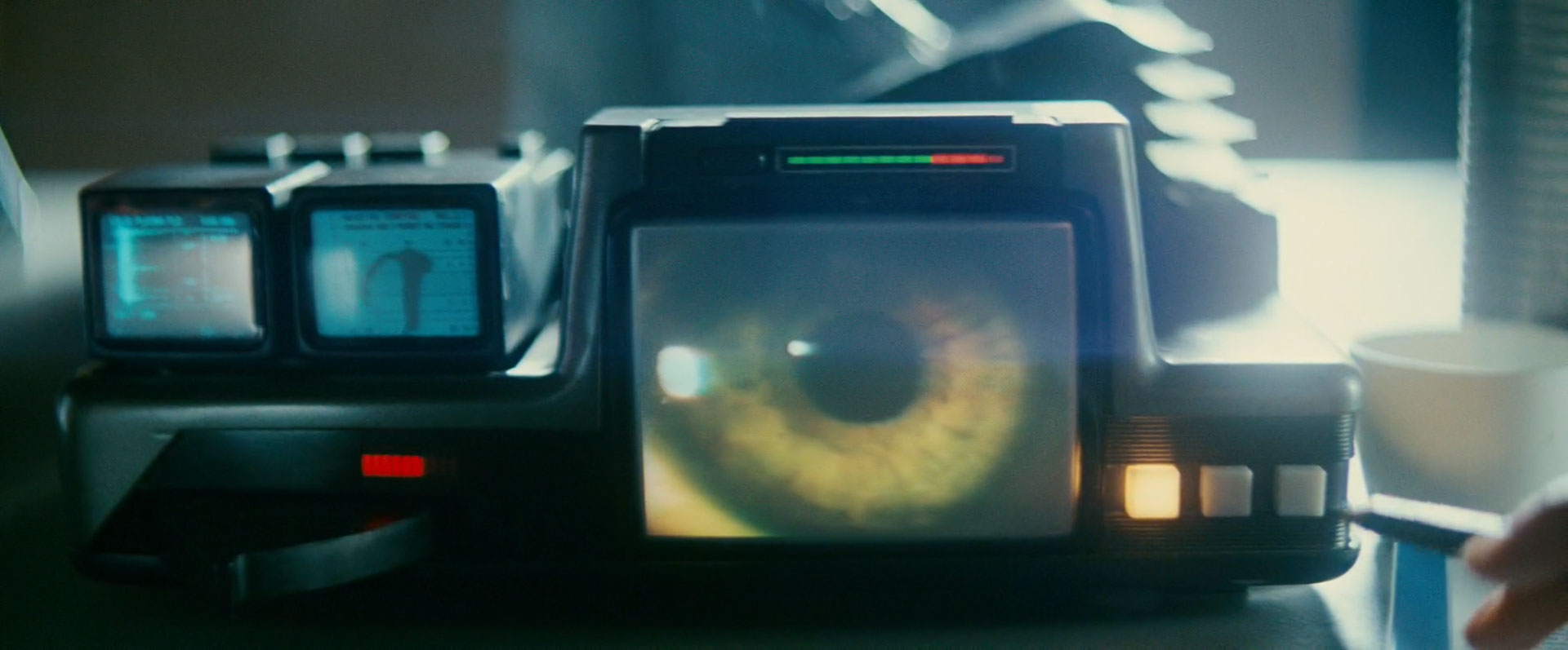
This is odd, given that Leon’s eyes are blue:

The Voight-Kampff test is also administered to Tyrell’s niece, Rachael, later in Blade Runner. We see a close-up of one of Rachael’s green eyes as the test is administered:
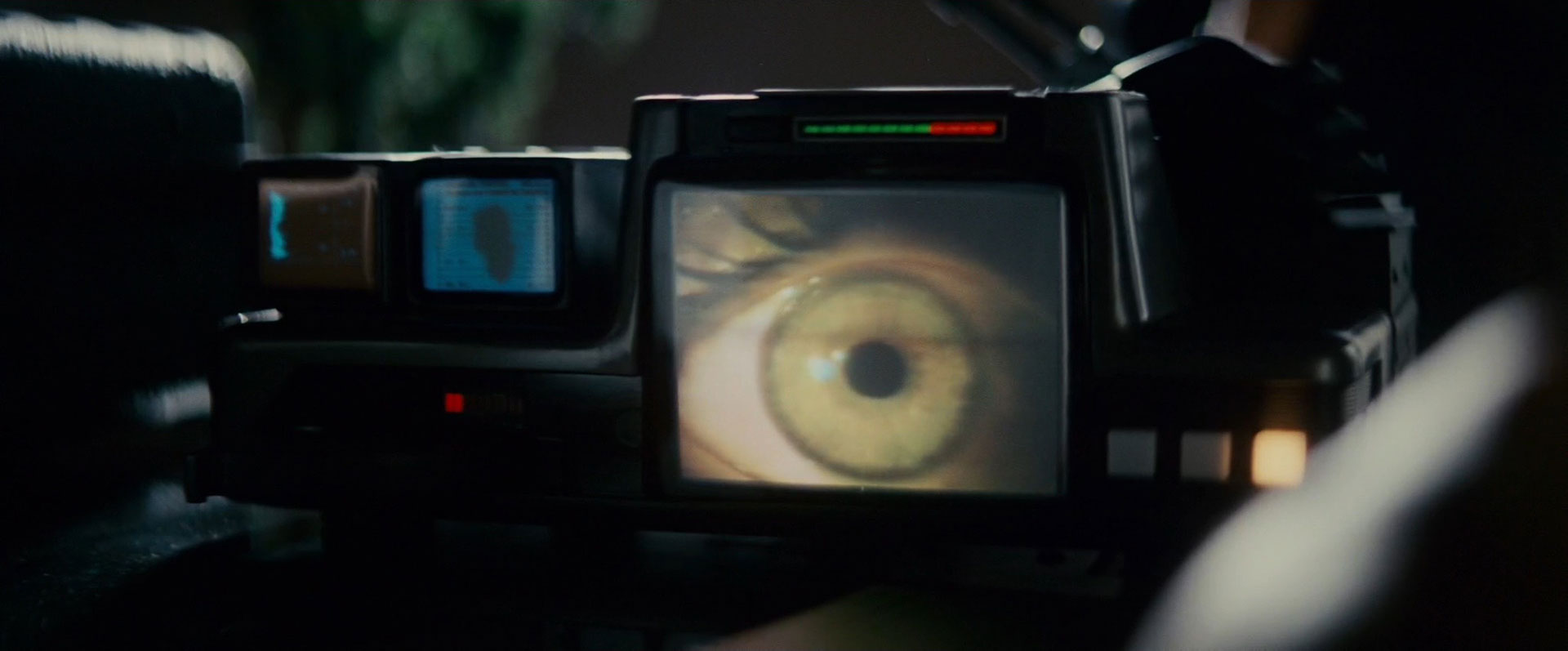
This is odd, given that Rachael’s eyes are brown:

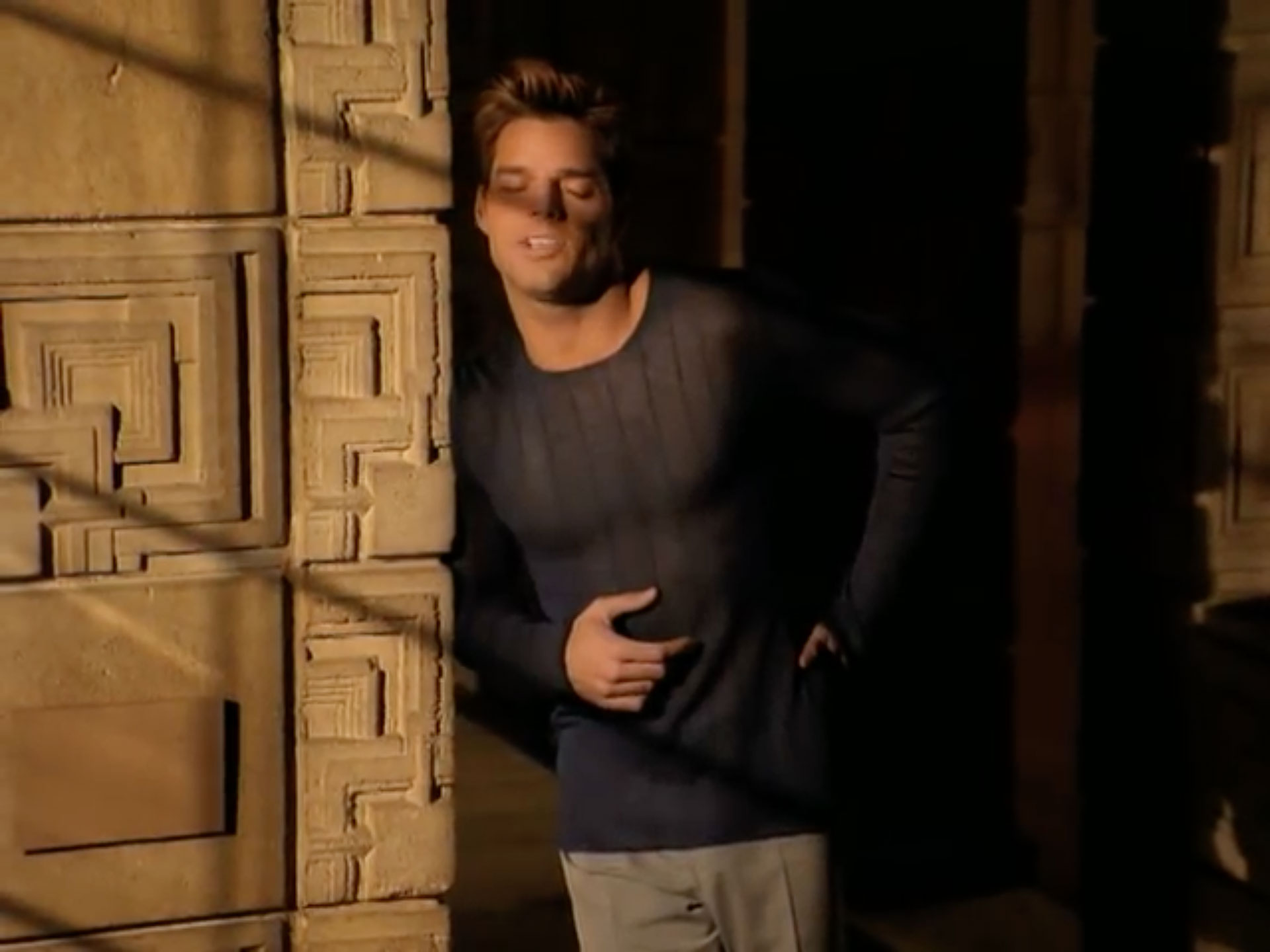
Thankfully, this mystery is easy to explain: the eyes we see on these Voight-Kampff screens are taken from stock footage by Oxford Scientific Films, and not from an actual replicant. This is almost certainly because the eyes of a real replicant are notoriously hard to film without a bad case of red-eye effect – a fact that Scott struggled with throughout the making of Blade Runner. Indeed, despite the efforts of modern film restorers, even the Final Cut of Blade Runner shows an unavoidable example of this phenomenon the very first time we meet Leon:

The same is true when we meet Rachael (purportedly Tyrell’s niece, but later exposed as an unsuspecting replicant):

The trademark tinge is also there when Pris is reunited with Roy Batty in J.F. Sebastian’s apartment:

Tyrell’s artificial owl provides a particularly glowy example:

Hell, even a top-of-the-range NEXUS 6 like Roy Batty suffers from a bad case of the red-eye:
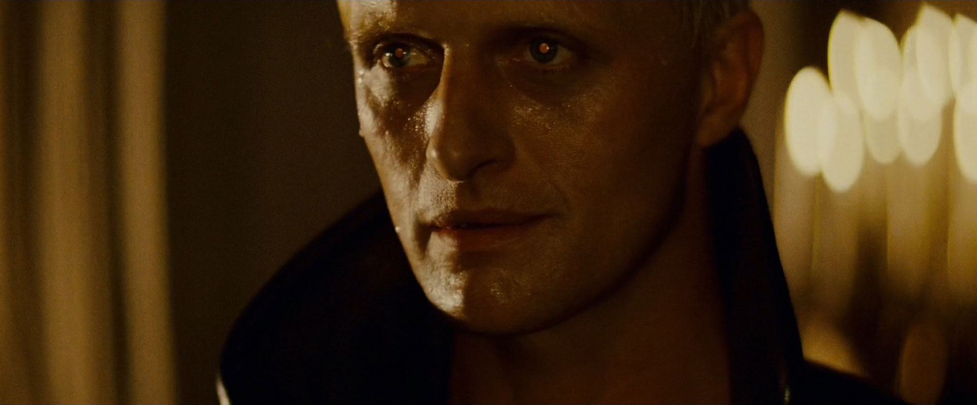
This problem surfaces time and time and time again throughout the film. Given the otherwise incredible realism of the (entirely animatronic) replicant “actors” in the movie, it’s unfortunate that the producers couldn’t find a way to work around such a simple photographic bugbear.
Perhaps the most inexplicable example of this phenomenon, however, is a blurry background shot late in the movie, featuring central protagonist (and definitely-not-a-replicant) Rick Deckard, played by Harrison Ford:
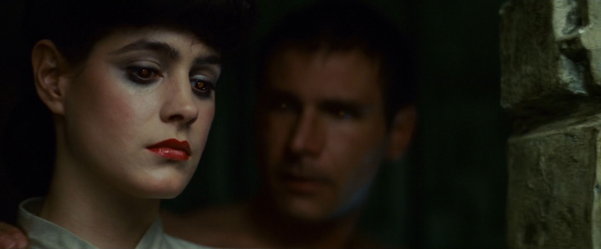
How strange! I’m sure it won’t turn out to be significant.
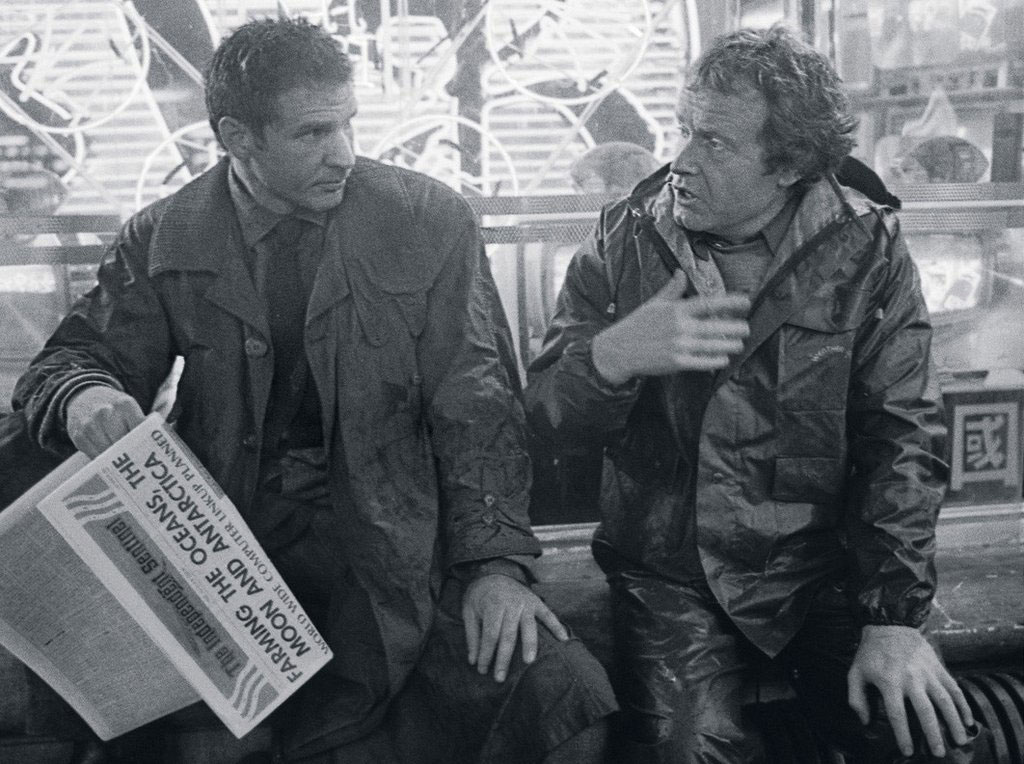
The first time we meet Deckard, he’s sat in the Los Angeles rain, idly reading a newspaper. The headline of this newspaper is FARMING THE OCEANS, THE MOON AND ANTARCTICA, in what looks like Futura Demi:

This isn’t the first time we’ve heard about lunar business endeavors. As we saw in Moon, NASA was accepting applications to mine the moon as far back as January 2014. Things have moved on even further since then, with the Google Lunar X Prize offering $20m to the first privately funded team that can land a robot on the Moon, travel more than 500 meters, and transmit back high definition images and video. By the end of 2015, sixteen teams had registered in the competition, with craft names such as Moonraker, Tesla, Sagan, and Tetris. Indeed, as of when this article was published, the Moon Express and Space IL teams had launch dates confirmed for 2017. The Lunar X Prize means that farming the moon for gold, cobalt, iron, palladium, platinum, tungsten and Helium-3 is a genuine possibility.
Here’s a close-up shot of that newspaper prop, from an on-set photo of Harrison Ford and Ridley Scott:
The subtitle reads WORLD WIDE COMPUTER LINKUP PLANNED, in what looks like Optima Bold. While the idea of a World Wide Computer Linkup might seem passé as we approach 2019, it was still very much unusual in 1982 when Blade Runner was released. Indeed, it wasn’t until March 1982 that the US Department of Defense, creators of pre-Internet network ARPANET, declared TCP/IP as the standard for all military computer networking, pretty much kick-starting what we know as the modern-day Internet of 2016.
Of course, if you’re going to set up business on the moon, you’ll need something a bit smarter than the simple terrestrial Internet we know here on Earth. Indeed, you’ll probably want some kind of Interplanetary Internet. By a strange coincidence, this is exactly what Vint Cerf and NASA have been working on, using delay-tolerant networking to forward bundles of data from spacecraft to spacecraft as and when they come into range. If you’d like to know more, here’s Vint explaining why the speed of light is too slow at a TEDx event in 2011. (We’ll excuse the Comic Sans in his slides, because he did after all invent the thing that’s letting you read this article.)
We see Deckard’s newspaper a couple more times in the movie. He’s reading it again while waiting for Zhora at the Snake Pit Bar, albeit inside-out:

Somewhat unexpectedly, the same day’s newspaper also appears as a makeshift drawer liner in Leon’s apartment:

But we’re getting ahead of ourselves. Back at the beginning of the movie, Deckard folds up his newspaper, and buys some tasty noodles from a street restaurant. As he noms the noodles, he’s approached by Gaff, a shady agent of the Los Angeles Police Department:

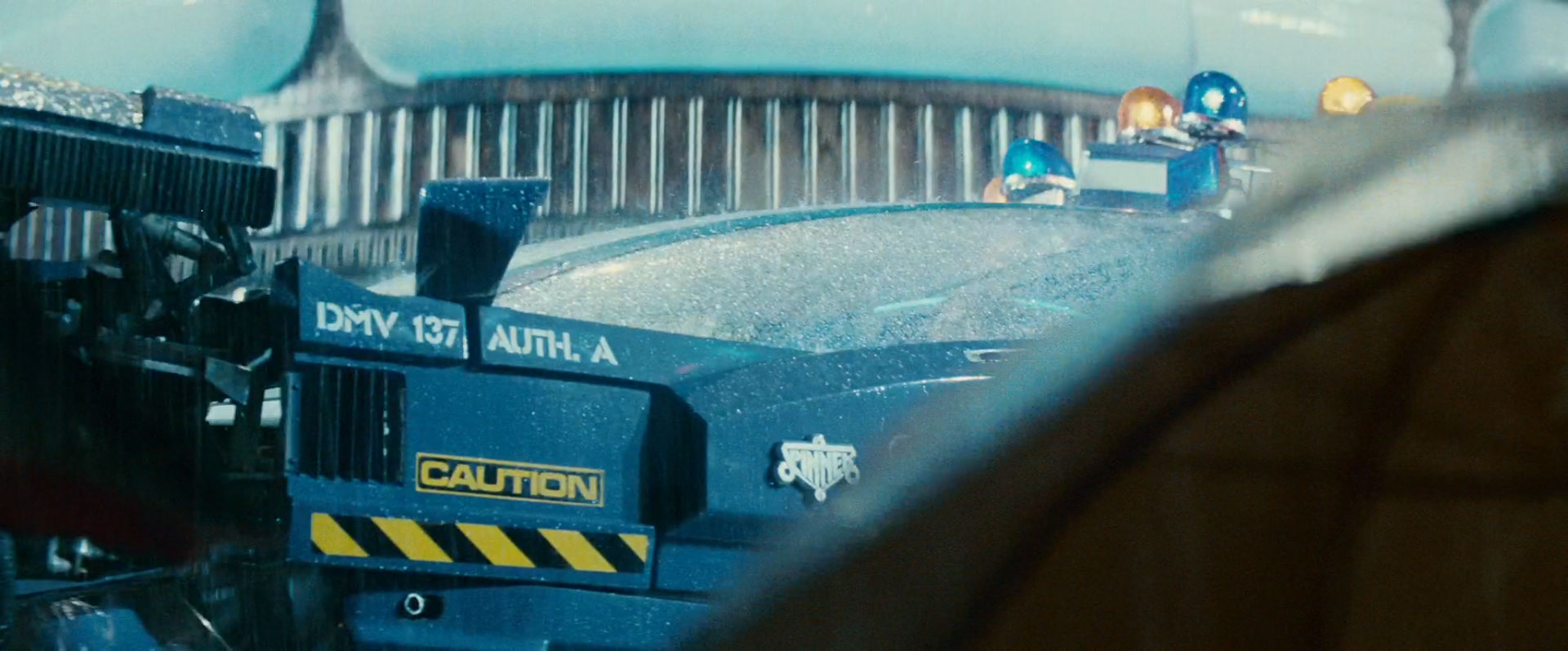
Gaff takes Deckard back to his car. It’s a Spinner, as indicated by the beautiful insignia on the door:
![]()
The Spinner’s landscape-orientation TV shows a display that may be familiar to regular TITF readers:
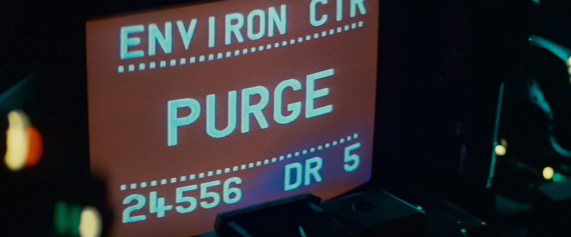
This ENVIRON CTR PURGE display is identical to the one we saw in Alien, just before the Nostromo exploded :

As if that wasn’t enough self-plagiarism, Ridley Scott also steals a second display from his earlier sci-fi masterpiece:

…which the more observant of you may recognize as Alien’s shuttle disconnect sequence:

Perhaps most importantly of all, however, Gaff’s Spinner features Blade Runner’s only reported instance of Eurostile Bold Extended, brought to you by the letters C, A, U, T, I, O, and N:
…and the number 44:

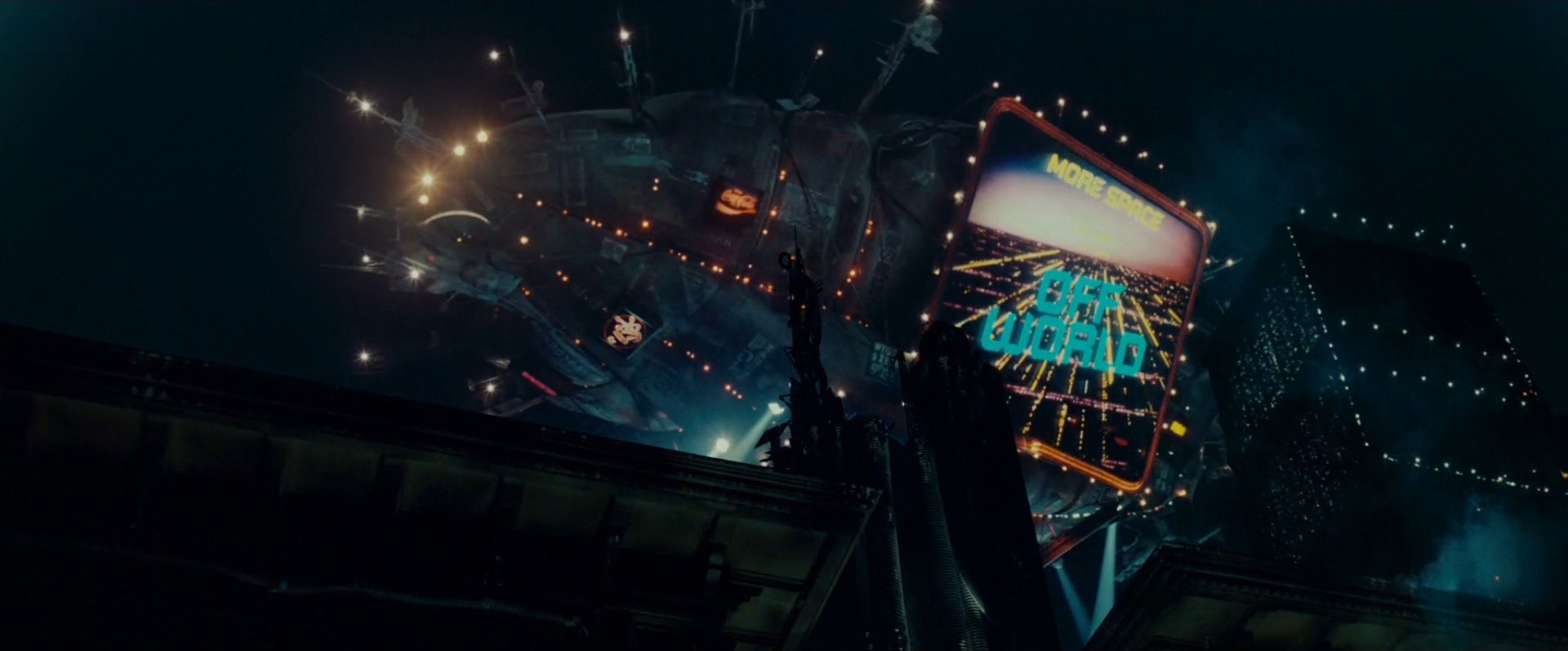
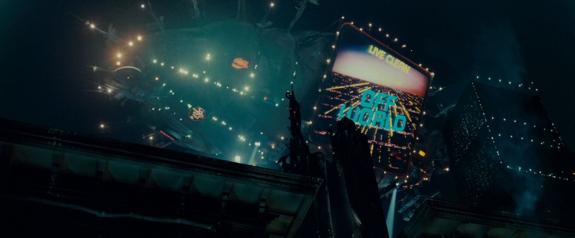
As the Spinner ascends into the LA rain, we see a particularly unusual piece of product placement behind it:

This is indeed a neon advertisement for popular American food processor manufacturer Cuisinart. Based on the shape of the food processor’s base, and its bottom-right neon-cyan rectangle, the robotic-looking icon you see here could well be the Cuisinart® Pro Classic™ Food Processor:

Cuisinart are far from the only 1980s company advertised in 2019’s Los Angeles cityscape, however. We once again meet American flag-carrier Pan Am, who in reality are just as defunct in 2019 as they were in 2001:

We also encounter popular carbonated sugar-water Coca-Cola:

…perennial halitosis-mitigator Dentyne:

…extra-terrestrial game manufacturer Atari:

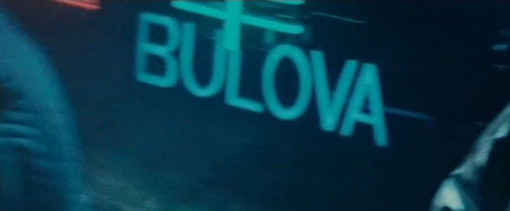
…regularly product-placed watch manufacturer Bulova:
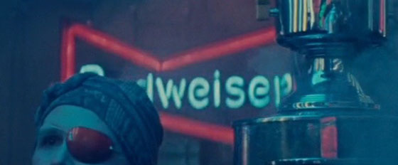
…alcoholic beverage brand Budweiser (no, not that one):
…and genius, irreverent, sexy mythical perfume brand Jōvan:

As Deckard and Gaff continue their flight through the Los Angeles skyscape, a technical-looking message tappity-taps itself onto a screen in Gaff’s Spinner. (Confusingly, this is a portrait CRT display – the landscape display we saw earlier is notable by its absence.)
This being Typeset In The Future, we are of course duty-bound to take a closer look at the on-screen text:

It’s a sign of my mis-spent youth that ALT / VEL / PTCH at the top of the screen immediately makes me think 1UP / HIGH SCORE / 2UP. However, the fuzzy text on the main body of the screen is even more interesting:

After spending an inordinate amount of time cropping, zooming, and enhancing these images, and squinting at them while holding Harrison Ford upside down, I have a theory as to what they mean. Here’s my rough transcription (with “xxxx” meaning “I really haven’t the foggiest”):
MICROPROCESSOR BASED ELECTRONICS PROVE
OUR SYSTEM DOES WHAT NO OTHER INS
TRUMENT CAN DO- IT PRODUCES INSTANT, ON
THE SPOT RESULTS WITH xxxxx xxxx FILM,
xxxx COLOR TRANSPARENCIES FOR BACKLITE
DISPLAYS AND OVER HEAD PROJECTION, 35MM
COLOR SLIDES. 40 IMAGE CLASS MICRO
RELATED AND SEQUENTIAL IMAGES CAN BE RE
CORDED IN ORDERLY ARRAYS, ON A SINGLE
SHEET OF xxxx INSTANT PRINT FILM. THE
It sounds like this text is describing an instant camera / image recording system, in the kind of terminology you’d find in an advertising brochure or user guide. (If any experts in microprocessor based electronics or color transparencies for backlite displays are reading this article, your insight would be gratefully appreciated.)
UPDATE: Thanks to some amazing detective work by Simon Flummox and David Large in the comments below, we now know that this text is adapted from a 1980s advert for the Matrix Color Graphic Camera System by Matrix Instruments. David found the ad in Datamation magazine Vol 26 No. 1 (January 1980):
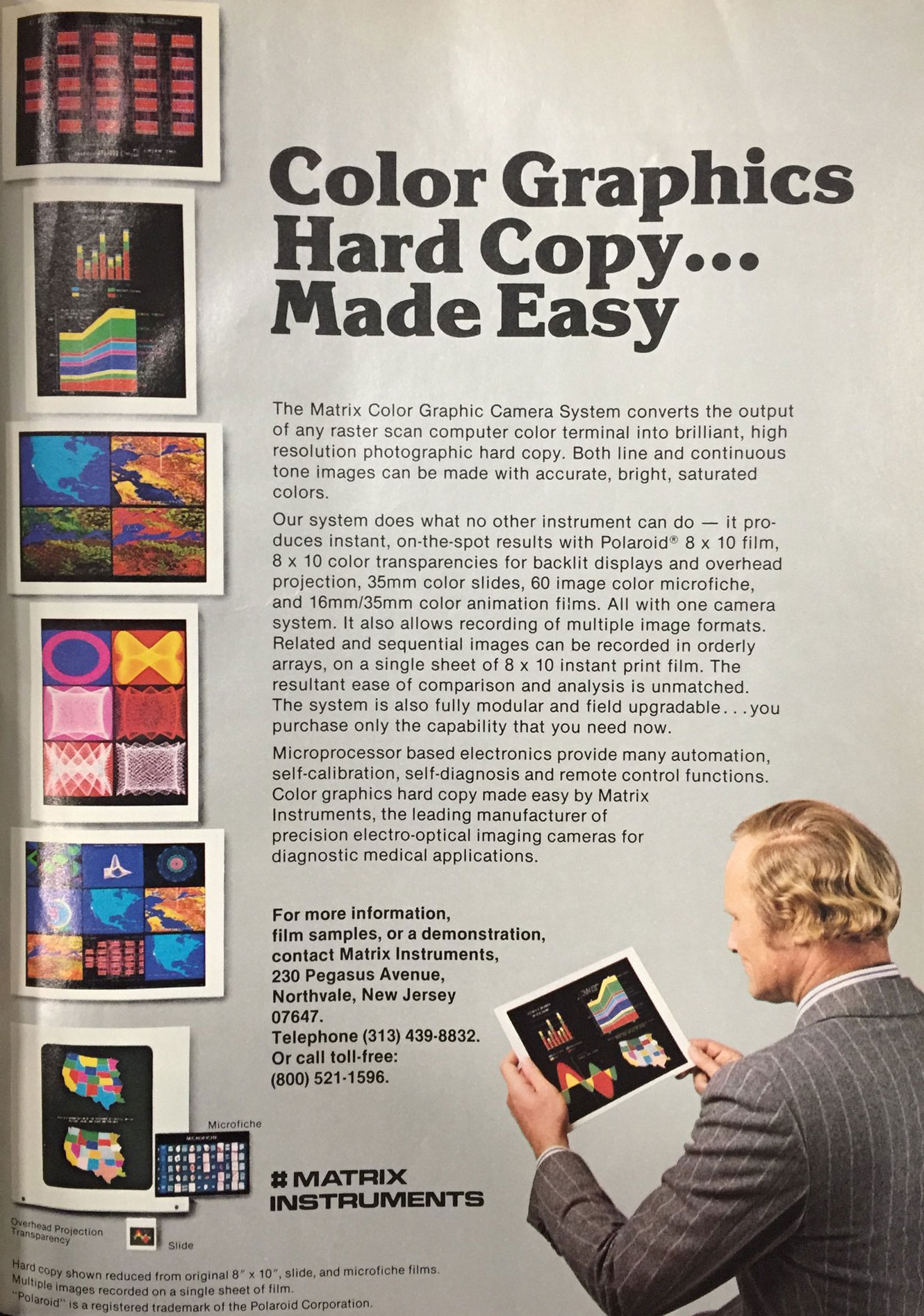
The full text is a chopped-up amalgam of several parts of the advert above:
MICROPROCESSOR BASED ELECTRONICS PROVI
OUR SYSTEM DOES WHAT NO OTHER INS
TRUMENT CAN DO- IT PRODUCES INSTANT, ON
THE SPOT RESULTS WITH xxxxx 8x10 FILM,
8x10 COLOR TRANSPARENCIES FOR BACKLITE
DISPLAYS AND OVER HEAD PROJECTION, 35MM
COLOR SLIDES, 60 IMAGE xxxxx MICRO
RELATED AND SEQUENTIAL IMAGES CAN BE RE
CORDED IN ORDERLY ARRAYS, ON A SINGLE
SHEET OF 8x10 INSTANT PRINT FILM. THE
The two remaining “xxxxx” words don’t look to match the advert, so I’m not taking a chance. Great work, Simon and David!
Oh, and one final aside: is anyone surprised by the font Matrix Instruments chose for their company logo?
Gaff’s Spinner journey also introduces us to a recurring piece of typography from the movie’s backdrop. The Blade Runner production team re-used city background scenery in different configurations throughout the movie, which is why the glowing NUYOK sign seen here…

…is remarkably similar to the glowing sign for the YUKON hotel seen thirteen minutes later (also known as the temporary home of replicants Leon and Zhora):

Shortly after this revelation, the Spinner lands at an LAPD station:

…which turns out to be a smoke-filled version of LA’s real-world Union Station (for trains, not policemen):

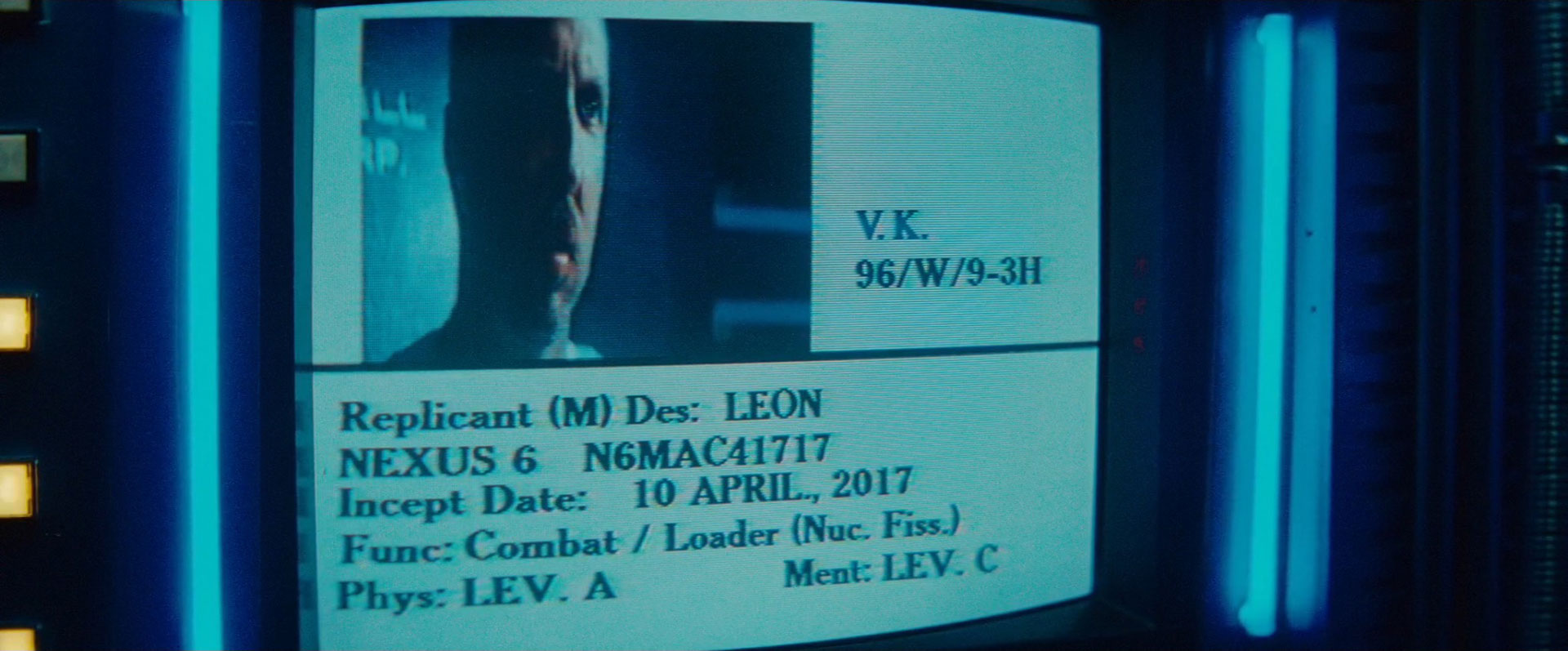
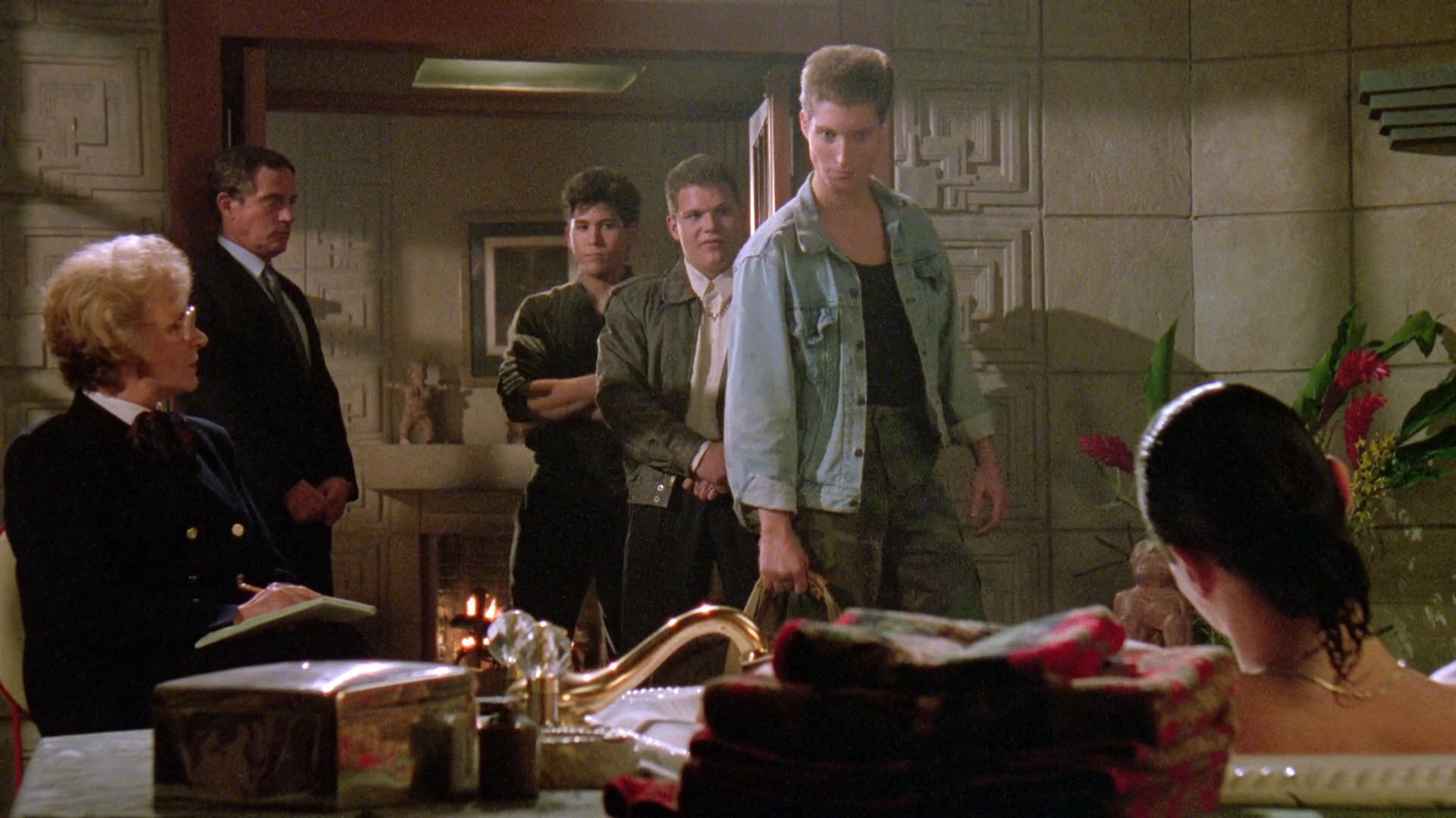
Here, Deckard is briefed by Harry Bryant, captain of the LAPD’s Rep-Detect department, about the replicants he is meant to retire. We’re presented with the serial numbers and details of all four replicants, starting with Leon, who we discover is a combat replicant and nuclear fission loader:
(I really want this typeface to be Caslon, but despite everything else matching nicely, the top of the 6 is just wrong. I can only apologize for the discrepancy.)
UPDATE: Several folks have noted in the comments that this looks a lot like Cheltenham, and I think they are correct.
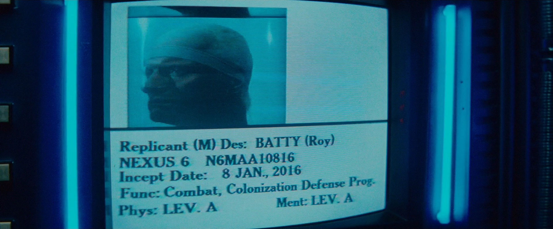
Next up we meet Roy Batty, the Head Replicant in Blade Runner. We learn that Roy is trained in combat for the colonization defense program, and is a general all-round badass:
Roy is followed by Zhora, who someone at the Tyrell Corporation decided it would be a great idea to retrain in Political Homicide:

Finally we meet Pris, who unifies the sadly-not-as-disparate-as-one-might-hope disciplines of Military and Leisure (and was incepted on the same day as the end of the world):

On the surface of it, the serial numbers of these replicants look easy to decode. The format seems to be:
[N6 for Nexus 6][Gender][Physical][Mental][Month][Day][Year]
For example, Pris’s serial of N6FAB21416 corresponds to:
[N6][Female][LEV. A][LEV. B][FEB][14][2016]
On closer inspection, however, these serial number contains several typographic oddities. I’ll use the Date Field Symbol Table from the Unicode Locale Data Markup Language to avoid any confusion in the following sections. (If only the makers of Blade Runner had done the same, eh readers?)
The first anomaly is the use of an American date format of [Mddyy] in the serial number, but a British date format of [d MMM., y] for the Incept Date. Surely a serial number, of all things, would benefit from placing year before month, for chronological sorting of SKUs? Even if not, the inconsistency between the two is disappointing, especially for a movie so clearly set in America.
Secondly, why use a single digit for Month? We know that Day is zero-padded, at least going by Roy’s serial number. The lack of comparative zero-padding for Month means that any replicant incepted in October through December will have an 11-character serial, and not a 10-character serial like their colleagues.
Thirdly, and most importantly, the date section of Leon’s serial number is just plain wrong. He’s listed with a serial number date section of 41717, and yet he was incepted on 41017:
Honestly, folks: these are the kinds of details that make or break a movie. Despite the fact that Ridley Scott’s Final Cut of Blade Runner rectified many on-screen glitches, I am sad to report that this typographic error is still awaiting correction.
Following his briefing on the target Replicants, Deckard drives back to his apartment through the crappy LA weather. Indeed, it’s hard to recognize the Los Angeles of November 2019 through Blade Runner’s incessant rain, especially given that it didn’t rain there at all during November 2015. Nonetheless, the city’s residents have found a way to work around the combined smog and rain with ingenious umbrellas, whose handles are fluorescent tubes:

Given the constant rain, it’s surprising that Deckard doesn’t bother to use his Spinner’s windscreen wiper during the drive back to his apartment:

The design of Deckard’s apartment is both classic and oppressive, with its instantly recognizable concrete tiled walling…

…and an impressive balcony overlooking the city:

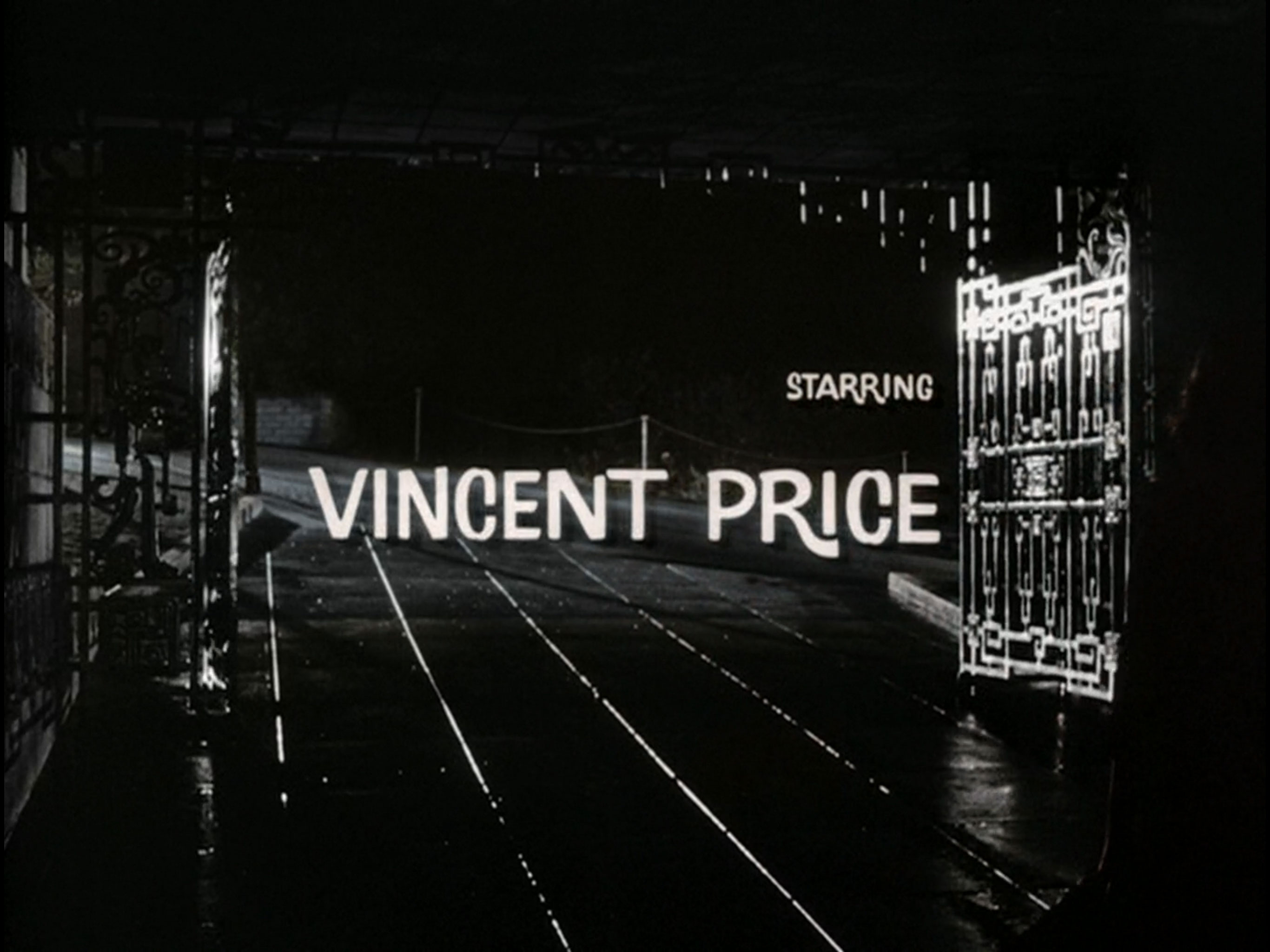
Like so many of the movie’s locations, Deckard’s apartment is based on a real-world LA landmark – in this case, the Ennis House, built in 1924, and designed by famous American architect Frank Lloyd Wright:

The Ennis House hasn’t just appeared in Blade Runner, however. You may also recognize it as the exterior location for 1959’s Vincent Price low-budget horror classic House On Haunted Hill…

…as the abandoned mansion where Angel, Spike, and Drusilla hang out in Buffy the Vampire Slayer episode I Only Have Eyes For You…

…as a variety of locations from Black Rain, The Glimmer Man, The Replacement Killers, Rush Hour, The Thirteenth Floor, The Rocketeer, Mulholland Drive, and Twin Peaks (according to Wikipedia)…
…and as a villain’s hideout in The Karate Kid, Part III:
Perhaps most famously, however, Deckard’s apartment is the setting for Ricky Martin’s top pop country classic Vuelve:
In fact, let’s take a quick 4m45sec tour of the Ennis House, while an overly-coiffured gentleman warbles at us in Spanish:
Thank you, Ricky, for that beautifully melodic introduction to Mayan Revival architecture.
The repeating interior design of Deckard’s apartment is lifted directly from the Ennis House, and is based on the 27,000 concrete blocks that make up the house’s interior and exterior (as seen on this 1969 elevation):

These concrete blocks have weathered somewhat over the years. Many have been patched up or restored to reinstate the original geometric pattern, as can be seen from the present-day building’s exterior:

There’s surprisingly little of the actual Ennis House in Blade Runner, however. The only two shots of the original house I’ve identified are the Spinner’s on-road approach to the apartment complex:

…which looks like a matte painting superimposed over the top of the house’s front wall:

…and the Spinner’s arrival through the apartment gates:
…which looks mighty familiar from House On Haunted Hill:
The rest of Deckard’s apartment was created from scratch on a sound stage, using replicas of those Mayan concrete bricks with substantially lower and more oppressive ceilings than the original.
If you’d like to explore Deckard’s apartment in more detail, I highly recommend Quentin Lengelé’s Blade Runner 9732, which is an ambitious project to build a realistic 3D recreation of the apartment for exploration with VR systems such as Oculus. Check out this rather beautiful video as a teaser of the final thing:
The level of attention to detail in this video is something we at TITF are more than happy to endorse.
After a brief encounter with Rachael, Deckard is left studying one of her childhood photos. The photo shows a young Rachael sat on the porch of a stereotypical American house:

This is eerily reminiscent of a photo from Deckard’s own collection, seen later in the movie in a frame on his piano:

How strange! I’m sure it won’t turn out to be significant.
During a close-up, we see Rachael’s photo come to life, in a way that reminds me of something I can’t quite put my finger on:

Following some initial confusion about this unexpectedly animated memory, I decided to check in with Blade Runner’s literary origin. It turns out Philip K Dick decided that all photographs in 2019 are holographic, which goes at least some way towards explaining Blade Runner’s brief animated GIF interlude.
Having studied Rachael’s photo in detail, Deckard next leafs through the photographs he collected from Leon’s hotel room:

When Blade Runner was made, there was an obvious and popular way to add arbitrary text to everyday objects such as the photos above. Regardless of whether you were an amateur or a professional designer, your lettering solution of choice would have been Letraset dry transfer:

This fantastic rub-on lettering gave a simple (if slightly imprecise) way to add text to pretty much any surface, and it’s the option that Blade Runner’s design team chose for Leon’s photographs.
However, there’s something… odd about the technical-sounding codes on the edges of Leon’s photos. Let’s take a closer look at their wording:

“HELCLN/IUM”? “VETICA MED/CLN”? Hmm. That sounds… familiar, somehow.
Let’s look again at our Letraset sheet from before, but rather than studying the body of the sheet, we’ll focus on the header and footer instead:

I thought that text sounded familiar:

HELCLN/IUM pt47
VETICA MED/CLN pt47
If I didn’t know better, I’d suggest that someone in the Blade Runner production department had a used sheet of Letraset hanging around, and didn’t want the leftovers going to waste.
In the time that we’ve been distracted by dry transfer lettering, replicant Pris (played by Daryl Hannah) has arrived at a building called “The Bradbury”, in an attempt to win over Tyrell Corporation genetic designer J. F. Sebastian:

J. F. Sebastian’s otherwise-uninhabited apartment is based on the iconic Bradbury Building in downtown LA:

The highly decorative future noir frontage seen in Blade Runner is sadly not the building’s real entrance:

…although it does feature some very lovely Berthold Block Heavy:

The real entrance to the Bradbury has more of an Art Nouveau style to it, and was designed so long ago that the type is probably custom:

The Bradbury’s interior is a beautiful, wrought iron representation of Future LA abandoned industrial chic:

You might recognize this metalwork from the similarly apocalyptic (500) Days Of Summer, in which Joseph Gordon-Levitt fawns incessantly over Zooey Deschanel’s manic pixie dream girl:

You might also recognize it from Oscar-winning 1920s throwback The Artist:

These are by no means the building’s only claims to fame, however. One of the side-effects of being a beautiful building within driving distance of Hollywood is that you get to appear in really quite a lot of movies and TV shows. This is one of the reasons why I know that when J.F. puts his key into the slot to call the Bradbury’s elevator:
…he’s actually sticking his hand into the mailbox at the bottom of the Bradbury’s mail chute.
Directly opposite the Bradbury Building is the Million Dollar Theatre, which exists in real life LA as a real life theatre located directly opposite the Bradbury Building:

Here’s a clearer shot of the theatre’s sign, from later in the movie:

I have not been able to confirm that Blade Runner inadvertently promoted a 1980s gig by Peruvian indie-alternative band Los Mimilocos Mazacote y Orquesta, but I sincerely hope that it did. (I also hope they played a double bill with famous Mexican crooner Gilberto Valenzuela.)
Back in the Bradbury building, we briefly glimpse a blimp through the building’s beautiful roof, with yet more Coca-Cola promotion on its underside:
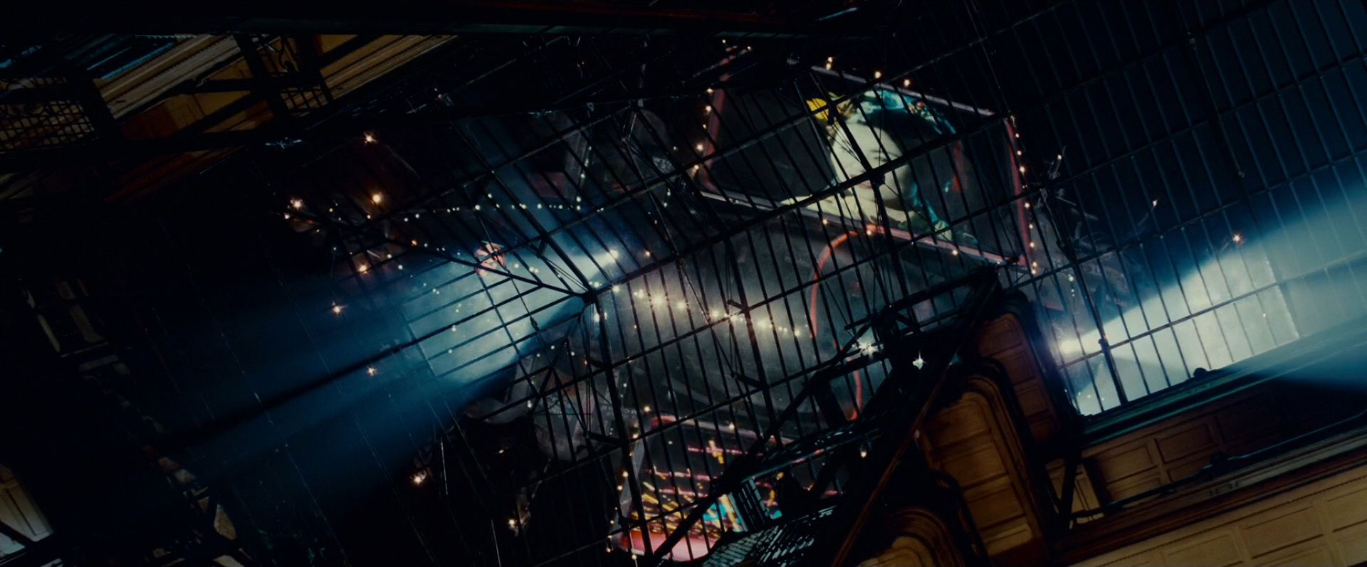
This flying advertisement is for the multi-national “Shimago-Domínguez Corporation”, who are surely continuing the international collaboration and all-round good work started by the Weyland-Yutani Corporation (a British / Japanese conglomerate) from Alien, and Lunar Industries Ltd. (a US / Korean mining partnership) from Moon.
This blimp is introduced with different voiceovers in the different versions of Blade Runner, but if you mix them all together, this is the message you get:
A new life awaits you in the Off-World colonies. The chance to begin again in a golden land of opportunity and adventure. New climate, recreational facilities, easy advancement, great pay. Plus, a loyal trouble-free companion, given to you on arrival, absolutely free. Use your new friend as a personal body servant, or a tireless field hand. The custom tailored genetically engineered humanoid replicant, designed especially for your needs.
I don’t know about you, but using a Replicant as a “personal body servant” or a “tireless field hand” sounds a liiiiiittle bit like out-and-out slavery to me. (It also makes it hard to blame Roy and company for rebelling.)
This Shimago-Domínguez advertisement is also eerily reminiscent of WALL·E’s Buy n Large infomercials:
Too much garbage in your face? There’s plenty of space, out in space! […] Spend your five year cruise in style, waited on twenty-four hours a day by our fully-automated crew, while your captain and autopilot chart a course for non-stop entertainment.
In addition to promoting slavery and advertising Coca-Cola, the blimp continues its WALL·E theme with soothing, encouraging platitudes to encourage off-world migration:

With that kind of encouragement, who wouldn’t want to conquer the new world, eh?
Back in his apartment, Deckard plays an A on his piano, while Vangelis plays an A♭:
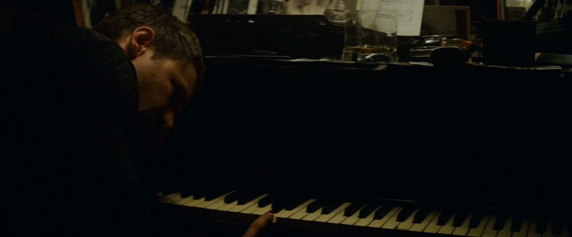
It’s no wonder that Deckard is keeping his piano-playing simple – the sheet music on his piano is actually scored for guitar:
Update: In the comments below, the fantastically-named Not A Walrus Today has correctly identified this music as the second movement of Vivaldi‘s Lute Concerto in D Major.
After his ineffectual piano playing, Deckard decides that it’s time to study Leon’s photographs in more detail. In doing so, Blade Runner gives us perhaps the Ur Example of popular crime trope the Enhance Button, via the suspiciously amazing ESPER Machine:

This chunky-looking gadget is a voice-controlled photographic enhancer with an almost supernatural ability to follow its controller’s verbal instructions. When Deckard inserts Leon’s photo into the ESPER and asks it to enhance 224 to 176, it diligently enhances 197 to 334 as requested:

Deckard continues to direct the ESPER to navigate around his blurry, out-of-focus photo. He asks it to enhance 34 to 36, and it obediently enhances 197 to 334 as instructed:

The ESPER zooms in further still, focusing on the mirror on the far wall of the next room. As image quality becomes more and more challenging due to distance, resolution, and the fundamental laws of physics, the ESPER’s enhancement algorithm automatically switches from “blurry VHS” to “high-quality film stock”:
Deckard asks the ESPER to enhance 34 to 46. It follows his instructions to the letter, enhancing 197 to 334:

At this point, things get kind of ridiculous. The ESPER Machine zooms so far into the mirror that we can see individual snake-skin pailettes on an item of clothing hanging on a wardrobe on the other side of a room, behind the wall we’re looking at:

After moving left a bit and right a bit and left a bit and right a bit, Deckard asks the ESPER Machine to enhance 15 to 23. True to its roots, it enhances 197 to 334:

The end result is a close-up photo of replicant Zhora, who is conveniently recognizable due to the large snake tattoo on her face:
I’m not going to lie: this whole scene is spectacularly geographically confusing. By my reckoning, the final photo above is a reflection in a mirror of a reflection in a mirror, although even then I’m not entirely sure.
To try and help, I’ve put together a precise map of how I think the apartment’s layout works, which will hopefully help us all make sense of what’s going on:

Indeed, things got so confusing at this point in the movie that I decided to make an painstakingly-edited recreation of the entire ESPER sequence, just to work out how far we crop, zoom, and enhance at each stage of the machine’s photo-processing. Here’s the entire thing, for your delight and delectation:
That’s right: by my calculations, that final photo of Zhora is a 667.9-times zoom in on the original photograph. It’s no wonder, then, that the image of Zhora that Deckard prints from the ESPER machine is a little bit grainy:

It’s also a completely different angle from the shot we see in the final frame of the ESPER:
Blade Runner is by no means the only example of cropping, zooming, and enhancing in popular media, however. Duncan Robson has kindly created an amazing edit of popular examples from across movie and TV, which I suggest is more than worth 1m43s of your time:
On his way to track down Zhora, Deckard makes a video call to Rachael on a handy “VID-PHŌN” booth at the bar. (The macron above the O draws out the vowel sound to make it sound like “phone”):

In a special guest appearance by OCR-A, we discover that the fictitious 555 area code is still going strong in 2019. (Strictly speaking, only the numbers 555-0100 through 555-0199 are reserved for fictitious use, but Blade Runner, like many other movies, merrily strays outside that range.)
It’s particularly interesting to note that the VID-PHŌN service is run by the Bell System group of companies (shown above using their redesigned Saul Bass logo from 1969). Bell System were also the people behind the PicturePhone video calling service we saw briefly in 2001: A Space Odyssey:
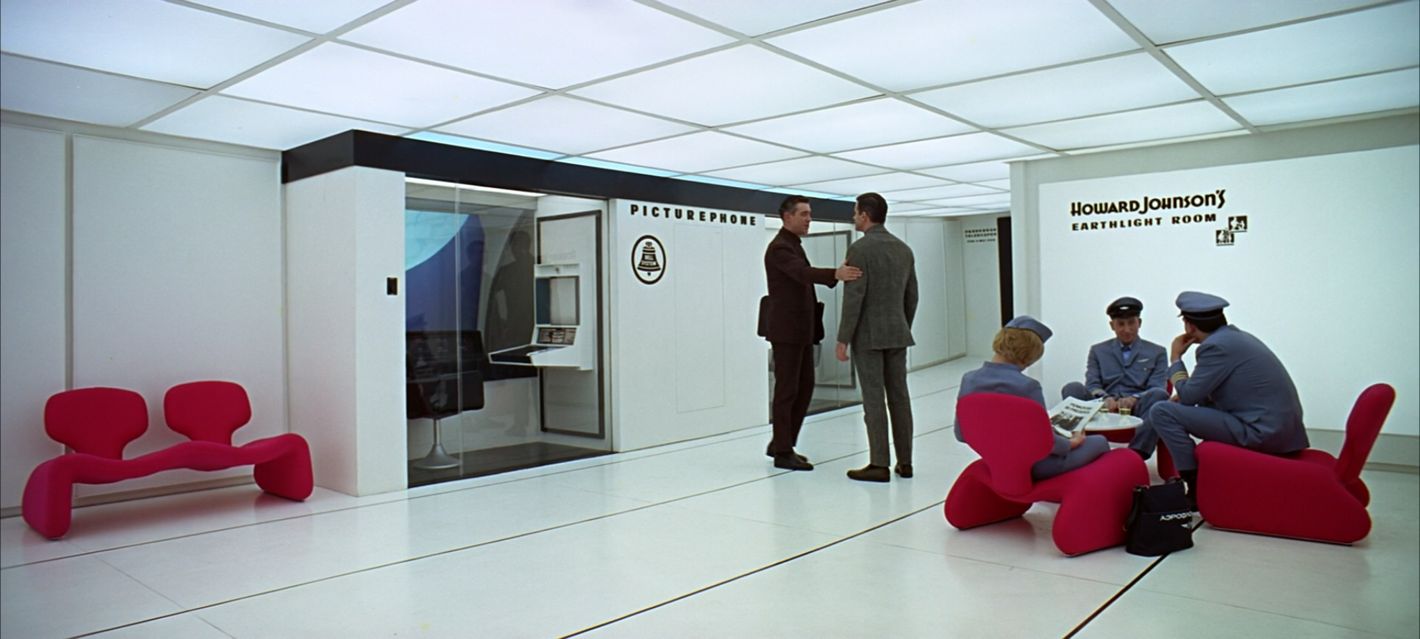
Given their recurring product placement, you might be asking yourself why Bell System have such a monopoly on video calls in science fiction movies. Well: it turns out that the PicturePhone was a real, working video calling service, from way before the days of Skype and FaceTime. In fact, in 1964, two Bell PicturePhone devices made the world’s first transcontinental video call, from Disneyland California to the New York World’s Fair, with remarkably good video quality for the time:

I’m sad to say that despite its technological advancements, the PicturePhone ultimately proved to be a commercial failure, losing Bell half a billion dollars in the process. Nonetheless, it cemented Bell as the de facto provider of futuristic phone calls in the psyche (and therefore the movies) of the 60s, 70s, and beyond.
Now: Dr Floyd’s PicturePhone call in 2001: A Space Odyssey cost $1.70 for a 90-second call. (This is substantially cheaper than the $9-a-minute that the PicturePhone cost when the system first launched.) By comparison, Deckard’s 30-second call to Rachael costs $1.25:
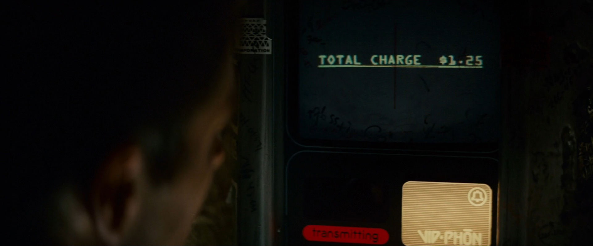
Let’s do the realism math here, to check that this holds up. The events of Blade Runner are set in 2019. Deckard’s 30-second, $1.25 call to Rachel works out at $2.50 a minute. This is substantially more expensive than the $1.33 per minute that Bell Systems charged Doctor Floyd in 2001. However, it’s only a 3.5% call cost increase per year over the intervening 18 years, so it is roughly in line with inflation. Never let it be said that Ridley Scott doesn’t sweat the details.
(The irony for both of these scenes? In 2016, just three years before Blade Runner takes place, a 30-second video call will cost you precisely zero dollars and zero cents per minute. Some things about the future really are hard to predict.)
Deckard tracks down Zhora, and a perhaps inevitable chase ensues. As Zhora exits Taffy’s Snake Pit Bar, she and Deckard run past a half-broken neon Schlitz sign:

This is remarkably similar to the half-broken neon Schlitz sign we see at a different bar when Deckard buys a drink a few minutes later:
Back in the Bradbury, we discover that J.F. Sebastian is in the middle of a chess game with Dr. Eldon Tyrell, head of the Tyrell Corporation:

Roy Batty recognizes the chess game as an opportunity to meet his maker, and gives J.F. some top chess tips to advance his cause. As Batty arrives at Tyrell’s office bedroom office bedroom with J.F., we see that Tyrell’s board features equally intricate figurines, although this time they are carvings of people:

Urban myth tells us that this game is based on the topically-named Immortal Game, as won by Adolf Anderssen against Lionel Kieseritzky in 1851. After a careful study of J.F. and Tyrell’s boards and dialogue, I can confirm that this is indeed the case. Here’s how the final few moves of the game play out, just as they did in 1851:

The Immortal Game is notable in that Anderssen defeated Kieseritzky despite sacrificing a bishop, both rooks, and his queen. By the time Batty meets Tyrell, he has already sacrificed Leon, Zhora, and two other Replicants in his quest to meet his maker.
Something something significant.
Batty finishes off J.F. and Tyrell, and heads towards the Bradbury for an Inevitable Showdown with Deckard. As the movie draws to its climax, Batty delivers his famous “tears in rain” monologue on a bleak, rain-soaked rooftop. This speech, improvised by Rutger Hauer during the scene’s filming, is universally acclaimed as one of the most moving death soliloquies in movie history. However, as a thing constructed solely from words coming out of a mouth, it is sadly typographically insignificant, and is therefore of zero interest to those of us here at Typeset In The Future.
This is in stark contrast to the neon TDK logo just over Rutger’s shoulder, which I think we can all admit is pretty damned spectacular:
![]()
There’s no way I can follow neon of that quality, so I’ll leave you all here with a heartfelt farewell. Until next time: goodnight!
(With thanks to @clamhead for the Mary Poppins, and to @kupfers, @marcrouault, and @timmountford for identifying Berthold Block Heavy as the Bradbury entrance’s pseudofont.)
FUN FACT: An expanded version of this article appears in the Typeset in the Future book, available on December 11 2018. You can pre-order it now on Amazon.

Yeeeeha, a happy day!!!
And a happy day starts with a “typeset in the future”-article. (Once or twice a year… 🙂
LikeLiked by 3 people
* Vint (Vinton) Cerf
LikeLike
Thanks – fixed!
LikeLiked by 2 people
I’m pretty sure the Ennis house was also used in one of the the Predator films, which might be vaguely relevant to this blog as aliens only exist in the future.
LikeLiked by 1 person
Predator 2 has scenes set in a reconstruction of the interior of the Ennis House. Predator 2 was set in 1997 but it was made in 1990. Although a near future it was set in a future.
The predator films repeatedly feature a script like cuneiform as motif and as a plot point.
LikeLiked by 1 person
Fab article as ever. I loved the ESPER recreation you did – above and beyond the call of duty!
LikeLiked by 3 people
Great details here (and not all of them typographic)! I was surprised, however, to not see some analysis/comment on the “so-futuristic-it-is-nearly-illegible” typeface used for the spinner’s id number (and “POLICE” above it).
LikeLiked by 1 person
Seriously!
LikeLiked by 1 person
The so-called plagiarism from Alien to Blade Runner doesn’t quite deserve that title. Same production team, and same graphics guy. I once worked briefly with a fellow called Anthony Gambier-Parry, who told me all about it and showed me drawings he had from that time. I can’t quite recall whether he had done the graphics himself (I think he did) as this was 20 years ago now.
LikeLiked by 1 person
Dave, this is literally the best thing on the Internet, ever. A new TITF article always makes my week!
LikeLiked by 1 person
Consistently high quality sass.
LikeLiked by 1 person
Excellent work as always, Dave.
A couple of observations… The font on the replicant info screens during Decker’s briefing always struck me as a lo-res Cheltenham Bold. Also, Eurostile was used on the logo of one of the prop magazines in the movie—MONI magazine. Not sure how visible it is in the movie, but I’ve seen it in “making-of” articles about Blade Runner.
LikeLiked by 2 people
The font for the replicant descriptions is Cheltenham (one of the older versions, not the ITC update). You can tell from the distinctive low x-height. It’s possible they took the condensed version and stretched horizontally (thus producing the relatively strong thick-thin vertical-horizontal bits). The numerals form a decent match.
LikeLiked by 2 people
The stretching also looks like the faux-bold you get in certain digital systems when there’s no actual bold cut available.
LikeLiked by 1 person
About the ESPER… I suppose the nigh-magical properties of the device come from some aspect of the supposedly holographic photos of the future: more than just 2D projections of a 3D space, they seem to be more akin to “full 3D scans in very high resolution” of an entire environment.
This way, the ESPER is literally “walking back and forth” inside the data of the photo. As shown in the Blade Runner adventure videogame, you would be able to even change the angle INSIDE the picture, potentially even seeing the wall behind the place of the camera.
Video:
LikeLiked by 1 person
Apparently light field photography will advance significantly over the next few years! No joke, theoretically you could look at light from around a corner, using this technique. I never thought of the moving picture of Rachel as being anything more than a fantastical element of the film, but when looking at it in conjunction to the further thought you’ve offered about the ESPER… Holy crap, I think we have an answer! Apple will add light field photography to Live Photos in iOS 12!
LikeLiked by 2 people
By bizarre coincidence I happened to watch this TED talk yesterday, with researchers at MIT photographing around corners!
LikeLike
fwiw (i.e. not typographical) in “Avatar” (and I think at least one other film) when viewing the film in 3D (with glasses) it’s notable that all of the photos visible (fridges, lockers) are also in 3D and change perspective as the camera moves through the scene.
LikeLike
I spent minutes trying to figure out why you had what looked like Ron Jeremy as the pawn for your chess game GIF. It wasn’t till I said it out loud that I got it.
LikeLiked by 2 people
555 area code or is it a 555 exchange? Confusing with only 7 digits displayed. Another future blunder perhaps?
LikeLiked by 1 person
Not sure why you refer to the eye effect as a “photographic bugbear” since it was entirely intentional for the Replicants’ eyes. http://www.theasc.com/magazine/mar99/blade/pg2.htm
LikeLiked by 2 people
Whoosh!
LikeLiked by 5 people
Exactly!
LikeLiked by 1 person
YES red glowing eyes were intentionsl, because of Jul Brinner in Westworld, and YES Deckard was a replicant!! everybody knows it, except the author of this post :O
LikeLiked by 1 person
Damn. I was scanning through the comments to see if anyone else had posted this as I was just about to.
LikeLiked by 1 person
Interesting. Though I note with disappointment that the typography of the blimp’s signs (MORE SPACE! ALL NEW!), nor indeed that of the ESPER machine itself, is specified.
LikeLiked by 1 person
Sadly I couldn’t identify the blimp font or ESPER on-screen font, so I didn’t call them out. Any suggestions? (And the ESPER logo is a custom design for the movie.)
LikeLiked by 1 person
Thanks for the best Blade Runner article I can ever remember having read! I can’t believe you left out the covers of the magazines that are shown in Blade Runner! Great stuff!
LikeLiked by 1 person
Link for the unfamiliar: http://sciencefiction.tumblr.com/post/23608072333/these-are-fictional-magazine-covers-from-blade
LikeLiked by 1 person
I shrank these down for a diorama I built featuring Deckard’s sedan….check it out here…. https://www.facebook.com/185693711496013/photos/a.469921223073259.110149.185693711496013/487497094649005/?type=3&theater
LikeLiked by 1 person
I bet the word before “COLOR” In the hard to read first screen is “SOLID”.
solid color transparencies for backlite…
LikeLiked by 1 person
This made me chuckle but so awesome!!
LikeLiked by 1 person
Just going to second the commenter above — “555” is the exchange, not the area code.
LikeLiked by 1 person
Quite literally the greatest article on BR I have ever read. I didn’t even know of the chess game. I agree that a light field image probably would allow even more lateral shift at +600% zoom. And a light field image would also allow Lister in Red Dwarf to uncrop his street photo!
LikeLiked by 1 person
I work in the U.S. military-research-industrial complex, and l see the (day-number month-name year-number) date format pretty often, so it doesn’t seem strange that the replicant incept dates are in that format. That’s not the same as (day-number month-number year-number), which really would be a “British” format.
It is slightly strange that “JUNE.” and “APRIL.” have periods even though the month names are not abbreviated.
LikeLiked by 1 person
Your commendation for services to Geekera Obscura is in the mail-bot.
LikeLiked by 1 person
Fantastic, once again. And, indeed, Deckard is definitely-not-a-replicant
http://bestforfilm.com/film-blog/deckard-is-not-a-bloody-replicant-blade-runner-1982-a-defence/
LikeLiked by 1 person
Isn’t the text displayed on the screen in Gaff’s Spinner actually a commercial for ESPER seen later in the movie?
LikeLiked by 1 person
The Cuisinart depicted is, I believe, the DLC-8.
LikeLiked by 1 person
Your recreation and analysis of the Esper machine sequence is really great. What has always bothered me though is: Why would Deckard need to analyse a photo and print a crop of it to get a half decent picture of Zhora since we know from the briefing with Bryant scene that he has access to a nice 360 turnaround view of Zhora’s face?
LikeLiked by 1 person
Oh – that is a *very* good question!
LikeLike
I don’t think Bryant’s video shows the tattoo.
LikeLike
Ah, yes. And it’s only when she showers at the club that the tattoo is revealed, confirming her identity.
LikeLike
As a Philip K. Dick fan, enjoyed this immensely. Loved your detailed rendering of just the typographical part of the classic film. Fonts for me are restricted to Calibri, New Times Roman, Comic sans (no thanks to Microsoft Word). Did not know about the esoteric realms of these other exotic fonts.
LikeLiked by 1 person
One note: Deckard’s car is not a spinner. Spinners fly.
LikeLiked by 1 person
They also have wheels, though…
LikeLike
He’s right though, Deckards car was always refered to as the Sedan during production.
LikeLiked by 1 person
I believe that I recall from Starlog or a similar magazine at the time (and this site confirms it) that Deckard’s sedan is an older model spinner, no longer flightworthy.
LikeLiked by 1 person
His sedan is actually a decomissioned Spinner with the flight capability removed….
LikeLike
I know this as I built one last year….. https://www.facebook.com/185693711496013/photos/a.469921223073259.110149.185693711496013/949281331803910/?type=3&theater
LikeLike
This made my day. Or week. Or month.
LikeLiked by 1 person
The Ennis house appears in Twin Peaks, but not in the show itself but in the soap opera some characters watch called “Invitation to Love.”
LikeLiked by 1 person
Good fact!
LikeLiked by 1 person
Just a brag: I attended a lecture many years ago sponsored by Brown University (my dad is an alumni) on the history of architecture in film, and we were treated to the Blade Runner Ennis house scenes while we were watching it projected on a screen IN the Ennis house. It was one of the the coolest life imitates art imitating life moments I’ve ever had or probably ever will.
LikeLike
Fascinating article. Such meticulous research.
LikeLiked by 1 person
Sure seems like the giveaway presence of the red eyes would have obviated the need for the Voight-Kamff test.
LikeLiked by 2 people
Hah! That is a *very* good point 😊
LikeLike
I suppose if they were actually viewing the subject’s eyes in the VK, they’d catch on eventually.
LikeLike
BTW, the “piano” music is indeed guitar music. Specifically, the slow movement of the Vivaldi Guitar Concerto in D Major RV 93…..
LikeLiked by 1 person
Wow – excellent identification work!
LikeLike
About the eyes:
What you call red eye is by no means a mistake. They actually went through great lengths to make it. Rather than a simple red eye reflection from a flash the effect is similar to one achieved by a ring light often used on music videos. But to avoid the ugly flat key light such a light gives, the gaffer constructed a huge reflective disk and bounced a light into it INTENTIONALLY to give the round reflection in the eyes. The reason may be to indicate that they are replicants – or rather suggest it. Because if it was a sure giveaway then one might argue that they would not need the Voight-Kampff machine in the first place.
That Dechard seem to have it in the half blurry image you point out, may be a hint that he might in fact himself be a replicant – something suggested extensively in the book.
As a side note IMO and many gaffers and cinematographers eyes this is one of the most beautifully lit movies of all times. So in short definitely not a mistake- go search cinematography forums and see how people discuss how to replicate it. The close up and the color change of the eyes – as you point out, yes that is another story 🙂
LikeLiked by 1 person
WHOOSH!
Reread the relevant section and engage your sense of humour this time.
“Given the otherwise incredible realism of the (entirely animatronic) replicant “actors” in the movie, it’s unfortunate that the producers couldn’t find a way to work around such a simple photographic bugbear.”
“How strange! I’m sure it won’t turn out to be significant.”
LikeLike
Aw, no X-Files for the “enhance” vid (which was great btw)?! They did that shoit quite a few times!
LikeLiked by 1 person
“My favorite aspects of this opening crawl, however, are the arbitrary examples of Mid-Sentence Capitalized Words”. The only ones I could spot were “Off-world” and “21st Century”. The latter usage can be found elsewhere. The former… well, in the early days of electronic mail (say what?) many people used to abbreviate it as Email or EMail. So its possible that this is a “New Term” which is just coming into everyday usage, and hence capitalised to stand out?
LikeLiked by 1 person
Hi. what you called ‘ bad case of the red-eye’ is actually an intended feature that let the public know they are replicants and not human.
LikeLiked by 1 person
As someone who has WAY too much time on their hands getting down in the weeds while seeking the title of King of the Nitpickers I’ll offer you a bit of nitpicking. The 555 would not be the area code. In the US the first 3 numbers of a 10 digit phone number is the area code. The first 3 numbers of a 7 digit phone number is a prefix.
https://en.wikipedia.org/wiki/Telephone_number
Now I am not trying to gain any nitpicking tile so keep that in mind before you try try dissect my post. You however have gone so far afield criticizing others for missteps on their films perhaps you should check yourself first. Or perhaps realize that if you made a mistake in a 5,000 word post that others humans will make far more in a work, such as a film, which took many, many more man hours to complete.
LikeLiked by 1 person
My first time here and I bow to your spectacular efforts, my friend. Looking forward to more of these. Cheers
LikeLiked by 1 person
This was absolutely a joyful read. Thanks for the thought, depth, and work. I was just reading another article from Slate about how many of us don’t take the time to read a whole article. What a miss for those who don’t read all of this one. Of course, one might have to really like the movie, which I did–director’s cut.
LikeLiked by 1 person
I meant to add:
Reading what someone said above about red-eye–did I miss something? Was Decker an unsuspecting replicant? Is that why he also had the same photo as Rachel? I may have picked this up years ago, but I don’t recall now.
LikeLiked by 1 person
There has been ENDLESS debate about whether Deckard himself is a replicant. The theatrical cut leaves it ambiguous, but later cuts of the film seem to be pretty clear than he is.
LikeLiked by 1 person
Have you or has anyone else read the book? I just might have to pick it up as well as watch the film again.
LikeLike
My favorite detail: LA Eyeworks as the eye store: http://laeyeworks.typepad.com/photos/laeyeworks_gets_exposed/bladerunner_eyestore.html
LikeLiked by 1 person
Dave, you get a gold star for at least 2 pieces of your detective work here: (1) the ESPER Machine, because that scene dogged me for years, playing it over & over each time I watched the movie, and now I can die happily; and (2) your deciphering the “technical-looking message tappity-taps itself onto a screen in Gaff’s Spinner,” because I’m not going to be able to sleep until I figure out the xxx’s (the xxxxx in “WITH xxxxx xxxx FILM” looks like it might be “blank?”) –joe
LikeLiked by 1 person
Day/Month/Year is also the format used by the US military, so it’s a reasonable choice for a file presumably pulled from their military records.
LikeLiked by 1 person
Tom Southwell’s main source of inspiration for the POLICE 995 font was a typeface from a Groucho Marx album. https://www.discogs.com/Groucho-Marx-An-Evening-With-Groucho/release/2341161
LikeLiked by 1 person
Wow, very cool! A little Googling found some further details from the man himself. It is indeed a shame that hand lettering is a dying art…
LikeLike
This post made my day. I love the OCDiligence. Thank you!
LikeLiked by 1 person
Reblogged this on aaronswickard and commented:
All my nerd friends shalt surely like this.
LikeLiked by 1 person
Hate to say it, but you missed:
– The POLICE and 44 on the spinner door
– The white dragon noodle bar logo
– Taffy’s (on the line) logo
– the information booth at union station
– METROKAB
– Eye World
Besides that…. I LOVE YOUR BLOG!!! Its amazing and makes my day every time. + Thanks for that amazing map and video mapping % of zoom of the photograph Deckard inserts into the Esper. I know the math is a disaster in that scene its hilarious that it only has one zoom number sequence! Ditto on NOT giving Ridley a pass on the green eyes since it was SO easy to fix!
(oh, OCR-A, how I love thee, let me count the ways…)
LikeLiked by 2 people
Re “Secondly, why use a single digit for Month?”
Maybe (who knows?) they were using A for October, B for November and C for December?
LikeLiked by 1 person
Re “Secondly, why use a single digit for Month?”
Maybe they are using “A” for October, “B” for November and “C” for December?
LikeLiked by 1 person
Cracking read.

However I was surprised at no mention of the hair follicle encircling text the on the replicant snake scale. Apparently its the maker number.
I make out the letters:
Something- 10.07%B4 -Something.
BTW, the Ennis house turned up in season two of True Detective, but not until around episode five, by which time most people had stopped watching. Theres more discussion of the Ennis house in Hollywood here:
http://strangedaysinloss2.blogspot.com.au/2014/03/flw-ennis-house-and-hollywood-movies.html
LikeLiked by 1 person
Wow, The House on Haunted Hill connection blew me away. This post was a great read. Cheers Dave
LikeLiked by 1 person
Great Post! Strictly speaking a video call wouldn’t be free today. You’d have to factor in the cost of internet access certainly, if not the hardware. Though it’s true you’re not paying for the call directly. The Enhance montage is epic!
LikeLiked by 1 person
I’m more at the level of enthusiast than expert, but I think I located the source for at least part of the microprocessor/transparency text.
Mini-micro Systems, Volume 13. Cahners Publishing Company, 1980 (p. 192)
https://books.google.com/books?id=eJhPAAAAYAAJ
of any raster scan computer color terminal into brilliant, high
resolution photographic hard copy. Both line and continuous
tone images can be made with accurate, bright, saturated
colors.
Our system does what no other instrument can do – it pro-
duces instant, on-the-spot results with Polaroid 8 x 10 film,
8 x 10 color transparencies for backlit displays and overhead
projection, 35mm color slides, 60 image color microfiche,
and 16mm/35mm color animation films. All with one camera
system. It also allows recording of multiple image formats.
Related and sequential images can be recorded in orderly
arrays, on a single sheet of 8 x 10 instant print film. The
LikeLiked by 1 person
WOW – great work, sir! I spent ages trying to work out what the “8×10” was – I didn’t think it might be numbers.
I will update the post presently. Thank you!
LikeLike
Thanks Dave, this is some fantastic work. building on Simon’s find, the portrait CRT in Gaff’s Spinner is reading (adapted) text from a 1980(ish) ad for Matrix Instruments’ Matrix Color Graphic Camera System, excerpted below:
“Our system does what no other instrument can do — it produces instant, on-the-spot result with Polaroid® 8×10 film, 8×10 color transparencies for backlit displays and overheard projection, 35MM color slides, 60 image color microfiche [….] Related and sequential images can be recorded in orderly arrays, on a single sheet of 8×10 instant print film. The resultant ease of comparison and analysis is unmatched. [….] Microprocessor-based electronics provide […]”
Obviously “Polaroid®” was swapped out for something else (I haven’t the foggiest either), but this helps fill some of the gaps.
I found the ad in Datamation Vol 26 No. 1 (January 1980), though it also appeared in similar trade and industry publications around the same time — Mini-Micro Systems among them.
LikeLike
Watching the recreation of the ESPER sequence, you can see that there’s a Joe Colombo “Elda” chair in the room with Zora. (starting at the 48s mark) I never noticed that before!
LikeLike
thanks for the excellent writeup, really enjoyed it!
The picture analysed by ESPER reminds me of https://en.wikipedia.org/wiki/Arnolfini_Portrait by Jan van Eyck. Especially the colors, the light coming from a window on the left and, crucially, the use of a mirror.
LikeLiked by 1 person
Fabulous work here, sir. I really need to watch the film again, with this on stand-by for reference!
LikeLiked by 1 person
I don’t know much about fonts, but that “Bradbury” looks like a cross between Hobo & copperplate narrow
LikeLiked by 1 person
Brilliant.
Scott revisited the Ennis House in his 1989 Black Rain. There`s actually another essay in there for you in regards to how similar the films are. I call it the Blade Runner prequel.
LikeLiked by 1 person
Thanks for this great article. I’ve been a fan of this film since ’82 and it takes a lot to impress me with Blade Runner writings, since I’ve read and collected so much of it already. You obviously took a lot of time to research all of this truly unique look at the film.
LikeLiked by 1 person
Since master industrial designer designed the Spinner, I was wondering if he also designed the custom typeface(s) of stuff that was on the exterior of the Spinners, like the blocky numbers, and the Chinese (or Japanese Kanji) characters. Any idea? Also, who designed the main logo used in posters? Syd Mead designed some of the futuristic numbers used in the Disney movie TRON, plus the logo of the movie itself, and the Blade Runner logo is similar, in my opinion.
LikeLiked by 1 person
Ooops, I mean to write “master industrial designer Syd Mead…” above. Sorry.
LikeLike
A previous post by MRSINISTAR seems to confirm that the POLICE 995 font was designed by one Tom Southwell.
As to the kanji, 警察 (keisatsu) is the Japanese for police, though might well be the same in Chinese. Note that the kanji doesn’t echo the roundedly pixelly nature of the rest of the font, though. Might have been seen as both too fiddly and something dangerous to mess with for someone who doesn’t actually read it.
https://rapidnotes.files.wordpress.com/2015/03/gbhskjz.jpg?w=448&h=295&crop=1
I do recollect a shot in “Blade Runner” where a neon 本 kanji in the background is upside down. However, I once saw a Japanese used book store with just such a sign, so even if it’s a mistake it was a happy one.
LikeLike
It has no relation to Ray Bradbury. https://en.wikipedia.org/wiki/Bradbury_Building?wprov=sfla1
LikeLike
A previous post by MRSINISTAR seems to confirm that the POLICE 995 font was designed by one Tom Southwell.
As to the kanji, 警察 (keisatsu) is the Japanese for police, though might well be the same in Chinese. Note that the kanji doesn’t echo the rounded pixelly nature of the rest of the font, though. Might have been seen as both too fiddly and something dangerous to mess with for someone who doesn’t actually read it.
https://rapidnotes.files.wordpress.com/2015/03/gbhskjz.jpg?w=448&h=295&crop=1
I do recollect a shot in “Blade Runner” where a neon 本 kanji in the background is upside down. However, I once saw a Japanese used book store with just such a sign, so even if it’s a mistake it was a happy one.
LikeLike
Amazing, this intersects and expands so much that I’ve learned about Blade Runner since we were required to view it 9 times as a grad school assignment in 1983 (only theatrical cut on beta video tape). I will be including your brilliant ESPER diagram and vid sequence in my art lectures, along side Velazquez’s “Las Meninas” of 1656 – a painting written about in the 80’s by Leo Steinberg – where a painting shows an artist painting the King and Queen of Spain, but we see them only as a copy of a copy (a mirror reflection of a painting) – see, http://www.infobarrel.com/The_Enigma_of_Las_Meninas.
As Steinberg states, “It is the fusion of the role of sight and the role of the mirror which explains the remarkable nature of this painting and which transmits the central message of “Las Meninas,” that reality, reflection and representation exist together (Steinberg 53)”.
So too for replicants, our copy of a copy of us.
Thus, I’m trying to figure what level of copy Decker holds in his hand:
Original Zora > Mirror 1 copy level 1 > Mirror 2 copy level 2 > Camera/Leon’s Photo copy level 3 > ESPER Vid screen copy level 4 > ESPER hardcopy image of Zora copy level 5
– should we count our level as Movie of Zora hardcopy as level 6 or if seeing it on this blog Vimeo of Movie of Zora hardcopy = level 7?
Any levels left out?
“It’s skin all the way down.” – M.C. Taylor
LikeLiked by 1 person
apologies if david scharfs book “Magnifications: Photography With The Scanning Electron Microscope” was already mentioned as the source for the snake scale http://www.morphographic.com/Gallery/GalleryFinestquality.htm
LikeLiked by 1 person
That was one of the hundreds of details that didn’t make this article’s Final Cut, sadly…
LikeLike
And it’s an EM image of cannabis sativa – just in case your brain isn’t fried already from this mind blowing movie.
LikeLike
Wow. This post (and entire blog) is speaking to me on a very deep level. Great work! Thank you.
LikeLiked by 1 person
Until this article, I don’t think I’ve ever noticed what a beautiful typeface is used for Cuisinart’s wordmark.
LikeLiked by 1 person
thank you : ) Blade Runner has always been, for me, the ultimate in classic sf movie masterpieces!
LikeLiked by 1 person
A-MAZ-ING! Your analysis is incredible. Thanks to you, my next viewing of the movie will be so much richer!
LikeLiked by 1 person
A friend just put me on to this – brilliant, though will have to re-read when I have more time. But by way of exchange, you and other fans might like to browse my 5 pieces looking at Blade Runner’s architecture, Syd Mead’s paintings, the ‘lost’ items of the script and the Esper sequence, here http://www.chrismrogers.net/#/tv-blade-runner/4564705267 The latter will be of interest especially, I think. Thanks again.
LikeLiked by 2 people
You just got a new stalker, er, fan. Nodding and smiling all the way through, then I get to the chess board and that bottle of water (well, what I was drinking at the time), got sprayed on the keyboard and monitor. Priceless. Anyway, adding you to the roll tomorrow when I update the blog.
LikeLiked by 1 person
Thank you!
LikeLike
Truly another triumph Dave.
Another element of Alien that was recycled for Bladerunner was the ambient noise from the Nostromo’s medical bay, this was reused for the ambient noise in Deckard’s apartment.
“crysknife007” makes 12 hour edits of ambient noise from sci-fi films and puts them on youtube.
Nostromo Medical bay:
Deckard’s apartment:
Keep up the good work 🙂
LikeLiked by 1 person
Just read all of the blogs and i’m mightily impressed. 2 of my favourite films (Alien and Blade Runner) dissected with great humour. I’ll check in every now and again to see what’s new in the world of geeky typesetting. My current favourite SciFi film is Avatar and this would be a great subject for your skill set, all of the films take themselves very seriously. I’m going to start writing all of my functional specifications and the like in Eurostile.
LikeLiked by 1 person
Like seriously!
LikeLiked by 1 person
Great post, thanks, loved the gory details!! My memorable first viewing of Blade Runner was on its original release in 70 mm in Westwood. Later revisits, including the digital restoration, didn’t quite match that rich image and sound.
I happened to see both the Bradbury Building (worked nearby) and the street set at Warner Brothers that included the Bradbury entrance during its filming.
LikeLiked by 1 person
Another awesome post! I found TITF recently and can’t begin to praise you enough for the level of detail and added satire.
I noticed or rather maybe I missed it if you mentioned the typeface/font for the name on the newspaper prop, “The Independent Sentinel.” It appears to be something like “Sheepman Bold” which my fonts.com describes as something “based on retro William Page’s No.506 typeface.” It caught my eye because I recently used it on a design project and found it to be quite unique in its style. Anybody else notice that font? I look forward to your future posts.
LikeLike
Thanks, Matt! I will investigate No. 506 and find out more.
LikeLike
Bravo. Appreciate the effort and detailed vivisection of the movie which is among the best movie experiences I had …and will stay in my memory until the end of times…..
LikeLiked by 1 person
Love your blog! Fascinating stuff presented in an entertaining style. Though, if I may point out one small thing, I believe the corporation advertising the Off-World Colonies is actually the Shimata-Dominguez Corporation. I remember reading somewhere that their use of the Japanese word “shimata” was an inside joke of the production team, since it roughly translates as “mistake.”
Looking forward to your next post!
LikeLiked by 1 person
Oh, interesting. I will research that further. Thanks, Mike!
LikeLike
fascinating stuff, only slight error being the “red eye”, as the replicants all have that, INCLUDING deckard who, as sir ridley himself stated, yes, he was also a replicant and did not know it. the effect is on purpose to designate replicants. other than that, you’ve done a man’s job,sir.
LikeLiked by 1 person
Amazing insight. I love it! The animated gif of Rachel struck a chord with me. I remember when I saw Terminator , the ‘Sarah-Connor-in-the-jeep’ photo that Kyle Reese carries with him also came to life, and I thought ‘I’ve seen that somewhere before’ but couldn’t quite place it until I watched Blade runner again not long after.
LikeLiked by 1 person
Oh, interesting! I hadn’t made that connection. Will check it out.
LikeLike
Oh man, this is by far the best thing I’ve read in a long time. How did I not know this blog existed?
LikeLiked by 1 person
Brilliant, brilliant, brilliant. Thoughtful and amusing. Vastly entertaining. More, please! Much more!
LikeLiked by 1 person
Excellent work in all areas, as usual. Thanks for the great read.
LikeLiked by 1 person
Fantastic as ever – I didn’t think you could top your “MOON” review.
One note though – the link you have attached to “reminds me of something I can’t quite put my finger on:” no longer works – what was it a link to? I’m dying to know what itreminds you of… 🙂
LikeLiked by 1 person
The immortal game’s also played by HAL and Dave in 2001 – though HAL calls mate early (significant..?)
LikeLiked by 2 people
I think the reconstruction of the back room is a bit wrong. If you look closely, you see that there is a light source (window) on the left of that room (no dragons 🙂 ). Also the whiskey table extends more to the right and there is some sort of chair next to it, which is reflected off the left door of the wardrobe (the real left, not the reflection of the door). Practically there is no room for Zora. The viewpoint moving left here reveals a slight production error IMHO. Zora is probably supposed to be reflected off the right door of the wardrobe, so she is on the left of the room. Note there is a light source next to her (the window) in the final view of her, so she should be on the left of the whiskey table. (I made a crude picture of this and could mail it to anyone who is interrested.)
LikeLike
.. and the shot of her (and that chair) should be flipped to correctly reflect.
LikeLike
So what’s the font used by the ESPER machine?
LikeLike
The 5 in ‘Police 995’ is actually an S. This is explained in the book Future Noir.
About the Esper getting the coordinates wrong in screen, the sequence seen in the movie was reshoot. There’s a previous Esper sequence, which can be seen as a deleted scene in special edition DVD. You can also notice that the Esper on the shots with Harrison Ford doesn’t match the Esper closeups – there’s a clock in the side of the Esper only present in the closeups, since the closeups were reshoot.
For a similar reason, Zhora’s photo doesn’t match the image seen on screen, it was shot after principal photography by another woman instead of Joanna Cassidy. For the Final Cut Cassidy was digitally composited into the Esper sequence, but the hard copy remained the other woman’s.
LikeLike
Hi guys. Yes, that’s right. Just as the search of Leon’s room nests a London reshoot – with a stand-in for Ford finding the scale in the bathroom – inside the LA-shot scene, so the Esper sequence in all versions of the film seen wraps LA shots with Ford around a core that was made with a completely different Esper machine, photo and ‘exploration’. More at my site here: https://www.chrismrogers.net/tvbladerunner
LikeLike
Hello, the animation in the photo of Rachel and is mother (seen by Deckard) should remember you the movie |La Jetée| of Chris Marker… a complete movie of unmoving pictures… just one time, fixed photos of the actress wich begun to move one time in the movie (when she sleep). 😉
LikeLike
Trying to find the Lady Luck font from the Zhora scene. Any thoughts?
LikeLike
Very late to the game here. Fantastic article! Skimming the comments, though, I see multiple mentions of the snake scale/cannabis bud with the ID number, but was it ever determined what typeface the ID number itself in? My Blade Runner obsessive brain must know! haha
LikeLike
Thoroughly enjoyed your article. Re the “ESPER” machine: No quite there yet, but getting closer:
https://github.com/nilboy/pixel-recursive-super-resolution
http://webdav.tuebingen.mpg.de/pixel/enhancenet/
LikeLike
I just found your blog and I really enjoyed the read – Are you going to keep on posting? – Because this is an outstanding example of attention to detail – Definitely would like to read more about contemporary sci-fi films.
LikeLike
Miss this blog updates so baad
LikeLike
Excellent work. I’ve always loved that the TDK logo – a brand predicated on replication – forms such a prominent backdrop to the finale of the movie.
LikeLike
Pretty sure it says “BLANK 8X10 FILM” and “IMAGE CLONE”
LikeLike
I revisited the Esper scene again and noticed something: There is obviously daylight coming from the left, and Zora lies next to a light source, therefore she ought to be in the left corner of the room.
I assume there is a slight production error: The mirror over the whiskey reflects on a wardrobe with mirror doors. Each door does supposedly reflect one corner of the room behind. As I assume Zora to be in the left corner and the chair in the right, the production error is that Zora should be reflected twice and therefore the “right” way around.
LikeLike
Wonderful, wonderful article – thanks!
The Bradbury Building was also used as the location of one of two Outer Limits episode scripted by Harlan Ellison, “Demon With a Glass Hand”. Ray Bradbury also used it for the opening and closing framing scenes in each episode of “The Ray Bradbury Theater” on syndicated TV, where he is seen going to an office in the building to write (although I believe he said he is only distantly related to the architect with the same surname who designed the building.) It was also inspired by an Edward Bellamy early SF novel.
Re the neon signs, I recall reading somewhere at the time of the film’s release (probably Jim Steranko’s “Mediascene” magazine) that many of the neon and illuminated signs were repurposed from Francis Ford Copolla’s neon-filled “One From the Heart” sets – I would guess the illuminated “Yukon” sign was.
LikeLike
You know about the videophone in Metropolis, right, and that one was non-Bell, and shooting it required them to mechanically sync the camera and the display ……..
LikeLike
Great to read it a few moments after watching the movie. You didn’t mention, but I think “The Bradbury” is also a homage to the great distopic science fiction writer Ray Brasbury: https://en.wikipedia.org/wiki/Ray_Bradbury
LikeLike
Sorry for barging in belatedly, but: I’m really surprised that you keep treating the Esper sequence as a spectacular feat of 2D zoom-in. Because, when Zhora is located, we can see her from two different perspectives: first we see her (reflected) elbow on the right of the (reflected) wardrobe frame, and then on the left. This would be possible to pull off if those were simply two reflections in two separate surfaces, e.g. mirrors on wardrobe doors, caught in the photo at once. However, when the Esper *continuously* pans to the left, Zhora’s image *moves* in perspective in relation to the wardrobe frame—and no panning in a 2D image is gonna achieve that.
LikeLike
It is likely an artifact of the limited possibilities of the time to visualize that. You are right, I also assume she is reflected once in the mirror and then in the mirror doors of the wardrobe. So the half opened doors reflecting the left and right sides of the room. We see in the big picture that light is coming from the left and Zora lies next to a light source so it is logical to assume she is lying in the _left_ side of the room, not the right. I guess it is a production error that she is not mirrored twice.
LikeLike