From a trash-filled Earth to the futuristic Axiom and back again, WALL·E is a finely crafted balance between consumerist dystopia and sixties space-race optimism. Please join me, then, for a detailed dive into the uniquely robotic future of a remarkably human film, as seen through the eyes of its eponymous hero, WALL·E.
[This article is from the Typeset in the Future book, which is really very good and you’re probably going to want to buy a copy of. If you’d rather read the article first, don’t worry—I’ll remind you again later on.]
Before we get started, there is an important detail we must clear up. Our hero’s name is not, as you might think, WALL-E. Moreover, it definitely isn’t WALL•E. His name is WALL·E, and that dot is an interpunct, not a hyphen or a bullet.

An interpunct is, of course, a vertically centered dot originally used to separate words in Latin and ancient Greek. (Spaces weren’t invented until several centuries later.) The interpunct is still in use today—it’s the official decimal point in British currency (£9·99), and is used to represent the dot product of two vectors in mathematics (x · y). Most relevantly, it’s used in Japanese to separate titles, names, and positions, as in “課長補佐 · 鈴木” (Assistant Section Head · Suzuki). It is therefore entirely appropriate as the separator in WALL·E, which is short for Waste Allocation Load Lifter · Earth Class.
The bold extended typeface seen on WALL·E’s front plate is Gunship, designed by Dan Zadorozny, one of the unsung heroes of modern sci-fi type design. Dan is an amateur type designer from Texas whose Iconian Fonts website features more than six hundred free hand-crafted typefaces, many of which have been used by sci-fi movies, TV shows, and book designers.
In addition to WALL·E’s front plate, Gunship is seen on Earth and aboard the Axiom, the flagship spacecraft of megacorporation Buy n Large (BnL, for short), most notably for robot-facing wall and door typography. Its upper- and lowercase variants include different combinations of cutouts and curve orientations, giving designers flexibility when crafting robot signage. (Strictly speaking, this means that our hero’s name, correctly capitalized, is “waLL·e,” with the interpunct as a further customization—Gunship’s own interpunct is rectangular.)


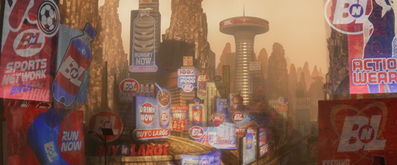
The movie begins with an insight into WALL·E’s typical workday, which is spent building gigantic piles of trash by compacting waste into neat, stackable cubes. After a hard day’s crushing, we follow him on his journey home, learning some useful exposition along the way. This includes a bank of electronic ads for BnL, promoting everything from liquid air to quadruple-patty burgers. Common throughout these ads is an insistence on immediate consumption—“DRINK NOW,” “HUNGRY NOW,” “RUN NOW,” “CONSUME.” And if consuming a product once isn’t enough, you can repeat the experience a second time—the signage seen below includes ads for both “100% Reused Food” and “Regurgi-Shake: Twice the Flavor.”
We’ve seen how corporate mergers, such as Alien’s Weylan Yutani and Blade Runner’s Shimata-Dominguez, are an inevitability in sci-fi futures. WALL·E’s Buy n Large is similar, except that this company was formed by a merger between a frozen yogurt manufacturer (Buy Yogurt) and a maker of suits for the larger gentleman (Large Industries). Clearly a marriage made in heaven, this corporate combination led to a rapid expansion, culminating with Buy n Large owning every company and government in the world.
The Buy n Large logo is an over-italicized customization of Futura Extra Bold Oblique, as demonstrated by a super-distinctive capital G in the BUY N LARGE BANK logotype that WALL·E passes early in the movie.


If the red-and-blue logo feels familiar, it shouldn’t be a surprise—it’s because BnL uses the exact same typeface and color scheme as real-world retail giant Costco Wholesale Corporation.

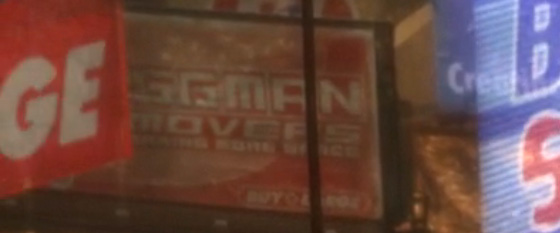
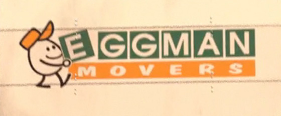
There’s another curious BnL subsidiary to be found among the city’s electronic ads, on a beaten-up billboard advertising “Eggman Movers (Creating More Space).” This company is an Easter-egg reference to WALL·E production designer Ralph “Eggman” Eggleston, and it shares the name of the moving company from 1995’s Toy Story, for which Ralph was art director.
The presence of a Buy n Large–branded bank means Buy n Large–branded banknotes, which are unusual for being strewn across the floor of the deserted city. If you look closely at the notes, you’ll see that some of them have “106” in the corner, and are marked “ten million dollars.” Others look to be marked “996,” suggesting that Buy n Large stores continued the classic $9.99 pricing trick even after adding six zeroes to the end of everything. (Indeed, it says much about the Buy n Large approach to consumerism that it prints notes with the 99s already included, to avoid customers having to receive any change.)

We discover later in the movie that the Axiom left Earth in the year 2105. This suggests that in the preceding years of overconsumption there was a period of severe hyperinflation, making a $10 million note a necessity. This is not without historical precedent—Earth’s most extreme example of hyperinflation occurred in Zimbabwe in November 2008, just a few months after WALL·E’s release, when the inflation rate for the Zimbabwe dollar reached a staggering 79,600,000,000 percent per month. At this point, a single US dollar was equivalent to 2,621,984,228 Zimbabwe dollars. The largest-denomination note printed during this time was the $100 trillion note, which makes Buy n Large’s $10 million bill seem like small change by comparison.

WALL·E leaves the bank behind and continues his journey via the disused tracks of the BnL Transit monorail system. In the absence of working trains, these concrete tracks provide a convenient route through the middle of the deserted city.

Despite their association with aspirational futures, monorails have been failing to become a global mass-transit system for almost two hundred years. The first passenger monorail opened in 1825 in Cheshunt, England, primarily to transport bricks, though it was also utilized for transporting people, mostly for novelty purposes. Unlike the top-of-rail system seen in WALL·E, Cheshunt’s monorail consisted of carriages suspended beneath an overhead track, and was powered by a single horse.
The Cheshunt style of monorail—with suspended carriages hanging beneath a single rail—was also adopted by the Wuppertal Schwebebahn, which began operation along the Wupper River in Wuppertal, Germany, in 1901. The Wuppertal’s suspended system is still in operation today, carrying more than sixty-five thousand passengers on an average weekday.

The monorail seen in WALL·E is of the style popularized by Swedish entrepreneur Axel Wenner-Gren, whose prototype ALWEG (Axel Lennart Wenner-Gren) monorail system came to the attention of Walt Disney after a family visit to Wuppertal gave him monorail fever. Disney saw the potential for a monorail attraction at his new Disneyland theme park in California, and the Disneyland-ALWEG Monorail System opened in June 1959. The system remains in operation today (under the name Disneyland Monorail), and there are similar attractions at Disneyland Tokyo and Walt Disney World in Florida. In total, Disney monorails have transported more than one billion passengers into an aspirational transportational future.

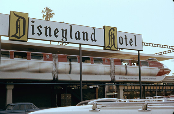
It’s not entirely clear what US city WALL·E lives in, but the presence of a monorail network certainly positions it as a location that was once optimistic about the future. This mid-century futurism is borne out by other architectural features of the city, most notably a curved building seen among the billboards encountered earlier. This building is strongly reminiscent of the Space Needle observation tower in Seattle, Washington, which was built for the city’s 1962 World’s Fair, together with an ALWEG monorail system that is still in operation today.


Near the monorail, WALL·E passes a promotional poster for himself, with the caption “Working to dig you out!” This poster has definite communist propaganda undertones, showing a stylized army of WALL·Es working together to build a brighter future. The implication of this design choice—that communist values are the solution to decades of rampant consumerism—is a pretty bold political statement for what is only the fourth minute of the movie.
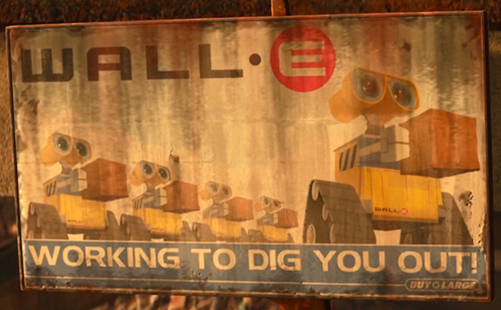
The future to which these WALL·Es aspire is apparently just above and behind the viewer—a common trope for communist propaganda, where the aspirational group gaze is almost always in this direction.


Indeed, this gaze is such a common trope that it became the primary styling of the promotional poster for 2014’s banned comedy movie The Interview, in which two Americans travel to North Korea to interview the country’s leader, Kim Jong-un. (The WALL·E poster’s bottom-edge caption, punctuated by an exclamation mark, is a recurring design feature in North Korean propaganda posters.)

This aspirational style is an example of socialist realist design, the officially sanctioned visual aesthetic of the Soviet Union, which positioned broad-shouldered, purposeful workers as the true heroes of the age. As a robot who is literally a rectangle, there is surely no worker more broad-shouldered and purposeful than our movie’s eponymous hero, WALL·E.
WALL·E’s self-promotional poster is also a fine example of Handel Gothic, one of the movie’s supporting typefaces. Originally designed in 1965 by Donald J. Handel, the font has become a mainstay of design futurism. (Indeed, it is quite possibly the originator of one of our rules for futuristic type: Make straight things curved.)

My favorite use of the typeface in WALL·E occurs later in the movie, when we see the distinctly curved E of some Handel Gothic… on a handle. (I refuse to believe this is anything but a deliberate typographic joke.)

Handel Gothic enjoyed a particular resurgence when the type family was expanded in the 1980s, and will be immediately familiar to anyone who visited EPCOT Center at Walt Disney World in Florida, which opened in 1982. (Later in this article, we’ll look in detail at the theme park, which is now named simply Epcot.) The original EPCOT Center logo was Handel Gothic all the way, making particularly good use of a lowercase n in “Center” to bring some extra curviness, and choosing a font variant with a curved leg in its R for consistency. (It also added letter joining and slicing for good futuristic measure.)

Handel Gothic will also be familiar to Star Trek fans, from its appearance in the credits for both Star Trek: Deep Space Nine (1993–99) and Star Trek: Voyager (1995–2001).

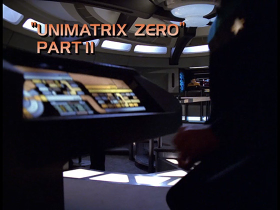
The movie that made Handel Gothic synonymous with sci-fi, however, was almost certainly Steven Spielberg’s Close Encounters of the Third Kind, released in 1977. Close Encounters used the typeface for its theatrical poster and for its opening credits, with the very words “Close Encounters” offering not one but three opportunities to recognize Handel Gothic’s trademark E.

But back to WALL·E’s journey. Toward the end of his trek home, he passes many more WALL·E units, all of them rusted and dead. The sole remaining WALL·E happily cannibalizes a Caterpillar track from a nearby broken unit to replace his own damaged part, and motors onward with the new track in place.
It’s an easy detail to miss, but WALL·E’s home is a broken-down “BnL WALL·E Transport” vehicle, which may once have housed all the dead units he just passed. When he reverses himself into a WALL·E-size bin in a rotatable storage rack a few minutes later and rocks himself to sleep, his loneliness as the last robot on Earth is made all the more acute by the uninhabited bins around him, now filled with ordered trash.


Before he climbs into bed, WALL·E retrieves his favorite VHS cassette from a nearby toaster, and pops it into a VCR. It turns out this is a beaten-up copy of Hello, Dolly!—1969’s awkwardly punctuated Jerry Herman musical. Delightfully, the typography of this cassette is taken directly from the movie’s 1991 VHS release, though the identity of its non-futuristic title font—half Century Schoolbook, half Benguiat Caslon—has sadly eluded my detective skills.


WALL·E watches his Hello, Dolly! cassette via a small, portable device that looks almost exactly like an Apple iPod Video. I say “almost,” because the real-world iPod Video had a smaller click wheel than the one seen in WALL·E, had white labels on its buttons, and did not support external playback from a VHS cassette player. Nonetheless, this iPod is just one example of many in WALL·E’s home that evoke nostalgia for gadgets past, reinforcing that WALL·E himself is the discarded, unwanted technology that humanity left behind.
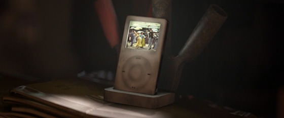
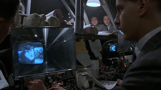
To work around the tiny scale of his iPod’s screen, WALL·E uses a plastic Fresnel lens as a magnifying device to enlarge the image to several times its original size. In doing so, he follows a trend started in Terry Gilliam’s similarly dystopian Brazil, in which employees at the Ministry of Information Retrieval huddle around tiny CRT screens to watch westerns through Fresnel lenses when their boss isn’t looking.

WALL·E awakes from robotic sleep on day two of the movie, low on power and dynamism. The fact that his head is a big pair of binoculars gives a great opportunity for a visual gag, as we see him literally bleary-eyed before activating the zoom lock on first his left eye, then his right, to reveal an eye-test chart in the opposing rack.


WALL·E’s binocular form is mimicked in the shape of his heads-up display (or HUD), which has the classic “two circles” shape used in many movies to indicate that we are looking from a character’s viewpoint through a pair of binoculars. This HUD raises an interesting question, however. Why does WALL·E have a heads-up display, with information overlaid on a video stream? A heads-up display really makes sense only if you are a human who has eyes; for a robot, any video input is combined with additional metadata from environmental sensors (such as direction, zoom, and power), and fed directly into the robot’s processor. Overlaying environmental information on a video stream implies that the robot has cameras that look at the world, and then more cameras that look at the augmented output of those cameras, which doesn’t make sense at all.
The answer, of course, is that WALL·E has a HUD because movie robots have HUDs, and movie robots have HUDs because they enable the viewer to visualize what the robots are thinking, even if it makes zero sense in technical reality. This trope began in 1973’s Westworld, whose final act shows us the world from the vantage point of Yul Brynner’s gun-slinging robot. Although Brynner’s HUD is not augmented with data, it is nonetheless the first use of computer-generated imagery in a feature film. Director Michael Crichton cuts several times from a real-world scene to the robot’s pixelated version of the same, including a thermal image when Brynner chases his prey in the movie’s final act.


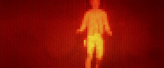
Westworld’s “robot viewpoint” trope was codified by 1984’s The Terminator and 1987’s RoboCop, both of which augmented their HUDs with additional data and text. Following these two movies, a heads-up display pretty much became the de facto expectation for any on-screen robot whose motives need to be understood.

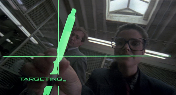
Pixar’s robot HUDs tend to include the shape of the robot’s eye(s) within the heads-up display, to help us associate the HUD with the character it represents. The Incredibles’ Omnidroid predates WALL·E’s binoculars in this regard. Other WALL·E robots—M-O, SECUR-T, and EVE—also follow suit.


Pixar’s neatest variation on the robot HUD trope occurs all the way back in 1999’s Toy Story 2, where a plastic toy’s marketing gimmick (plus some clever camera framing) enables us to literally see through the eyes of the movie’s robotic bad guy.
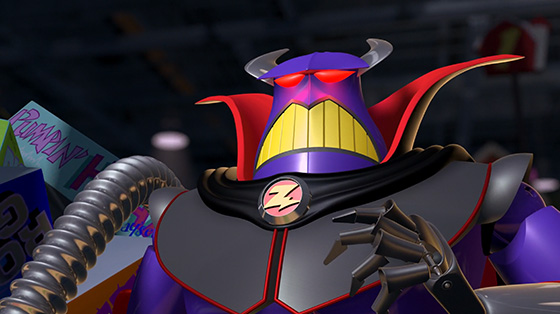
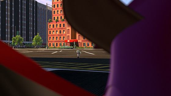

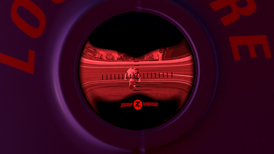

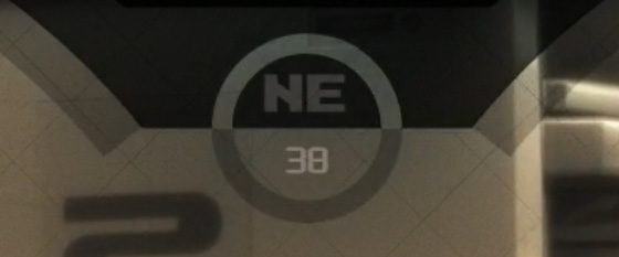
There is one further question raised by WALL·E’s binocular HUD. How does his directional compass—seen at the top center of his HUD—continue to work when he is aboard the Axiom? Lots of planets may have a north, but the same is not true of spacecraft—north, south, east, and west make sense only when you’re on the surface of a sphere.
Day two (and act two) of WALL·E see a Buy n Large scout ship arrive on Earth, disrupting WALL·E’s routine. Most importantly, it introduces us to EVE, who is everything WALL·E is not. EVE’s shiny white design is technologically advanced; she’s the curvy iMac G4 to WALL·E’s boxy Mac 128K. Her design evokes sleek Apple products of the 2000s, with her head, in particular, highly reminiscent of a 2002 iMac G4’s base. Even her reboot sound is a futuristic take on Apple’s famous startup chime, whereas WALL·E’s post-charge chime is the version Apple introduced in 1998 and removed altogether in 2016.
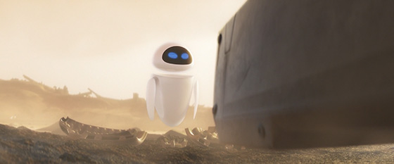

released in 2002, with an EVE-head-like base.

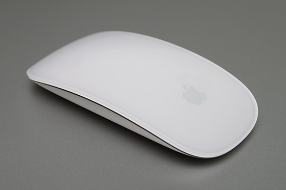
EVE’s evocation of Apple product design is not entirely coincidental. In a 2008 interview with Fortune magazine, director Andrew Stanton stated: “I wanted EVE to be high-end technology—no expense spared—and I wanted it to be seamless and for the technology to be sort of hidden and subcutaneous. The more I started describing it, the more I realized I was pretty much describing the Apple playbook for design.” This led to a 2005 call to Steve Jobs—at that time, both owner of Pixar and CEO of Apple—which in turn led to Apple design head Jony Ive spending a day at the Pixar headquarters in Emeryville, consulting on the EVE prototype. (It is surely entirely coincidental that EVE’s wireless arms and hands are reminiscent of Apple’s wireless Magic Mouse, released the year after WALL·E.)

During a dust storm, WALL·E takes EVE back to the safety of his home, where he presents her with a small multicolored cube. In the three seconds the camera pans away for WALL·E to retrieve Hello, Dolly!, EVE solves the Rubik’s Cube and returns it to her astonished host.

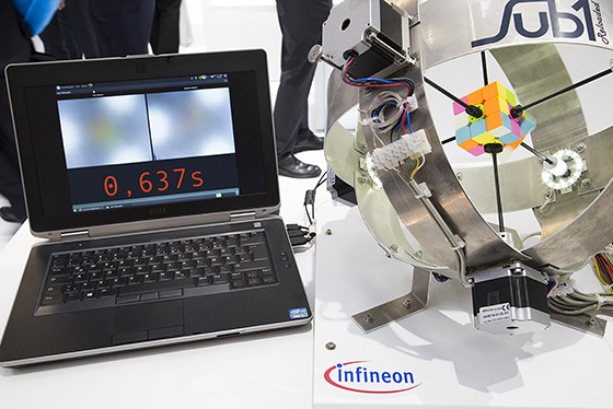
EVE’s cube-solving time would be impressive for a human; the current world record is 4.22 seconds, set by Feliks Zemdegs in May 2018. Sadly, because of the camera pan, we’ll never know if EVE broke the world record for a robot, which currently stands at a mind-boggling 0.637 seconds. This record was set in November 2016 by Sub1 Reloaded, a cube-solving robot built by German engineer Albert Beer. Six high-performance stepper motors turned the cube twenty-one times to complete the task, averaging just 0.03 seconds per rotation.
Spare a thought, then, for poor WALL·E. His surprise at EVE’s accomplishment is understandable—he lacks color vision and has only three digits on each hand, which means that Rubik’s Cubes are really not his specialty. (There’s a reason Guinness doesn’t have a “fastest dog” Rubik’s Cube category.)
One other point of note: This scene is the only time the color green appears in WALL·E in a scene unrelated to a plant. While this breaks the movie’s careful color scripting, it’s worth it for a good gag.
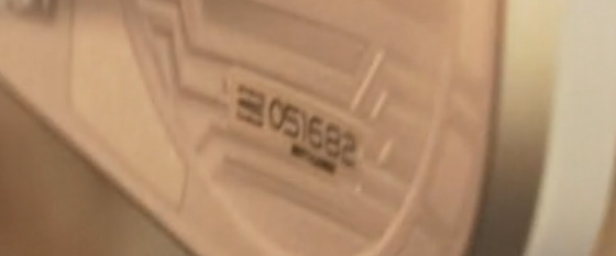
All seems to be going well with WALL·E and EVE’s introductions, until they are rudely interrupted by EVE’s spotting a plant that WALL·E has excavated from the trash. She subsumes the plant, as per her “directive,” and enters hibernation mode. WALL·E’s attempts to wake her invariably end in comedic pain, though one of them does reveal EVE’s serial number, 051682, set in Handel Gothic. (I can’t help but wonder whether someone in Pixar’s art department was born on May 16, 1982.)
WALL·E gives up on reviving EVE and disconsolately returns to his trash-crushing routine. Shortly afterward, the Axiom’s scout ship returns to Earth and collects EVE to take her home. Desperate not to lose his new friend, WALL·E hitches a ride on the outside of the scout, causing him grief when the ship blasts through Earth’s surrounding satellite trash. As the satellites fall away, we see that WALL·E has a Soviet-era Sputnik 1 satellite on his head. This is impressive, especially given that Sputnik 1—the first man-made object to orbit Earth—burned up on reentry to Earth’s atmosphere in 1958.


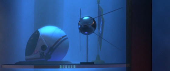
We see Sputnik 1 again later in the movie, as a model in Captain McCrea’s display cabinet. This model is accompanied by a NASA space shuttle launch/entry helmet, as worn by space shuttle astronauts between 1982 and 1986 during launch and return from space.

This “retro space tech” theme can also be seen on Earth during EVE’s scan for plant life. After scanning a Toy Story Pizza Planet truck and a portable lavatory, EVE checks a rusting Apollo command module before slamming the door shut in disgust at its absence of plant-based life.
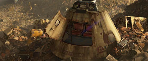
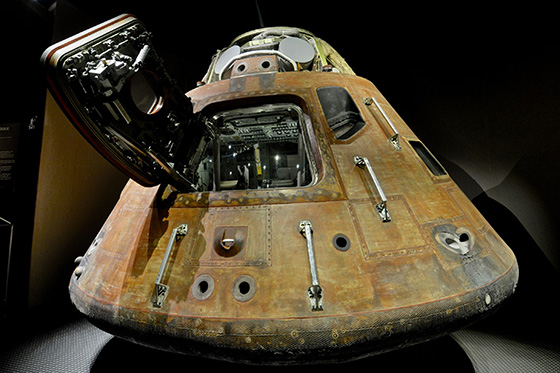
Showing recent space technology as trash or as museum pieces positions our personal experiences of space as archaic and quaint in comparison to the Axiom’s futuristic styling. This further reinforces WALL·E’s own obsolescence as a discarded piece of technology, and sets us up neatly for a transition to the shiny futurism of the Axiom.
The Axiom paints a vision of the future where every menial task, no matter how small, has a dedicated robot created expressly for the purpose. Like 2001: A Space Odyssey’s HAL and Alien’s MU/TH/UR, all these robots have cute acronyms to make them human-friendly.
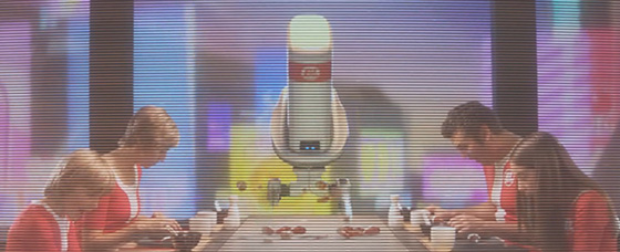


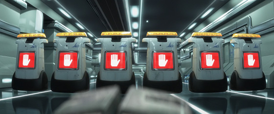


Of particular note is VN-GO, the painterbot, whose acronym perpetuates a common yet incorrect pronunciation of Dutch painter Vincent van Gogh’s surname. (According to the BBC Pronunciation Unit, it is “van Gokh,” with the kh pronounced like the ch in the Scottish word loch.)

EVE’s acronym, sadly, is even worse. Her denomination as Extraterrestrial Vegetation Evaluator could not be more inaccurate, given that her entire reason for existing is to evaluate vegetation on the planet Terra (as Earth is known in Latin). Presumably, her moniker was chosen for cuteness rather than linguistic accuracy—after all, this movie is about WALL·E and EVE, not WALL·E and TVE.
Also of note is TYP-E, a typingbot who is designed solely to press keys when someone approaches the elevator shaft to the captain’s quarters. TYP-E provides an excuse for one of the movie’s best visual gags—as a robot, he has a keyboard made entirely, of course, from ones and zeroes.


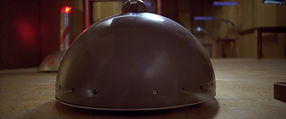
M-O’s cleaning colleagues (VAQ-M, SPR-A, and BUF-4) may bring back memories for fans of 1997’s The Fifth Element. In Luc Besson’s over-the-top vision of the future, evil industrialist Zorg demonstrates his own array of task-specific robots by dropping a glass tumbler on the floor to trigger their “lovely ballet.” As two sentrybots stand guard, a sweeperbot, a spraybot, and a bufferbot clean up his mess before returning to a nearby storage station.


The Axiom’s robots travel around the ship via their own dedicated corridors, separate from the craft’s passenger areas. These passenger areas are split into three classes—economy, coach, and elite—each of which has a distinct architectural style. The classes themselves do not play a functional role in the movie’s plot, but one has to wonder what they mean for the Axiom’s society. Are children born into the classes their ancestors originally purchased, as if into some kind of futuristic caste system? Would the Axiom have its own Titanic moment if a passenger from economy bumped hover chairs with someone from elite? One thing’s certain: The styling of each class is extremely useful for helping viewers orient themselves within the ship’s overall structure as the action moves back and forth along its length.
Our introduction to the passenger area starts with the economy deck, which is compact, angular, and concrete in texture and color. Its palette is deliberately sparse, rarely moving outside the Buy n Large blue, red, and white, and making extensive use of the corporation’s Futura Extra Bold Oblique.


The deck’s design is highly reminiscent of the interior of the Contemporary Tower at Walt Disney World Contemporary Resort, whose A-frame concrete-and-steel structure was so futuristic when it opened in 1971 that it even had a monorail running through the middle. (As anyone who has stayed at the Contemporary can attest, however, its rates can hardly be considered “economy.”)

The coach deck, unlike the economy deck, is curved, eclectic, and spacious, with brightly colored holo-ads scattered everywhere. It mimics Las Vegas’s Strip in gaudiness and style, with artificial neon colors used extensively and every sign encouraging Axiom passengers to spend more money. (How the ship’s financial economy continues to function after a seven-hundred-year flight continues to remain a mystery.)


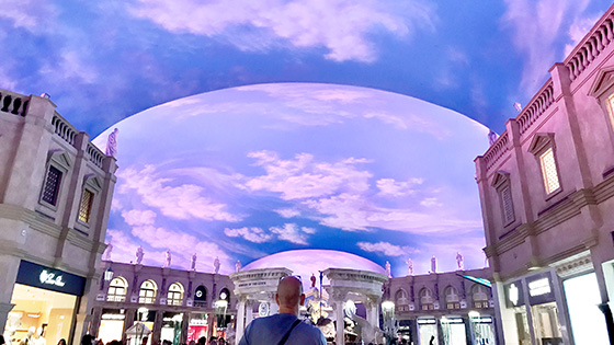
The ceiling of the coach deck is a gigantic animated screen that can switch between day and night, complete with a BnL-branded sun or moon. The ceiling’s relationship to actual time is somewhat tenuous, as we see when Captain McCrea winds the sky back from 12:30 p.m. to 9:30 a.m. in order to make his morning announcements. In this regard, the ceiling is essentially an amalgam of two Las Vegas landmarks: the painted cloud ceilings of the Forum indoor arcade at Caesars Palace, whose lighting ebbs and changes without ever making it nighttime enough for you to want to stop buying things, and the four-block-long overhead screen of the Fremont Street Experience—the world’s largest video screen—whose 12.5 million LEDs illuminate Vegas partygoers every night. The result is an entirely fake sky for the Axiom’s population, allowing finely tuned control over their artificial environment.

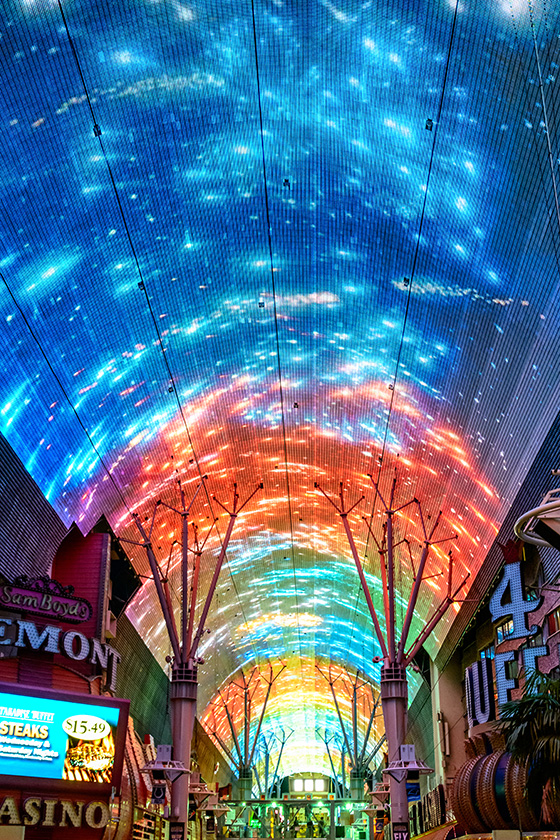
The coach deck leads to the elite deck, whose styling resembles that of a high-class lido or spa. Despite their very different palettes, the coach and elite decks share a curved, futuristic environmental styling that unifies their overall architecture. According to production designer Ralph Eggleston, the architecture of this shared area is inspired by the work of architect Santiago Calatrava, whose signature curved supports and arches can be seen throughout both decks’ central concourse.


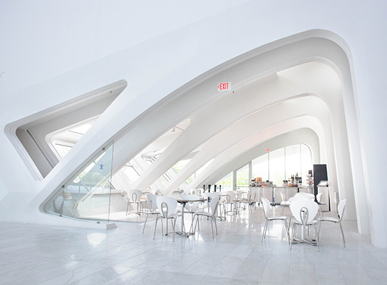


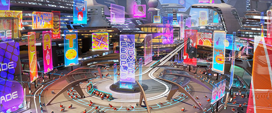
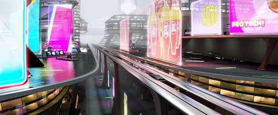
The other main influence for the Axiom’s architecture is the design of the Tomorrowland area of Disneyland, in California. According to production designer Ralph Eggleston, during the movie’s production WALL·E’s design team visited an exhibition of Tomorrowland concept art and took inspiration from the designs therein. Perhaps the most obvious of these influences is the presence of a PeopleMover transportation system running through the middle of the club and elite decks, in a style very similar to the PeopleMover at Tomorrowland. (Do check out DaveLandWeb’s fantastic PeopleMover photo page for some great examples of the original in action.)
The evolution of Disney’s PeopleMover concept began with the 1964–65 New York World’s Fair, for which the Ford Motor Company asked Disney to design an attraction to compete with General Motors’ Futurama II exhibit. The resulting Magic Skyway gave fairgoers an opportunity to ride in a driverless Ford convertible—including the just-launched Ford Mustang—through a diorama that transported them from prehistoric times to a futuristic space city.
Following its success at the World’s Fair, the traction system behind Magic Skyway was adapted into a new feature for Tomorrowland’s 1967 relaunch. The new attraction, known as the WEDway PeopleMover, enabled Walter Elias Disney to follow Axel Lennart Wenner-Gren (of ALWEG monorail fame) in naming a futuristic transportation mechanism with his initials. It also provided an ideal inspiration for the Axiom’s central transport system.
The Axiom’s PeopleMover has much in common with its WEDway counterpart. Both are focused on a main circular loading area in the heart of a central plaza, with a long, straight stretch of track extending away from the loading deck. Both give passengers a tantalizing view of surrounding attractions as they are transported from one area to another. Indeed, I am sure Walt Disney would have been delighted to see his dream of future transportation integrated into the Axiom’s space-age environment, especially given that Disneyland’s PeopleMover was a prototype for Walt’s grander vision of futuristic living. Walt planned to build a larger PeopleMover installation as part of his Experimental Prototype Community of Tomorrow, or EPCOT—a new and futuristic city to be created from scratch at his planned Disney World Resort in Florida.
In October 1966, Walt recorded a short film pitching his “Florida Project” to industrialists and legislators, including a detailed description of EPCOT’s transportation system. In this new city, cars and trucks were to be pushed underground, with the community’s twenty thousand residents instead traveling by WEDway and monorail to work, play, and socialize. The concept images below from Walt’s EPCOT film give an idea of just how much imagination the creative brains at WED Enterprises applied, under Walt’s careful guidance, to everyday living challenges.


Tragically, Walt Disney died less than two months after his EPCOT introduction was filmed, passing away before the pitch was screened and before New Tomorrowland opened to the public. His ambitious vision of a prototype community did not become a reality, but its name lives on in the Epcot theme park (formerly “EPCOT Center”) at Walt Disney World in Florida—although the eventual EPCOT park became more of a permanent World’s Fair than a real-life city of the future. The WEDway PeopleMover did not realize its potential, either: The Disneyland attraction closed in 1995, to be replaced by the faster (but short-lived) Rocket Rods ride, which itself closed in 2001.
Disneyland park-goers can still see the PeopleMover’s abandoned tracks snaking through Tomorrowland, displaying curved, arched supports that Santiago Calatrava would surely approve of. (Thankfully, a PeopleMover can still be experienced at the Magic Kingdom park at the Walt Disney World Resort in Florida, where the Tomorrowland Transit Authority PeopleMover continues to provide a leisurely tour of nearby attractions.)

Of course, the PeopleMover also lives on via the Axiom, whose reimagining of the concept is almost a microcosm of Walt’s vision for EPCOT. Aboard the Axiom, it’s a PeopleMover (not a monorail) that fulfills the role of high-speed arterial transport, with individual BnL hover chairs completing the “final mile” of the journey via preset illuminated paths (blue for humans, white for robots, red for stewardbots). It may not match the scale of Disney’s EPCOT dream, but it’s nonetheless fitting that Walt’s vision of a transportational future made the trip into space.


During WALL·E’s tour of the passenger decks, we discover that the Axiom’s computer is voiced by none other than Alien’s Ellen Ripley. Casting Sigourney Weaver as the disembodied voice of a space-based computer is clearly ironic, especially given her experience with such voices in Alien and Aliens. WALL·E ups the irony by having Weaver narrate not one but two scenes that would feel all too familiar to her xenomorph-hunting counterpart, triggering bonus space-peril associations for Alien fans. (Weaver also plays a disembodied voice in Andrew Stanton’s Finding Dory, aping her narration of nature documentaries.)
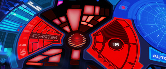




Alien and Aliens are not the only sci-fi movies to get a nod from WALL·E. On the Axiom bridge, we meet AUTO, the ship’s autopilot robot. It might be hard to believe just by looking at him, but AUTO is actually an Evil Space-Based Computer. His design is clearly influenced by a certain other ESBC—that central red eye is a direct reference to 2001: A Space Odyssey’s HAL, giving an immediate signal that this robot is not to be trusted.


AUTO’s physical similarity to HAL gives him a practical similarity, too. On the rare occasions we see the world from AUTO’s vantage point, we get an extreme fish-eye view of the surrounding area, just as we did for HAL in 2001. WALL·E combines HAL’s fish-eye view with The Terminator’s red HUD hue, making AUTO’s evil intent doubly clear to any discerning fan of sci-fi.


AUTO and HAL belong to a long-standing tradition of sci-fi automata whose glowing red eye(s) give away their evil nature. They really are everywhere in sci-fi movies—from the Model 101 in The Terminator, via the replicants in Blade Runner, to the evil wriggly thing inserted into Neo’s belly button in The Matrix.


That red glow has its benefits, however. You can always tell when an evil robot has been finally defeated from the fact that its red eye(s) slowly fade to black. The Terminator’s T-800, The Matrix’s wriggly thing, and WALL·E’s AUTO all follow this trope when deactivated.


AUTO may look like the movie’s bad guy, but his actions are simply an example of artificial intelligence following its programming too literally. To understand his motives, we must remember that BnL’s original plan was for its star liners to return to Earth as soon as an EVE probe found proof that life was once more sustainable. Five years after their departure, however, BnL autopilots were sent a directive by CEO Shelby Forthright telling them to keep their craft in space indefinitely, because the cleanup process on Earth was not going to succeed. Six hundred and ninety-five years later, with no subsequent instructions to the contrary, AUTO is simply following this command to the letter, blocking any and all attempts to return to Earth.
In this regard, AUTO is eerily similar to 2001’s HAL, whose murderous tendencies aboard the Discovery were similarly driven by an inability to reconcile a contradiction in his programming. In the movie’s sequel, 2010: The Year We Make Contact, we learn that the basic purpose of HAL’s design was “the accurate processing of information without distortion or concealment.” We also discover that HAL was instructed (via Directive NSD 342/23) to lie to Dave and Frank about the real reason for the Discovery’s mission. After lip-reading that they planned to disconnect him, HAL determined that the only logical way for him to both keep processing and avoid lying was for Dave and Frank to die.
AUTO’s own instruction is Directive A113, whose numbering may sound familiar to Pixar fans. “A113” appears in every Pixar film, from a family license plate in Toy Story to an underwater camera model in Finding Nemo. (Indeed, it’s even in Brave, where the roman numerals ACXIII appear carved just above the front door of a witch’s hut.) The reason for its repeated inclusion is that room A1-13 was the classroom for the Character Animation Program at the California Institute of the Arts, where Pixar alumni John Lasseter, Pete Docter, and Andrew Stanton studied. (This explains why it’s also the number on the door of Riley’s classroom in Inside Out, and on the Scaring 101 classroom door in Monsters University.) WALL·E may be its highest-profile outing, but it’s there in every Pixar movie if you keep your eyes peeled.

The majority of WALL·E’s robots are voiced by Ben Burtt, the Academy Award-winning sound designer and creator of R2D2’s bleeps. AUTO’s voice, however, is provided by MacInTalk, a speech synthesis technology first used to announce the Apple Macintosh computer in January 1984. (You may also recognize MacInTalk as the lead vocalist on Radiohead’s “Fitter Happier,” from 1997’s OK Computer album.)
MacInTalk’s inclusion in WALL·E makes it one of only two Apple voice synthesis technologies to star in a feature film; the other is Siri, who provides the voice for ’Puter, Batman’s high-tech assistant in The LEGO Batman Movie.

Despite the technology’s age, I’m happy to report that MacInTalk voices still ship with macOS today. If you’d like to turn your Mac into an Evil Space-Based Computer, simply open the System Preferences application, select Accessibility and then Speech, and enable the “Ralph” system voice.
In addition to AUTO, there are two more nods to 2001: A Space Odyssey in WALL·E, both of which take advantage of preexisting associations for dramatic or comedic effect. The first is WALL·E’s brief escapade in a LifePod, the design of which seems clearly inspired by 2001’s EVA pods. That iconic ball-like shape immediately triggers an association with interstellar peril, which WALL·E soon discovers is entirely justified.


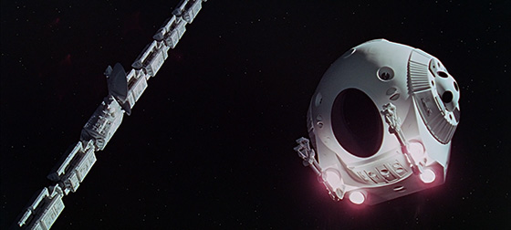

The second 2001 reference is a knowing usage of Richard Strauss’s Also sprach Zarathustra, when Captain McCrea becomes the first human to stand up and walk in possibly hundreds of years. It’s an appropriate enough use of the music—2001’s monoliths oversee (and supposedly trigger) several leaps in mankind’s evolution, so it’s entirely valid to hear those famous chords when the captain makes his first steps (even though this is technically a regression, not an evolution).


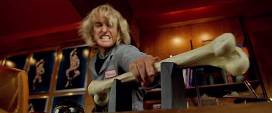
Of course, WALL·E is not alone in riffing on Strauss’s classic melody. It is similarly parodied in Charlie and the Chocolate Factory (as a 2001 monolith turns into a bar of chocolate) and Zoolander (as Hansel considers smashing Mugatu’s iMac with a nearby bone). If that’s not enough, it’s also in Pixar’s Toy Story 2 and Cars 3, plus other animated movies including Kung Fu Panda 3, The Pirates! In an Adventure with Scientists!, and The Simpsons Movie. On the live-action front, it’s in Man on the Moon, Catch-22, Night at the Museum: Secret of the Tomb, Clueless, Turner & Hooch, and Harold & Kumar Go to White Castle, to mention just a few.


Despite AUTO’s best efforts, McCrea manages to switch him to MANUAL and sets the Axiom on a hyperjump trajectory back to Earth. The hyperjump looks exactly like you’d expect, which is exactly like the USS Enterprise engaging warp drive in Star Trek: The Motion Picture.
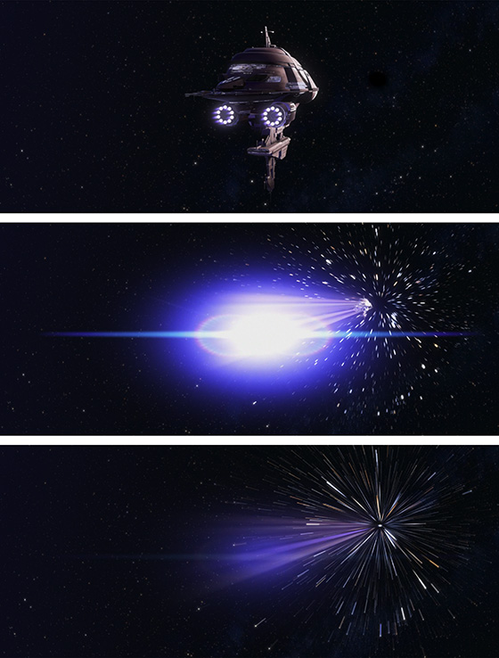
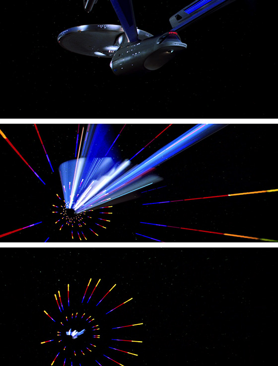
Once again, WALL·E is sneakily using prior sci-fi art as a shortcut, re-creating familiar effects so that the Axiom’s quick journey home can be explained without exposition. (It might also account for why everyone aboard the Axiom experiences a brief stint of The Motion Picture’s wormhole effect during the jump.)


As these homages show, WALL·E is not afraid to borrow from its predecessors to gain some free sci-fi association. Indeed, such references are celebrated and elevated, drawing on the production team’s clear fondness for vintage sci-fi to create a movie that is both a love letter to the classics and a worthy addition to the list. WALL·E capitalizes on our existing associations with the future to communicate complex plot points and motives with minimal dialogue and text. It is, to my mind, Pixar’s most realistic vision of an internally consistent world, despite the polar opposites of its Earth- and space-based environments. It’s political and satirical, representing utopia and dystopia with enough humor to poke fun at the downsides of both. In short, WALL·E envisages a future that could so easily be bleak and pessimistic—but is instead inspired by the naïveté of its inhuman heroes to re-create the optimism that took man into space in the first place.
Wow! That was good, wasn’t it? What an amazing article! So amazing, in fact, that you probably want to impulse-buy the Typeset in the Future book it comes from, right this very second. Here are some convenient links to buy it from Amazon or Barnes and Noble, or you can head down to your local bookstore (which it is much harder for me to link to) when the book is released on December 11 2018.
The book also includes an interview with Pixar designers Ralph Eggleston and Craig Foster about the making of WALL·E, plus six more equally amazing movie studies, alongside interviews with Paul Verhoeven (Total Recall) and Mike Okuda (Star Trek). You can read more about it here if for some reason you’re still not convinced.
While the red eye of AUTO is certainly inspired by HAL, the white shiny plastic body and black metal frame seems very reminiscent of another malevolent AI, GLaDOS from the Portal computer games (first released in 2007, a year before WALL·E). The “Anger Core” in that game has the same “red eye surrounded by a white plastic sphere with black metal scaffolding” (http://ru.halflife.wikia.com/wiki/Файл:GLaDOS%27_Emotion_Core_attached.jpg). (The gun turrets in the game have a similar aesthetic [https://www.gamingheads.com/portal-2-turret-statue.html].)
A tremendous article as always! (My only wish would be for more frequent pieces, but I am sure that such detailed research and clever writing is not easy to produce.)
LikeLike
Reblogged this on Annabelle's Reading Den.
LikeLike
“…after all, this movie is about WALL·E and EVE, not WALL·E and TVE.”
Underrated pun right there.
LikeLiked by 2 people
Thank you. I cannot begin to describe how much this pun amused me when I wrote that section.
LikeLiked by 1 person
I believe that HUD displays in robots are made for people developing a robot. So they can see exactly what the robot is doing and debug it.
Great article anyway, buying the book right now.
LikeLiked by 1 person
Sigourney Weaver was also in Galaxy Quest. Her character’s main job on the show within the movie is to repeat what the on-board computer says.
LikeLike
I’d usually hate to be a pedant but this blog is pretty much 50% awesome pedantry, so I’ll point out that SECUR-T’s HUD is more rangefinder than SLR. The faded circles are a focus aid using some incredibly clever optics that I still don’t understand.
LikeLike
Thanks for the writeup! Just a little correction: Werther Brücke is actually a Schwebebahn station in the city of Wuppertal, formerly Barmen, and not in Cologne.
LikeLike
Oops – not quite sure how I got that so spectacularly wrong. I mean, the clue’s kinda in the name… Thanks for the spot – fixed!
LikeLike
The Wuppertaler Schwebebahn “hovers”(german:schwebt) over the river called Wupper in the city of Wuppertal (wupper vally) – hence the name.
The city of cologne is about 60km away from wuppertal on Rhine river.
Love the article but reading about the Wuppertaler hover train located in Cologne made me jump to the bottom to comment. 😊. Off to read the rest!
Best regards
LikeLike
Fixed – thank you!
LikeLike
Wuppertal is a city in Germany, where the Wuppertaler Schwebebahn is located. Cologne does not have a Schwebebahn, and the depicted station is most certainly within Wuppertal.
LikeLike
Ach, that’s a research fail on my part. Fixed. Thank you!
LikeLike
The Wuppertal Schwebebahn is in Wuppertal, which is a city of 300k inhabitants, and not in Cologne.
LikeLike
Thank you – fixed!
LikeLike
Maybe i missed it… are all Hud Fonts Handel Gothic?
LikeLike
Just out of interest, there was something odd-looking about the Costco logo use of Futura Bold Oblique, so I used Illustrator to overlay the graphic used above; I found that the characters had been scaled horizontally by 120%, and the “T” had been made even more oblique, by individually shearing it a further 7º.
LikeLike
Super amazing post, really inspiring ❤
LikeLiked by 1 person
While Epcot Center’s typeface has nods to Handel Gothic, it’s a distinct face named “World Bold,” which was designed by Deborah Lord. More info here: http://www.rudyanddebbie.com/epcot.html
LikeLike
Hi Howard! Thanks for the info and link. I’m pretty sure that the EPCOT Center logo itself is Handel Gothic – the N and R have different shapes to World Bold, and the C and E are just a bit curvier, suggesting Handel is more likely. I hadn’t discovered World Bold before, however, and it’s a great design – thank you for introducing it to me!
LikeLike
Hi, thanks to Tested I was directed to your wonderful site. Please allow me a slight pedantism re- “Lots of planets may have a north, but the same is not true of spacecraft—north, south, east, and west make sense only when you’re on the surface of a sphere.” A compass reads the direction of a magnetic field, which may very well exist in future spacecraft as the field would protect the ship from ambient radiation. So anything with its own magnetic field would have an arbitrary “north”, which would probably make navigating pretty wierd. Pedanticus out, great article and thank you for introducing me to die Wuppertaler Schwebebahn, its existance genuinely makes me happy: https://www.youtube.com/watch?v=2rQvsVBv5r4
LikeLike
Really great article, as usual!
Impressive amount of research. 🙂
If I may add some input, I’ve also made some research in the past to identify typefaces from WALL·E:
> The “AXIOM” painted at the exterior of the ship seems written in Ethnocentric typeface.
> In SECUR-T’s HUD, “HALT” along with “CPT CHG SRV” seem written in Neuropolitical typeface.
> And finally, the “Operation Recolonize Operation Manual” along with the “A113” appearing in AUTO’s HUD, and many other writings inside the Axiom, look a lot like Rally typeface, except that the numbers don’t match…
There are also the opening credits that I’ve not been able to identify. They look like Babak or Golestan but not exactly.
LikeLike
Getting slightly off topic, I wonder if the “Gunship” typeface was a riff on the logo from the 1980s helicopter flight simulator of the same name from Microprose. It’s got another distinctive “G”.
LikeLike
I’m sure aficionados of type get irritated when people identify them incorrectly. Similarly, math people find basic math mistakes annoying.
10 to the 6th is not ten million; it’s one million. If you look at the money bills closely, you can see that they say one million, not ten.
LikeLike
You’re absolutely right – 10 to the 6th is indeed one million. I’ll need to go back and take more screenshots to verify the accompanying text.
LikeLike
Hello, Dave!
Fantastic as usual. Rewatching Wall•E but with more scrutiny re: fonts and nods to vintage sci•fi. Love your articles, hope for more, and I’ll pick up your book ASAP!
LikeLike
PS:
The Axiom’s fleet ID is “?X51204E”. Another inside reference probably. I’d guess the first letter is A, there’s only one shot of that in the film at 1 hour and 25 seconds in.
I don’t see one note about that ID anywhere online, not even the Pixar Wall•E Wiki article for the Axiom.
Just FYI, Dave. Enjoyed your work!
LikeLike
This is an amazing article- fascinating! Thank you! Although the fact he is actually called waLL·e is quite unsettling… 🙂
LikeLike
Regarding the headline on the Hello Dolly VHS tape, up until the 90s there were large type setting houses in every major city, and most of them maintain their own library of headline font film strips to be used in their photo-typositor (R) machine.
Because of a quirk of copyright law, typefaces cannot be trademarked, only their names. So these headline type sets, which were usually limited to numbers, alphabets and punctuation only, often had one-off names and slight variations from other people’s design work sufficient to establish a distinction only.
If I’m correct, that’s why you may never find the name of that typeface: it only exists in one company’s catalog, and that company is long since defunct.
LikeLike
Marvelous article. TYP-E is actually the second Brazil reference in the film. The lone, scary, taciturn robot at the end of a cavernous room having a single important elevator is a reference to Lowry arriving at Information Retrieval: https://youtu.be/LFlFIG22Y9E And, there was a reference to Brazil even before the movie was released! The teaser trailer for WALL-E (no interpunct on my iPad) features the music from the opening of Brazil, which is then not in the film itself: https://youtu.be/l3W-QJQjsu4?t=58s
LikeLike
The trillion dollars on the Zimbabwe bill are impressive – almost enough to distract our attention from the delicately rendered pile of stones, which recalls the etymology of the word “Zimbabwe.”
LikeLike
Very interesting article, thank you! I’d missed quite a few of these details.
LikeLike
I stumbled on that article randomly… It’s very interesting! You spotted alot of detail I didn’t noticed.
There is however one detail that excited many nerd tech that you missed – despite putting a picture of it that show it clearly :
The video tape system used by WALL·E isn’t a VHS. The tape, with that large visible spool and the second totally hidden (unlike VHS which has a symmetrical design on that part) tells us that this is a Betamax tape, Sony’s failed format.
This choice is certainly no innocent; it most likely express the message seen with many other piece of technology in the movie – that humanity produce waste that end up just piling up, but also, as noted here too, talk about obsolescence and consumerism – Betamax and VHS were very similar in quality; but after Sony lost the format war, many people got ride of their perfectly adequate and working Betamax player and tapes to get the same thing in VHS.
LikeLike