Star Trek: The Motion Picture, a movie adaptation of the cult sixties TV show, very nearly didn’t get made. If it weren’t for the runaway success of Star Wars and Close Encounters of the Third Kind (both released in 1977), fickle Paramount executives would have canceled their faltering TV project Star Trek: Phase II, instead of adapting it into a big-screen production. We must give thanks, then, to producer Gene Roddenberry for pushing the project through ten years of development hell. In doing so, he named a space shuttle, created a custom font pack, and relaunched the swashbuckling futurism of the greatest of all space franchises: Star Trek.
Before any buckles get swashed, however, we must first sit through one minute and forty seconds of this:

This is not a positioning shot of deepest, darkest space. Nor is it a close-up of a black hole—although it could be a close-up of The Black Hole, Disney’s sci-fi adventure. That’s because The Motion Picture and The Black Hole, both released in 1979, were the last two big Hollywood movies to feature a musical overture before the start of the movie proper. If you begin either movie and see nothing but beautifully-scored blackness for a couple of minutes, don’t worry—just hum along to the theme tune, and wait for the typography to begin.
If you’re a fan of Star Trek: The Original Series, you might be expecting to see the font from its opening titles in Star Trek: The Motion Picture too. This font was (perhaps unsurprisingly) called Star Trek, though its modern-day digital version is known as Horizon, and is available only in non-italic form:
In addition, I’m delighted to report that during season one, Star Trek was accompanied by a variant of sci-fi stalwart Eurostile in its closing credits:

The Star Trek font also appeared in a non-italic version, to introduce William Shatner and Leonard Nimoy to 1960s TV audiences:


Sadly, this is where the good news ends. When The Original Series returned for a second season, it added DeForest Kelley (Dr. “Bones” McCoy) as a second “ALSO STARRING”:

The problem here is obvious, isn’t it? Unlike the Es in “SHATNER” and “LEONARD,” the ones in “DEFOREST KELLEY” have straight corners, not curved ones:

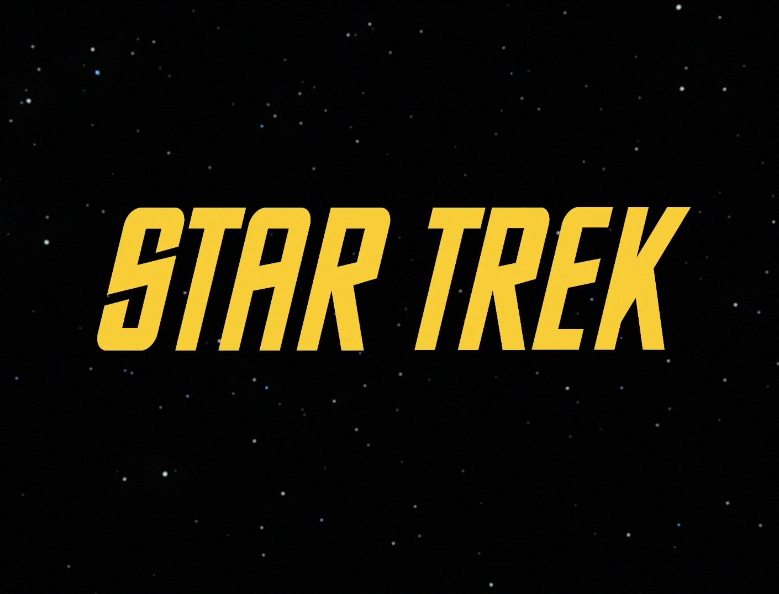
Alas, The Original Series’s inconsistent typography did not survive the stylistic leap into the 1970s. To make up for it, The Motion Picture’s title card introduces a new font, with some of the curviest Es known to sci-fi. It also follows an emerging seventies trend: Movie names beginning with STAR must have long trailing lines on the opening S:


The font seen in The Motion Picture’s titles is a custom typeface created by Richard A. Foy, known at the time as Star Trek Film (and now known in digital form as Galaxy):

Star Trek Film also shows up on the movie’s US one-sheet poster, with bonus Technicolor beveling to make it even more futuristic:
Illustrated by Bob Peak, the poster for The Motion Picture has become something of a classic. Its striking rainbow motif was reprised in a limited-edition poster for 2016’s Star Trek Beyond, presented to fans who attended a Star Trek fiftieth-anniversary event.


On which theme: If you’ve ever doubted the power of type to aid recognition, note that the teaser poster for Star Trek Beyond features the word “BEYOND” in metallic, beveled, extruded Star Trek, without feeling the need to add the actual words “STAR” or “TREK.” The presence of the Enterprise and the use of an iconic font were deemed more than sufficient to identify the franchise. (Although it would have worked far more effectively if they’d remembered to curve the E.)

If you like the style of Star Trek or Star Trek Film, and want to use them to spice up your corporate communications, I have excellent news. In 1992, the creators of the Star Trek franchise partnered with Bitstream to release an officially licensed “Star Trek” Font Pack. The pack contains full versions of Star Trek and Star Trek Film, plus Star Trek Pi (a collection of insignias and Klingon glyphs) and Starfleet Bold Extended (a Eurostile look-alike that appears on the outside of many Starfleet craft). It also, of course, uses Eurostile Bold Extended liberally on its front cover:

Let’s take a look at Bitstream’s examples of how the fonts should be used, from the back of the font pack’s box:
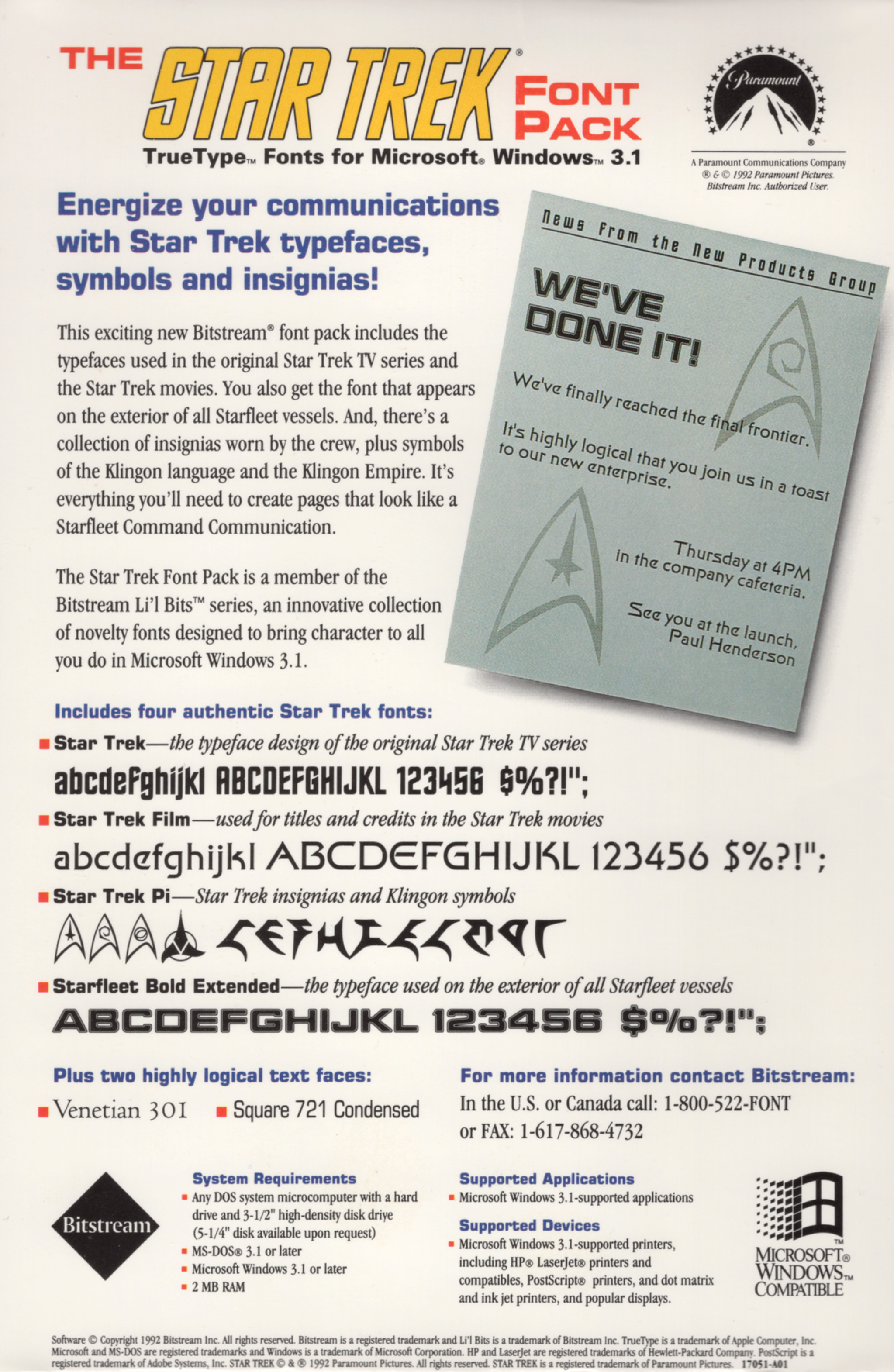
If you’re looking to bring character to all you do in Microsoft Windows 3.1, the “Star Trek” Font Pack is for you.
But back to the movie. Its opening scene starts with a menacing close-up of the movie’s central antagonist, which just happens to be a gigantic glowing space cloud:

Clouds are not generally known for their evil, murdering tendencies. To work around this potential dramatic limitation, the movie’s producers cleverly employ a scary sound effect whenever we’re meant to be intimidated by this galactic floaty miasma. Despite aural evidence to the contrary, the cloud’s twangling menace was not made by throwing a ham
into a sack of pianos. Instead, it’s the sound of a Blaster Beam, a twelve-to-eighteen-foot aluminum guitar-like device invented in the early 1970s by musician John Lazelle.
Los Angeles–based Beam player Francesco Lupica, who has performed as the Cosmic Beam Experience since the early seventies, is mentioned in The Motion Picture’s credits for his work creating sound effects for the movie. However, the primary credit for the cloud’s eerie twang goes to Craig Huxley, a child actor and musician who originally appeared in The Original Series as Captain Kirk’s nephew, before going on to create The Motion Picture’s scary soundscape.
As part of his collaboration with composer Jerry Goldsmith, Huxley (by now a professional musician) composed the Blaster Beam cadenza for The Motion Picture’s climax. He subsequently obtained a patent for the Blaster Beam’s design, and went on to bash its eerie strings in Back to the Future Part II and Part III, Tron, 2010, Who Framed Roger Rabbit, and 10 Cloverfield Lane, plus several more Star Trek movies.
If you’re not sufficiently freaked out by reading about how the Blaster Beam sounds, here’s Craig playing all 18 feet of it in a variety of movie scores:
Following its starring role in The Motion Picture, the Blaster Beam became so synonymous with sci-fi that it was featured in Seth MacFarlane’s The Orville as an aural homage to the original Trek movies. It’s basically become the audible equivalent of Eurostile.
As the cloud twangles ominously, three Klingon ships float into view. Clearly intimidated by the cloud’s noncorporeality, the Klingons fire some photon torpedoes into its inky midst. (It’s not entirely clear what they hope this will achieve.) As they optimistically launch their missiles, we see their native tongue translated into English in a slightly fuzzy Pump Demi:


The Motion Picture is notable for being the first time in Star Trek history that Klingons speak Klingon, rather than conversing in English. An initial Klingon dialect was created for the movie by UCLA linguist Hartmut Scharfe, but wasn’t felt to be alien enough, so James Doohan (aka Scotty) volunteered to work on an alternative. Doohan’s skills with accents were already well known—after all, he played a Scotsman, despite being a Canadian with Irish parents—and he helped come up with a number of nonsense phrases that formed the basis of the movie’s Klingon language. Associate producer Jon Povill described the birth of Klingon this way:
After Hartmut had done his thing and worked it all out logically, Jimmy and I just sat down one day and made up stuff. We created the Klingonese by using some of what Hartmut had done and then combining it with our own: We strung together nonsense syllables, basically—totally made up sounds with clicks, and grunts, and hisses.
The Klingon typography seen in the movie is just as nonsensical as the spoken language—the limited set of Klingon glyphs seen here don’t actually mean anything. They were nonetheless adapted (along with various Starfleet and Klingon insignia) into a “Star Trek” Font Pack typeface known as Star Trek Pi:

The Motion Picture’s Klingon might be nonsense, but the language has had a long and active development since the movie’s release. Doohan’s guttural phrases were adapted by linguist Marc Okrand into a full language for 1984’s Star Trek III: The Search for Spock, which was followed in 1985 by an official Klingon Dictionary:
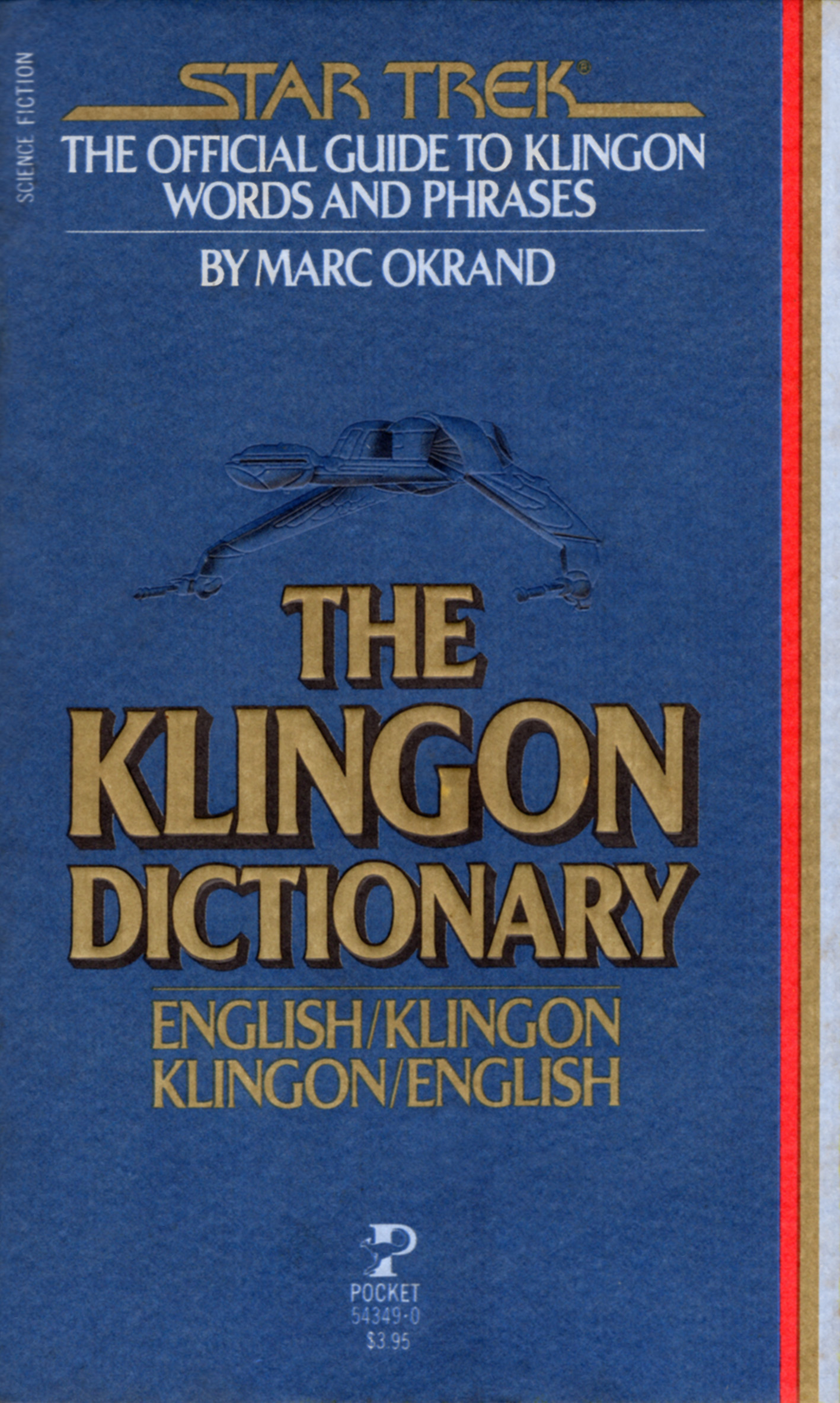
This dictionary describes the language’s grammar in detail, and provides two-way translations for common English and Klingon phrases. The dictionary has since been translated into Portuguese (Dicionário da língua Klingon), German (Das offizielle Wörterbuch: Klingonisch/Deutsch; Deutsch/Klingonisch), Italian (Il dizionario Klingon), Czech (Klingonský slovník), and Swedish (Klingonsk Ordbok).
Star Trek’s producers were not the first world builders to create an entire language, however. Lord of the Rings author J. R. R. Tolkien, inventor of two complete Elven languages, was a philologist long before he was a novelist. From his early days at the Oxford English Dictionary (where he was responsible for words starting with w), through his multiple professorships at Oxford University, Tolkien loved the study of language more than anything else. Indeed, he didn’t construct his Elven languages to add color to his novels; rather, he wrote novels to provide a world in which his created languages could live and breathe. Tolkien believed a language was truly alive only when it had a mythology to support it, and his books provided a world in which that mythology could exist.
Had Tolkien lived to see 1991’s Star Trek VI: The Undiscovered Country, I am therefore sure he would have approved of Klingon chancellor Gorkon’s tongue-in-cheek statement: “You have not experienced Shakespeare until you have read him in the original Klingon.” This comment inspired the Klingon Language Institute to produce The Klingon “Hamlet,” an equally tongue-in-cheek 219-page restoration of Shakespeare’s famous work to its original Klingon:

Despite the Klingons’ use of their native tongue, things are not going well for them in their battle against the evil space cloud. A distress message from the Klingon command ship is picked up by a sensor drone from space station Epsilon 9 and translated into English for the benefit of the station crew. This time, the Klingon does not translate into Pump. Instead, it’s a customized version of Futura Display, which is almost certainly the Letraset Instant Lettering version with bits cut out of it to make it more futuristic:


Its final sentence is completed by a voice reading out the English translation: “IMPERIAL KLINGON CRUISER AMAR… CONTINUING TO ATTACK.” (Given that these events take place during the opening ten minutes of the movie, you can probably guess how “CONTINUING TO ATTACK” is going to pan out.)
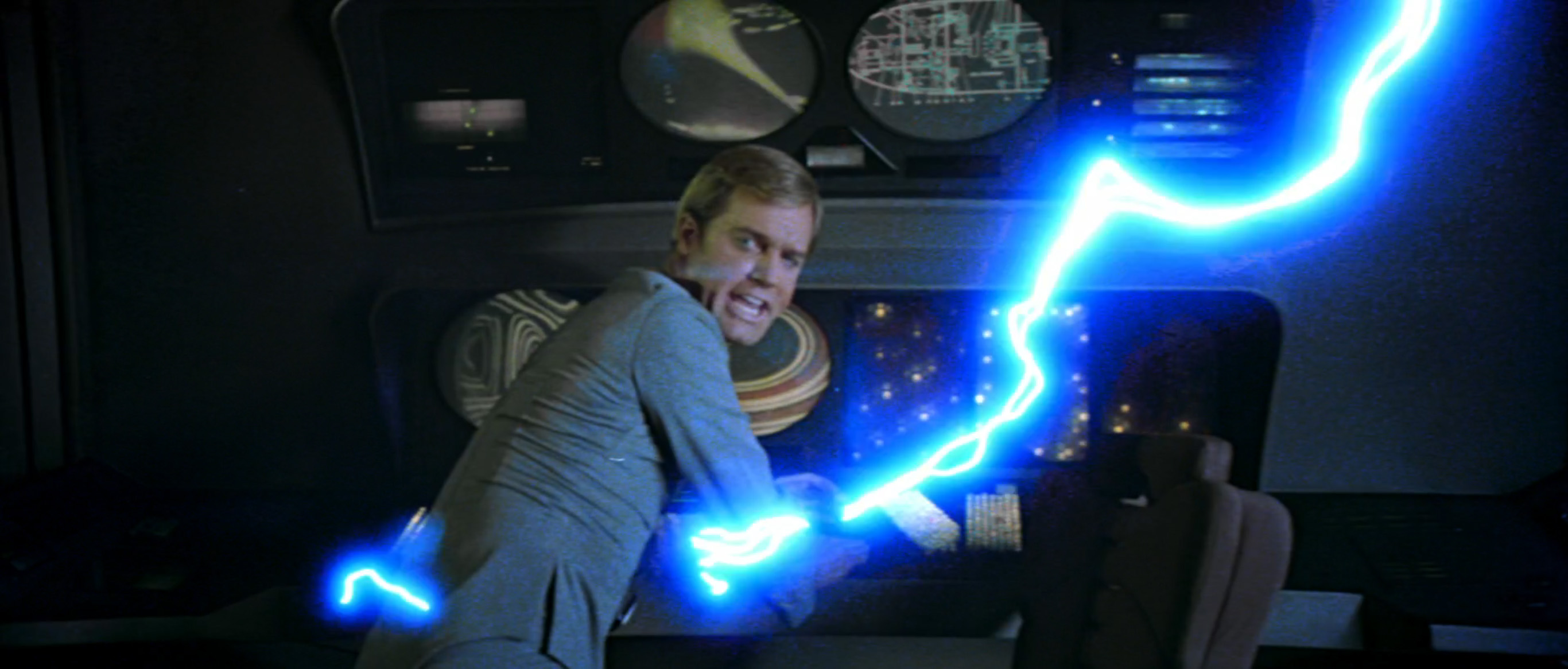
As we cut back from Epsilon 9 to the cloud, we see that only two of the three Klingon ships remain. According to the movie’s shooting script, this is because a “FRIGHTENING WHIPLASH OF ENERGY” has been fired from the cloud, creating evil lightning that makes Klingon ships disappear. A second frightening whiplash takes out ship number two, leaving only the command craft. As a third bolt appears on the Klingons’ tactical display, the command ship poops a red torpedo, but it is all to no avail. The command ship is whiplashed into nothingness.

As they express their shock, the watching crew of Epsilon 9 observes that the sinister gassy blanket is heading directly for Earth. The cloud puts on its best evil face, and makes its destructive intentions clear via some particularly dramatic twangs.
With twangling in our ears, we quickly switch scenes to Vulcan, which is easily recognizable from its lava-strewn matte paintings and suspicious geological similarity to filming locations in Yellowstone Park. Look—it’s Spock! He’s talking in Vulcan, which also translates into English as fuzzy Pump Demi:
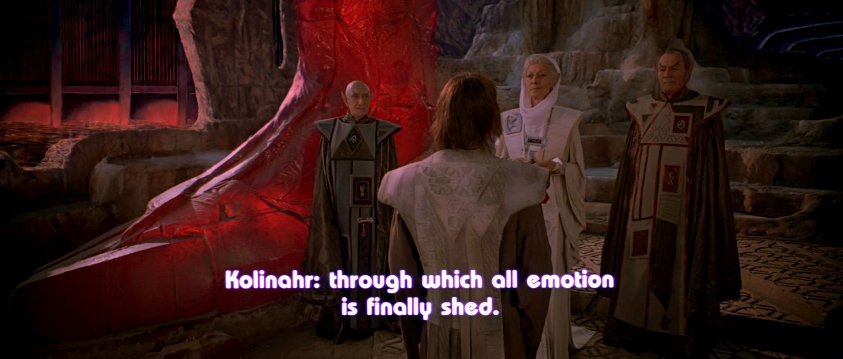
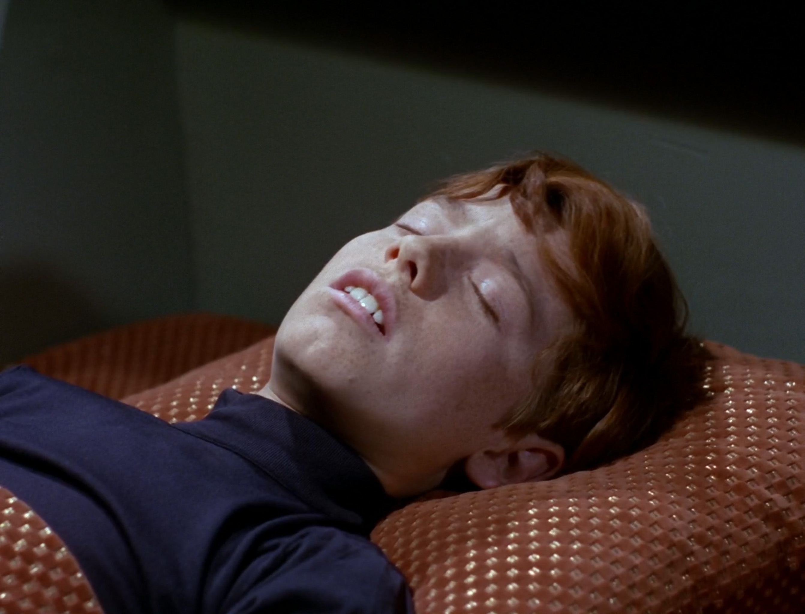
The lady Vulcan here is talking about the many years Spock has spent striving to attain Kolinahr, a state of pure logic in which Vulcans shed all of their emotion. She offers Spock a symbol of total logic to commemorate his imminent Kolinahr-ization—but just as she does so, Spock hears an 18ft cloud-guitar twangling in space. Lady Vulcan realizes that Spock’s goal lies elsewhere, and despite several years of exhortations, he fails to Kolinahr.
After our brief trip to Vulcan, we switch straight to San Francisco, specifically to the Golden Gate Bridge, as we follow an air tram on its way to Starfleet Command. The most notable change between now and the 2270s is that the bridge’s traffic lanes have been covered, thereby hiding the vehicles and making for a much cheaper effects shot:

Spoiler alert: That flying air tram contains Admiral James T. Kirk, who is heading to Starfleet Headquarters in San Francisco’s Presidio Park. There’s a nice close-up of the United Federation of Planets logo during a positioning shot as he arrives. This looks to be Eurostile Bold, but not quite—there’s something wrong with the capital Ss:
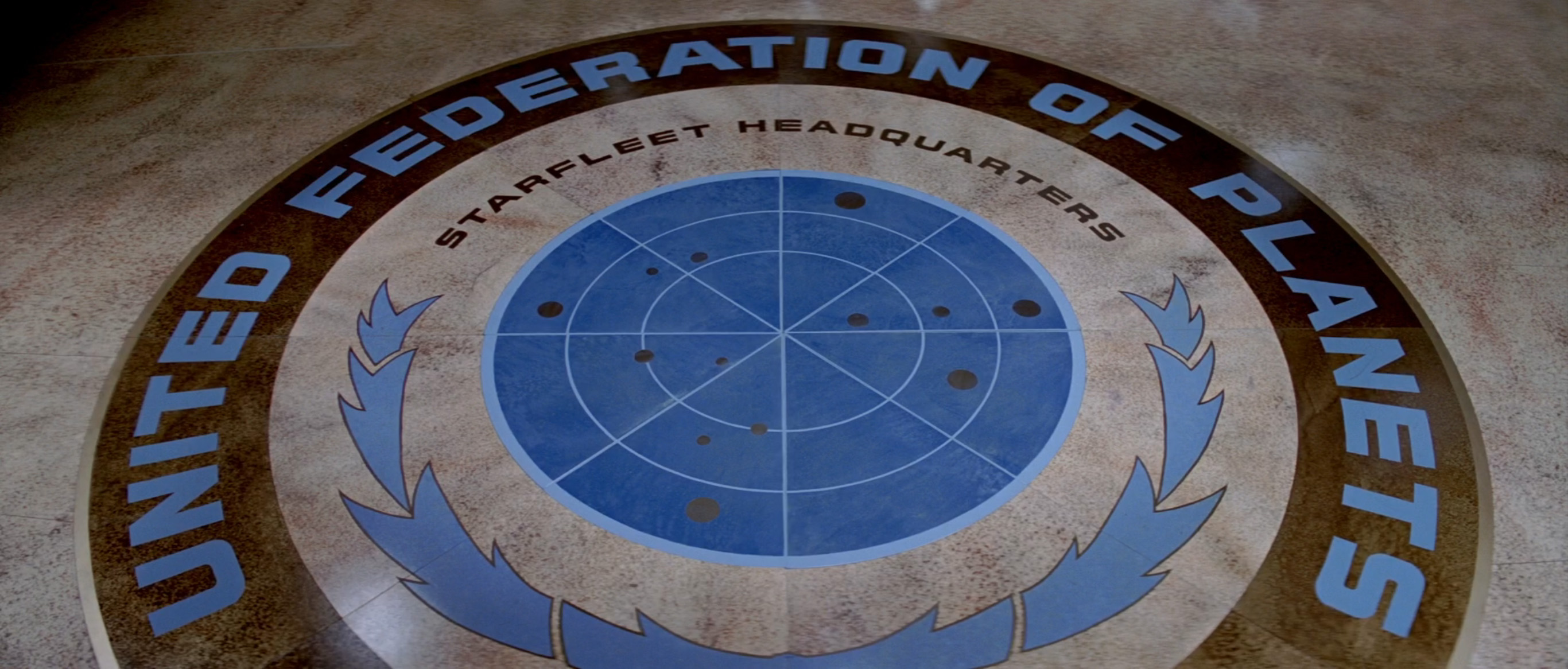
Starfleet is the military and exploratory arm of the Federation, which explains the use of the Federation’s stars-and-thistles logo as part of the floor decoration. We see the same logo a few moments later, on the side of Kirk’s air tram:

…and again when Kirk briefs the crew of the Enterprise about their upcoming mission:

Confusingly, each of these Federation logos has a different thistle design and a different constellation of stars. Perhaps more importantly, they bear a remarkable similarity to the official flag of the United Nations:


This is clever branding by the movie’s design team. A viewer’s subconscious recollection of the United Nations via this extrapolated logo and color scheme gives the Federation (and therefore Starfleet) an immediate association with peacekeeping and ethical behavior, eliminating the need for an extended explanation of their role in the movie’s universe. (All of which goes to show: Design doesn’t have to include typography to provide a shortcut for exposition.)
Just in case you have any doubt about the coincidence of this similarity: The “Star Trek” Star Fleet Technical Manual, published in 1975, includes the charter of the United Federation of Planets. It’s a direct copy of the United Nations charter, but with life forms instead of humans, and planets instead of nations. Differences are indicated in yellow, additions in green:


Shortly after arriving at Starfleet, Kirk transports to a space station near the USS Enterprise, which has been in dry dock while undergoing a post–Original Series refit. On arrival, he meets up with Scotty, and they take a shuttle to go and see the ship:

As they depart for the Enterprise, we see a mix of fonts on the side of the shuttle and station. “OFFICE LEVEL,” seen on the right, is, of course, perennial sci-fi favorite Eurostile Bold Extended:

…although, according to the Star Fleet Technical Manual, the “Earth font name” for Starfleet’s official type style is Microgramma Ext, suggesting that we may be looking at Eurostile’s predecessor Microgramma instead:

The “05” on the side of the shuttle is not Eurostile Bold Extended, however. This is Starfleet Bold Extended, the fourth and final font from the “Star Trek” Font Pack:

Unlike Eurostile, it has an outline, giving it a more curved silhouette overall. It also has higher bars on the P and R, a squared-off corner for the Q, and a very different number 1. (Eurostile’s 1 is perhaps its least practical glyph, which may explain why the Star Fleet Technical Manual extract above states that it should not be used in fleet operations.)


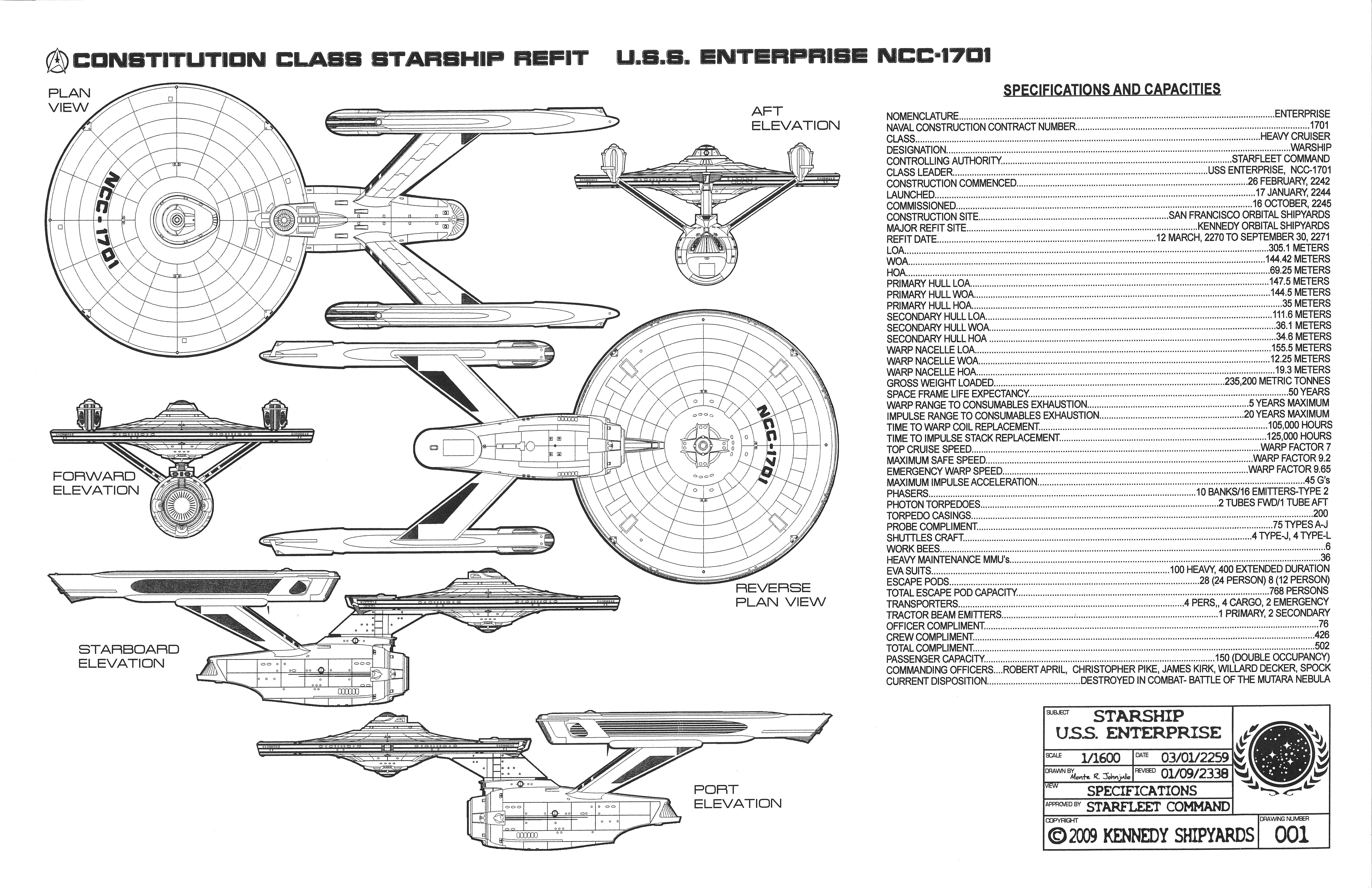
The R and the 1 make it easy to tell that Starfleet Bold Extended is used for the Enterprise’s hull classification symbol (“NCC”) and number (“1701”):
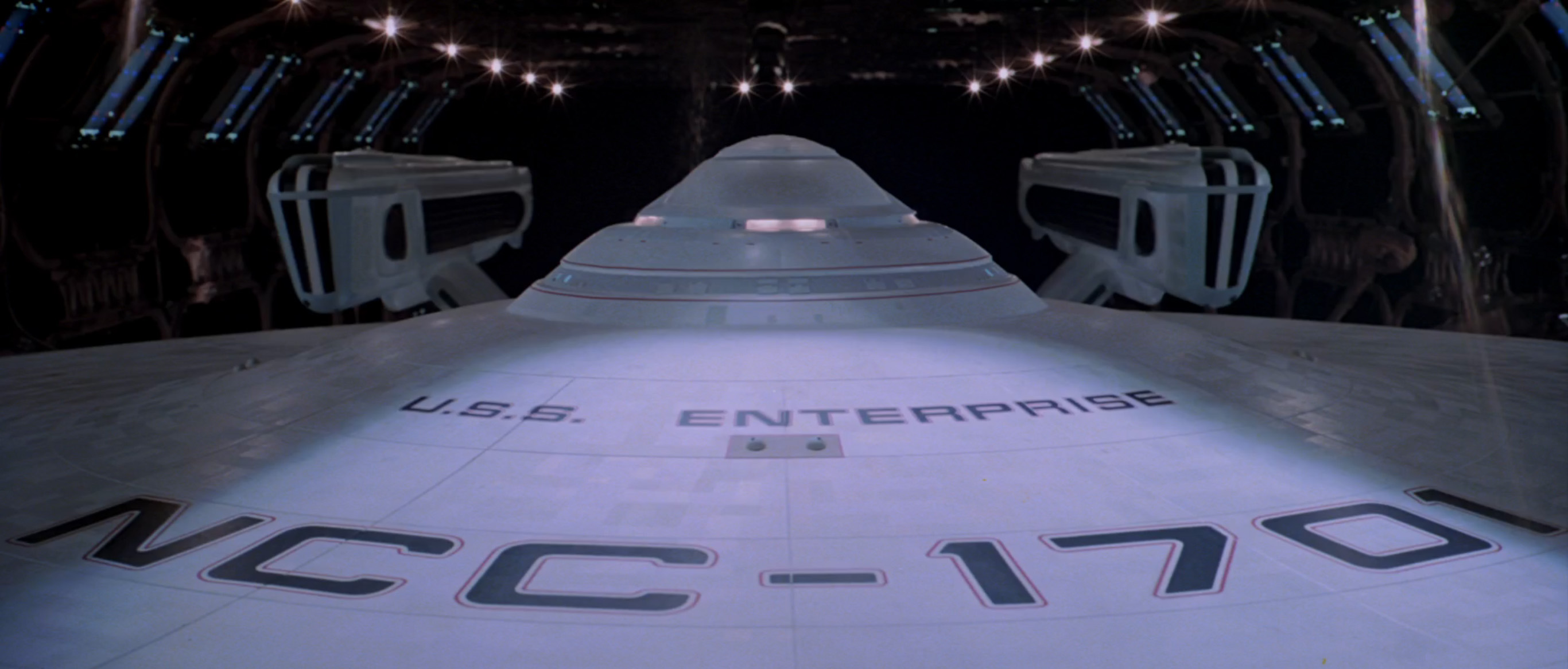
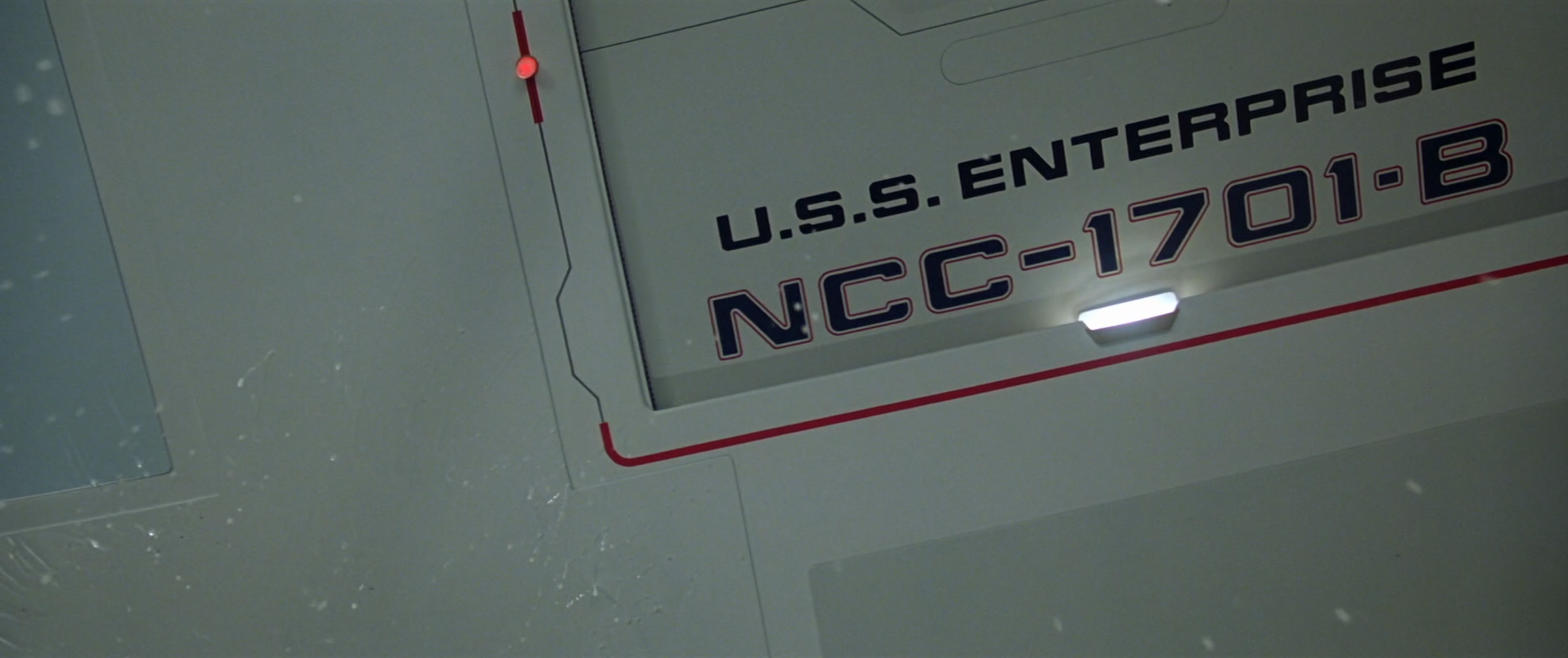
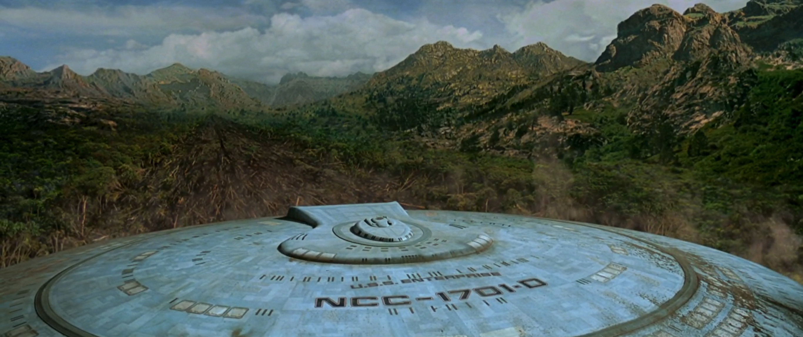
Indeed, Starfleet Bold Extended is used on the front of USS Enterprise NCC-1701 (and 1701-A, B, C, D, and E) in all subsequent Star Trek movies and TV shows, in essentially the same style as in The Motion Picture. This gives a consistent, instant recognizability to each iteration of the craft, despite the crew’s tendency to crash or otherwise destroy the ships for dramatic effect.


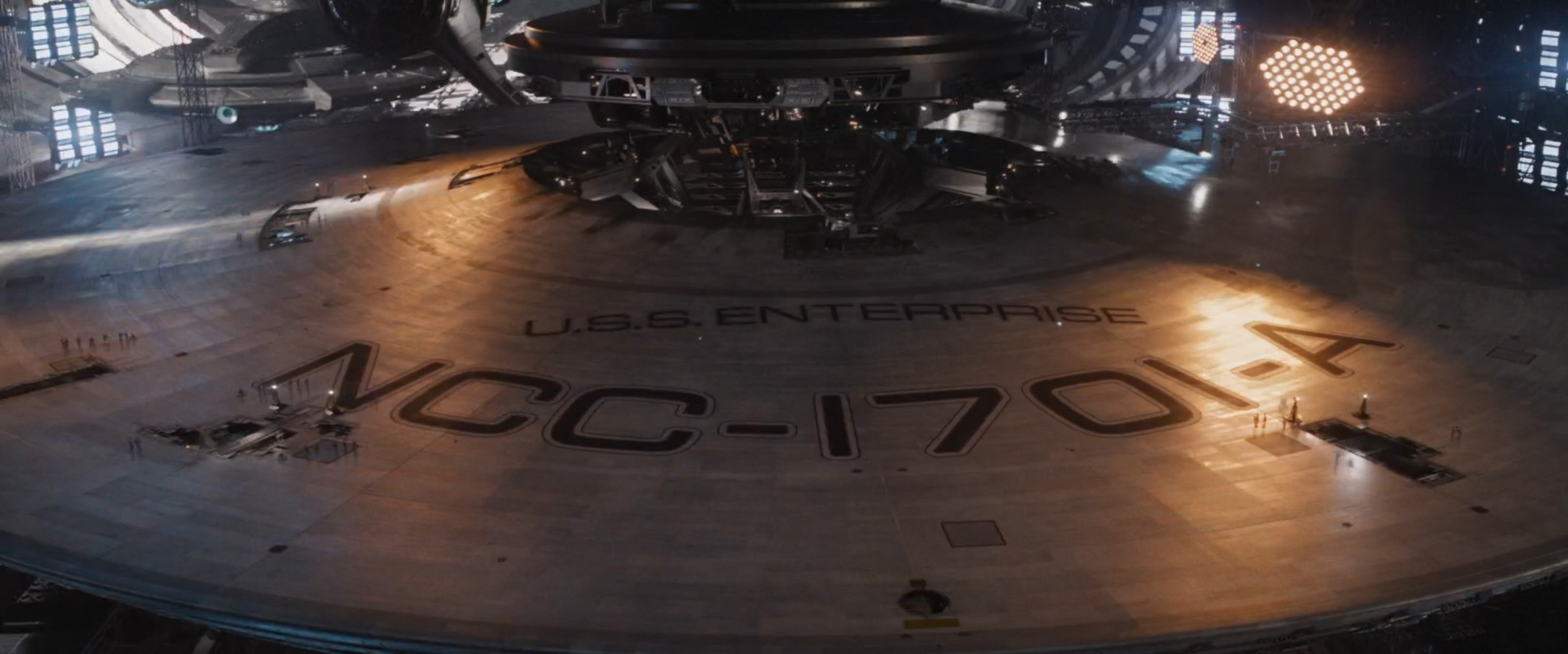
A different style was introduced for 2009’s Star Trek reboot, and continued through 2016’s Star Trek Beyond. The reboot movies use an outlined version of plain old Eurostile Extended for “U.S.S. ENTERPRISE,” though they continue to heed the advice from the Star Fleet Technical Manual about Eurostile’s 1, opting for flat lines for the 1s in “1701”:


In 2017, the Star Trek: Discovery TV series rebooted the typography once more, opting for Eurostile Bold Extended for the USS Discovery’s name and designation. Crucially, the Discovery becomes the first central Star Trek craft to ignore the Starfleet official type style, shamelessly using a Eurostile 1 character without modification:

The Enterprise’s complex shape could easily make it a nightmare to navigate. Thankfully, it has a fancy horizontal-and-vertical elevator system known as a turbolift, which whizzes crew members from A to B via handily placed turboshafts. We see a two-part map of the craft’s turboshaft network as Kirk heads up to the bridge. Judging from this map, it looks like the turbolift can move in all three dimensions, including along a curved route:

The white dot on the map indicates the lift’s current position. We see it move from right to left as the lift departs, and it’s clearly visible at the top of the map after the lift arrives at the bridge:

The turbolift’s multidirectional nature is also represented in its iconography, seen when Decker boards a turbolift on level five later in the movie:

Despite the turbolift’s obvious futurism, Star Trek was not the first to propose a multidirectional elevator. That honor goes to Roald Dahl, whose 1964 novel Charlie and the Chocolate Factory features a glass elevator that goes “sideways and longways and slantways and any other way you can think of.” (Unlike the turbolift, it can also propel itself out of its containing building and into the air via sugar power.)
The turbolift’s secret is being able to switch cars between shafts dynamically, in order to route travelers around the craft in the most efficient manner. This may have been a futuristic concept in 1979 when The Motion Picture was released, but I am delighted to report that it recently became a reality. In 2017, German elevator company thyssenkrupp performed the first real-world test of its MULTI elevator system.

According to thyssenkrupp, MULTI increases elevator capacity by 50 percent, while halving the elevator footprint within a building. It allows ninety-degree turning of the system’s linear drive and guiding equipment, enabling cars to quickly move between horizontal and vertical shafts during a single journey.

MULTI operates in two dimensions, not three, so it’s not quite a full-fledged turbolift. Nonetheless, its motors are based on technology from a magnetic levitating train system, so it’s still pretty damned futuristic.
Kirk gathers his crew and explains that they are the only ship near enough to intercept the evil space cloud, and so they’re going to have to save the day. A message comes through on the big screen from Epsilon 9, informing everyone that the cloud is “over eighty-two AUs in diameter.” This seems somewhat incredible, given that one AU (astronomical unit) is the average distance from Earth to the sun, which is about ninety-three million miles. (Indeed, it’s so incredible, that the director’s edition of the movie used some sneaky dialogue editing to make the cloud “over two AUs in diameter” instead.)

To give some context to vastness on this scale: On August 25, 2012, NASA’s Voyager 1, humankind’s farthest-traveling spacecraft, entered interstellar space at a distance of around 125 AUs from the sun, after traveling nonstop for nearly thirty-five years. Even this distance is still technically within our solar system, however, and it will be another forty thousand years before Voyager 1 approaches a planetary system outside our own. (Unless, that is, a Voyager craft finds a way to sidestep such vast distances by traveling through a black hole—not that this is likely to be relevant to the plot of The Motion Picture, of course.)
Regardless of the true size of the cloud, it makes short work of dispatching Epsilon 9 (and a random man, with really big hands, in an orange spacesuit) while the Enterprise crew looks on. Kirk tells the shocked crew to get ready to leave, and they set about their preparations.
As the Enterprise heads cloud-wards, Kirk notes that he must risk engaging warp drive while still within the solar system. In a turn of events that will surprise no one, engaging a not-properly-tested warp drive while still in the solar system turns out to be a bad idea, resulting in the Enterprise being dragged into a wormhole. Everything goooeeesss a biiiiiit sloooooow moootionnnnnn as the crew tries to destroy an asteroid that has been dragged into the wormhole with them. This scene’s highlight is an excellent use of some spare Letraset Instant Lettering, in which a combination of symbols from the bottom right corner of a Letraset sheet are used upside-down in a weapons system’s “TRACKING SEQUENCE”:

With the wormhole successfully navigated, the Enterprise continues on its way toward the space cloud. Not much happens. Indeed, there are ten whole minutes that basically consist just of people looking at a cloud, without any typography. So let’s skip ahead to the cloud’s approximate center, and the mild peril therein.
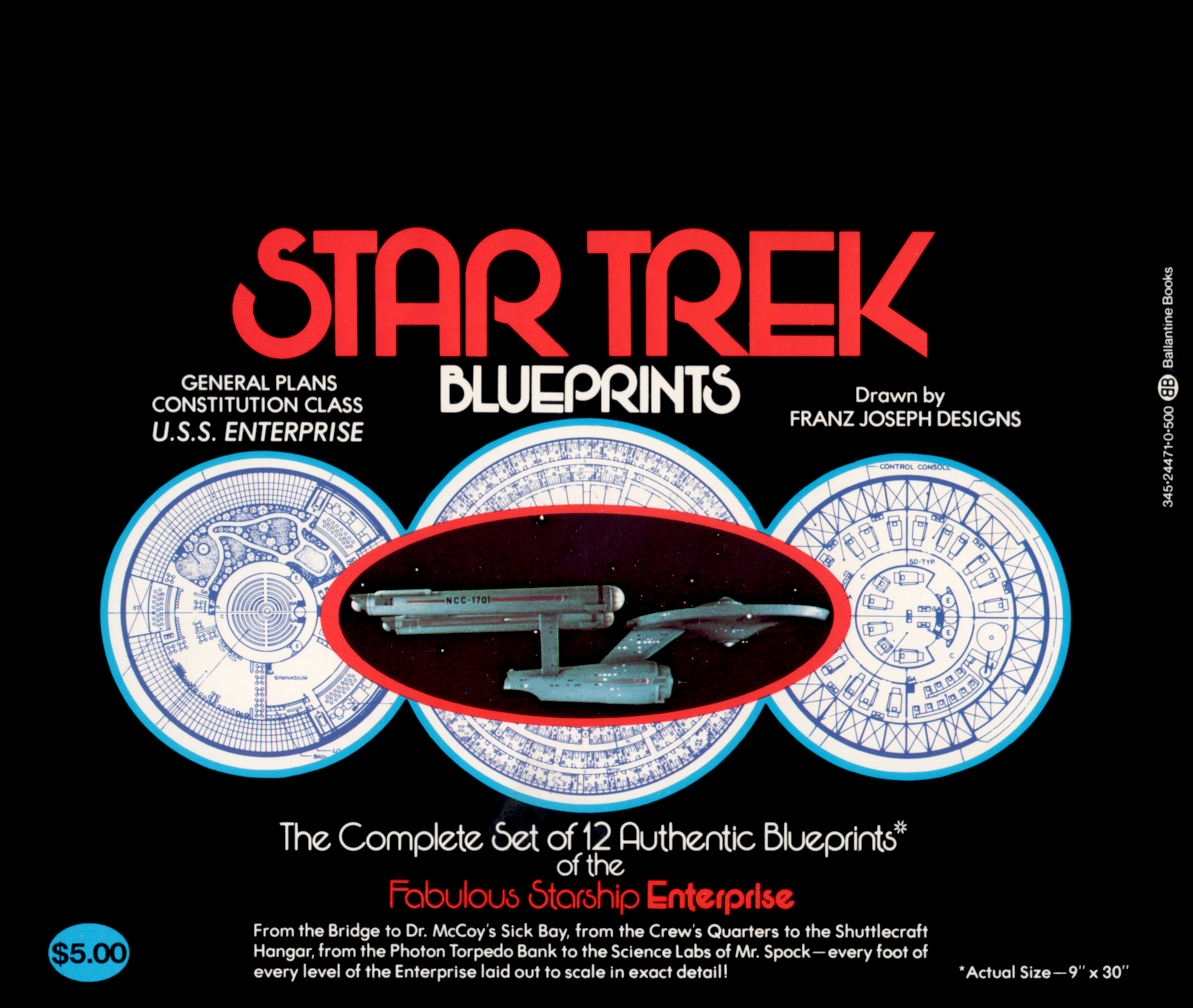
Intruder alert! A strange alien light-beam probe intrudes into the bridge. It heads over to the science station and starts calling up blueprints of the Enterprise:
These blueprints are taken directly from 1973’s “Star Trek” Blueprints by Franz Joseph, who also wrote and designed the Star Fleet Technical Manual. Specifically, these blueprints show the inboard profile and crew’s quarters of the Enterprise. (Strictly speaking, this means the probe is scanning blueprints from before the Enterprise underwent its Motion Picture refit, but let’s not worry too much.)


Joseph’s Blueprints and Technical Manual were spectacularly successful publications for Ballantine, with the Technical Manual reaching number one on the New York Times trade paperback list. (Indeed, it is entirely possible that the books’ success contributed to Paramount’s decision to revive Star Trek in the first place.)
After scanning the blueprints, the probe zaps Deltan crew member Ilia, and she disappears. She’s not gone long, though. A few minutes later, she returns as IliaBot, a synthetic replacement created by the mysterious life force at the space cloud’s center in order to communicate with the “carbon units” aboard the Enterprise.
The newly appeared IliaBot notes that she has been “programmed by V’Ger to observe and record.” In doing so, she provides a name for the mysterious cloud-based entity that’s been causing everyone so much trouble. (Although why there would be a flying entity called V’Ger this many AUs from the sun still remains unclear.)
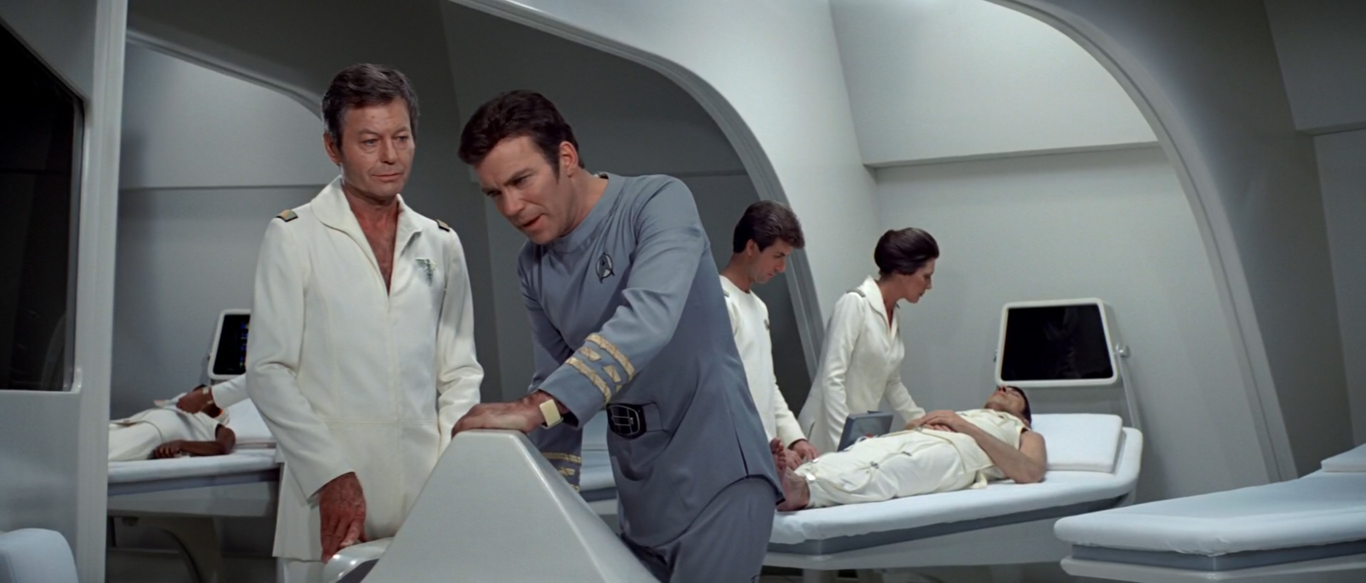
Spock advocates a thorough medical analysis, and IliaBot is whisked off to the Enterprise’s sick bay, where she is scanned on a futuristic medical table:

Alien, also released in 1979, features a remarkably similar scanner in the Nostromo’s onboard “autodoc.” Alien’s version didn’t make it into the original theatrical cut of the movie, but you can see it in the 2003 director’s cut, in which it is used to scan the body of a recently face-hugged Kane:

Both of these devices look to be inspired by the just-invented science of X-ray computed tomography (better known today as a CT scan), for which physicists Allan M. Cormack and Godfrey N. Hounsfield shared a 1979 Nobel Prize.
These two scanning devices may have seemed futuristic to 1979 viewers, but as CT scanners became more common, later sci-fi outings had to up their game to keep one step ahead of reality. Lost in Space (1998) and the “Ariel” episode of Firefly (2002) both moved to holographic scanners, projecting a virtual image of a patient’s innards above their actual body instead of on a screen.


More recent movies have adopted even more advanced approaches. Prometheus (2012), Elysium (2013), and Passengers (2016) all feature devices that perform actual surgery without the need for a doctor.


These devices are definitely one step ahead of present-day robotic surgery, which focuses more on improving the precision of humans rather than removing the need for them altogether. Their nearest real-world equivalent is the da Vinci Surgical System from Intuitive Surgical, which was approved by the FDA in 2000, but is still controlled by a specially trained surgeon from a nearby console.

The most impressive movie medical gadget, however, is surely the reconstruction device seen in 1997’s The Fifth Element, which can re-create an entire living being from a single bone fragment. Despite recent real-world advancements in growing human replacement organs, we can be confident that this device will remain futuristic for some time yet.
As these medical devices show, the threat of technology catching up with the future is a perennial problem for science fiction, especially in a franchise as long-running as Star Trek. In the time between The Original Series (1966–69) and The Motion Picture (1979), hand-held communicators of the type used by the original Enterprise crew had gone from a futuristic possibility to a technical reality. As a result, Gene Roddenberry felt a new style of communicator was needed to make The Motion Picture feel like it was set in the future. In the place of hand-held devices, The Motion Picture introduced wrist-based communicators, worn at all times by Enterprise crew members.

Despite their always-available convenience, these wrist-based communicators are used to advance the plot in only two scenes—when Decker tells the crew to return to their stations, and when Kirk speaks to Uhura from beside the V’Ger craft. Indeed, it’s notable that earlier in the movie, Kirk uses a desktop comms panel in the Enterprise’s sick bay rather than speaking into the device on his wrist:
Real-world wrist-based devices such as Apple’s cellular Apple Watch don’t require the device’s built-in microphone to be held anywhere near the face in order to be effective. However, in a movie, it’s necessary to move the device close to the actor’s mouth to make it clear that it is being used to communicate. (The alternative—keeping the actor’s wrist by his or her side—makes it look like the actors are simply talking to themselves.) This practical storytelling disadvantage, with the potential to mask the actor’s face, may be why the otherwise futuristic wrist communicators were used sparingly in The Motion Picture—and were quietly replaced by more traditional handheld devices in later Star Trek movies.


The medical scanner’s analysis tells Bones that IliaBot is made from “micro-miniature hydraulics, sensors, and molecule-size multiprocessor chips.” However, despite the spectacular level of detail in this mechanical marvel, V’Ger’s creation is sadly missing any sign of emotion. An optimistic Decker takes it on a tour of the recreation deck, one of Ilia’s favorite hangouts pre-robotification, to try to connect with its non-robotic side. Here, Decker introduces IliaBot to a set of illustrations of five historical ships called Enterprise:
From left to right, they are:


on screen. The same illustration does, however, appear on a wall in “First Flight,” a 2003 Star Trek: Enterprise episode.


The USS Enterprise (CV-6) is not the only aircraft carrier to have a Star Trek connection. Its successor, the nuclear-powered CVN-65, appears in Star Trek IV: The Voyage Home, when Chekov and Uhura attempt to steal some nuclear power to recrystallize their dilithium. We can be confident that they steal it from the USS Enterprise (CVN-65), because the US Navy has conveniently left out some large signs that say “USS ENTERPRISE CVN-65”:

UPDATE: Actually, it turns out we can’t be confident that this is the USS Enterprise (CVN-65), because it was out at sea when this scene was filmed. The non-nuclear USS Ranger (CV-61) stood in for it instead.
The inclusion of the space shuttle Enterprise (OV-101) in this gallery is also of note. NASA’s prototype space shuttle was originally going to be called Constitution, to celebrate its unveiling on the anniversary of the signing of the United States Constitution. However, Star Trek superfan Bjo Trimble, who had previously led a successful letter-writing campaign to bring back The Original Series for a third season, launched a new campaign to encourage fans to ask for the shuttle’s name to be changed to Enterprise. Tens of thousands of fans responded. This led President Gerald Ford’s senior economic adviser, William F. Gorog, to write a memo to the president, advocating for the name change:

Four days later, Ford received a follow-up memo from James Connor, secretary to the cabinet. Ford was convinced, and the Constitution became the Enterprise.

When the shuttle was unveiled on September 17, 1976, many of the Star Trek cast were in attendance as special guests, along with creator Gene Roddenberry. To complete the occasion, the Air Force band struck up a surprise rendition of the Star Trek theme in their honor.

Paramount wisely made the most of the announcement’s PR value, taking out a full-page ad in the New York Times a few days later to announce the movie to the world:

As a prototype, the space shuttle Enterprise was constructed without engines or a functional heat shield, and was therefore incapable of independent spaceflight. The photo seen in The Motion Picture’s recreation room looks to be from the Enterprise’s final test flight in 1977’s approach and landing tests, during which the Enterprise was flown atop a Shuttle Carrier Aircraft (a heavily modified Boeing 747), then jettisoned from its perch using explosive bolts. After its release, it glided to a landing on the runway at Edwards Air Force Base. (The engines seen on the back of the craft in the photo are dummy engines, for aerodynamic test purposes only.) Despite initial plans to retrofit the Enterprise as a spaceflight-capable vehicle, this ended up being financially impractical, and the Enterprise never made it into orbit. Nonetheless, its 1977 test landing happened just in time for a photo of OV-101 to appear aboard NCC-1701.
The space shuttle Enterprise might not have made it into space, but some of its campaigners did. As a thank-you for the letter-writing efforts, Star Trek creator Gene Roddenberry asked Trimble to organize a cattle call of fans to appear in the recreation room scene. The Enterprise crew members shown listening to Kirk’s impassioned speech in The Motion Picture are all Trekkers, in a range of costumes and latex alien masks:

UPDATE: According to none other than Bjo Trimble herself in the comments below, the crew in this scene is actually a mix of Trek fans and professional extras (at the insistence of the Screen Extras Guild). The good news is that fans were paid the same as the professional extras for their time; the bad news is that both fans and extras were on set from 5am until midnight, as the scene was filmed in one day rather than the expected two. Bjo herself is in a white uniform, halfway back, behind an extremely tall extra.
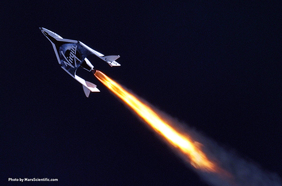
The space-faring hopes of real-world Enterprise craft didn’t end with the space shuttle Enterprise, however. In December 2009, Virgin Galactic unveiled its SpaceShipTwo spacecraft, as part of an attempt to become the world’s first commercial space carrier:
From a Virgin Galactic press release of the time:
In honour of a long tradition of using the word Enterprise in the naming of Royal Navy, US Navy, NASA vehicles and even science fiction spacecraft, Governor Schwarzenegger of California and Governor Richardson of New Mexico will today christen SS2 with the name Virgin Space Ship (VSS) ENTERPRISE. This represents not only an acknowledgement to that name’s honorable past but also looks to the future of the role of private enterprise in the development of the exploration, industrialisation and human habitation of space.
Sadly, this Enterprise didn’t make it into space either. During a powered test flight in October 2014, the VSS Enterprise was destroyed after a premature deployment of its descent device.
In a twist of hope for The Motion Picture fans, the VSS Enterprise’s successor was nearly named VSS Voyager. Its final name, however, was chosen by physicist Stephen Hawking, who christened the new craft VSS Unity instead.
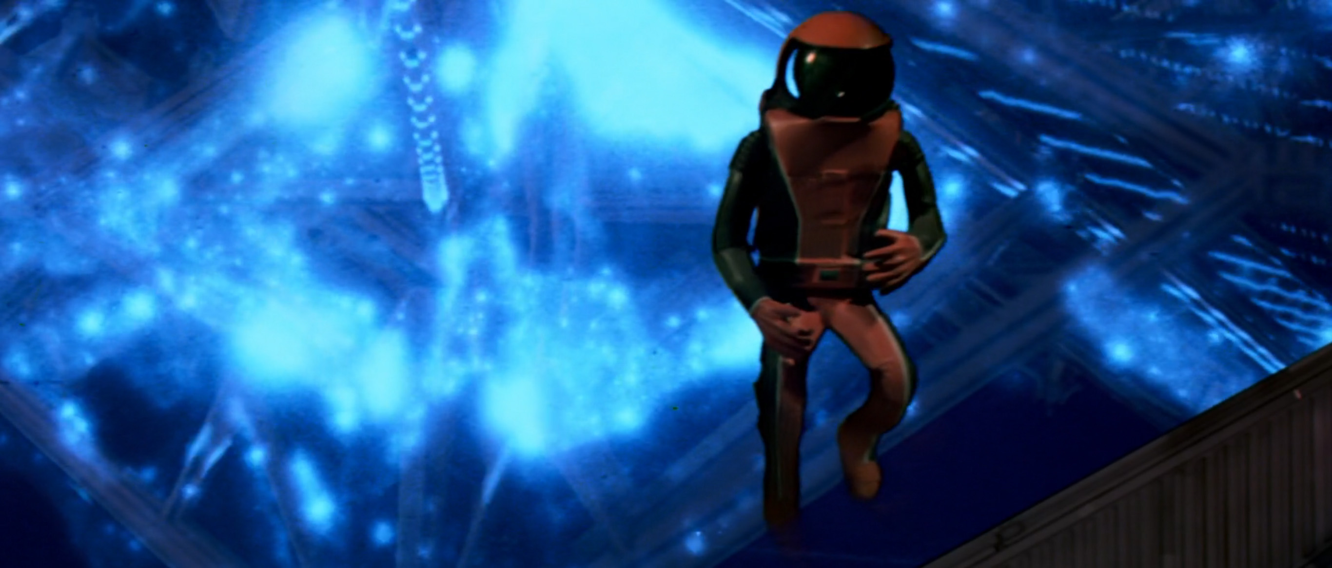
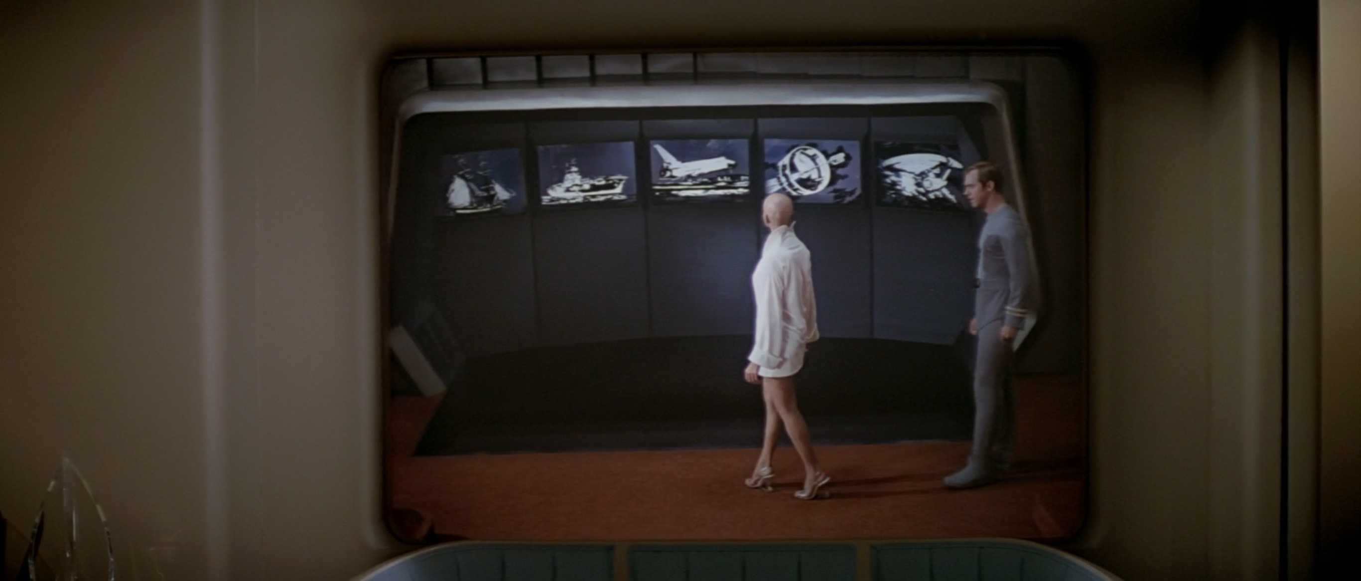
While Decker gives Ilia a tour, Spock sneaks outside in a spacesuit and flies through V’Ger’s pulsating orifice with pinpoint timing. He encounters a giant pseudo-Ilia, with whom he attempts a mind-meld. A dazzling montage of images flashes up on his space helmet during the meld, including one of particular interest:

This illustration is from the six-by-nine-inch gold-anodized aluminum plaque mounted aboard NASA’s Pioneer 10 and Pioneer 11 spacecraft, which traveled to Jupiter (and in the case of Pioneer 11, to Saturn) in the late 1970s:

These plaques were created by author Carl Sagan and SETI (Search for Extraterrestrial Intelligence) Institute founder Frank Drake, and illustrated by Linda Salzman Sagan, as a message from mankind to any passing extraterrestrials that might chance upon the flights.
The purpose of these plaques was to educate inhabitants of other planetary systems about Pioneer’s home planet. Pioneer 10 is shown leaving the solar system after passing Jupiter, though the arrow symbol indicating its trajectory is unlikely to make sense to extraterrestrial species unless they, too, evolved from a hunter-gatherer society.

This Pioneer plaque also appears briefly in Star Trek V: The Final Frontier, though it is erroneously facing outward for shot-framing convenience. It doesn’t really make a difference, as the Pioneer craft is unceremoniously blown up by a passing extraterrestrial, without so much as a glance at the engraving. (The moral: Let’s hope mankind’s actual first contact does not involve a Klingon.)


Pioneer’s successor, the Voyager program, also contained a message to extraterrestrial life. For Voyager, however, Sagan went one better than a plaque, sending an entire album of Earth facts into the cosmos. And when I say “album,” I really do mean it in the old-school vinyl LP sense. Voyager 1 and 2 each carried a golden record of earthly sights and sounds, along with engraved instructions as to how to play the record.


The Voyager golden records include music, spoken phrases, a recording of human brain-waves, and a series of encoded images including food, anatomy, biology, animals, and architecture. The presence of these images showing Earth’s amazingness raised concerns around the launch of Voyager 1 and Voyager 2 that if an intelligent species ever did encounter one of the records, it might decide to invade or attack Earth to control that amazingness itself. Still, I’m sure there’s no chance of that happening in practice, right?
After a tense standoff during which a mysterious being named “V’Ger” threatens to attack Earth to control its amazingness, the Enterprise crew manage to gain an audience with V’Ger itself. Much to everyone’s surprise, the all-powerful creature at the center of the evil space cloud turns out to be an old-school NASA spacecraft. As the crew inspects the craft, Kirk rubs some dirt off a sign on the side and reads out, “V-G-E-R. V’Ger.” Oh my goodness—it’s a hypothetical Voyager 6!

The timing of The Motion Picture’s release is important when considering the cultural significance of this scene. Voyager 2 launched on August 20, 1977, followed by Voyager 1 a couple of weeks later. (Voyager 1 overtook its sister craft in December 1977, hence the unusual ordering.) Both craft completed their observations of Jupiter during 1979, shortly before The Motion Picture was released. In the same way that 1968’s 2001: A Space Odyssey leap-frogged the Apollo moon missions and aimed for Jupiter, 1979’s The Motion Picture leapfrogged Jupiter and imagined humanity sending a probe far beyond its 1970s counterparts.
The idea of a rogue Voyager would not have been alien to seventies viewers, either. Shortly after the launch of Voyager 2, the probe started triggering its onboard systems independently, ignoring the post-launch instructions of its creators. The extreme shaking of Voyager 2’s launch rocket had made the probe think it was failing, causing it to switch to its backup systems and
try to figure out what was going on. Indeed, for a few days NASA engineers on Earth had no idea whether the Voyager 2 mission had been lost altogether. Newspapers ran headlines such as “‘Mutiny’ in Space” and “Voyager Going to HAL?”, with 2001’s antagonist HAL 9000 clearly still a reference point for space-based computers turning rogue. Thankfully, Voyager 2’s trajectory stabilized and conditions returned to normal operating thresholds, ending its temporary rebellion.

The real-world Voyager 1 and 2 were sadly not succeeded by Voyagers 3 through 6, leaving The Motion Picture to imagine what the program’s future might have been. Its ambitions are certainly grand—during the movie’s finale, Decker suggests that V’Ger traveled to the far side of the galaxy after falling in to “what they used to call a ‘black hole’”. This is impressive, given that the nearest black hole to Earth is HR 6819, which is about 1,120 light years away from our solar system. Even traveling at its current speed of 38,000mph, it would take Voyager 1 nearly 20 million years to reach this black hole. (No amount of Eurostile Bold Extended can set The Motion Picture that far in the future.)
Back in the movie’s finale, the Enterprise crew deduces a remarkable amount of V’Ger’s life story from zero evidence, thereby accelerating the exposition nicely. Without any assisting typography, they determine that V’Ger wants to physically join with a human to become one with its creator. Decker bravely volunteers to join with IliaBot. He turns all sparkly, and his hair blows crazily in the breeze. Ilia’s does not. As their join completes, the entirety of V’Ger turns sparkly and disappears to leave nothing but the Enterprise, flying pointedly toward the camera.
As we wave goodbye to the Enterprise, we should note that unlike many sci-fi movies, The Motion Picture has not once shown a present-day company in a futuristic setting. To make up for it, Italian car manufacturer created a movie tie-in ad for the launch of their own spacey craft, the Fiat Panda:
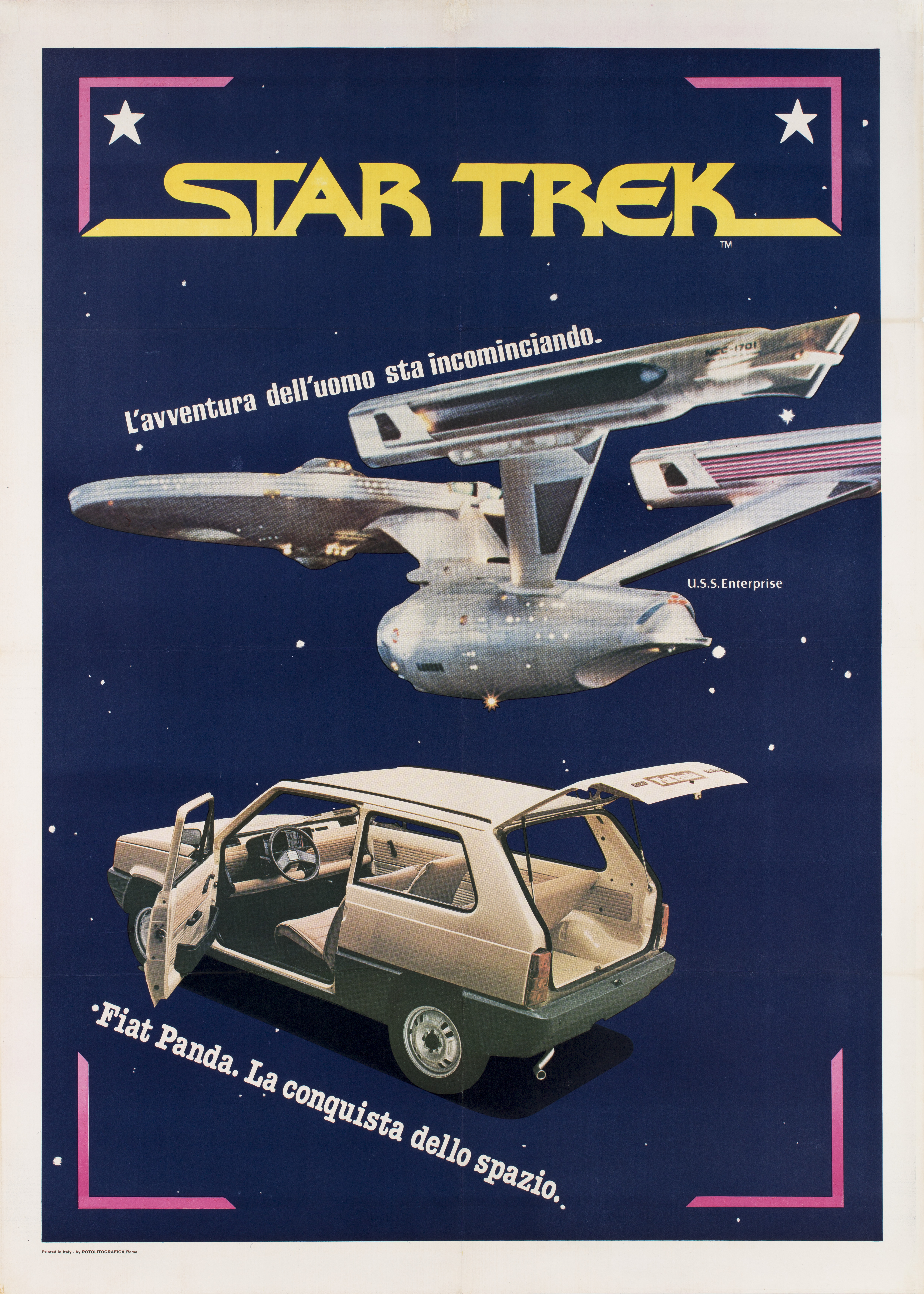
The text on the poster can be translated as: “The human adventure is just beginning. [This was The Motion Picture’s tagline.] Fiat Panda. The conquest of space.”
To find out if this is a fair comparison on Fiat’s behalf, let’s pitch the USS Enterprise refit against the Panda 30:
| USS Enterprise (refit) | Fiat Panda 30 | |
| Launched | Jan 2244 | Feb 1980 |
| Length (m) | 305.1 | 3.38 |
| Shape | Curvy | Boxy |
| Gross Weight (tons) | 235,200 | 1.05 |
| Top Speed (mph) | 522,201,121,422 (1) | 71 |
| Max Acceleration | 45 g | 0.08 g (2) |
| Officer Complement | 76 | 1 |
| Crew Complement | 426 | 0 |
| Passenger Capacity | 150 | One in the front, two in the back |
| 7-Position Adjustable Rear Seat | No | Yes |
Here’s that seven-position adjustable rear seat in action, converting from fold-up storage to a comfortable bed:

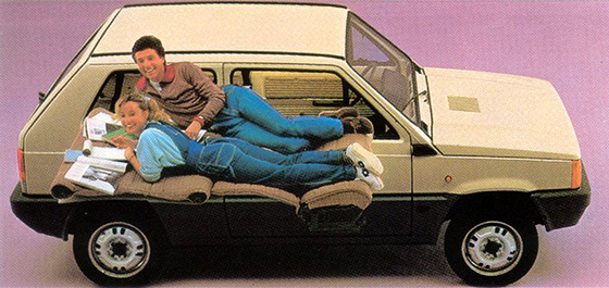
Impressive as the Enterprise undoubtedly is, I think we can all agree that the Panda is the clear winner here.
The article above is an expanded chapter from the Typeset in the Future book, which you should absolutely go and buy while you’re all excited about sci-fi typography. There’s even a Japanese edition! The book also contains an in-depth interview with Mike Okuda, designer of many Star Trek movies and TV shows, and creator of the LCARS computer interface first seen in Star Trek: The Next Generation.
If you’re not yet sold by just how much you need the TITF book in your life, you can always check out my other articles, including 2001: A Space Odyssey, Alien, Blade Runner, WALL·E, and Moon. And if you’d prefer even more Star Trek font trivia, I highly recommend The Fonts of Star Trek by Yves Peters.
(1) USS Enterprise (refit) max speed warp factor = 9.2
Warp speed calculation: speed = (warp3) * c
speed = (9.2*9.2*9.2) * 299,792,458 m/s
speed = 778.69 * 299,792,458 m/s
speed = 233,444,789,535 m/s
speed = 522,201,121,422 mph
(2) 0-60mph in 34 sec = 0.08 g

Fantastic work as always, Dave! Many many details I didn’t know about a movie that is near and dear to my heart (even if that heart admits it’s not all that great — they don’t call it “Star Trek: The Motionless Picture” for nothing).
In seeing the Golden Record, and recalling some images of other space probes, I was wondering if there might be an article on Fonts in Space, about the type used on the non-fictional devices humans have sent out into the cosmos. I am especially struck by the use of what appears to be Impact very prominently on the Curiosity Mars rover (https://gadgets.ndtv.com/science/news/nasas-curiosity-rover-completes-6-years-on-mars-1895838), and of course the Futura on the Apollo 11 “We came in peace” plaque (complete with very wonky spacing of “JULY 1969, A. D.” (https://rangetracking.com/2018/08/31/we-came-in-peace-for-all-mankind/). I think there is something so evocative and…human…about putting text on something that no homo sapien is intended to read.
LikeLike
It was Admiral Kirk in the tram heading to San Francisco. He took a reduction in rank to Captain to assume command of the Enterprise after he arrived on the Enterprise. Great article 🙂
LikeLike
Oh, _very_ good spot! You are absolutely correct 🙂
LikeLike
I have updated the article to fix the error. Thank you again!
LikeLike
Interesting stuff, I love all the detail you’ve included! 🙂
FTR: “The real Enterprise, out at sea at the time, was unavailable for filming, so the non-nuclear-powered carrier USS Ranger (CV-61) was used.”, per Wikipedia: https://en.wikipedia.org/wiki/Star_Trek_IV:_The_Voyage_Home#cite_ref-31
LikeLike
Good fact – thank you for the clarification!
LikeLike
Good spot! I have updated the article to clarify.
LikeLike
Gene Roddenberry Based Star Trek On Project Solar Warden – The “New” (40+ Year Old) Space Force…
LikeLike
Got halfway through the article, and I bought the book. Thank you!
LikeLike
An excellent piece detailing the typography of my favorite movie of my favorite show! One small little tiny nit to pick, though – your photo of the original Enterprise (“no bloody A, B, C, or D!”) is actually a shot from the Remastered Star Trek, so while it is representative, it’s not a shot from the series as shown in 1966. Additionally, the ship in the photo is indeed traveling left to right. The only time the ship was shown traveling right to left was in “Mirror, Mirror”.
LikeLike
It is worth mentioning that this episode could be considered a cinematic adaptation of the episode The Changeling.
LikeLike
This is brilliant and very entertaining! Buying the book.
LikeLike
I thoroughly enjoyed this.
LikeLike
Would love a font of the TMP subtitle. It’s the only font you didn’t mention in this incredibly thorough article.
LikeLike
Fantastic article! As a former professional graphic designer and frequent user of the Start Trek font set through many years of organized fandom and running convention photo ops, etc., I really enjoyed that aspect of it along with the details about ship designs, blueprints and diagrams.
One detail that should be noted, however, is that in Star Trek IV: The Voyage Home, it was the carrier USS Ranger that stood in as the carrier Enterprise.
LikeLike
Interesting article, aside from a few niggles. The biggest one is that the ST:TMP crew shown on the rec deck was not 100% fans. Gene Roddenberry went to the Screen Extras Guild (later to be combined with the Screen Actors Guild) and asked permission to “go on the street” for some of the 400+ people on the rec deck. SEG said OK but he had to hire an equal or better number of professional Extras. And GR had to pay the fans the same rate as the real Extras. The result was a mixed bag of bored Extras and thrilled fans. Two days were planned for filming the one scene, but Mr. Wise decided that they could do it in one day if filming went late. This was fine with the actors on salary, not so good for the Extras, and certainly not for the fans. We started our day day at 5 am and ended it at near midnight. BTW, I am not the little brunette woman in a tan-colored uniform in the front row: that is Mrs. Robert Wise. I was in a white uniform, halfway back, behind the tallest Extra ever! — Bjo
LikeLiked by 2 people
Hi Bjo! Thank you *so much* for clarifying the details of the rec deck scene. Good story, too! I will update the article to clarify.
LikeLike
Sidebar on Trek Typography: in the cartoon series Star Trek: Lower Decks that launched in 2020, Starfleet is depicted as using regular Eurostile – Not Eurostile Bold! Not Starfleet Bold Extended/Millennium either! – on its starship hulls for reasons as yet unclear to the audience. Starting with the hero ship USS Cerritos, all the way through other guest starships.
LikeLike
In the movie the Enterprise covers an AU in a matter of seconds, and this is on impulse drive!
So 80 AU would not be very big for a molecular cloud in space. There are much bigger clouds out there.
LikeLike
Pump Demi, the name revives a lions-repressed crush I had on a certain actress that has her heyday in the 80s.
LikeLike