Typography and font choice are often used to create a sense of futurism in movies. Indeed, it’s got to the point where you can set your calendar to FUTURE simply from the presence of Eurostile Bold Extended on the wall of a passing spaceship.
This site is dedicated to typography and iconography as it appears in sci-fi and fantasy movies and TV shows. It’s inspired by the Typeset In The Future trope I added to TV Tropes. (If you know of more good sci-fi font examples, please do add them to that page.)
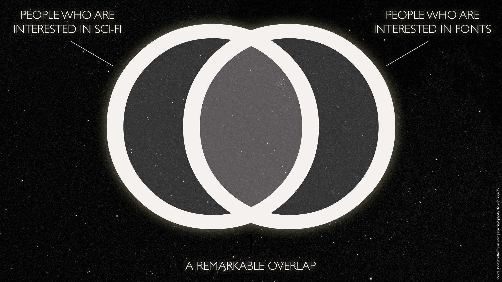
It’s based on the following principle:
(Yes, that is a Gill Sans capital letter O.)
However, there’s a deeper mission at work. In fact, I’ll let you in on a secret: this blog isn’t really about typography at all. It’s about storytelling through design. I wasn’t aware of this when I started, but here we are.
This site is written and curated by Dave Addey. You can find me at @daveaddey on Twitter.

Awesome concept. I can’t wait for the entry on Firefly/Serenity. 🙂
LikeLike
Yes! I concur!
LikeLike
Someone else tool care of it, to an extent:
http://rickyaeger.com/print-production/adventures-in-font-matching-joss-whedons-firefly/
LikeLike
Firefly’s a great idea. Battlestar Galactica too.
LikeLike
Great idea.
I suggest the english TV serie Space: 1999. …and then Duncan Jones’s Moon.
LikeLike
Great post! i’d love to see a similar analysis of the iconic fonts used in the Terminator movies.
LikeLike
Seconded! What font family did Skynet select for the console log of the T-800?
LikeLike
Would be curious as to your thoughts on the 70’s Buck Rogers movie and subsequent series. I always felt they used over-stylized and unreadable fonts.
LikeLike
Dave,
This is fantastic. I live in the “remarkable overlap.” Keep it comin’!
LikeLike
Absolutely amazing and exhaustive work, congratulations. It’s obvious, but would be great a review of Alien series (mainly 1 and 2)…
LikeLike
I hope you include anime scifi movies too. But if not, my top two would be Blade Runner and The Fifth Element.
LikeLike
Yes, I’d love to see how The Fifth Element borrowed from classic sci-fi too.
LikeLike
Greetings! Very cool concept. I would like to hear more about the obviously terrible reason/arguments why Avatar and Serenity uses – oh, the horror – Papyrus.
It is interesting how much effort they put in to mise-en-scène, special effects etc, but seemingly gives the font decision over to a seven-year-old.
LikeLike
THIS! ^
LikeLike
Tuned in.
LikeLike
This is such a great idea, will be coming back for more!
LikeLike
I LOVE your blog – as a designer/sci-fi filmmaker, how could I not.
Maybe one day you’ll do a post on my indie sci-fi feature Senn, although the problem is 95% of the writing in the film is in an alien language (it’s all grammatically correct though)!
LikeLike
please create a twitter account so i can follow you 🙂
LikeLike
Just wanted to say, as all others, this is amazing =)
LikeLike
OK. You might hate me, but.. why don’t you have a look at something that’s future, and real? I find Tektronix Gear amazingly futuristic in design. It belongs in any Sci-Fi movie. And I bet it was in many of them, but I don’t keep track. Just look at things like the Tekronix 7000 series, or the Tektronix 455. The documentation is some of the most amazing ever, too. Have a browse inside some service manuals. Have a look at the pictures on the TekScopes mailing list Yahoo Group. You’ll love it. If you liked my idea, let me know via email.
LikeLike
Can you do Oblivion?
LikeLike
Very interesting website!
Someday you’ll have to do an analysis of the typography and fonts in J. Michael Straczynski’s tv show “Babylon 5”! I’d love to read that.
LikeLike
Just found this website through the Smashing Magazine newsletter. I love the amount of detail you’ve put in here, and will be sharing it. Please, please do some more when you can – it’s great reading.
LikeLike
Love the blog, but are we ever going to see another entry?
LikeLike
I’ve been coming back for 2 months since the last post.. but still nothing 😦
LikeLike
I second the Space 1999 suggestion. It would be a great topic for this – always loved that show and its usage of typography stood out for me even as a kid. Great blog:)
LikeLike
I just read your Moon article and enjoyed it very much. Please do keep writing more articles. I can relate to how time-consuming blogging can be, and your in depth analyses must be even more time-consuming. Still, the overlap is correct … there is demand for more typography-related sci-fi articles.
LikeLike
Hi, just discovered your site / project – very cool. I’m a long time type-nut and went to Compugraphic Typesetting School in 1985. Just wanted to say what a very cool concept this site is. You should add some share/like buttons on here! 🙂
LikeLike
Thanks man, such a great blog with quite some interesting information. Just read the Alien article and was kind of surprised by the handdrawn self destruct informations. Quite interesting and nice. Thanks for all your work!
LikeLike
Hats off! I could have never thought of all these things you are able to make out of the movie if I wouldn’t have come across this blog of yours. Simply amazing!
LikeLike
I just found this through BoingBoing, and serendipitously I just re-watched “Alien” last night!
I’d love to see your thoughts on the Manhattan Island Prison font from John Carpenter’s “Escape From New York.” It’s used inside the prison’s intake facility and on the walls, and nowhere else as far as I can tell.
I tried to recreate and complete it as a set of vector files, hosted here:
http://www.thingiverse.com/thing:241090
I’d also love to see you take on the British show “UFO”.
LikeLike
Where’s Dune ?
LikeLike
Thanks for a great site. I’d like to see an expanded post on Albertus. In addition to it’s cameo in 2001, it’s also featured in The Prisoner, David Lynch’s Dune, John Carter, and appears in the posters for the Star Wars prequels and Lord of the Rings films.
LikeLike
How about corporate typography in Sci-Fi movies like RoboCop and Rollerball?
LikeLike
Six words.
Star Trek: The Next Generation’s Font
Disconnected T’s, E’s and K’s. Open R’s. Most obviously the wild A’s. Let’s not forget those “lower case” n’s. Unless you’re writing the subscript (WHaaaaa?!?!) What is going on? This IS a next generation!!!
Please deconstruct!
LikeLike
Brilliant articles, Blade Runner must surely be on the cards?
LikeLike
Outstanding blog! It just nails myself being in the “remarkable” overlap 😀
What about Norman Jewison’s “Rollerball”? That could be fun, I guess…
Keep up the good job!
Cheers
LikeLike
Seconding the wish for Escape From New York. Also maybe Tron?
LikeLike
Word on the street is that the rather accomplished Richard Edlund hand lettered the oblique font used in the title sequence for the original Star Trek television series, would love to heartier about that!
LikeLike
Wow. Just wow. I exist solely in that Venn diagram overlap. Thank you for being the new centre of my online universe!
LikeLike
Oh! I love this concept so much!
LikeLike
I’d like to see this done for Brazil!
LikeLike
This is an excellent example of how visual clichés develop. Much of this typography originates in the post-WW2 zeitgeist of futurism which was a sort of ‘go faster’ version of the geometric forms of the Bauhaus suggesting that it was somehow more scientific and technological than other typographic forms. I always felt that Clive Sinclair’s trade mark was the apogee of this movement being constructed entirely of straight lines. Once established, typographic clichés are surprisingly resilient – similar examples being the forms used in rave culture or graffiti art or the current vogue for light/ultra light weights of sans serif humanist forms within IT culture. Can you imagine Apple suddenly deciding to adopt Palace Script as their primary system font? As far as mainstream cinema is concerned, the level of typographic imagination is abysmal: it’s either the aforementioned extended geometric forms for sci-fi/futuristic/space subjects; distressed typewriter forms for spy/espionage; or the most over-used of all: Trajan for anything remotely epic/historical/iconic!
LikeLike
Have you seen Splatoon (a Nintendo game)? They created a new language (or the semblance of one) as well as multiple fonts which are used extensively throughout the game. I am cataloguing examples of the in-game art and text on my Instagram page, Splatoonology.
LikeLike
Idiocracy: It’s worth your time for the hospital admission scene alone. Thanks for a fascinating blog post on Alien!
LikeLike
Hi Dave, I just wanted to say I love your site and the subject you chose. I’ve nominated you for a Liebster award at my blog. The award is meant to help spread the word about smaller but worthy blogs. If you want to participate, just post your own nominees and set of questions. Thanks.
LikeLike
I wonder what your take on the opening to ‘Stranger Things’ opening title, which seems to me to be a call back to many book covers of the eighties, might be? 🙂
LikeLike
I’m in love with this blog. Keep them coming!
LikeLike
I hope to see a new post soon!
LikeLike
Very interesting and clever and congratulations on the book.
LikeLike
What a fantastic discovery. Never stop doing this!
LikeLike
One to consider is The Andromeda Strain. The opening titles alone are a rampant fontfest (Eurostyle included).
LikeLike
MICROGRAMMA BOLD EXTENDED.
LikeLike