Exciting news: there’s a Typeset in the Future book! Typeset in the Future: Typography and Design in Science Fiction Movies, published by Abrams Books, is available to buy in all good bookstores.
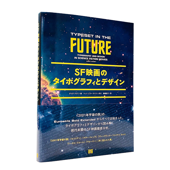
Even more exciting news: there’s a Japanese edition! SF映画のタイポグラフィとデザイン, published by FilmArt, is available in all good Japanese-language bookstores.
- 🇺🇸 Amazon (Print / Kindle)
- 🇬🇧 Amazon (Print / Kindle)
- 🇯🇵 Amazon (Print)
- 🇨🇦 Amazon (Print)
- 🇦🇺 Amazon (Print)
- Apple Books (ePub)
- 🇺🇸 Barnes and Noble (Print / Nook)
- 🇺🇸 Kobo (ePub)

The book contains new and expanded TITF studies for seven all-time classic science fiction movies, in a form that is beautiful enough to adorn even the most discerning of coffee tables. It’s the perfect holiday present for the design / sci-fi geek in your life, even if that geek happens to be yourself.
Does it include my favorite sci-fi movie, [MovieName]?
The book studies seven classic sci-fi movies, focusing on those that create a detailed vision of the future through design and typography. (The list is also heavily inspired by requests I’ve received on TITF over the past few years.)
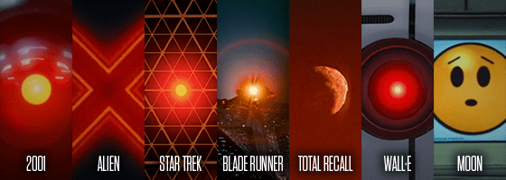
Here’s the line-up:
- 2001: A Space Odyssey (1968), adapted from the original article
- Alien (1979), adapted from the original article
- Star Trek: The Motion Picture (1979), plus a look at the wider world of Star Trek typography
- Blade Runner (1982), adapted from the original article
- Total Recall (1990)
- WALL·E (2008), which I’ve also posted as a brand new article in its entirety
- Moon (2009), adapted from the original article
The book also includes interviews with sci-fi, typography, and design experts, including:
- Paul Verhoeven, director of Total Recall, RoboCop, and Starship Troopers
- Mike Okuda, scenic art supervisor for Star Trek: The Next Generation, Deep Space Nine, Voyager, and Enterprise (plus associated spin-off movies)
- Ralph Eggleston and Craig Foster, production designer and graphic designer for Pixar’s WALL·E
- Stephen Coles, co-founder of Fonts In Use, author of The Anatomy Of Type, and Associate Curator at Letterform Archive
- Antonio Cavedoni, font designer and expert on Eurostile creator Aldo Novarese
And if that’s not enough, there’s also:
- A study of the tricks movies use to make their worlds look realistic without distracting you from the plot
- A detailed guide on how to make your own text look futuristic
- A study of futuristic movie font Eurostile Bold Extended
- A foreword from Matt Zoller Seitz, editor-in-chief of RogerEbert.com, and author of New York Times bestsellers The Wes Anderson Collection and The Wes Anderson Collection: Grand Budapest Hotel
How does the book differ from the web site?
Four existing articles from typesetinthefuture.com have been revised and expanded for the book, with even more geeky detail than the originals. (The book’s 2001: A Space Odyssey chapter already contains twice as much goodness as when I first studied the movie in 2014.) Three new studies have been written entirely from scratch, alongside in-depth interviews with the typography and sci-fi experts listed above.
Sounds great! I’m going to buy a copy right now.
Why thank you!

Liked the website, love the book.
Two pages with glitches in my hardback copy ISBN 974-1-4197-2714-6:
On p.207 the captions for “left” and “right” are reversed from the actual pics
On p.241 the text says ‘shadow renderings of “Sam Rockwell” (right)’ but the pic is on the left
And I’m sorry to say that on p.259 the bottom right Star Wars image is from a Rebel Y-Wing, not a tie-fghter.
In Moon, the countdown clock on the operational notifications board might be a nod to the 1981 science fiction film Outland. In the last part of that film there’s also a prominent countdown clock for the arrival of the shuttle with a couple of hired killers on board. Outland isn’t very good, but might be worth a look for the Alien style title and quite a lot of typography.
LikeLike